Indie game storeFree gamesFun gamesHorror games
Game developmentAssetsComics
SalesBundles
Jobs
Tags
A jam submission

Sci Fi CorridorView game page

Sci Fi
Submitted by Joe Edwards — 1 day, 14 hours before the deadline
Add to collection

Play game

Sci Fi Corridor's itch.io page

Results

CriteriaRankScore*Raw Score
Creative#74.0004.000
Overall#133.7003.700
Technical#143.5003.500
Presentation#163.6673.667
Documentation#173.8333.833
Research & Development#183.5003.500

Ranked from 6 ratings. Score is adjusted from raw score by the median number of ratings per game in the jam.

Judge feedback

Judge feedback is anonymous and shown in a random order.

  • Great work here, lots of good approaches to tackle this environment. Only technical suggestion is to investigate how you might approach this environment using trim textures and tiles. Overall great work.
  • The concept you chose is really nice and works due to a few key points you may have missed. The scale and proportions of the scene and objects is very important - the cables are much thicker, fuller and of different sizes, they fill the space, they are crammed in, same with the wall mounted objects and structural supports. With a few proportion and scale adjustments your scene can get much closer the concept.
  • It’s good to see a breakdown of the images you did find but it would have been work to see more reference in general. I like that you tested a workflow before you began but I would say that it would be more optimal to use opacity in textures rather than high res geometry for the grates. Using geometry for panels not in place is fine but when the mesh is under foot you can get away with using a texture instead. It would have been good to see a block out of the scene before getting into production. Good to see use of a modular kit. UVs look efficient. It would have been good to test if you needed to include all the geometry here or whether you could bake some of it into a trim sheet (this isn’t a deal breaker). Door asset has clean and good topology. Good use of PBR throughout. I like the set dress you’ve added to the scene. This could have been enhanced by not having the wiring as symmetrical and having some panelled meshes in the floor and ceiling. Although the lighting is quite simple I do think it complements the scene. Be careful of your shadows becoming too black. Good work.
  • I think you've got a technically sound piece here, and have shown that you understand production workflows that a lot of studios will follow. The end result is a good piece for your portfolio - with some extra work I think you can make this shine even more. I agree with your self-assessment in your conclusion, and am glad you realize where the potential shortcomings in this scene lie, and that your documentation has helped showcase your thought process from beginning to end. I would like to see you potentially revisit your lighting mood-board again and see how you can improve your final scene with a lighting pass. At the moment, your final result doesn't seem to quite capture the color represented, and it feels somewhat monotone overall. You've done good in creating focal points with the lighting itself, but the final color could be pushed a bit more, along with some use of post-processing to help create a bit more depth. Consider bending the tunnel in general, similar to the references you have posted, and push some of your lights to create more visible shapes if you can. Your final presentation is decent, but I think lowering the camera angle, or framing parts of the scene might help sell the details more. Right now, due to the level of detail all across the scene - some of it gets lost, and with better lighting, some larger shape variety (the tunnel itself) and some more focused camera shots you would be able to showcase all the work you've done.
  • Great work! And I am going to tell you why just in a moment. But first I am going to tell you the points you can improve and that I had a hard time finding some. Mainly in production, you should have in mind the levels of resource optimization. What you have done here is ok for Unreal, but you have to keep in mind you could end up working on different platforms and engines that have different restrictions for the levels of geometry detail. Another thing will be in the UVs, you should try to keep all the elements as straight and rectangular as possible. In the uv map of wall connectors, I think, you could give some rectangular modifiers on some elements also on the door back and roof. The things that i really appreciate was the light tuning, material tuning and..the unexpected one and probably the most important, the production time management in relation with the quality of the end product. Something that sometimes in studios, people are struggling. That moment when you started working on that room, and realized that you could deliver a better more finalized scene if you switched the theme/location. I think that was a good effort and a prof of a production mindset putting time and detail to work together, to deliver the best you could, even though you made another scene besides that. Again, good work and keep it up!

Challenge Tier

Sumo Digital Rising Star

Leave a comment

Log in with itch.io to leave a comment.

Comments

Jam Judge

Research & Development

The preproduction shows several real world and concept references with similar elements. The research for what everything is used for feels a bit overlooked, as well as if it's supposed to be abandoned.

Creative Art

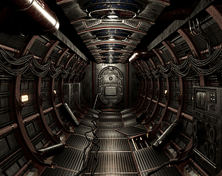
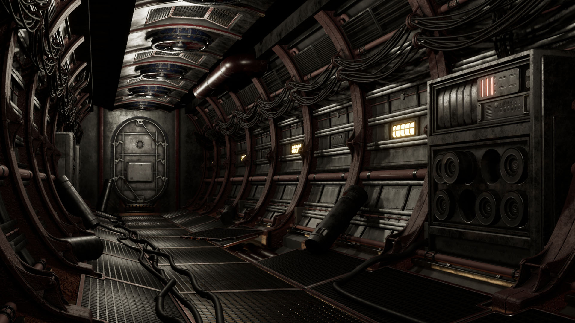
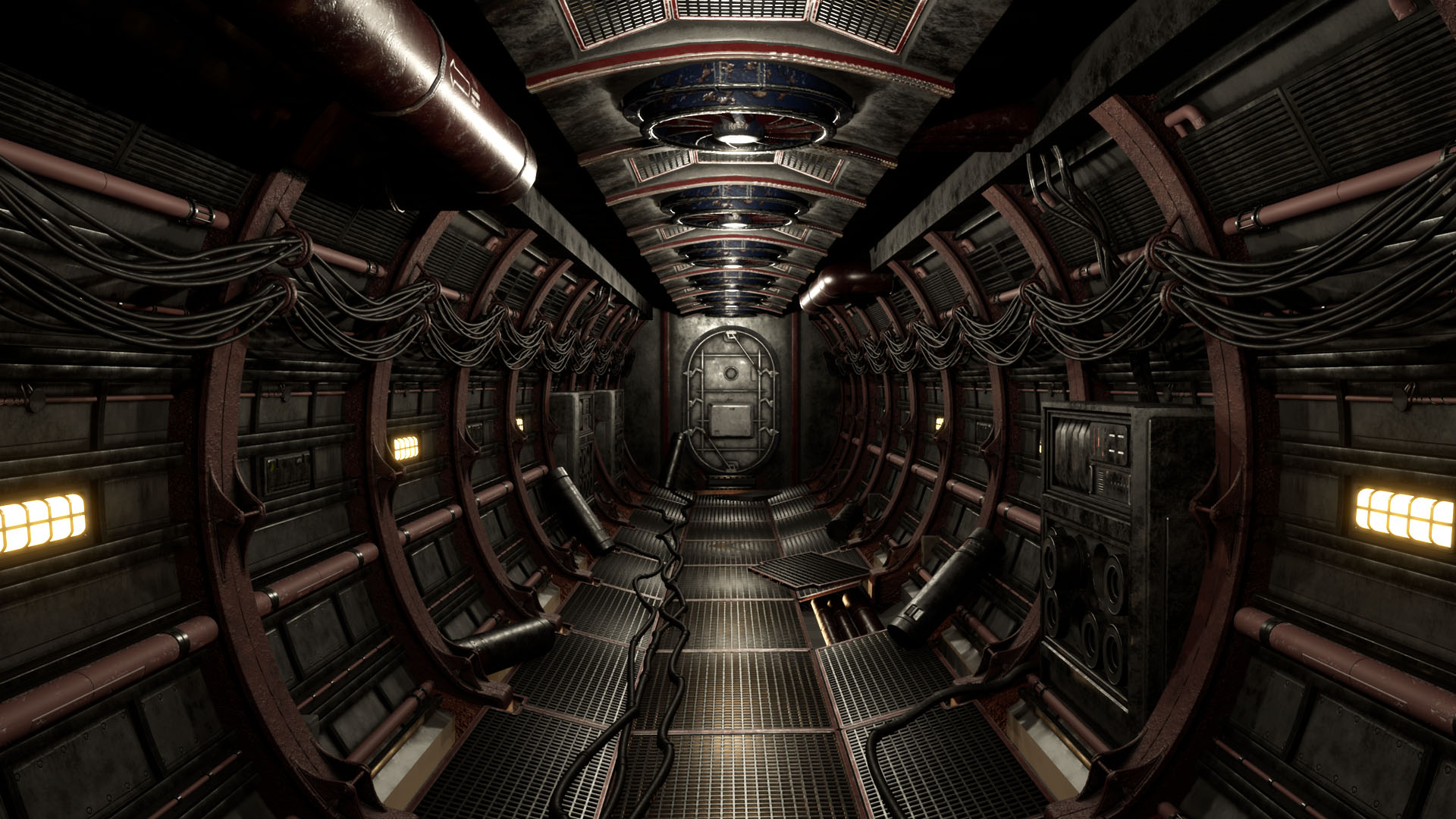
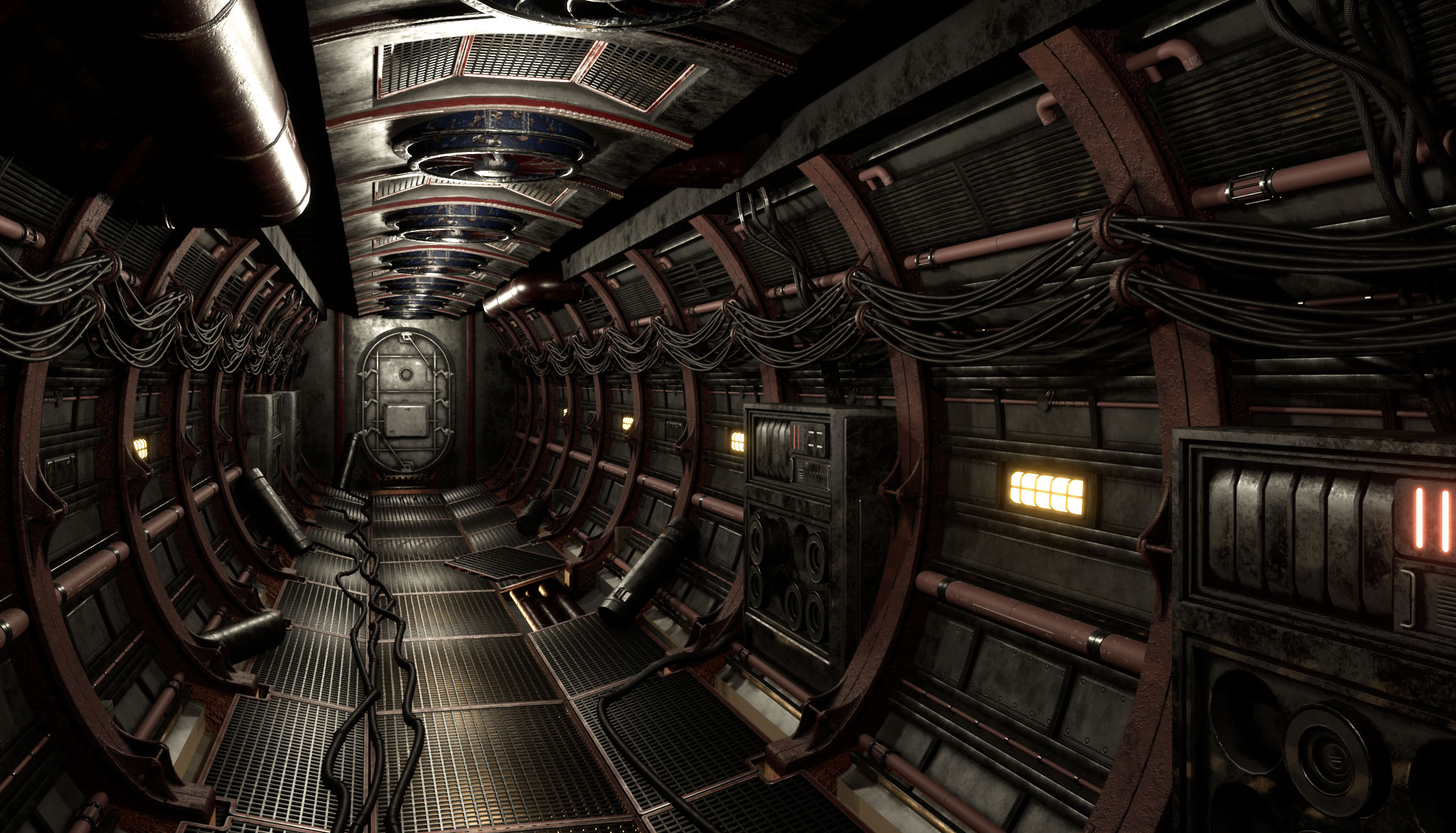
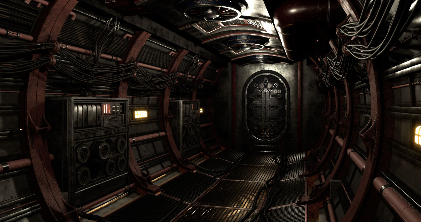
The scene looks interesting with lots of different elements in it. The level of detail is a bit on the high end, making everything blend together in a nice and interesting way, but also taking away attention from that detail to some regard.

The contrast between the door's surrounding and its detail makes it a very nice focal point, with light hitting it nicely and wall pieces and cables acting as leading lines towards that door.

If you wanted to add more of the abandoned feeling to it, I'd maybe have a look at more scattered assets, such as the gas bottles (I presume) in the concept, on the 2nd page of your pdf. The feeling is created, I think, with placement and them looking a bit random, but also interfering a bit with the player path.

The strong dirt with soft transitions makes it very dominant, but it's not clear where it has come from. You could control the roughness of such domninant texture with for example vertex paint channel in your shader to make it a bit more local. Decals might also add nice feeling to edges, without needing to result pushing the dirt so much to all over the place, just as you mentioned in the Conclusion. Has the support structure rusted all the way up, by the way? That's how it feels right now.

The overall feeling is a bit cold without warmer elements that don't feel so cold when being touched (like cloth, plastic, wood). It's cool.

Technical Art

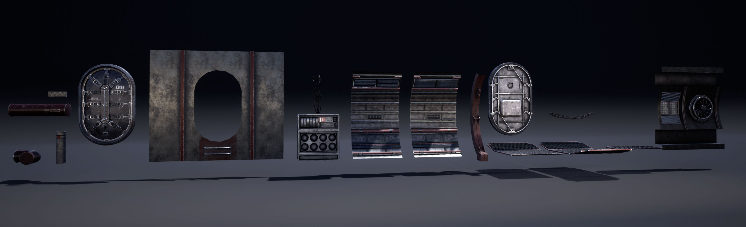
The final work includes mostly Game-ready assets while keeping custom LODding in mind with baking. The texel density might not be as high as I'd like to see, but it's done in a consistent manner, which is great. Exported textures are including AO in the textures map to a big extent, which is not exactly wanted with how the shaders handle value changes.

The workflows are pretty much spot-on with what studios use. Some use more trim sheets and tileables to hit higher texel densities and to keep the material more flexible for reuse from what I know, some use masks with tileables to get least amount of texture memory usage.

Documentation

Influences are fairly straightforward and noticeable in the final image. Original moodboards might have gotten a bit lost in the process, but the end result makes up for it. Showcase of the lighting color and taking palette from an image were also a nice touch to the documentation. Summary also gives a nice insight on what you were thinking of adding, and how you'd go forward from here. The time constraint is quite tough.


Final Presentation

The final images are a bit on the cold side with limited color palette. The contrast looks great with lighting, and emphasizes the door. The final renders also feel nice with softened edges, I believe, anti aliasing, giving a realistic feel for the renders.