


Play asset pack
Fruit Cart on Street Corner's itch.io pageResults
| Criteria | Rank | Score* | Raw Score |
| Technical | #25 | 3.143 | 3.143 |
| Presentation | #37 | 2.857 | 2.857 |
| Documentation | #42 | 2.857 | 2.857 |
| Overall | #42 | 2.714 | 2.714 |
| Creative | #50 | 2.571 | 2.571 |
| Research & Development | #69 | 2.143 | 2.143 |
Ranked from 7 ratings. Score is adjusted from raw score by the median number of ratings per game in the jam.
Judge feedback
Judge feedback is anonymous and shown in a random order.
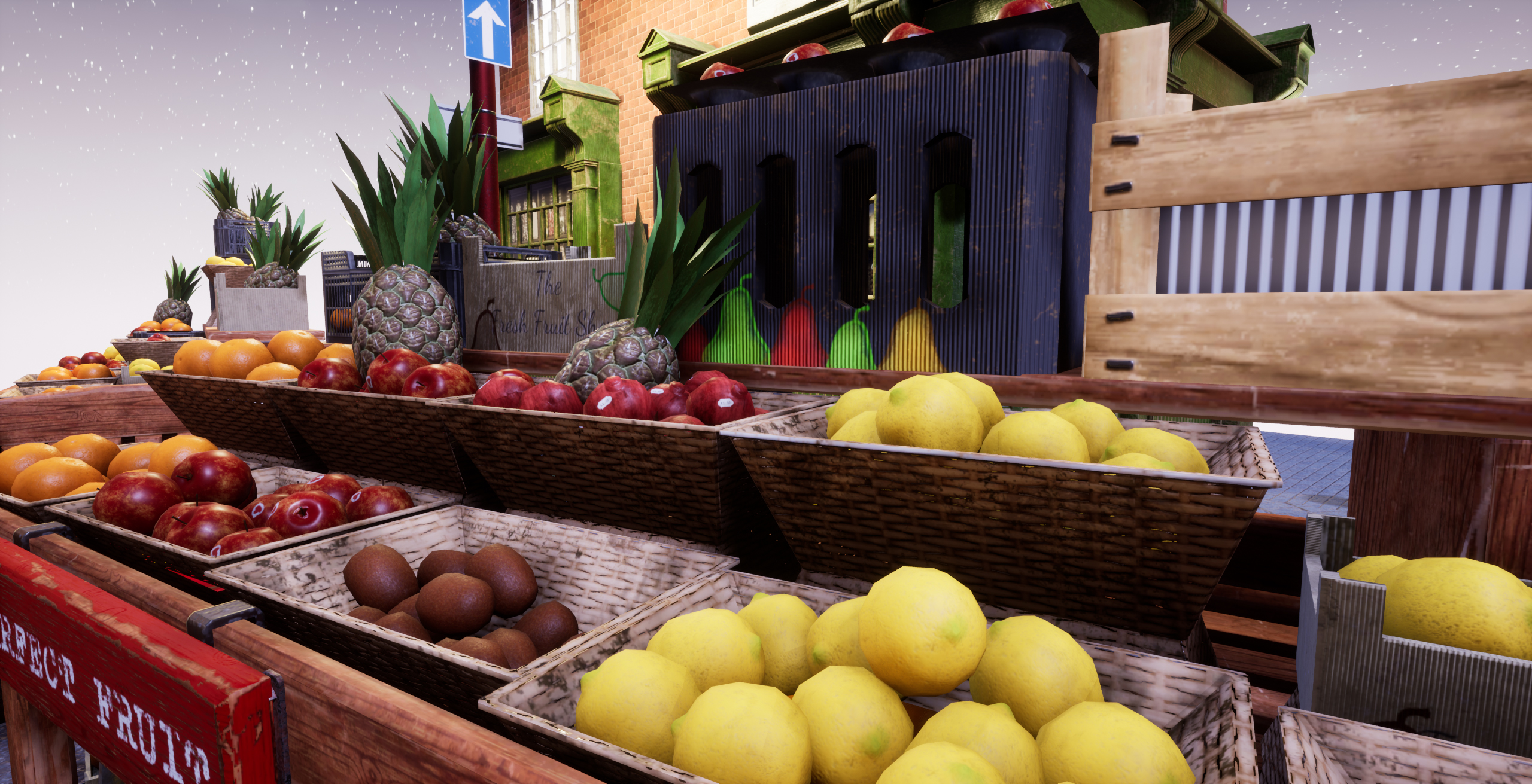
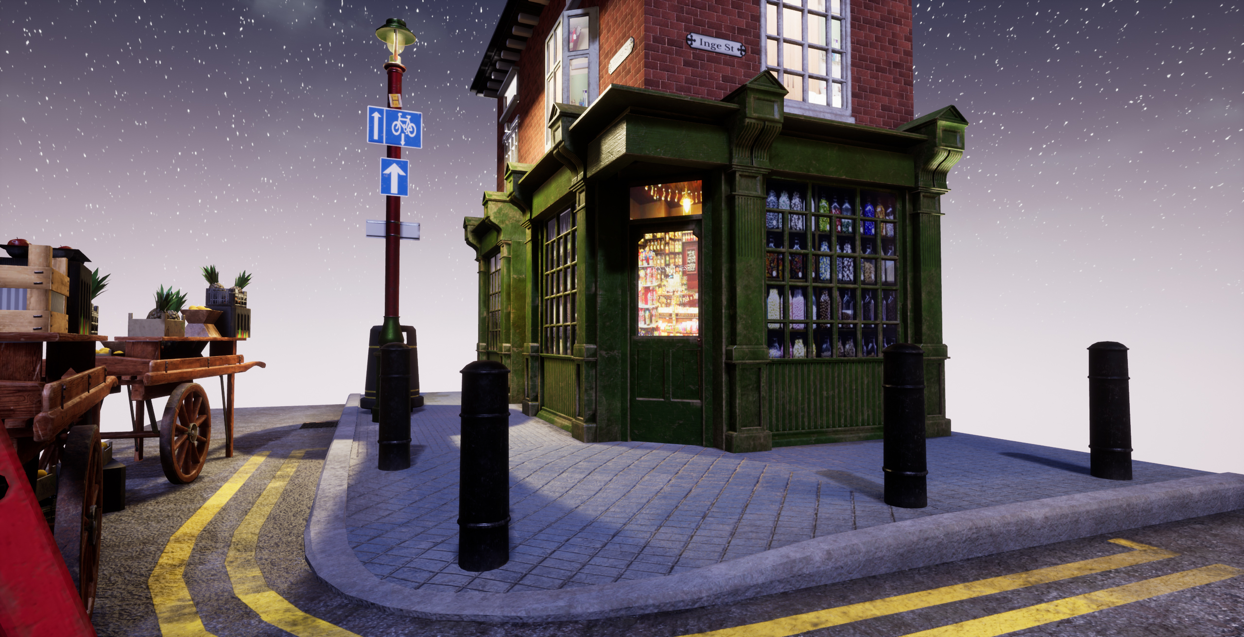
- Research & Development Inspiration shows diving into both real life and other people's work. Creative Art Scene reads well. There's a nice sense of contrast and colors. I like your puns. Fruits, lighting and materials look pretty cool and interesting. To push it further, you could implement material blending, some dirt decals to the brick wall and irregularities to the meshes, to push them a bit out of the realm of 3D and into real life like structure, where basically nothing is 100% perfect. Technical Art You have an interesting approach to mesh splitting. Meshes are mostly well optimized. It was nice to see the interior idea in the project. The values work well in the corner store. (PS; using Master material and material instances can speed up experimenting with shader work as well, as you can set the image and float values as parameters to be changed basically on the fly for the material instance.) Some sort of depth mask implementation with parameter to control the depth of the room might be a nice addition if it doesn't become too heavy. Metallic map is used for pure metals; painted metal should be treated as non-metallic, as the paint showing is done with non-metallic material. Reusing texture space with trims and tileable textures can prove to be helpful in the future when thinking about hitting texel densities of 512 or 1024. Documentation Documentation is clear to read and easy to understand. Final Presentation Renders are of high quality and present the subject matter well.
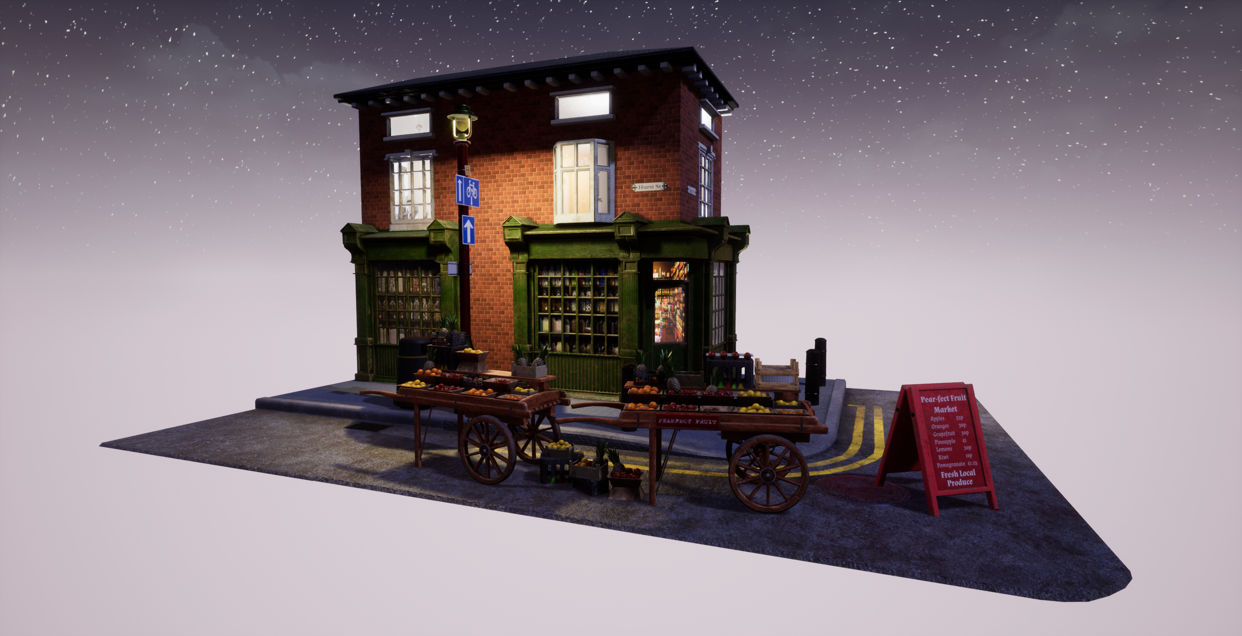
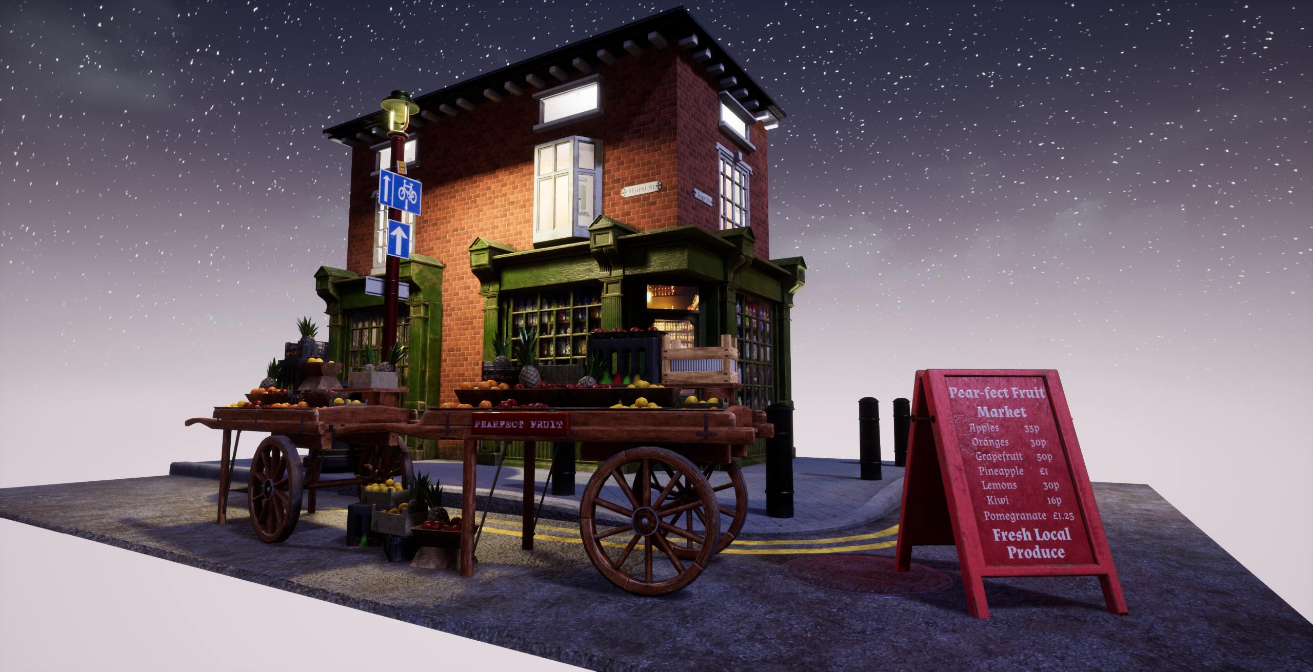
- It would have been good to see more reference and annotations of what you liked and wanted to include in your scene. Good to see a block out of parts but it’s always better to flesh out as much of the scene as possible in the engine. A lot can be accomplished in the block out phase that will make things easier later on in development. Your modelling, UVs and texturing work all look good. Be careful of having skewed UV islands (window frame). You might want to add a bit more geometry into the baskets as the sharpness of the geometry makes it look unrealistic. Good use of modular kit pieces and tiling textures. I like that you created separate day and night scenes and that the lighting in both works well. The scene may have benefitted from a subtle amount of fog to add depth. Good work.
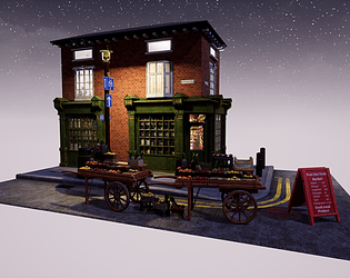
- Submission Title: Fruit Cart on Street Corner Submission Tier: Search for a Star Assessor: Dominic Shaw Artist @ Firesprite Research & Development There was a good breakdown of how you went about making this environment and it showed your intentions for the project quite well. It would have been nice to see some more project management aspects such as time plans and asset lists as these really help with the production of environments to keep everything organised. Creative Art I think that this is a good base and it has potential to be a nice portfolio piece but at the moment, there a few small improvements needed that would help push the quality of this environment way up. The main improvement needed are the shop windows, I really like that you stated you pushed yourself to learn a new workflow by trying to match the quality of the windows in the recent Spiderman game. I think you achieved getting the depth but the issue at the moment is that you can really tell that you have used images which makes the scene feel unnatural and too fake. In the Spiderman game, they modeled the interiors and did a cube map render so even though they were fake interiors, they were still game interiors so they blended in well with the exterior. Here is a good post from the guy that made the fake interiors in that game: https://www.artstation.com/artwork/W290vD To help improve this effect, I would model the interior rather than using photos but I do understand that this is time consuming. If you don’t want to model the interior, I would personally remove this affect and just have a nice reflective glass material instead. The other aspect that needs work is the composition of the scene, at the moment there is no strong focal point so it’s hard to know where to look, I noticed in the documentation that the fruit cart was the hero asset so maybe you could change the lighting to really highlight the cart area. At the moment, I am just drawn to the fake interiors and then I instantly see they are photos which I think lets the environment down. Technical Art You have used modular pieces and channel packing pretty well to optimize the level but I would be more organised with the props that you are bringing in. I noticed that all the elements such as single fruits were one mesh each which will add another two draw calls (one from the mesh and another from the material ID) which will make the level not optimized. I think from a technical point of a view, the hardest thing you did was the fake interiors and you managed to get that fake depth in quite nice when playing the level. I just think this needs improving by replacing images with game models. The last thing you could have done is broken up some of the materials such as the brick with a second material and used vertex paint to blend between the two materials or even just added some dirt and grunge decals around to break up the tiling. Documentation There was good insight into your workflow and it showed how you went about making the environment quite well. Final Presentation Overall, I think that this could be a really nice environment with the small improvements that I have mentioned above. I really like that you pushed yourself to learn complex workflows like the fake interiors and moving forward, I would focus on improving the lighting and composition to make the fruit carts more of a focal point.
- Looks very clean and very good so far. On the composition and visual part I would fill the space between the windows with some details, the brick wall could have some extra decals with weathering and a blend with another texture. On the modeling side, if it's possible to work with non quad models, some extra optimization could be done on the side walk model, wall model and generally most of the flat surfaces.
Challenge Tier
Search For A Star
Leave a comment
Log in with itch.io to leave a comment.
Comments
No one has posted a comment yet