Play asset pack
Shrine to the Goddess of Harvest's itch.io pageResults
| Criteria | Rank | Score* | Raw Score |
| Research & Development | #53 | 2.333 | 2.333 |
| Documentation | #60 | 2.500 | 2.500 |
| Creative | #67 | 2.167 | 2.167 |
| Overall | #68 | 2.133 | 2.133 |
| Presentation | #73 | 1.833 | 1.833 |
| Technical | #74 | 1.833 | 1.833 |
Ranked from 6 ratings. Score is adjusted from raw score by the median number of ratings per game in the jam.
Judge feedback
Judge feedback is anonymous.
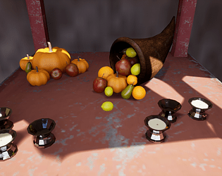
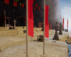
- The fruit look like they were a great start here. Would like to have seen more of that "completed" feel in the design of the space. There are some steps on the ground here, but they do not add any dynamic shape to the scene or playspace. A testable whitebox would have helped a lot here. I think you would have discovered a lot more about the player experience when walking around it.
Challenge Tier
Search For A Star
Leave a comment
Log in with itch.io to leave a comment.



Comments
Research & Development
There's nice writing for the topic; it feels very interesting. Different assets are shown well for the process of development. Research into real world and defined location could be maybe added, and choosing 1 image as the main reference.
Creative Art
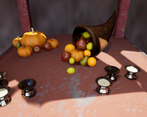
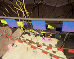
The shrine reads, and there are interesting elements to the scene. Fruits are of high quality, and the scene introduces vivid colors with flags.
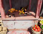
The scene could benefit maybe from an overpaint; you have organic elements in slightly blocky forms, and lots of small detail props. Try to make the next scene a bit more with big (>2m), medium (2m>x>20cm) and small shaped (>20cm) props for similar scene. :) Another thing could be to push the scene to be more concise and packed so you can push the quality rather than quantity; the altar itself could already present an interesting opportunity for the scene. If you want to create a bigger scene like this, I'd suggest researching level design for interesting spaces and how they lead player and eye to certain locations.
Technical Art
The assets show roundness very well, but smaller assets may be a bit too small to have that many polygons. Shrine asset has too few polygons to the roundness, while the crate has some polygons that don't add to the silhouettes of the objects. Add polygons to the rounded surfaces; Can you spot an object being 3D with sharp polygon lines? -> it calls for maybe more polygons to get the roundedness. For candle glass the roundedness might be a bit much; be more mindful of what player sees and try to be coherent there with that in mind.
Water works. Ground could maybe benefit from making use of Unreal's Landscape tools.
Post process volume with Min & Max Brightnesses set to 1 would help with delivering kickass lighting and material work.
Extra keywords to research Texel density (512, 1024), tiling textures (used already well, but maybe a bit more research would do no harm), trim sheets, face-weighted normals.
Documentation
Images are easy to look at. Text reads well. Layout could maybe be touched a bit to add to a more easy viewing experience.
Final Presentation
Renders showcase subject matter. Composition could maybe pushed a bit with implementing rules of third or golden ratios while keeping the main attraction or what you want to show well in the image.