

Play asset pack
Mini Funfair's itch.io pageResults
| Criteria | Rank | Score* | Raw Score |
| Documentation | #64 | 2.400 | 2.400 |
| Creative | #66 | 2.200 | 2.200 |
| Research & Development | #75 | 2.000 | 2.000 |
| Overall | #78 | 1.920 | 1.920 |
| Technical | #81 | 1.600 | 1.600 |
| Presentation | #85 | 1.400 | 1.400 |
Ranked from 5 ratings. Score is adjusted from raw score by the median number of ratings per game in the jam.
Judge feedback
Judge feedback is anonymous and shown in a random order.
- Good amount of research into existing games and their styles. Don’t limit yourself to exact scene dimensions. Instead, change the position of the assets to create more interesting compositions. It would have been good to see which style you aimed for and why. Also, testing a style on a few assets first would have made creating the scene easier and consistent. Move away from destructive workflows eg. Photoshop and bake your maps Substance Painter or Designer. Keeping assets in one program will also increase the speed in which you can work. Where you can work to the scale of a human. Seeing the assets in place and knowing that the space is 30x30x30m makes everything very oversized. Adding in props that a human can relate to eg. a chair or barrel, will help. It would have been nice to have the ground extend in all directions so that there would be no cut offs to it. Get your final shot cameras in place early on so you can better compose your shots. Look into texel density to get better texture consistency between assets. Lighting could do with some refinement too.
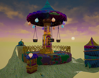
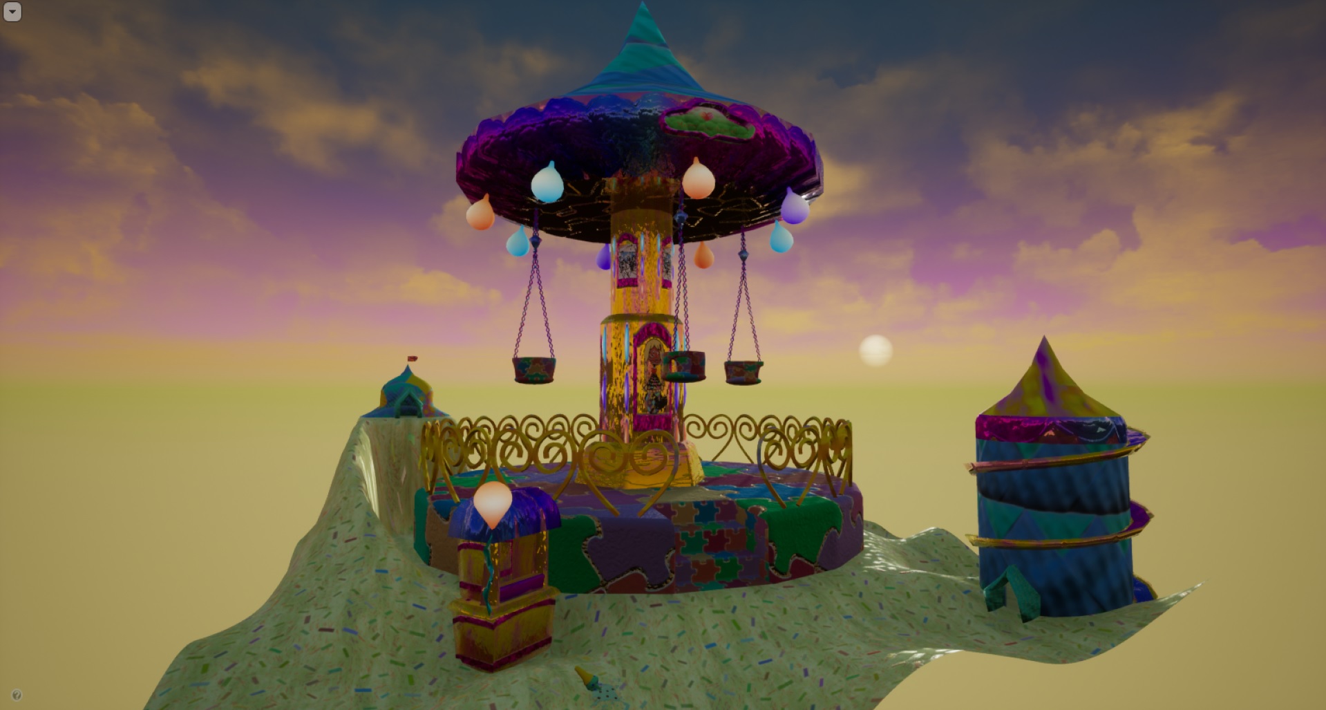
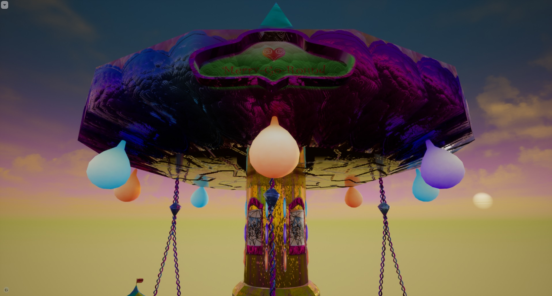
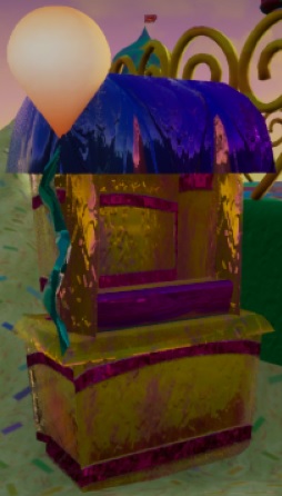
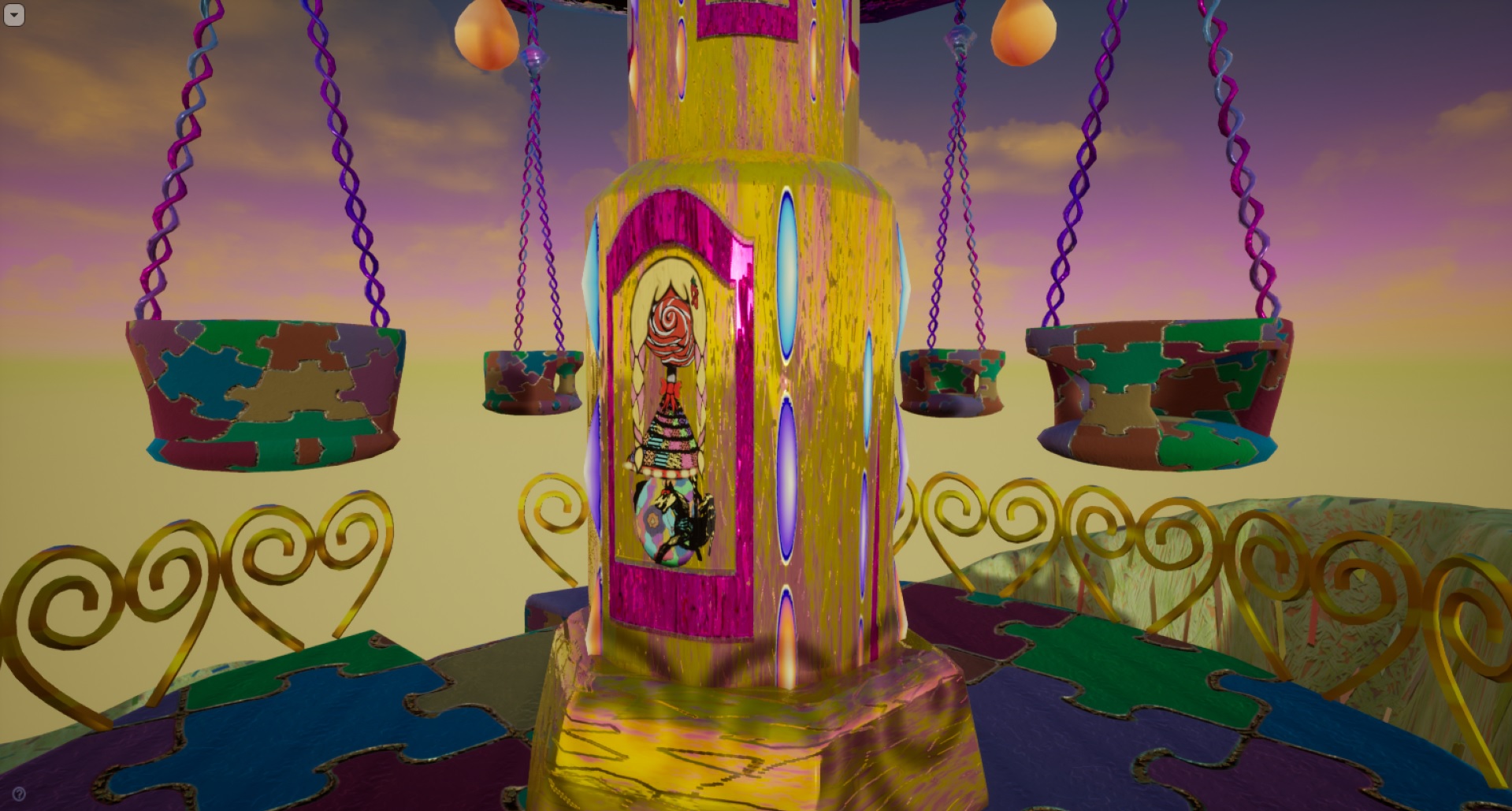
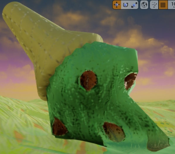
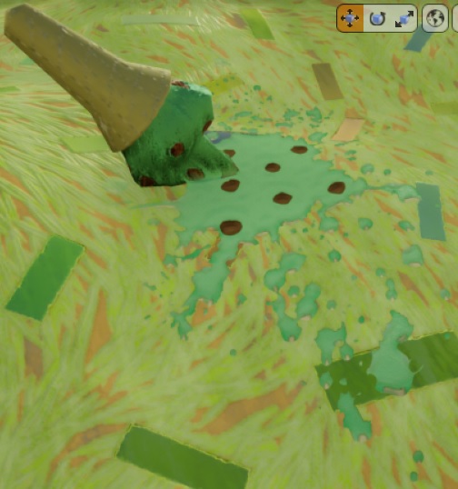
- Anthony O Donnell : Lead Artist - Firesprite The diary was well written and provided good insight into the production and creative process. The theme of escapism / dreamlike scene is interesting and somewhat successful in the final images. The composition of elements could be pushed to be a bit more surreal to drive home the dream like aspect of the work. Such as the swings defying gravity and floating or the spilled cone being over scaled and "flooding" the scene with melted ice cream and chocolate chips. The final colour palette is less vibrant than I think was intended. The reflectiveness of the materials somewhat takes away from the stylised look the scene wants to achieve. It was good to see some trim sheet use. The jig saw pattern in SD is well done. It's a good idea for a scene that would benefit from more time fleshing it out. Treating the scene as a small isolated diorama as it is now and pushing the themes it has potential to be an interesting piece.
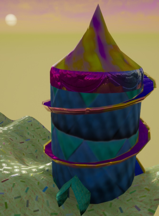
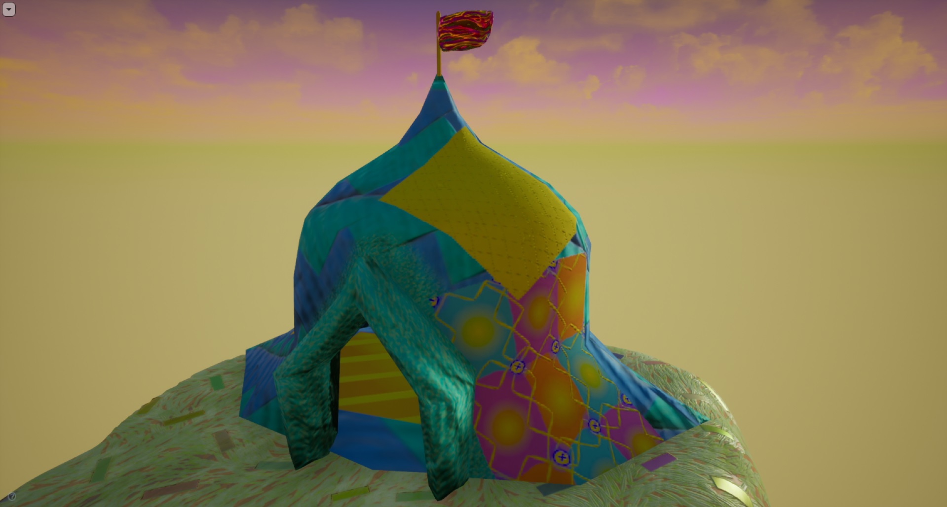
- Research & Development Research shows exploration into different games, their moods and stylistic approaches. I'd appreciate also some real world reference for materials, lighting, mood, narrative in form of reference and mood boards (more images would be pleasing to my eyes). Creative Art The scene is an interesting blend of colors, dream-esque lands and mix of odd and familiar. The ice cream looks great :) The use of colour, shape and ornaments remind me of Dream Eaters from the Kingdom Hearts universe, which could maybe also be used as a reference when thinking about ratios of detail and use of color. Technical Art I'd suggest looking into Unreal Documentation for material creation; maybe a video such as this could help you towards the right track; https://youtu.be/tZsEzOCETBM Terrain uses a high amount of polygons, but the structures could use a few more. Roundedness on hearts shows some good polygon usage; as a point to compare between, the main pillar of the carousel has some polygons that don't adhere to the shape of the object or its silhouette, which isn't optimal. Documentation The documentation has been written in a very college, and documentative fashion. I would compare it to final thesis work or a book. Steps have been presented well, and basically everything feels sort of 'filed' and 'documented'. Final Presentation Images are of high quality and show nicely the scene.
- Hello Nicole, I appreciated your efforts in the documentation, you provide a lot of details and some interesting informations about where you want to go. The execution and technical execution is low level currently, you need to focus more on the global render and think as a picture. You take some risks about working with material highly reflective, it provides a "cheap" render effect which doesn't serve you in the good way. Focusing on the lighting should help you to provide a better render, why not playing with some psychedelic lighting? (Purple, blue, red tones). I can see there is no postprocess also, it will definitely help to reach the render you want. The landscape is too high poly, you should add some lod level. You have two exponential fog, you should have one actor supported by the engine. Project wise, be careful about the organization, you should call "persistent" the master level, I didn't know which one to open. Also, create folder for your materials/texture, assets... Good luck for your next projet! Quentin Papleux, Sr. Lighting artist, Sumo Digital
- Hey, So at first I was a bit confused as it looked like a PS1/PS2 era game, but I'm thinking that's kind of what you were going for after reading the documentation. All I can say with that is be very careful. There's a style there for sure, look at popular demakes on twitter etc and see how its done, because it's very difficult and you run the risk of it just looking a bit rubbish - make it clear you're doing a demake. Naming convention - there isn't one, it's not clear where the map is to open.. There's no scene like the one you show in your picture. Maybe you forgot to save it? Organisation is key and being clear when you are working with other people is going to help. You will cost time and money if you are sloppy like this. A huge amount more research and love development needed to go into this for it to work. Spend more time planning at the start and make sure you have a clear roadmap before attempting something like this again. To close I really admire the demake aesthetic. Just take the time to do it right and look at what other people are doing and what works and think about what you want to bring about the simplistic charm. Thanks, Chris Harper Snr Technical Artist @ Splash Damage.
Challenge Tier
Sumo Digital Rising Star
Leave a comment
Log in with itch.io to leave a comment.
Comments
No one has posted a comment yet