Results
Ranked from 9 ratings. Score is adjusted from raw score by the median number of ratings per game in the jam.
Judge feedback
Judge feedback is anonymous and shown in a random order.
Bravo!
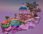
Visually very impressive. I'd say maybe you even spent too long concepting when looking at the documentation, could have probably left it as a sketch and a quick paintover.
In terms of technicality, as its the only thing I dropped you down on. Those rocks don't need to be so high poly for the effect you are going for, good retopo and a normal map would do the same for a much cheaper cost.
Good asset re-use, only single use assets were the hero and decoration, and obvious single pieces, good job.
With the tree you could have placed some geo like this X to make the leaves seem thicker, as a single plan like this _ is a bit flat.
Motion and some VFX would have added a lot to this scene, its beautiful, but very still which would leave it feeling somewhat dead in a game world. After this, go and work on adding some atmosphere with vfx and it will make this piece shine.
Also make sure you set the post process volume extent (unbound) checkbox to on, as when i moved away to get a distance look of the diorama, it lost the PP which meant some of the awesomeness of it faded.
Overall, wonderful piece. Congrats.
Chris Harper
Snr Tech Artist @ Splash Damage
Good amount of reference though it would have been good to see some annotations. I really like that you drew your own concepts for how you wanted the scene to look and be arranged. Good to see a block out. I would say it’s a little blocky but your paintovers redeem you!
I can see you’ve used modular kits for some assets but not everything. It might have been easier to break the pavillion into a kit of parts and relied on trim sheets and tiling textures to add detail.
The lighting looks great and the colours of the scene work really well. I also like that you’ve changed the skydome texture to better complement the scene. Good work!
- Great choice of scene to demonstrate lots of different skills
- Scene composition worked well
- Concept sketches were great
- Nice coherent art style that was successfully implemented across the piece
- Tri counts were far too high, suggest heavy optimisation for industry job applications
- Liked the stylized rocks with highlights on the edges
- The start point for the character in UE4 was inside the rocks so couldn't navigate environment
- Some reflection map on the water would have been nice
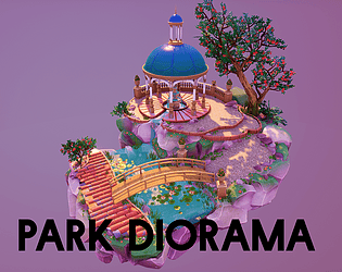
Submission Title: Park Diorama
Submission Tier: Search for a Star
Assessor: Dominic Shaw Artist @ Firesprite
Research & Development
You have done some nice research and development for this project, I like that you found both style reference and real world reference for your assets. The fact that you did your concepts is really good too and there was a good idea in place before starting the 3D side to the project. It would have been good to see some project management for the environment such as time plans and asset lists as these really help with the development and keeping organised.
Creative Art
You have matched your concept really well and the environment is visually appealing and eye catching. You have shown that you can do the full process from 2D all the way through the final game engine level which is a really good skill to have.
The composition for the piece is pretty good and there is a nice flow through the image, the positioning of the lighting is really good too as it’s lightest at the focal point which draws your eye to that part of the image.
Technical Art
You know the workflows that are needed to make game environments pretty well and you have created a really nice portfolio piece for yourself. You have missed out showing some more advanced techniques such as world aligned moss that you can vertex paint on to your rocks. This way you would have more freedom of rotating your rocks around. I would also be careful on some of the roughness values as some areas such as the bridge are just a solid colour and roughness variation is always really nice to have in a level.
Documentation
There is some good insight in to how made this environment and a good breakdown of all of your props and materials.
Final Presentation
Overall, I think that this is a really nice portfolio piece that has good composition, lighting and it’s an interesting piece to look at. I think on your final renders; you could have cropped the images a little better as there is a lot of wasted space that is just the background but this is a small change to make. Moving forward, you could look into getting more life into the level such as the tree blowing in the wind and the river moving which I think will add another layer of interest to the piece.
Really lovely piece of artwork. Detailed pre production with consistent quality of assets and well detailed materials. I would have liked the lighting to pop a bit more to create more contrast in certain areas but also make the greens of where the lighting hits, emmit an almost subsurface effect of a glow. Despite that 10/10 would go on holiday here.
Submission Title: Elder Tree
Submission Tier: Sumo Digital Rising Star
Assessor: Anthony O’Donnell Lead Artist Firesprite
Concept design & Development:
A wide range of research was carried out covering most of the featured assets from the robotic skull and statues to the trees. The mood board per prop approach is good as when assigning art tasks / briefs out to a wider team as it helps to maintain an overall aesthetic and consistency within the scene. Suitable real-world referencing was done to further define elements of the concept.
Chris discusses his take and understanding of the techniques employed in the concept art in terms of how value and leading lines direct the eye around the image which showcases his understanding of these concepts.
The blockout stage was taken to an appropriate detail level with some test lighting to flesh out some ideas.
Technical Art:
The production diary displays a strong knowledge of game art production techniques currently being used in the industry. They were understood and executed well.
Materials utilise channel packing in the textures which is very efficient for memory usage. sRGB was unchecked for these maps as these need to be in linear space which is correct.
The ZBrush workflow for the tree, robot head and statue via ZSpheres was a good approach. ZBrush in conjunction with Substance Designer for the leaf is a fast way to get good results for foliage.
The efficiency taken by Chris for the background assets being modelled only with detailing done in Painter makes perfect sense and is a good demonstration of time management.
I was especially impressed by the reduction of alpha overdraw of the grass via cutting the geometry closer to the opaque areas of the texture thus reducing the final cost to render the pixels.
The use of blueprints in UE4 to allow for quick placement of the lanterns and wires was a nice touch and a time saver if more of these were needed across a larger scene.
Overall Chris has shown a strong understanding of the technical side of game art production via texture channel packing, asset optimisations and sensible effort per asset and detailing across the scene along with very suitable workflows for the assets he produced.
Creative Art:
Overall Scene
A lovely piece of work, this diorama is a highly successful example of environment art. A thorough approach to research and some impressive 2D concepting has given this piece some very strong foundations, and goes to show how important the 'paper process' is before moving on to any 3D work. The final result is visually intriguing, with a good balance between detail and space, allowing the eye to focus and rest on different areas - this is something a lot of student environment art falls down on, so congratulations on that.
Feedback/suggestions - not much, but my main area to look at would be the lighting. I feel the purple hue of the indirect/sky lighting is slightly drowning out other colours in this piece. Perhaps a less saturated colour, maybe pushing it slightly more towards blue for a slightly more realistic hue balance between sun and sky might help. I understand the artist is looking for a specific colour palette however, so this may be a matter of taste.
Two other things - the edging on the base rocks is too prominent. It's a nice effect that helps give form to rocks, but it needs to be used with restraint, otherwise it's a very 'game-y' look. Also the tree foliage is looking a touch sparse (most tree foliage completely obscures the branches), and a bit too low poly - I can see the flat leaf planes too easily. However, trees are extremely tricky to do, and can quickly eat a poly budget for breakfast, so a good effort nonetheless.


Leave a comment
Log in with itch.io to leave a comment.