

Play asset pack
Cosy Cafe's itch.io pageResults
| Criteria | Rank | Score* | Raw Score |
| Documentation | #14 | 3.500 | 3.500 |
| Technical | #21 | 3.000 | 3.000 |
| Presentation | #22 | 3.000 | 3.000 |
| Research + Development | #26 | 3.000 | 3.000 |
| Overall | #27 | 3.000 | 3.000 |
| Creative | #40 | 2.500 | 2.500 |
Ranked from 2 ratings. Score is adjusted from raw score by the median number of ratings per game in the jam.
Judge feedback
Judge feedback is anonymous.
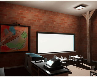
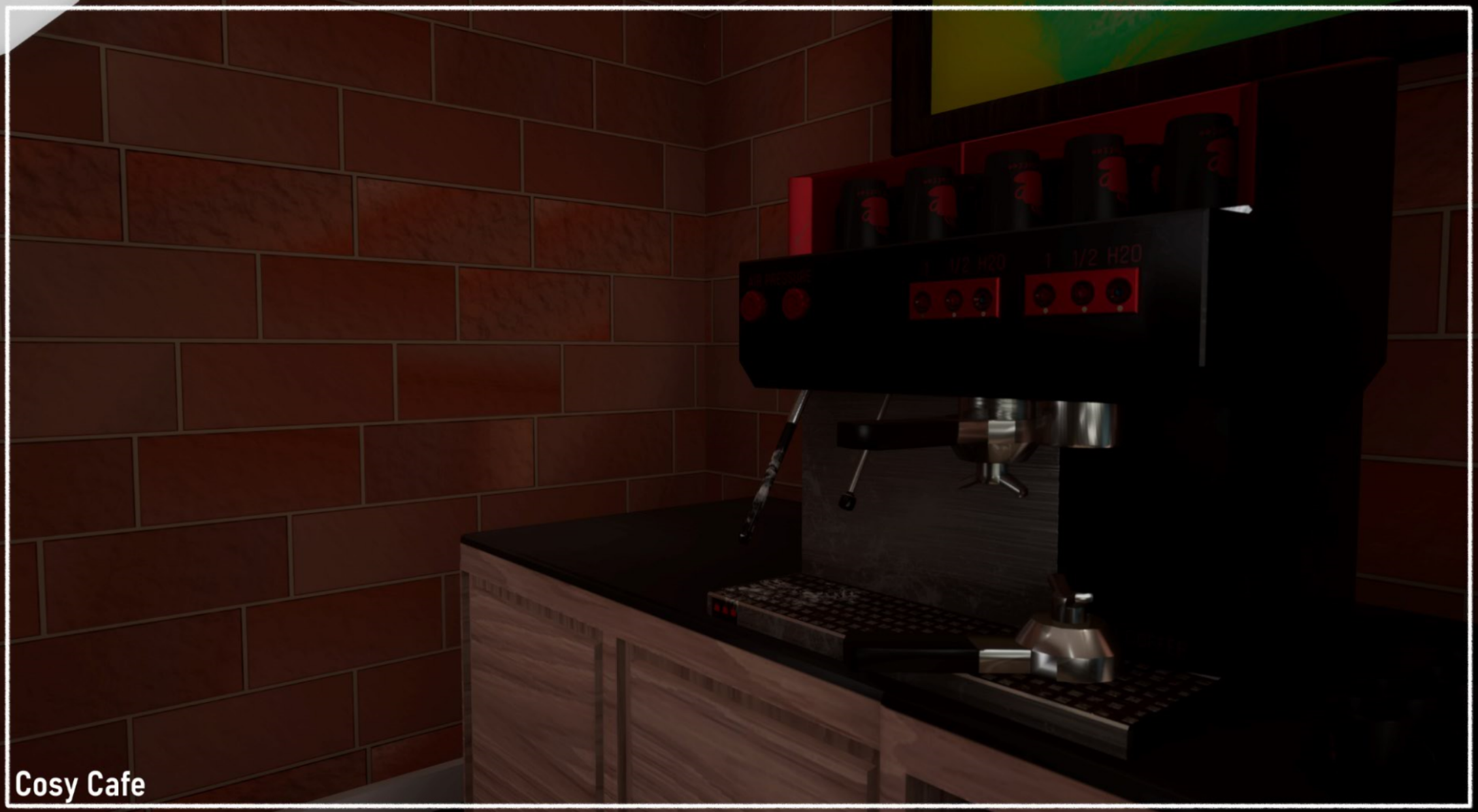
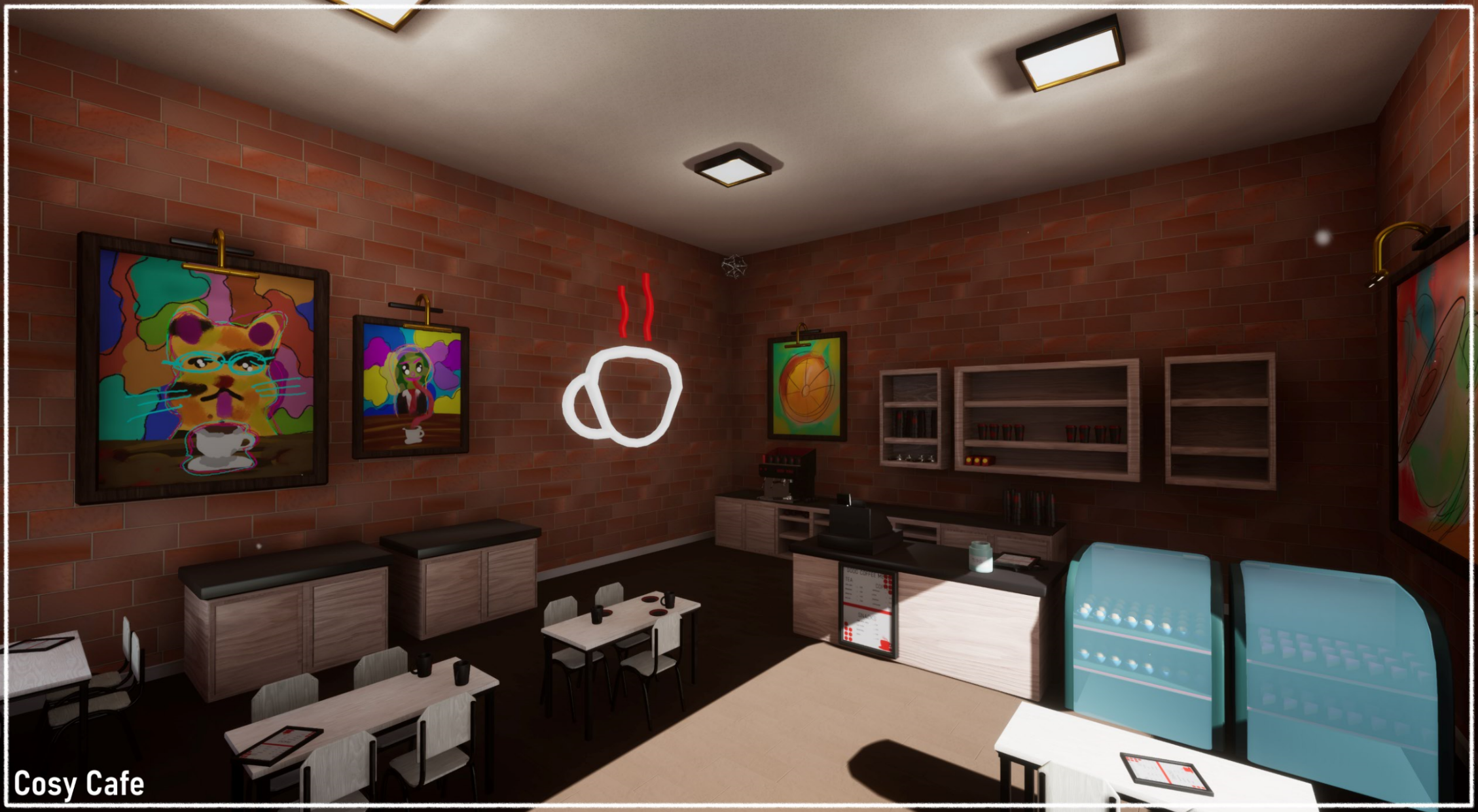
- Submission Title: Cosy Cafe Submission Tier: Search for a Star Assessor: Dominic Shaw Environment Artist @ Firesprite Research + Development You done some really good research in to this environment and provided a lot of good reference. I think the environment could have benefited from a bit more research into the style has the style research you did so far was good for the general vibe of the environment but I think you could have done some reference into stylized props and how you were going to approach making them. Creative Art The environment concept and layout design are really nice and it’s an interesting environment! I think that are few things that you could do to push the realism of the environment such as making the prop placement a little less organised such as the cups not being perfectly aligned etc. You could do a lot of storytelling with the props that you made so far such as a cup spilt over on one of the tables. The other thing that I think you could improve on is the scaling of the assets, the table and chairs seem really small compared to other assets and materials in your environment. The till asset and the individual brick sizes seem really big compared to the chairs for example so when you are making meshes make sure you get a character scale in there to reference to. Technical Art I think that you have a good understanding of the lighting inside of Unreal and the lighting tip about turning off the ‘squared falloff’ setting was really cool! I didn’t know that myself so I will definitely use this in my next project, thank you for that. To improve the lighting even more, you could have added some blind meshes to the windows that the directional light would cast some more interesting shapes into the cafe. To help optimise the level you could channel pack the ambient occlusion, roughness and metallic maps into one texture. The texture would look like this: • Red Channel- Ambient Occlusion • Green Channel- Roughness • Blue Channel- Metallic Then make sure that the texture compression is set to ‘Masks’ for this texture. I think you are good in the designing of environments and moving forward, I would focus on your prop workflow. Look into the pipeline of making a high poly model in Zbrush and baking this down to a low poly to fully utilize the normal map. Here is a tutorial on this https://www.youtube.com/watch?v=Qztk4ivmejE. Documentation The documentation provided had a really good breakdown of everything and I liked the workflow that you used where you concepted, blocked out and then started to replace to the block out meshes. I would just make sure to double check the scale of everything at the block out stage. Final Presentation The final renders were nicely presented and I think that this is a really good base environment that could be improved a lot with a few small changes such as fixing the scale of things.
Challenge Tier
Search For A Star
Leave a comment
Log in with itch.io to leave a comment.
Comments
No one has posted a comment yet