Play asset pack
Lockdown's itch.io pageResults
| Criteria | Rank | Score* | Raw Score |
| Technical | #13 | 3.500 | 3.500 |
| Research + Development | #26 | 3.000 | 3.000 |
| Documentation | #30 | 3.000 | 3.000 |
| Overall | #35 | 2.900 | 2.900 |
| Presentation | #39 | 2.500 | 2.500 |
| Creative | #40 | 2.500 | 2.500 |
Ranked from 2 ratings. Score is adjusted from raw score by the median number of ratings per game in the jam.
Judge feedback
Judge feedback is anonymous.
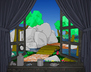
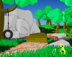
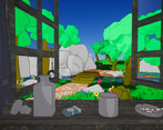
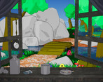
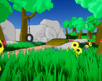
- Assessor: Anthony O Donnell - Art Director @d3t The idea for the scene at the start was really interesting. The realistic interior contrasted against a stylised view didn't make it at the end. Polygon distribution was inconsistent. One clear example being the tyre where the rope had too much and the tyre not enough to define the curvature / smoothness of the tyre. It was good to see a stylised piece, relative to the reference the final pieces colours were very saturated with lighting creating a high contrast look. The references pieces chosen have a softer look with less strong contrast with in the scene. The Tomka example also utilises edited vertex normals on the grass or a solution in the shader which gives the grass a softer look when lit. This piece is interesting and worth pushing more to get closer to the initial images presented during the concept phase.
Challenge Tier
Search For A Star
Leave a comment
Log in with itch.io to leave a comment.


Comments
No one has posted a comment yet