

Play game
Lockdown in Venice's itch.io pageResults
| Criteria | Rank | Score* | Raw Score |
| Documentation | #14 | 3.500 | 3.500 |
| Creative | #20 | 3.000 | 3.000 |
| Presentation | #22 | 3.000 | 3.000 |
| Overall | #33 | 2.900 | 2.900 |
| Technical | #33 | 2.500 | 2.500 |
| Research + Development | #54 | 2.500 | 2.500 |
Ranked from 2 ratings. Score is adjusted from raw score by the median number of ratings per game in the jam.
Judge feedback
Judge feedback is anonymous.
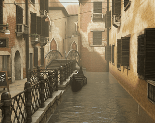
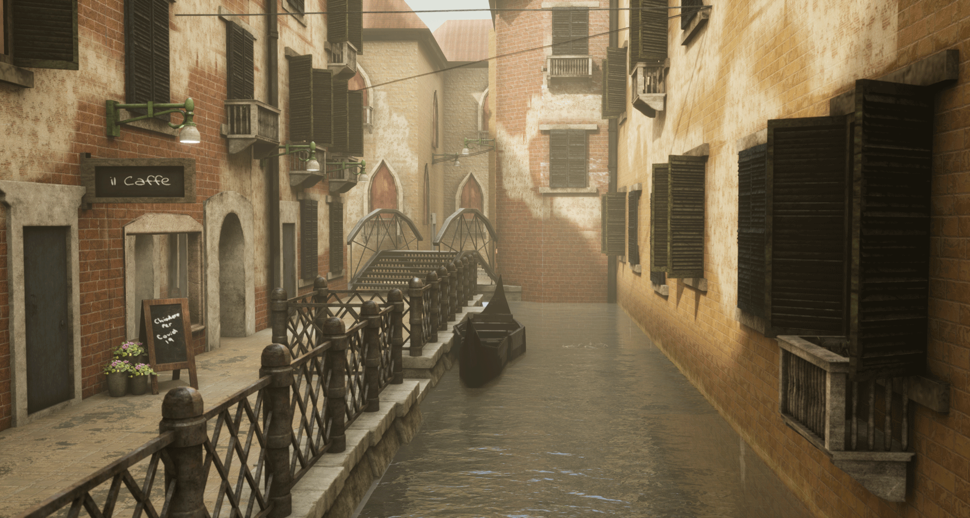
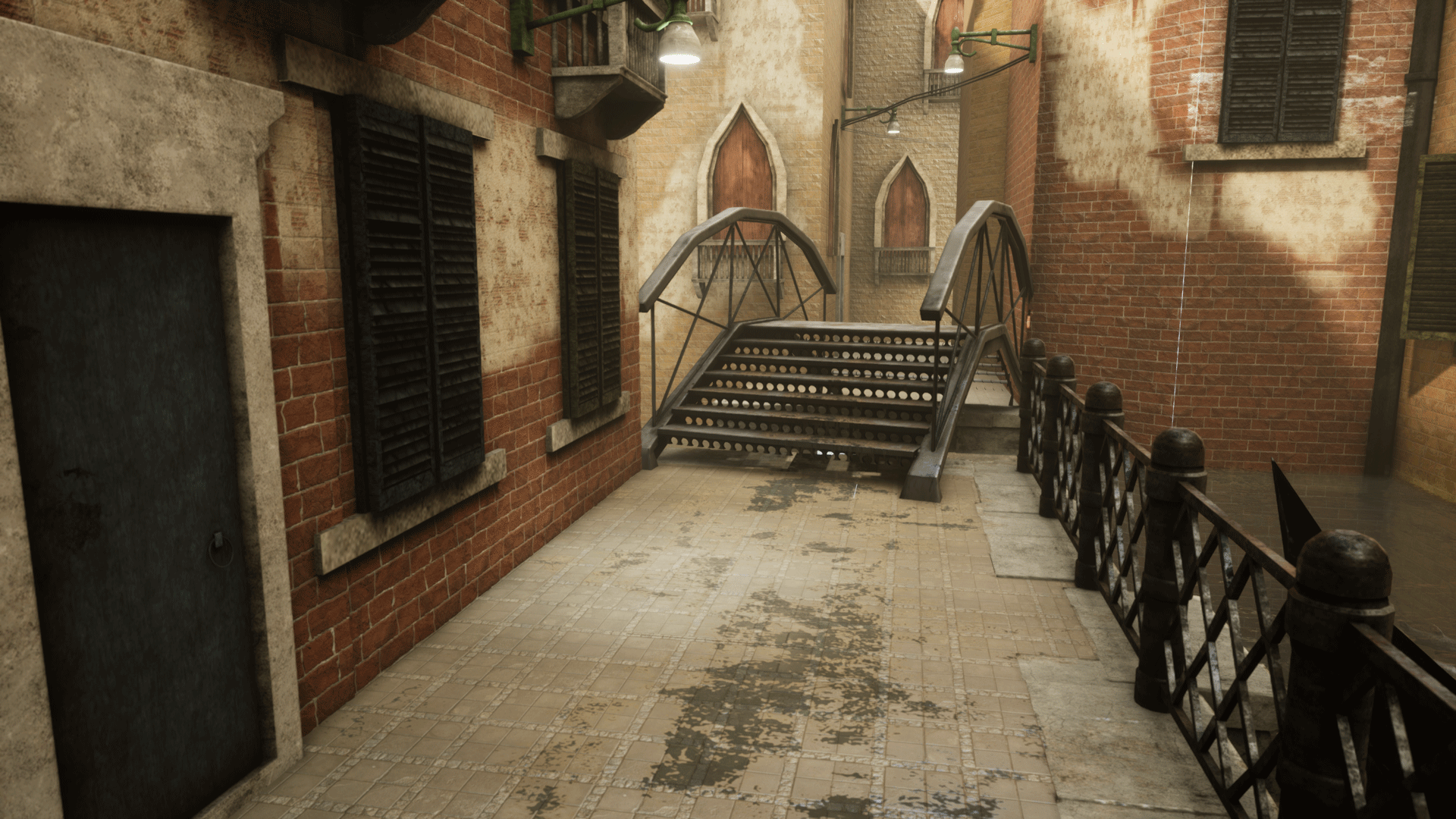
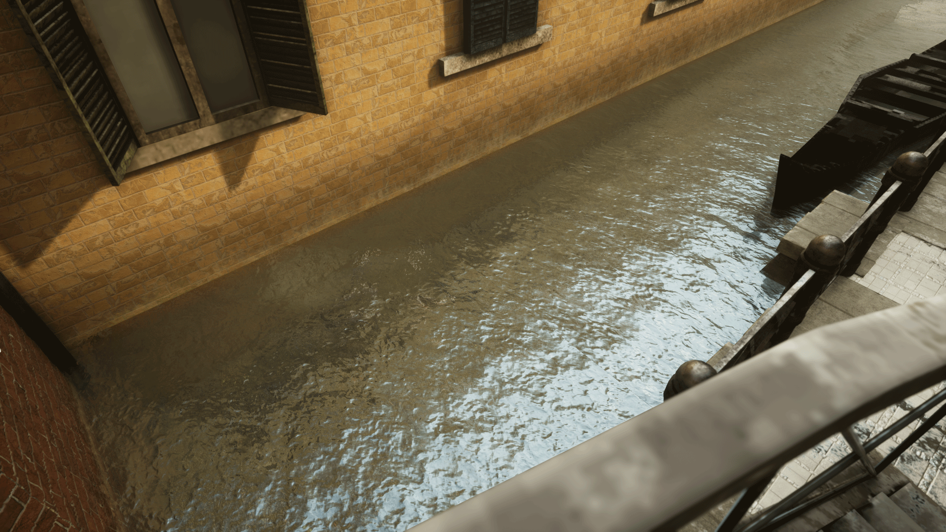
- Assessor: Anthony O Donnell - Art Director @ d3t Submission: Lockdown in Venice. The piece does a good job of recreating the look seen in the reference. The scene is let down by some texel density inconsistencies and texture work / material blends not holding up as well when viewed closer. The bricks in the material blend are smaller in scale than the ones on the wall. The document is well presented and covers the main points of the production process. The approach to texturing was inefficient in areas with the majority of assets baked. This scene would have benefited from the use of tileable textures and a trim sheet approach. Even within the baked assets the UV layouts had a lot of unused room and non pixel aligned shells. Such as on the barrier, the diagonal elements were left at 45 degrees. This could have been aligned to the U or V axis, packed tighter leaving more room for variations or other assets to cut down on texture memory. This approach has resulted in a low and inconsistent texel density in areas. UE4 shader setups are tidy and make use of Material Functions. The blends themselves are a bit soft looking when compared to the sharper and noisier material transitions seen in the reference. In areas the polygon distribution was uneven. Assets such as the game res mesh for the gondola could have done with more edge loops to better define the smoother forms of this type of boat. The bridge is also an asset that would need more edges added. Some of the meshes such as the metal railing have shading errors and seams. Tessellation for the wall is somewhat excessive given the height detail is only a couple of cm's. POM (parallax occlusion mapping) would have been a better option. Tessellation is best used on larger scale details. Dropping the ambient lighting level would allow for a stronger contrast between the in shadow streets on the left and light from the sun hitting the facades on the right. Overall it's a good piece that with some polish time and lighting can achieve an image as desired from the reference.
Challenge Tier
Search For A Star
Leave a comment
Log in with itch.io to leave a comment.
Comments
Lovely idea for the Isolation theme!
Thank you :)