


Play asset pack
The Greenhouse's itch.io pageResults
| Criteria | Rank | Score* | Raw Score |
| Presentation | #1 | 4.500 | 4.500 |
| Creative | #5 | 4.000 | 4.000 |
| Research + Development | #6 | 4.000 | 4.000 |
| Overall | #7 | 3.900 | 3.900 |
| Documentation | #8 | 4.000 | 4.000 |
| Technical | #21 | 3.000 | 3.000 |
Ranked from 2 ratings. Score is adjusted from raw score by the median number of ratings per game in the jam.
Judge feedback
Judge feedback is anonymous.
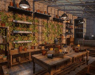
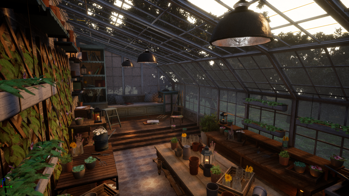
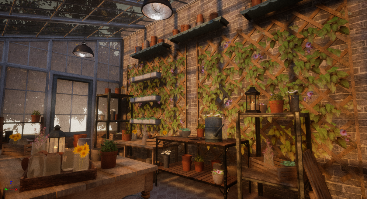
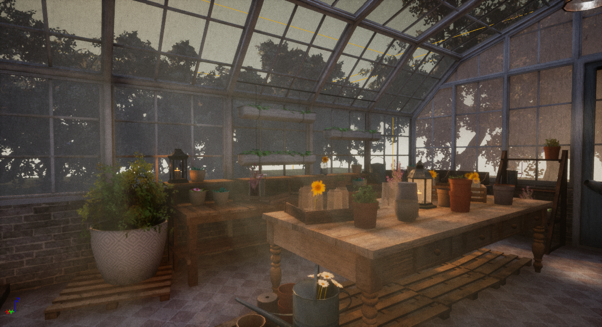
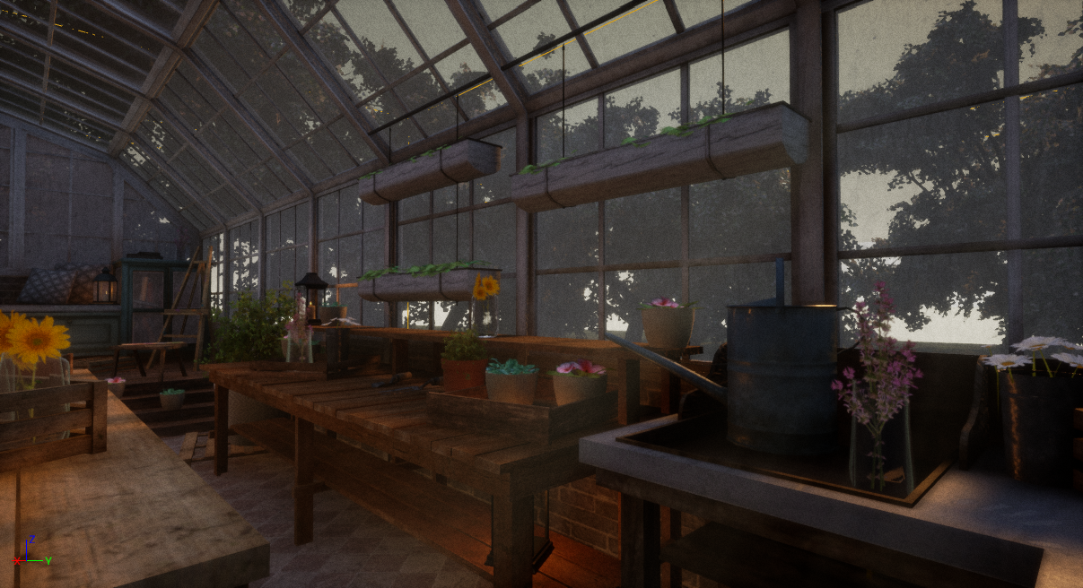
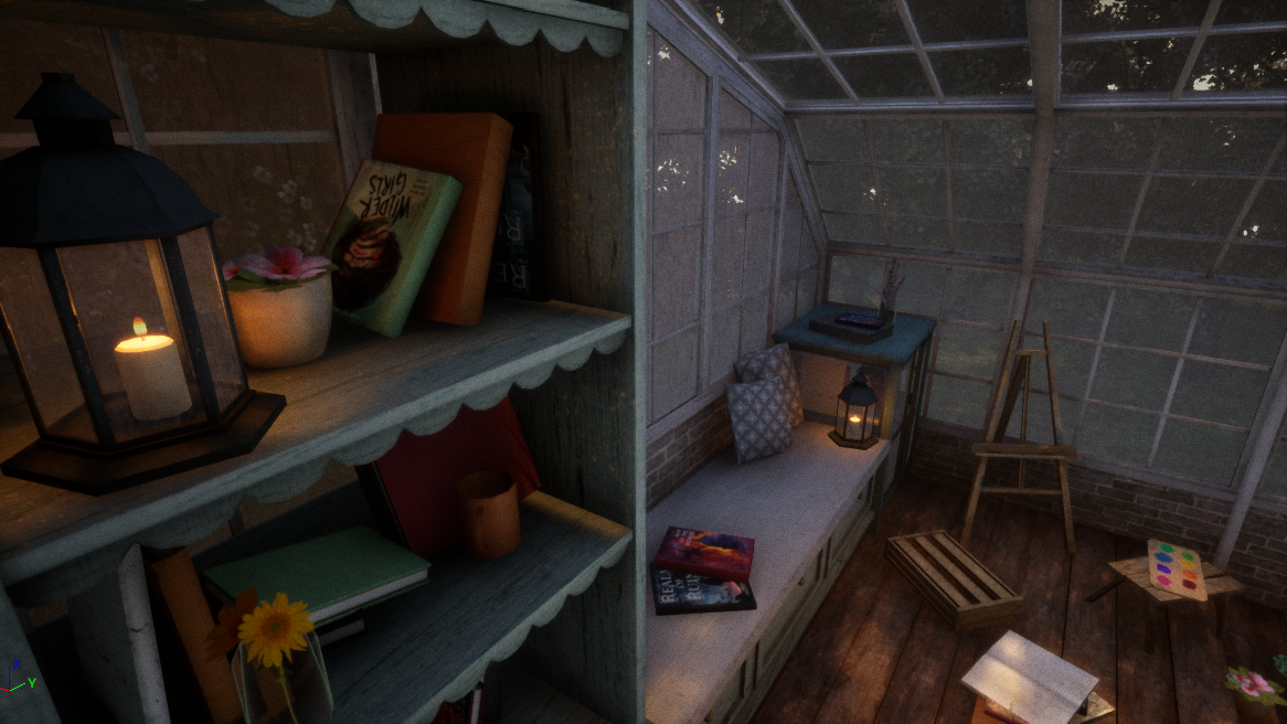
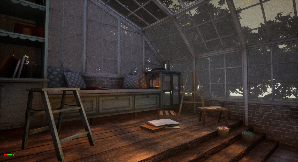
- Hi Antonia! Your choice of “happy place” is lovely and I’m very much in agreement about using plants as an escape from a reality (typing this in the company of my avocado plant along with about 100 other houseplants!!). You’ve captured a peaceful and meditative atmosphere really well in this piece so even from first look this hits every point on the brief amazingly. First up, amazing work with the documentation; well presented, neat and incredibly thorough. You’ve approached this project systematically and maturely, pretty much industry level. Documentation is important to cohesive teams and makes up a not insignificant part of my job, so this is a professional skill you’ve already got on lock. Keep it up! :D Your photo research is very thorough and clearly shows you iterating ideas on each aspect of the project. I really like that you’ve included both photos and paintings, and 3D models; both reaching for the stars and staying realistic in scope. The dimensions and technical drawing research, as well as your own diagrams, are also indispensable and you’ve used them well in the process towards your final piece. Similarly, I appreciate that you found these dimensions didn’t quite work and adapted to make this a workable game environment, which shows a great iterative process- moving between 3DS Max and UE4 to check your own work. This is really professional thinking and allows for problems to be anticipated early, great job! That said, I think a concept would be useful when approaching an ambitious project like this, even a simple one if you’re not a confident 2D artist. However, you make up this this with your iterative blocking process and thorough research, and I can appreciate you’re limited on time so picked a way of working that was best for you. I love that you tried Substance Alchemist for this project too; a willingness to try new things even under the pressure of a deadline is awesome! It’s really successful too, and again you’ve jumped between UE4 and Substance to get the best result. I’d like to see you work more with Unreal’s material authoring, you’re obviously very confident in Substance and I’d love to see what you can do to make your materials more adaptable. In industry textures will be reused in variable ways to save on time and memory, and a lot of this can come down to adaptable material authoring in Unreal- essentially being able to change your material in engine rather than having to edit the textures in Substance or Photoshop. That said, this is obviously a small environment and there’s little need to reuse textures, so that’s not a criticism, just something to think about! Also, if you haven’t already tried it, I think you’d like the Substance plugin for Unreal- if you expose parameters while working, then you can bring the Substance files directly into Unreal and tweak them without having to go back out and open Substance. I think if you like the iterative process it can save a lot of time and effort yoyoing between the two programmes :D Some of the tiles on the textures can be a little obvious, which could be avoided in the textures themselves. Ideally your texture should have no repetition at all, and you can tile it in the world instead. I understand some of it may have been unavoidable based on the photos you used in Alchemist, but there are some edits you could have made to hide the tiling a little; adding a grunge generator over parts of the texture for example. Alternatively, some decals would have also been cool and would have added more variation to some of the surfaces- these are 2D planes with a masked and/or translucent texture on, for example mould, maybe some coffee rings for the tables, dirt for the windows, etc. They can be pretty simple to make and very versatile because you can move them about and instance them as you please, and if you really want to get into it you can create an atlas texture and adapt your UVs for each plane so that you’re only really using one texture for all the different decals. Some of the normal maps could do with a little variation too in terms of depth- you have a lot of small details in there which looks great, but there could also be some larger shapes in there too; for example, the brickwork can end up looking a little flat from some angles as the plaster and brick don’t seem to be apart from each other. Varying the bricks’ shape in the normal, even where the diffuse looks similar one brick to the next, could also add some interesting variation and mitigate the tiling. Your choice of foliage shader is interesting. Choosing a translucent shader isn’t bad, it means things like the ivy aren’t casting a shadow on the wall; using a subsurface shader, for example the “two sided foliage” shader in the “shading model” dropdown would add the ability for foliage to cast shadows, and gives you the option to add a subsurface scattering map, which would look lovely with the nice lights you’ve got. Translucent shaders can also be very expensive to load- less of a problem in your scene as your framerate is very, very good, but something to bare in mind when working with larger scenes in future. The shader’s also caused a few translucency sorting issues; for example on viewing the daisies, the stem flickers in and out over the flower, as the engine doesn’t know which to render in front of the other (you can set the translucency sort priority in the item details under Rendering’s advanced options, but in this case using a SSS shader instead is probably a better fix). (There’s a little documentation about this here if you need it, when I learnt about this issue it confused me a lot! https://docs.unrealengine.com/en-US/RenderingAndGraphics/Materials/HowTo/Transparency/index.html#translucencysortpriority) Your optimisation is fantastic; you’ve stacked masks in colour channels and most of your meshes are very low poly, which shows a very game-focused approach, which your technical team will love you for in industry! Some of the meshes could have even afforded to be bigger if you wanted, if you added LODs, or you could have pushed the set dressing and really made the greenhouse look cluttered and lived in. Your highest poly mesh is the ceiling light- which although gorgeous and a really nice piece (the way the light reflects off it with the textured normal is fantastic!), doesn’t really seem to make sense given it’s at the peripheral of your scene. Again, though, relatively speaking, it’s a very small mesh, so not a big issue, just remember to consider what your key assets are and adapt your technical specs accordingly. That said, the set dressing you have done is lovely- particularly like the stacked pots on the shelves, it has a real personality and sense of place, and the gardening tools are really nice assets. The bookshelves are also pretty, and I like that you’ve scattered book titles (I assume) you like in there, that’s a nice little easter egg and is really charming! Be careful to check none of your assets are clipping through other items; it may help sometimes to use the foliage tool if you want to place instanced objects, as it uses the collision of the other objects to place your “foliage”, and the settings can be messed with to give some nice scattering and instancing with minimal effort. Making separate textures and materials for each book is probably not necessary even though they look really good; you could merge a couple together into an atlas texture, or use material instances with different diffuses instead of new materials. Again though, this hasn’t been particularly detrimental to your framerates, so it’s a pretty minor thing! The inspiration pieces are pretty stylised, and if you ever get the chance to work with a programmer/ tech artist, I’d love to see what you could produce with an interesting shader to get a painterly effect on one of your pieces! However you’ve noted you’re using the pieces for lighting and set dressing rather than the actual style of the pieces, so that’s more of a thought for future projects than a criticism :D And of course, the lighting really sells this piece, and it looks great! The IES textures are a neat addition. Your light complexity could become problematic in a larger scene (you can see this through the optimisation viewmodes under view mode- click the dropdown in the viewport that says “Lit”) as there are a lot of lights and they overlap a lot, which can be expensive to render. This is what those red crosses on your lights are indicating, so watch out for those. Lighting is obviously a key part of your project, so I would expect a lot of lights, even overlapping to an extent, and the result definitely looks nice, but keep an eye on it as too many lights/ overlapping can tank your framerate and cause all sorts of weird rendering issues. A relatively easy fix if you want a lot of lights would be to reduce the attenuation radius so they don’t overlap so much, and if needed increase the intensity to balance it back out. The GI adjustment in the postpro is nice too, makes it feel lazy and serene, which from your documentation is exactly what you were going for, and you’ve achieved that sense of happiness and escape really well. I think other aspects of the postpro could have been pushed even further; your inspiration pics have very intense, almost fantastical lighting, and it would have been nice to see you use something like this to draw the eye across your scene. Adding a dirt mask texture to go with the beautiful bloom you have would have scattered the light nicely and possibly achieved effects similar to your right-hand inspiration pic (from page 16 of your documentation), and you can fiddle with the colour grading to get a warmth, and some shadow distinction. I also think the film grain is a little intense, but I can see this is probably personal preference :D The fog is also a great addition, subtle but really effective to get the mood just right. Overall, a successful project, really thorough process and the final piece really stands out, definitely something to be proud of!
Challenge Tier
Search For A Star
Leave a comment
Log in with itch.io to leave a comment.
Comments
No one has posted a comment yet