

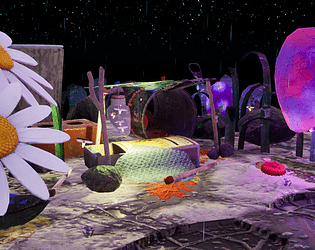
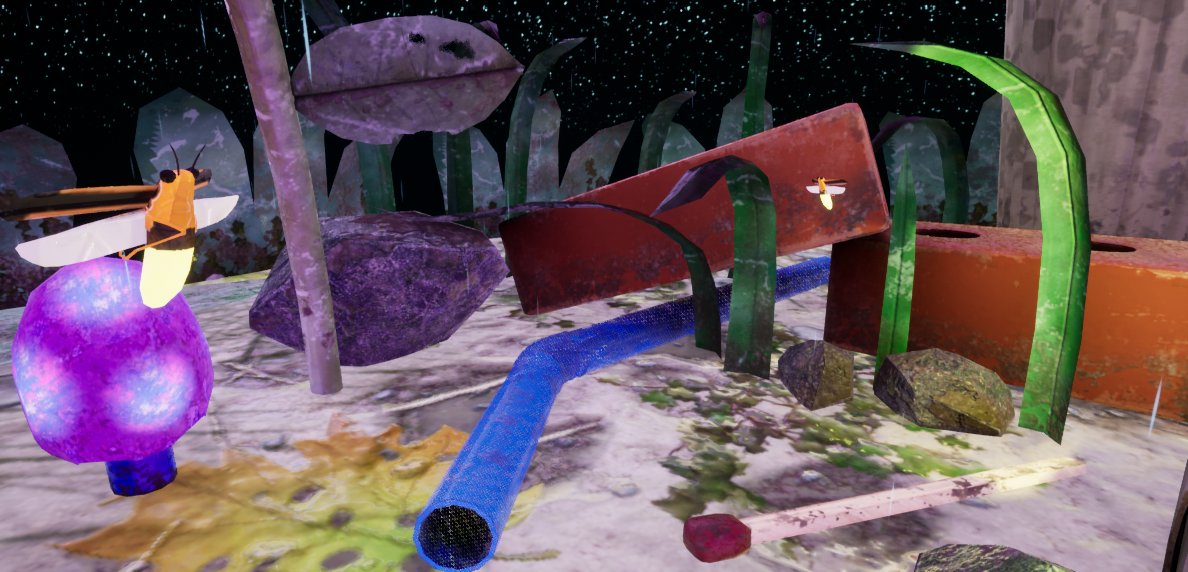
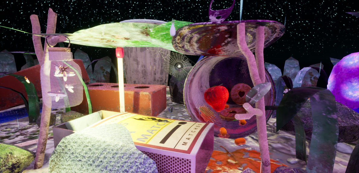
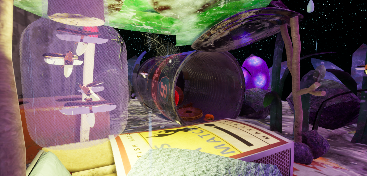
Play Environment
Scavenger Tin Can house 3D Environment's itch.io pageResults
| Criteria | Rank | Score* | Raw Score |
| Creative | #35 | 2.828 | 4.000 |
| Research + Development | #42 | 2.828 | 4.000 |
| Technical | #43 | 2.121 | 3.000 |
| Presentation | #46 | 2.121 | 3.000 |
| Overall | #49 | 2.404 | 3.400 |
| Documentation | #59 | 2.121 | 3.000 |
Ranked from 1 rating. Score is adjusted from raw score by the median number of ratings per game in the jam.
Judge feedback
Judge feedback is anonymous.
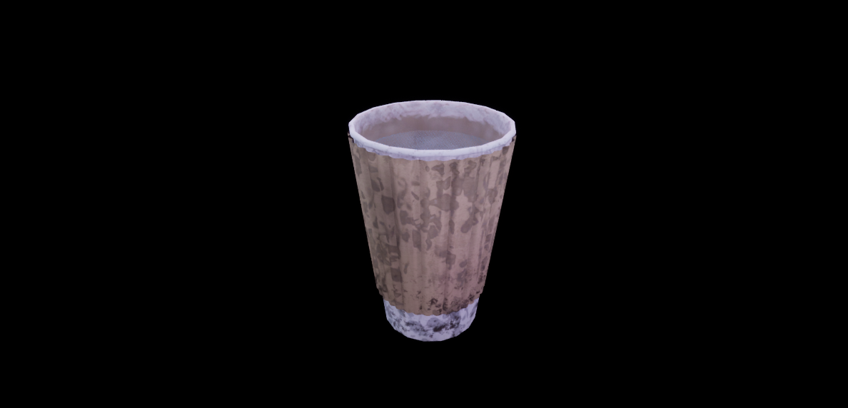
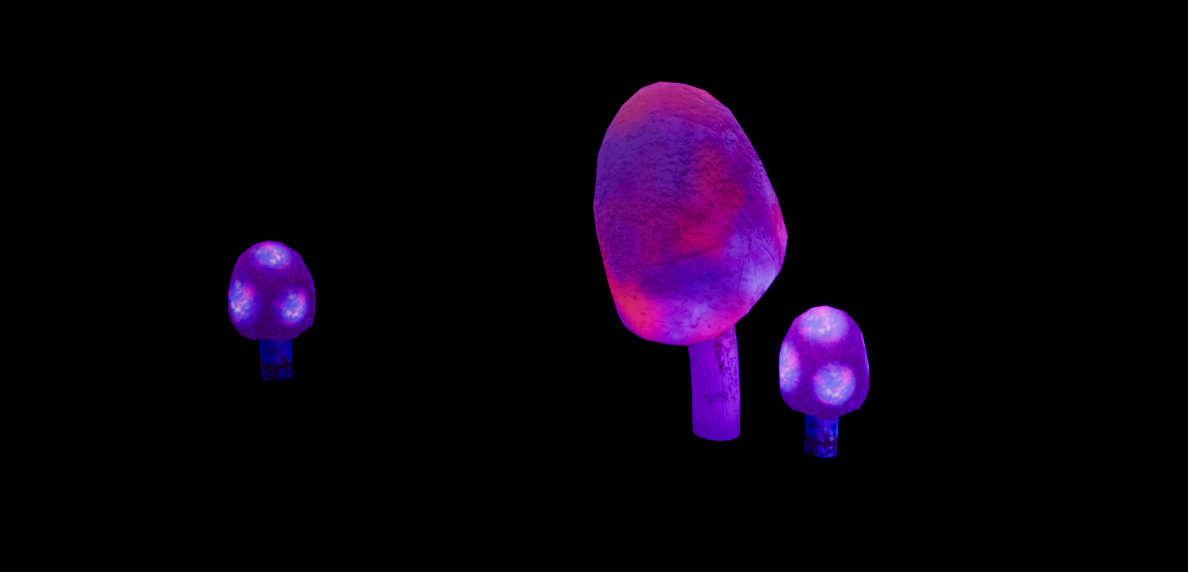
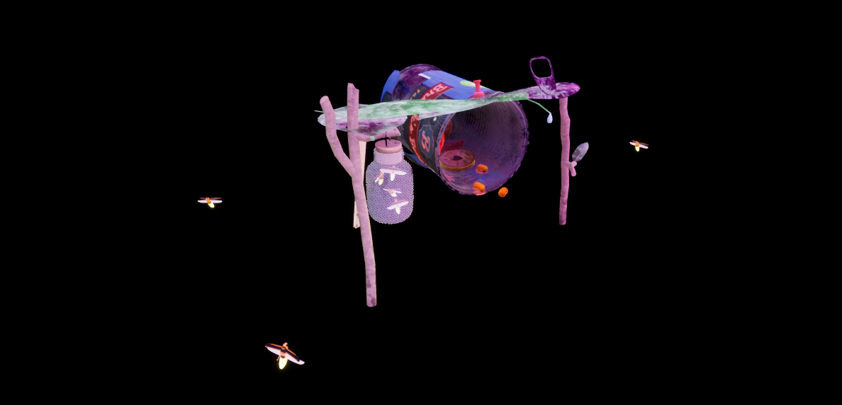
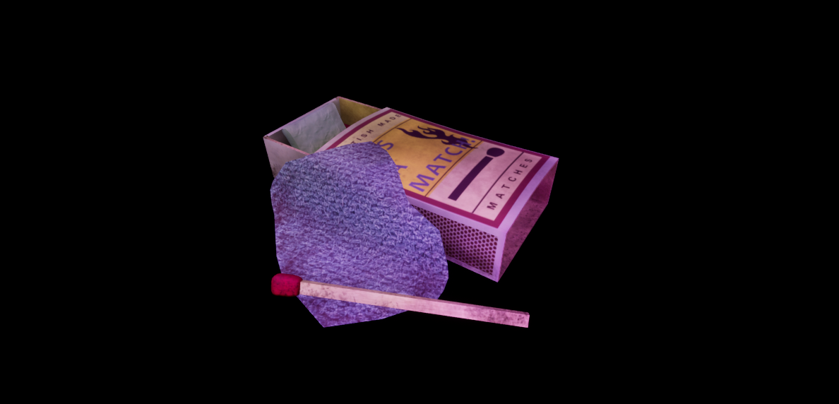
- Assessor: Anthony O Donnell – Art Director @ d3t Title: Tin Can House Research and Development The theme chosen and idea for it are interesting. The research was focused and really in depth for each asset which was great to see. The reference provides so many interesting details within the props despite them being fairly simple and usually insignificant in many contexts. Creative Art / Technical The overall idea is really good and some elements executed well. As noted by the artist in the conclusion the texturing itself could have been pushed further to show the finer details of all the assets as seen in the reference. Since the assets are of a small building in scale relative to the viewer, different texturing approaches such as a greater use of tileable textures with detail maps would have been a better approach to maintain a higher texel density for up close viewing. The can and match box are the better of the assets. There seems to be a tendency to add too much noise to the textures in a generic manner as opposed to a more considerate approach. I’d always suggest get the base values / properties down first. Then contextual dirt / edge wear or any other suitable detail layered on top in a logical fashion. Doing it in a stepped and considered way makes it easier to get each step correct. Texel density varied across the scene giving the final image an inconsistent look. Documentation The document covered a lot of the developments details well and was clear. Final Presentation The final image needs to be more considered in its lighting setup and colour use. At the moment there are many strong diffuse / base colour values fighting for the viewers attention. The lighting doesn’t help clarify where the viewer should be looking to mitigate the aforementioned colour use. A more simplified colour pallet along with clear lighting choices would benefit the scene. The idea and elements within the scene work very well so another pass tidying up areas would make it a stronger piece.
Challenge Tier
Search For A Star
Leave a comment
Log in with itch.io to leave a comment.