Play asset pack
Happy Haven's itch.io pageResults
| Criteria | Rank | Score* | Raw Score |
| Presentation | #6 | 4.000 | 4.000 |
| Technical | #13 | 3.500 | 3.500 |
| Documentation | #14 | 3.500 | 3.500 |
| Overall | #15 | 3.400 | 3.400 |
| Creative | #20 | 3.000 | 3.000 |
| Research + Development | #26 | 3.000 | 3.000 |
Ranked from 2 ratings. Score is adjusted from raw score by the median number of ratings per game in the jam.
Judge feedback
Judge feedback is anonymous and shown in a random order.
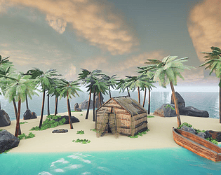
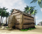
- I think there was a lot of great attention to detail in this project. The textures are very good. I would have liked to also see a sand texture. I think what would have improved the scene would have been more focus on the overall concept and ideas of the scene. I think it could have benefited from some initial sketches and different ideas for the design of the hut and the boat. Right now, the hut and boat feel quite generic. I would like to see them have more character and interest. For example the hut could have had the roof extruded beyond the walls of the building to break up the shape. There could have been some kind of platform the hut sits on, a porch or steps. The boat also doesn't contain a seat or oars so looks a bit unbelievable. All these additions would make it more interesting. It's also good to think about who lives there. What is the story? Are they marooned? If so why are there no trees chopped down? How did they make this hut? Could we have some signs of the personality of the character who lives there. This could be done with props or the way the hut was constructed. Overall it was a very well presented scene with nice colour choices and mood.
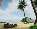
- Assessor: Anthony O Donnell - Art Director @ d3t Submission: Happy Haven The document was well presented and went in to some depth for areas of the production. The foliage workflow is a known approach and was followed well. The content itself of a tropical island, unspoilt and untouched is a cliché for a happy place but a very good one to use. More production time should have been given to the hut being one of the main items to attract the viewers attention in the final renders. The UV approach here was not the best, tileable textures for the straw or a 2k atlas and build it up like foliage cards would have achieved a stronger result with the wooden beams on a tileable or trim sheet. The layout of the scene could have done with being more dense with trees and foliage in areas as visual blockers to better frame and compose the scene. Examples of this are evident in the reference boards. The plants ended up as the strongest element to me, despite material properties making them a little more plastic than waxy. It's always difficult to tackle natural texture sets (sands etc) , rocks, man made structures and foliage in the same scene given the time frame as they all need different approaches to do well. You've done a good job balancing all of them and getting a final scene done. You've managed to get the final colour palette and image close to some of the reference images in terms of hue/value.
Challenge Tier
Search For A Star
Leave a comment
Log in with itch.io to leave a comment.


Comments
No one has posted a comment yet