


Great Job! Always nice to see an original composition and multiple lighting scenarios.
Play asset pack
A Happy Place is a Panda Place's itch.io pageResults
| Criteria | Rank | Score* | Raw Score |
| Creative | #1 | 4.600 | 4.600 |
| Research + Development | #3 | 4.400 | 4.400 |
| Overall | #4 | 4.160 | 4.160 |
| Presentation | #6 | 4.000 | 4.000 |
| Documentation | #7 | 4.200 | 4.200 |
| Technical | #9 | 3.600 | 3.600 |
Ranked from 5 ratings. Score is adjusted from raw score by the median number of ratings per game in the jam.
Judge feedback
Judge feedback is anonymous and shown in a random order.
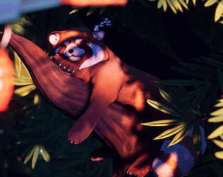
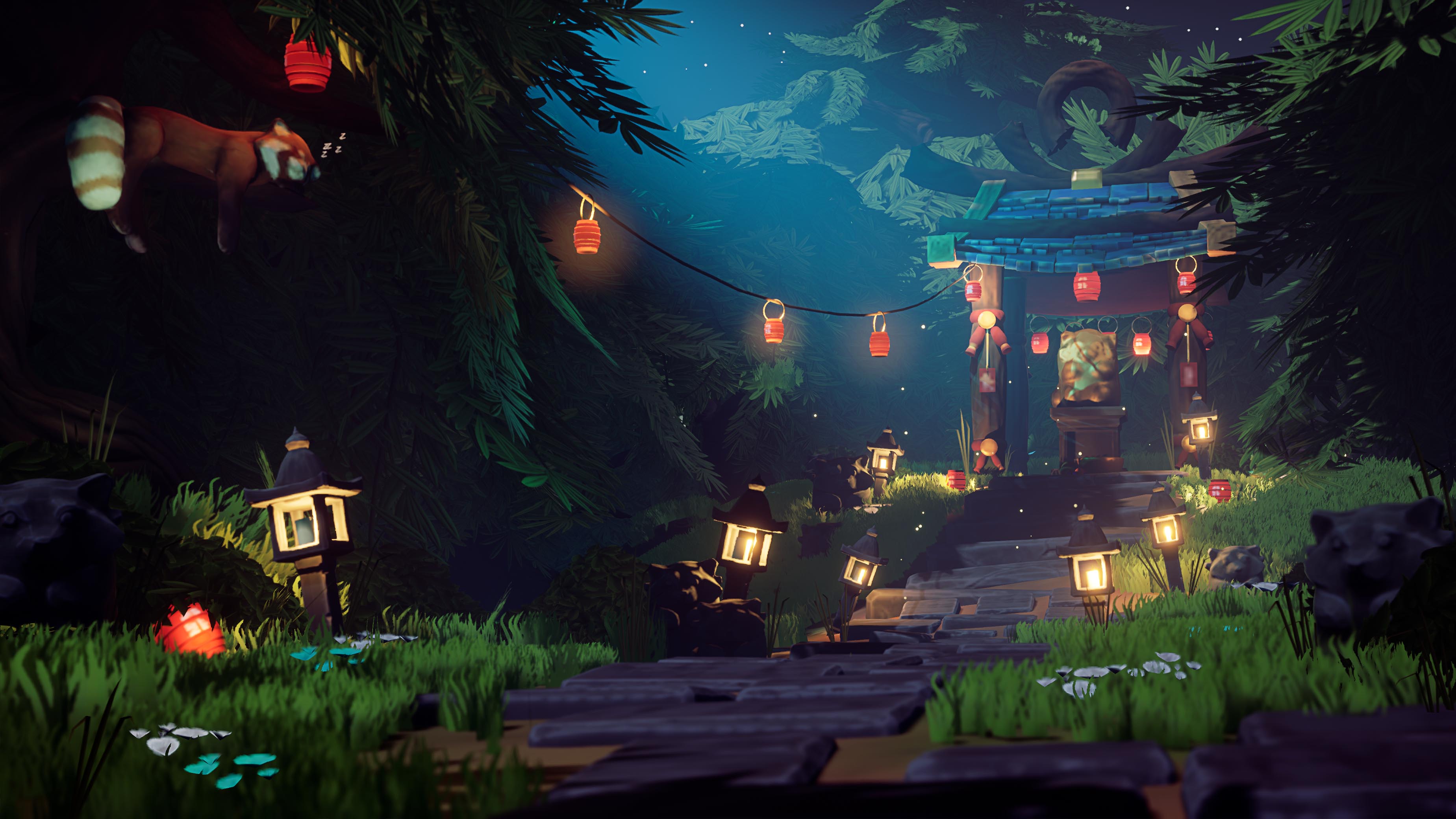
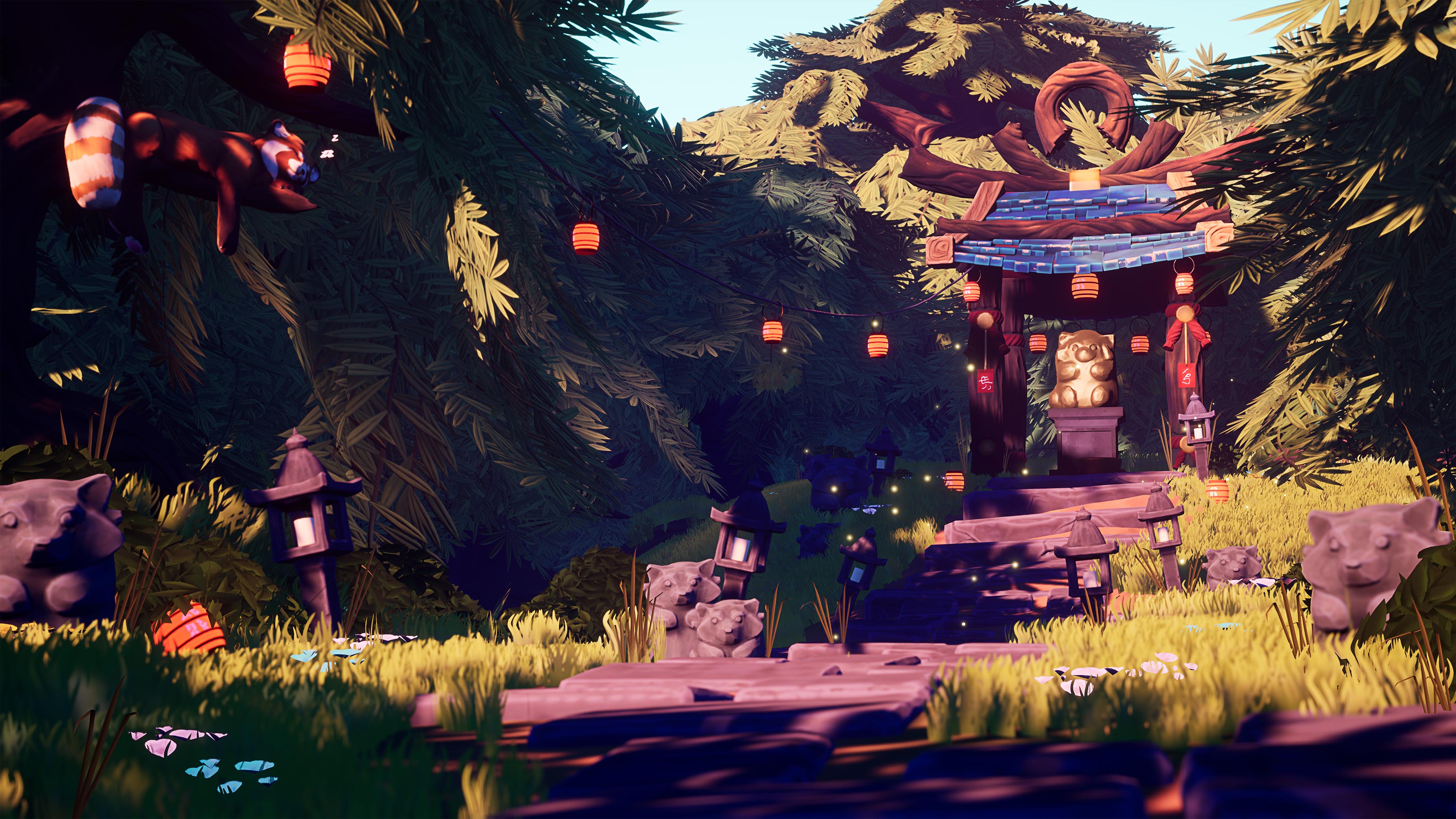
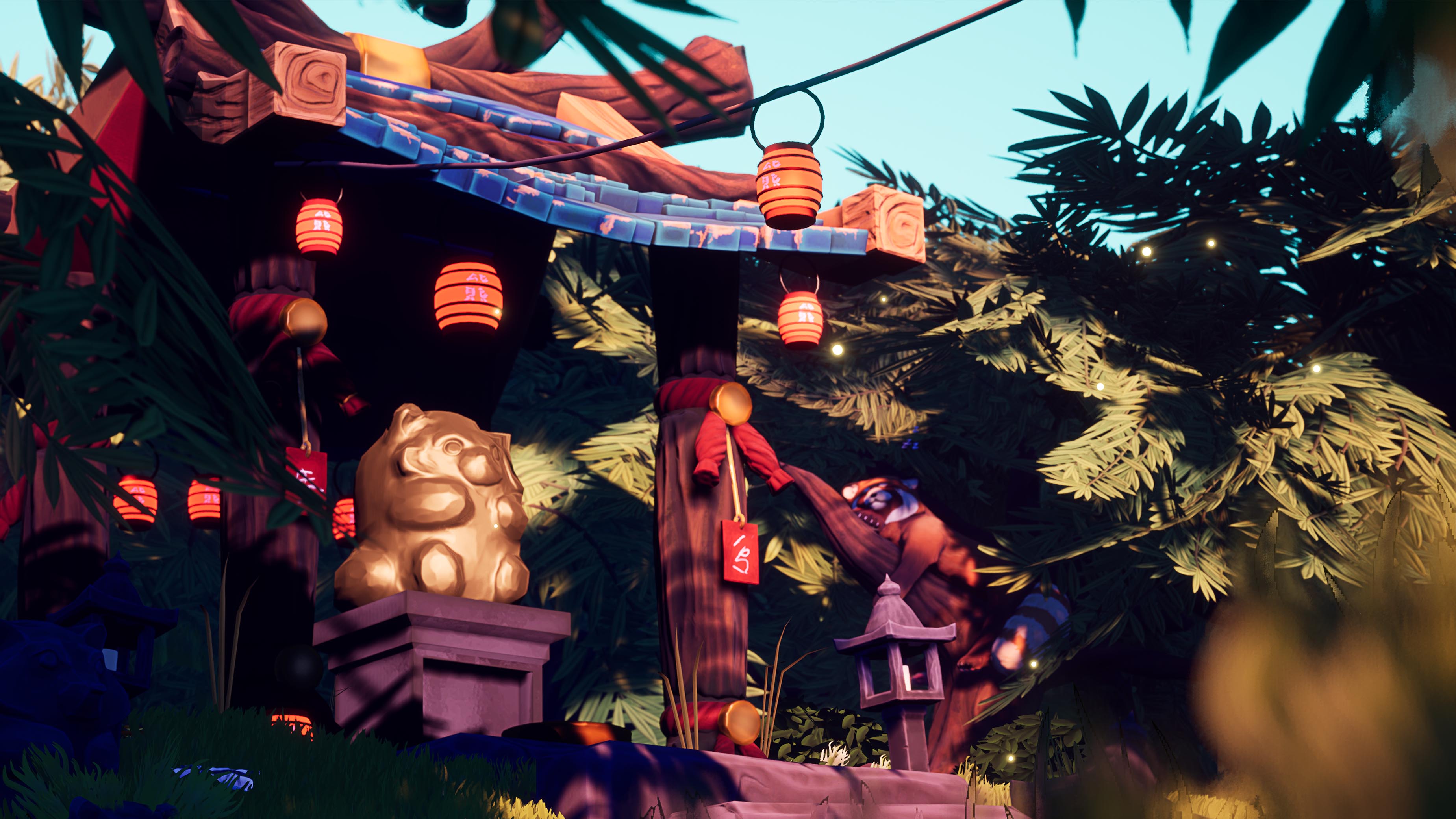
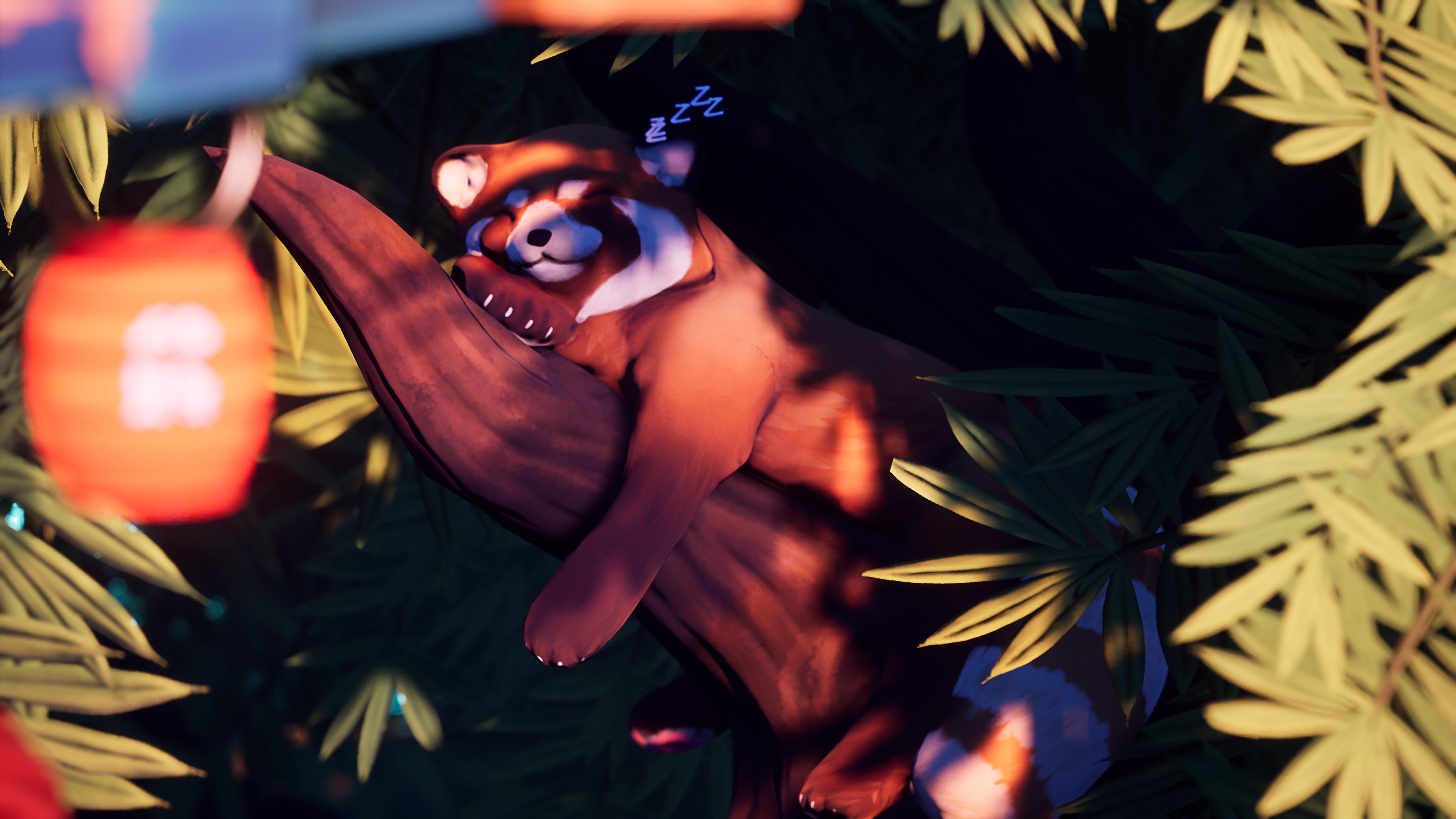
- Hi Alice! Firstly- wow! Well done on completing this project, it was an ambitious concept and the final piece is incredible. I love stylised work so your project immediately stood out to me- it gives my remastered Spyro vibes, and those games are some of my all-time favourites! Pre-production is good, I think in an ideal world some more iteration on the concepts would have really pushed this work a lot further, but I can appreciate you were really restricted on time and don’t consider concepting your strong point (and this is an environment art assignment too!). To be honest, I think you’re too hard on yourself; your drawing skills are solid and you’ve stuck to a consistent “style” throughout the project, which is very impressive. All the same, the PDF is nicely put together and shows pretty thorough research, and I love the lil panda drawings on the first page! Again, in an ideal world I think I’d have liked to see more research on particular types of trees. The work is stylised but having a grounding in reality really adds believability; however again, the trees aren’t listed as a main prop you’re proposing for this project so the fact you’ve even included them at all really shows you’ve gone above and beyond with the scope of your work :D The foliage you have produced, especially considering this is your first time with foliage, is awesome; the tree trunks compliment the scene so well and the moss/green hues at the bottom are a great touch. Also, I totally feel you on trying to get the mesh working properly, it’s an eternal struggle, and I think you handled this particular challenge really well. If you want to try foliage again some time, maybe try SpeedTree or similar to get your blocking down and work from that, as a pipeline to try (that’s not to say the pipeline you used is wrong, just you may find the presets helpful and it might save you some time, because I imagine doing it in Zbrush is intense!). I get the feeling you’re most comfortable modelling, particularly in Z-Brush, and the Shrine looks amazing in Zbrush! I feel like some of this detail is lost in the final version, particularly on the wood of the roof, which is a shame because the Zbrush sculpt is stunning. You mention baking the high poly onto the low poly which is great but the documentation doesn’t discuss much what you did with the generated masks; on the wood of the roof, for example, maybe using the AO map from the bake as a mask on the albedo/diffuse to add in some darker colours (a darker brown maybe) in the crevices would really push the contrast of the wood and help the details you made in Zbrush really shine. Similarly, you have a great sense of variation in the shapes from modelling but less variation in the textures; you mention going and painting detailing at the end but I think this could have been pushed further- maybe a little crack in one of the tiles or similar? As for the other assets, the stone steps are gorgeous and a really nice touch. I love what you’ve done with the emissive on the lanterns; technical teams really hate you if you put lights everywhere as they’re expensive to render, so a well-made emissive like yours can really go a long way to make the scene real and visually engaging without making the scene expensive to render. In this way, the fact the opacity thing didn’t work out is probably a blessing, because the emissive looks great. Speaking of expensive to render, I think even a brief optimisation pass would have been helpful. Again, I can appreciate optimisation is an entire task and you’ve got a relatively short amount of time that I imagine you would have wanted to use to make things look pretty instead of deleting faces off your meshes etc (ew!). Faces the player won’t see aren’t needed, for example faces inside meshes (there’s a torus you’ve used on the shrine that has faces that view inside the shrine’s leg) and the bottoms of things. Deleting these faces can be a whole task, and the polycount of most of your meshes isn’t bad, so I’ll admit I won’t have expected you to do that (though it is best practice to make this part of your modelling process, if you have time to). However, there are some easy wins that could have been made using tools inside of Unreal, for example lodding meshes through the static mesh view- some of the presets in LOD Group, eg Small Prop, Large Prop, will give you a pretty good result with minimal adjustment. Doing some quick optimisation would likely help with some of the loading issues you can see in the final shots (the characters on the shrines don’t seem to have loaded quite properly in one of the versions) and will really set your piece apart from the crowd in your portfolio if you show it. If you enable “Show FPS” in the viewport, that’s a good marker too- you want to keep it above 30fps as much as possible. That said, your topology is clean so would LOD well and be easy to optimise, and you have a lot of good practices in your workflow, so these are just minor things you could push from a technical standpoint that would make your piece more appealing to a potential games employer. If you were using this as an interactable environment, I’d also expect disabling shadows on some assets and disabling collision where it’s not needed, eg, grass meshes. If you’re not sure where to start, you can use some of the optimisation viewmodes in the viewport; Quad overdraw, light overlap and texel density are good. I found the “SM_Bush_Blockout” this way- if you put an 140k tri foliage mesh in a game environment, your tech team *will* kill you! XD But again, I know that’s not an asset to be assessing so I’m not knocking points for that or anything, just keep it in mind :D I like that you experimented with MASH for this though, it’s a great tool and the result is really nice. I’m probably being a little harsh about optimisation though- I did the exact same thing as you on my MA pretty much, then worked on a project in industry where my whole job was optimising other people’s work. You come to appreciate how much of it could have done in production when you spend 6 months just making lods for other people! Your Unreal project is great, super well organised into folders (and even colour-coded!) with solid naming conventions. Game dev is definitely a team sport, and you’d be surprised how key skills like that are to the production of good games; keep that up, your future colleagues will thank you for it! Your set dressing is great- despite the fact you’ve got relatively few assets to work with considering the short timeframe for this project, the scene feels full and the statues in particular and nicely instanced at different sizes, angles etc. You obviously have a really good grasp on lighting and colour anyway, but your documentation discusses how even from the get-go the lanterns were planned for inclusion in order to draw the eye across the piece, which is great thinking! This really sets the piece apart as a *game* environment as it’s essentially a piece of UX design, as well as good composition- I can see a player interacting with this and knowing where to go to follow the story. Great job! The panda is adorable!!!!! The stylised fur is lovely and the fact the lil guy isn’t even one of your main assets really shows how much love and dedication you’ve put into this project, which is awesome to see. The particle snoozing effect is also beautiful and a really original idea; subtle, tongue in cheek, really fits the mood of the piece nicely, and again, way beyond the scope of the brief. On the topic of VFX and small animations, the cable actor too is also awesome; I’ve never even used this before, so the fact you attempted it is really impressive even if it didn’t work out. You’ve also shown some great problem-solving skills in accepting defeat with the actor and finding a workaround with the spline, which gives the same effect and really looks just as good. Overall, great job! You’ve clearly put a lot of passion into this piece and it comes through very strongly- in a game environment your player will feel this too. It really comes through solidly as a “happy place”, so I’d consider your overall project a massive success, one you should be proud of.
- Very nice composition and lighting! Bonus points for cute pandas.
- Love the artistic direction! Composition of the shots, Level art and Lighting could be better. You've done a good job with the texturing and sculpting.
Challenge Tier
Search For A Star
Leave a comment
Log in with itch.io to leave a comment.