

Play asset pack
Lady Snowy - SFAS 2023's itch.io pageResults
| Criteria | Rank | Score* | Raw Score |
| Research + Development | #7 | 4.500 | 4.500 |
| Project Documentation | #7 | 4.500 | 4.500 |
| Overall | #26 | 3.600 | 3.600 |
| Final Presentation | #29 | 3.000 | 3.000 |
| Technical / Workflow | #31 | 3.000 | 3.000 |
| Creative Development | #37 | 3.000 | 3.000 |
Ranked from 2 ratings. Score is adjusted from raw score by the median number of ratings per game in the jam.
Judge feedback
Judge feedback is anonymous and shown in a random order.
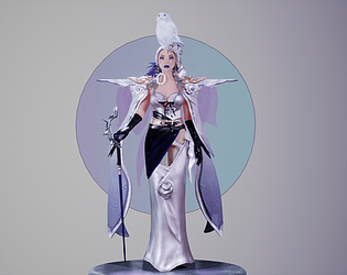
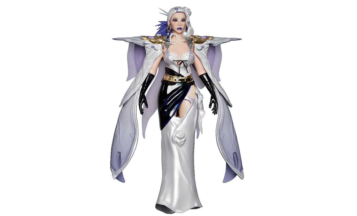
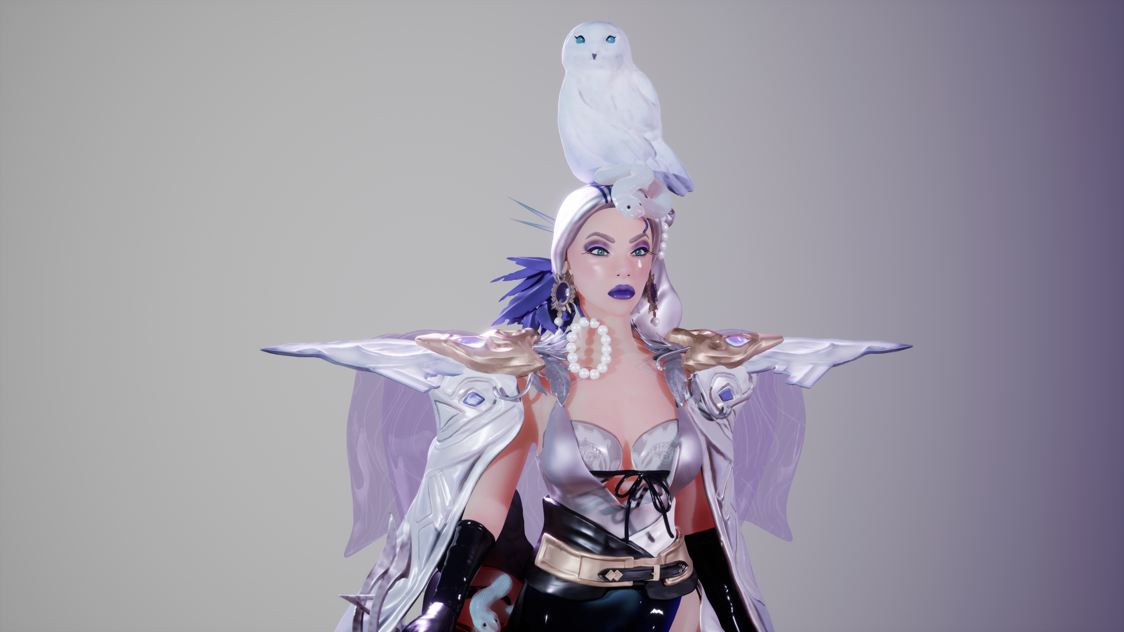
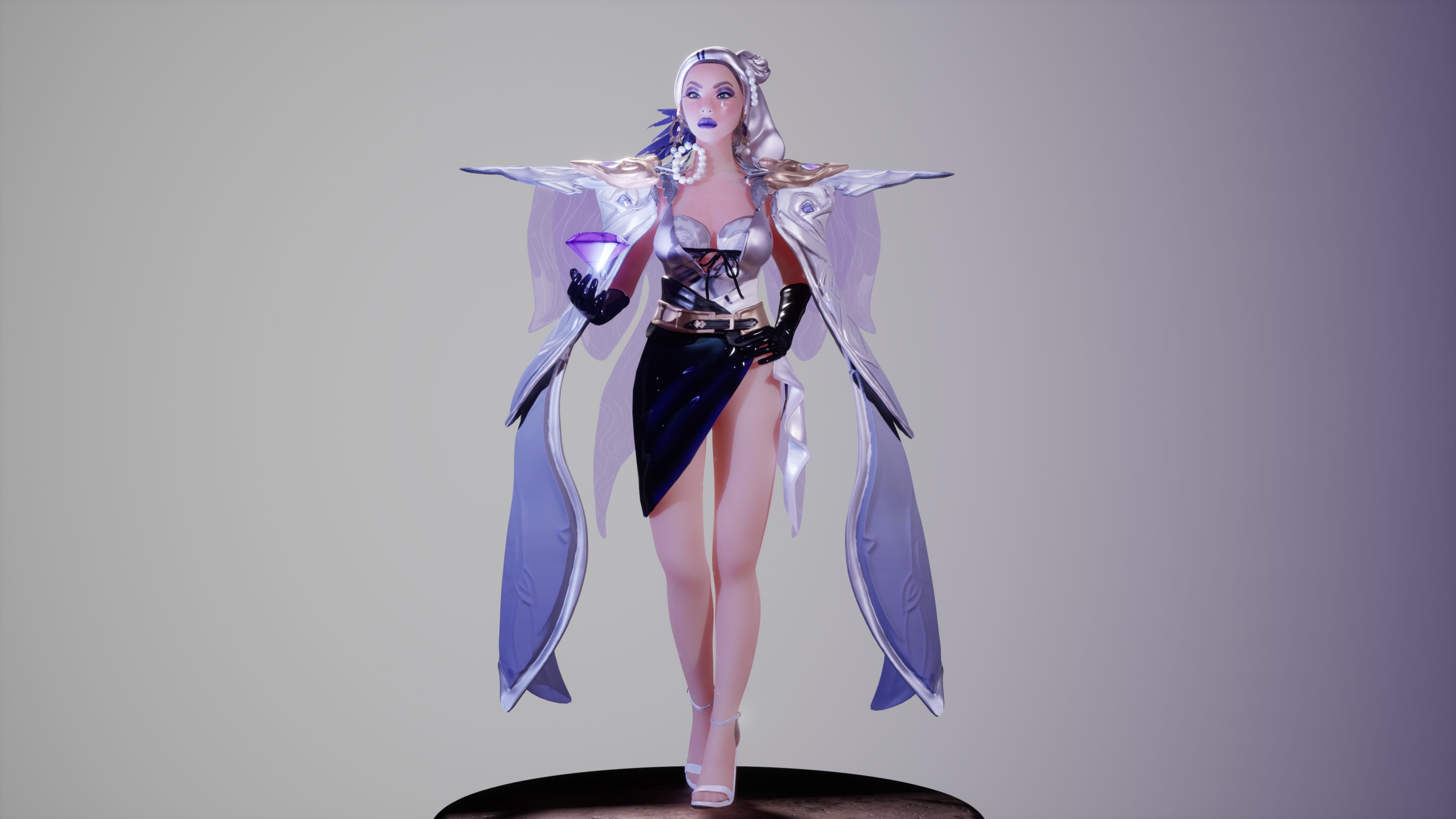
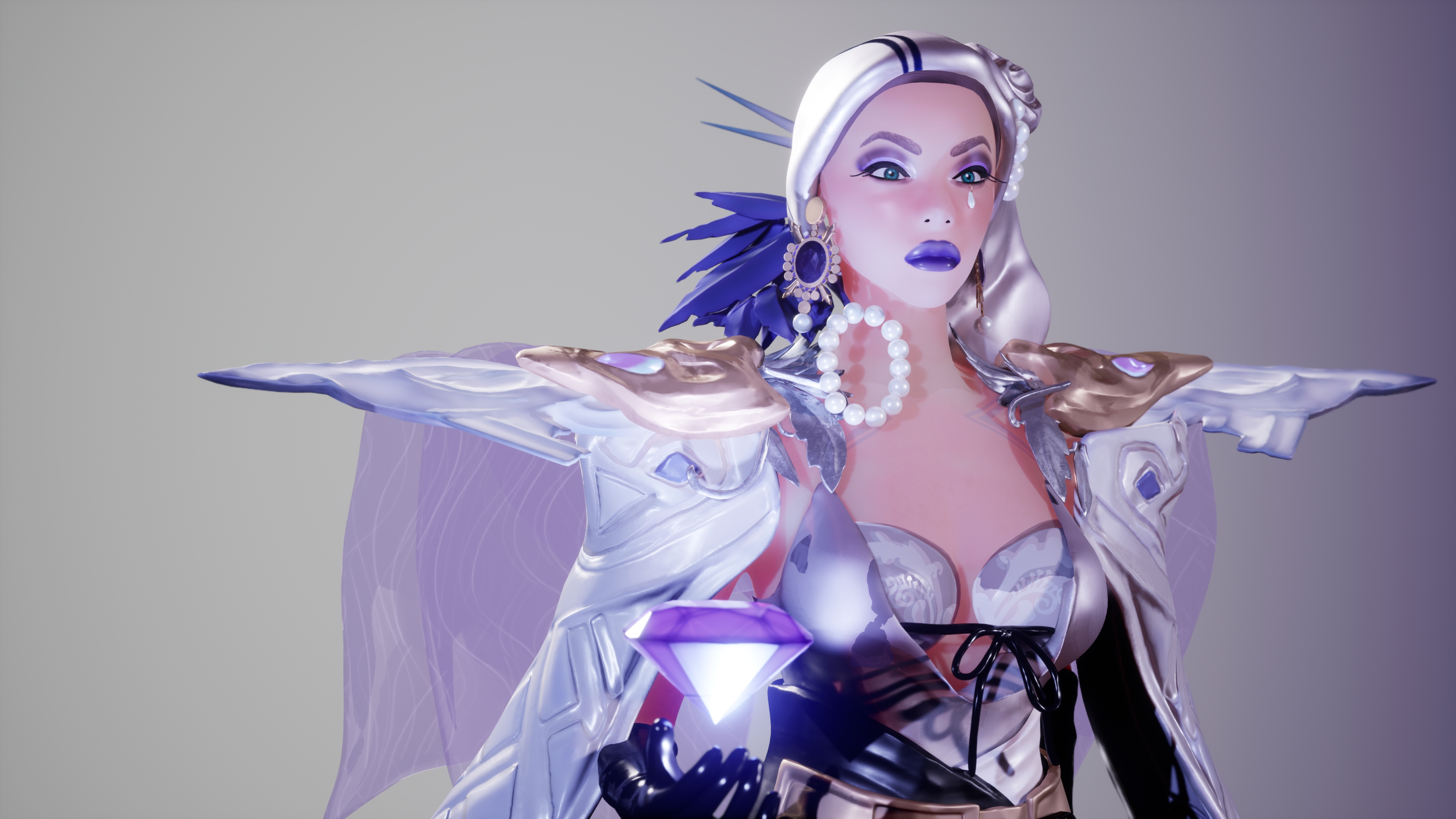
- Hi Aneeza! I really loved the concept you chose, and despite how challenging it is (!!!), you persevered through and got it finished within the timeframe. That is a real achievement. I hope this feedback helps you, looking forward to what you create in the future! //Research & Development// You have great references that go into each individual element of the asset. I think you struggled with ensuring that your assets were consistent stylisation wise, I’d recommend finding research on different stylisation choices to have something to aim for. Your timeplan is very reasonable and a great way to organise your scope. In future, I’d recommend giving yourself more time for rendering too. //Technical Art// It was smart to use the alpha mask for the snake, but unfortunately this only works in the direction of the camera. In future, you could have UVed the snake body to align in one vertical direction, and then applied the alpha mask by UV to ensure that it tiled across the whole body and followed the curves. https://www.youtube.com/watch?v=AmoLxrcU3Qw Your retopology is very well done for your first try. It’s obvious that you took proper considerations for character topology and to consider deformation. You are missing one key edgeloop around both of the eyes (like a superhero mask) and a circular loop around the nipple - we tend to add those for characters with larger breasts. The hands and fingers need specialised topology around the knuckle joints too. Your UVs are very well divided and nicely optimised, you have used almost all the 0-1 space in all the maps. As the face is the main focal area with the most detail, it’s important to make sure that this has the most UV space possible. I’d have a look at Tristan McGuire’s work for reference on materials and UVs (Winner of SFASX and Finalist of RS19) https://www.artstation.com/artwork/3dZ03A It can also be common practice to move the eyes to their own texture set too. I appreciate that rigging and weight painting can be difficult and I have a feeling that you faced some issues with the long skirt when posing the legs. It would be better to keep the skirt in and make the legs straight, than to remove the skirt altogether. It changes the character a little too much and doesn’t show any hidden details. Next time if you really want to move the skirt with the legs, you may need to shift it around in ZBrush. //Creative Art// Concept art has quite stylised anatomy (short torso and long legs) so it may have been useful to use the “head” ratio anatomy against the concept to get a better idea of proportions. The face is a really key part of the character and I think you could have used a little more work on the sculpting phase to help emphasise the high status features. The upper lip is protruding slightly too far forward and the eyelid / brow bone area needs to be more defined. It would be useful in future to find more references for the face you’d like to aim for, for example pick a celebrity and try and find every angle of their face you can. You can add stylisations after you have the correct anatomy. The sculpting of the clothing could have been more refined, particularly in the shoulder pieces and draping cloth, I’d suggest using a “HPolish” or “TrimDynamic” brush across those edges to clean them up. In all fairness, you chose a very intricate concept that is really pushing that deadline. It may have been a better choice, in this case, to texture in some of the details. The skin texturing could have been a little more variant with colours and roughness values. In your concept, we can see areas around the nose and eyes that are slightly pink-ish and have some dewiness to pick up the lighting. I would definitely work on some bust sculpts to improve your texturing skills here. Think about underlying colour zones and bumpiness that is covered by makeup in real life, this will help to inform your texturing in the future. Overall, texturing is at a good standard but needs that extra 10% push to add those extra details to bring it all together. Think blue/purple values in the white areas and in the latex. //Documentation// Your documentation is well written and you talk through your achievements and challenges at each stage. It was a pleasure to read and I hope you carry this through your future documentation. Only thing that was missing is your final map sizes and images of each map (albedo, normal, roughness etc). //Final Presentation// Choosing to add a pedestal and background is a great choice for this character and adds to that film element. The lighting on your final renders could have been more interesting to appeal to the character and add to the “Star of the Show” element. I think the shadows could have been more intense to resemble spotlights (like on a celebrity). It would be great to see a turnaround of Lady Snowy too, I’d recommend including this in your Artstation posts (or portfolio website).
- Contestant: Aneeza Ashraf / @Aneeza Ashraf Assessor: Tristan McGuire / @Draconic_Cowboy Tier: Search For A Star Congrats on completing your project! Things that went well: ✧ Nice to see documentation of the scheduling process. A very important skill in a studio setting. ✧ Good job setting up master materials in engine. ✧ Nice idea to have the long skirt off in the second render as this helps show off more of your work. Things to consider next time: ✧ When UV unwrapping, try to make the islands as straight and aligned to the grid as possible, as this allows you to pack them into the square more efficiently. Even an organic form can be cut in such a way that many of the parts can be straightened. ✧ For the topology, avoid having many edgeloops where they aren’t necessary such as on the left side of the skirt. Aim to have evenly spaced quads and avoid long and thin rectangles. ✧ Next time make sure to closely reference real life facial anatomy and look at the places of the head for guidance. I hope this feedback proves useful and will help you with future projects and building your portfolio. You can find me on the social medias in the link below. Feel free to reach out in the future. All the best! https://draconic-cowboy.carrd.co/ - Tristan, Character Artist at Airship Interactive.
Challenge Tier
Search For A Star
Leave a comment
Log in with itch.io to leave a comment.
Comments
Thank you guys for taking out the time to give me such detailed feedback! Really appreciate it :)