


Play asset pack
Drax's itch.io pageResults
| Criteria | Rank | Score* | Raw Score |
| Creative Development | #12 | 4.000 | 4.000 |
| Final Presentation | #12 | 4.000 | 4.000 |
| Technical / Workflow | #15 | 3.500 | 3.500 |
| Overall | #28 | 3.600 | 3.600 |
| Project Documentation | #32 | 3.500 | 3.500 |
| Research + Development | #40 | 3.000 | 3.000 |
Ranked from 2 ratings. Score is adjusted from raw score by the median number of ratings per game in the jam.
Judge feedback
Judge feedback is anonymous and shown in a random order.
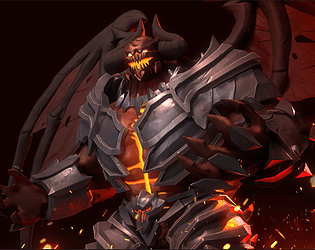
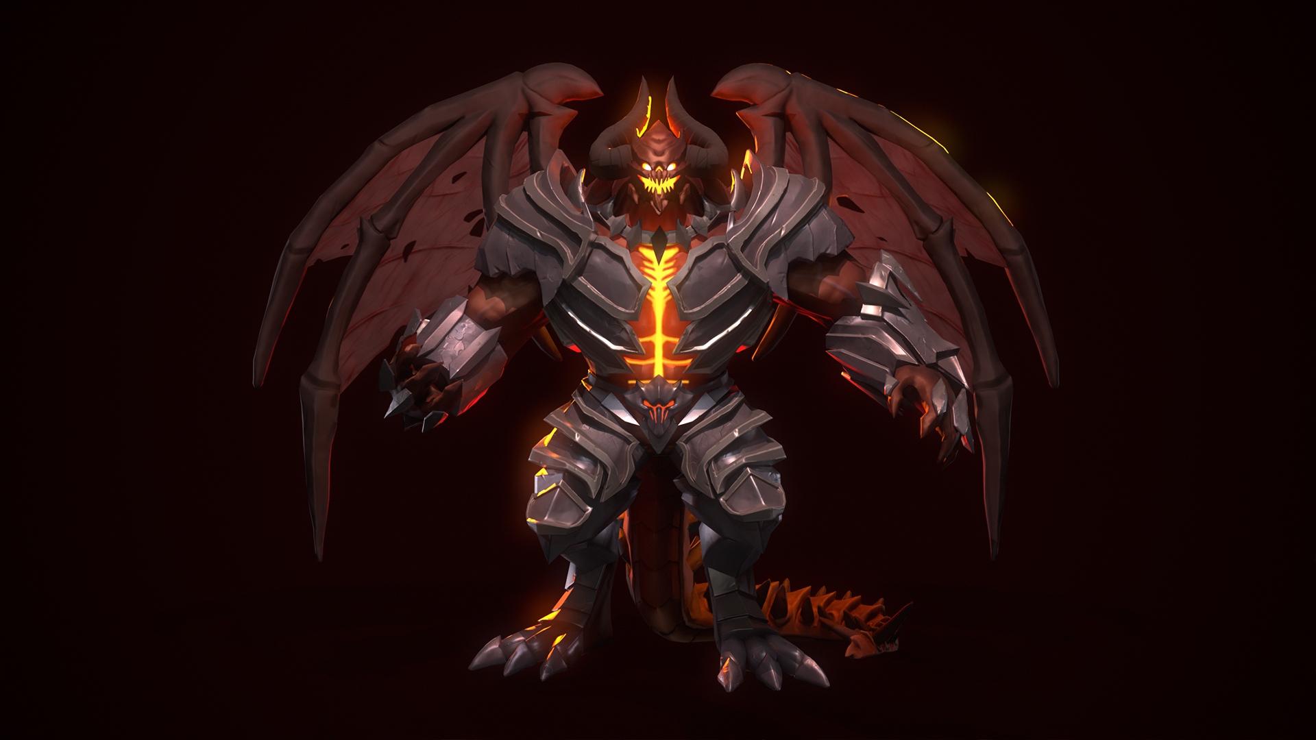
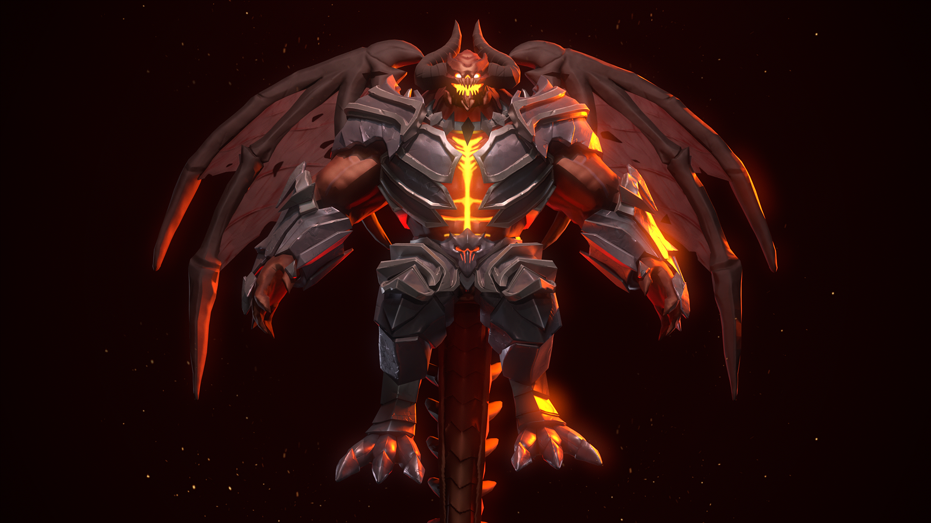
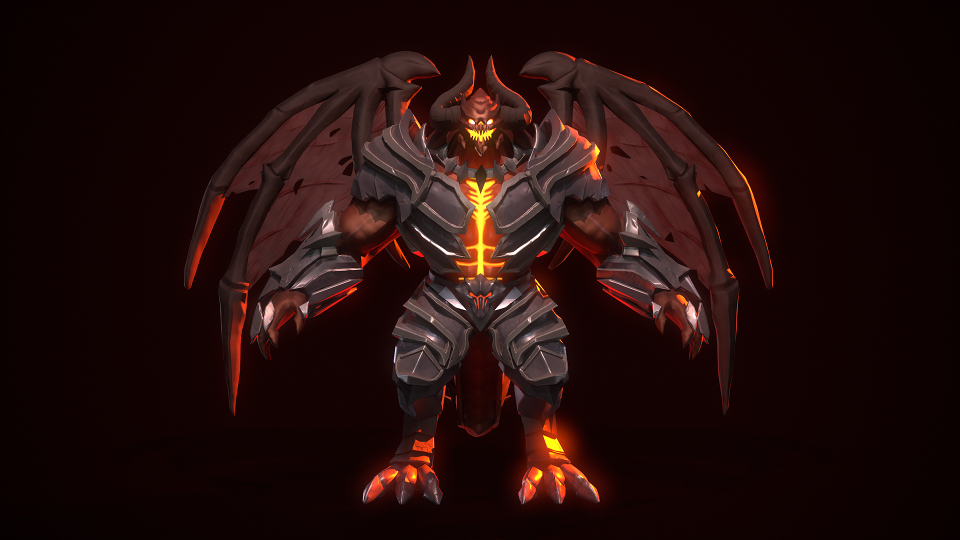
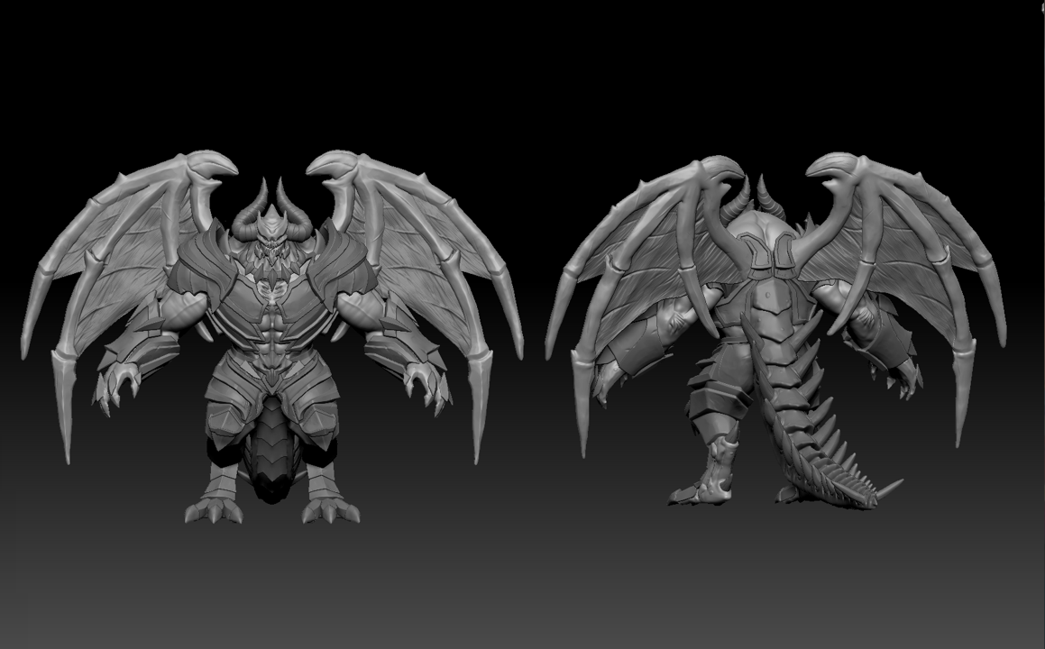
- Hi Harry! First of all, great work on this project. I want to really emphasise that I think the texturing, topology and lighting is a delight on this character. There’s a couple of areas I think you can improve on, but you are definitely on your way to becoming a fantastic character artist. I hope this feedback helps you! //Research & Development:// I would recommend researching more into your character’s assets before jumping into production. Your moodboard highlights the Darksiders style well, but it's always beneficial to look at other perspectives or even real-life references. J-Hill (Youtube) does this exceptionally well, I’d recommend watching his videos for some insight into why he chooses certain references. You mention a few times that you misread the concept, you can avoid this by spending a few hours at the start of the project breaking down the concept properly. For example, it may have been helpful to have an understanding of the back of the armour before approaching it, so that you can anticipate how it’ll look during the blockout phase. In your next project, plan out all the assets you require and gather references for each of them. Think about how you’d categorise them into materials and what special considerations you need to make. //Technical Art// You have included an image of the correct topology for faces but haven’t carried it through in this character. It is not far off, but the key loops around the eyes, mouth and nose are missing. I would highly recommend Danny Mac 3D (on Youtube) for retopology tutorials! Other than that, your topology is very well completed with decent polygon density. Great job! You didn’t mention texel density in your UV unwrapping slide so I’m not sure if you have considered it, but it’s something that’s very important in games workflow. This post by Anthony O’Donnel goes into it really well: https://www.artstation.com/blogs/antodonnell/BppX/texel-density-is-back-it-seems Although it’s for environment art, the principles still stand and this is something you need to know to work in the games industry. Hand in hand with the texel density, 4k textures may not have been necessary for this character. Unwrapping by hard edges is usually correct, however with character workflow; we have to take all aspects into consideration. In this case, your old unwrap for the armour is more functional than your final armour map as cutting your character into small pieces makes it difficult to texture and cause even more errors. The baking errors you may have faced could be solved by adding more bevels or controlling the baking cage on your character. I think you matched the Darksiders art style really well from a texturing point of view and finding the Orb Brush to mimic the sculpting style presents great attention to detail. You have not included your final polycount in this documentation, but I would recommend that you add it to any future descriptions of this project. //Creative Art:// I think you took a real creative challenge with this character and executed it very well! You clearly have the artistic skill to take you far in this industry. You can tell there’s a Darksider inspiration to this piece, although your armour and body look fantastic, I’d really hone in on making that head look cleaner. It is your focal element and the place that most people will look first, make sure that it is the area that you dedicate the most resources to. I understand that this was one of your first times trying out handpainted textures, I'd recommend adding more highlights to areas of focus - like the head and the horns. The flat colour allows the shape to get lost in the background, and a highlight around key folds in the silhouette would have helped to add depth. There could have been another step further to add more personality and charisma to Drax. Particularly in the eyes and face area, I feel like it’s lacking some emotion that the concept includes quite well. I’d recommend having a look into blendshapes to create easy facial expressions! The wings are such a large focal element of this character and maintaining symmetry throughout the process took away from it. It would be more appealing to sculpt in different cuts in each wing to make them visually stand out. //Documentation// Your documentation feels a little rushed and needs some proof-reading in areas. I would suggest allocating yourself more time to this part - hiring managers and art directors will be very interested in your workflow, make sure it’s clear for them! I liked that you spoke about your difficulties with ZModeler, and how you handled it and kept going. It shows self-improvement and dedication to the workflow. I would like to know what other methods you tried and how they turned out too, talk about your thinking process and why was ZModeler the best choice in this situation? //Final Presentation// *Submission: Graded in this category is your final submission file formats, and unfortunately I think you’ve attached the marmoset viewer file instead of the marmoset file itself. Due to this, I’m unable to view the character any further than what you’ve submitted. *Renders: Although the lighting is great, the posing of your character is quite stiff. I would lean into the reference of your concept and characters from your moodboard to see how to add that weight to Drax. Think about how they’d carry themselves and put across a more intimidating pose (sort of like they’re towering over you). One way the concept does this simply, but effectively, by adding a large shadow under the character - you can do this in Toolbag using a Shadow Catcher or making your own using an alpha! *Video: I liked how you included a final turntable video and went to the extra effort of picking out appropriate audio and fonts! I would suggest having your final model showcase first, then the topology, then the maps (albedo, normal etc) as this will help to add more context to those areas. It also adds more of the “wow factor” that your character is so well topologised! The slow pan at the end of your video (@ 1:00) is absolutely fantastic! I felt it was so atmospheric and added so much personality to Drax, I would have loved to see this as soon as I clicked on the video, as it is your show-stopping clip. Perhaps it would be nice to see Drax spin at half the speed through the turnarounds as well. It was a little quick and I felt rushed to take in all the details. Rendering wise, your lighting is very well done. I loved how the metal shone with the red lighting, it really suited your character. I would turn down the flare slightly as it can be distracting at certain angles.
- Contestant: Harry Barnes / @Visces Assessor: Tristan McGuire / @Draconic_Cowboy Tier: Search For A Star Congrats on completing your project! This is a really strong project and I hope you are proud of what you have achieved. It’s great to see that you challenged yourself to explore new things and were able to produce a great result. Things that went well: ✧ Nice use of Zmodeller and IMM brushes. ✧ Great to see the use of a custom rig as this is a skill going above and beyond expectations of a character artist. ✧ Good to see continuous referencing of the source material to ensure the style matched well. Things to consider next time: ✧ When UV unwrapping, try to make the islands as straight and aligned to the grid as possible, as this allows you to pack them into the square more efficiently. Even an organic form can be cut in such a way that many of the parts can be straightened, similar to what you’ve done on the armour set. ✧ For your final presentation, the beauty renders are really nice, but it would be best to also include some more refined technical renders of the HP, LP, UVs and textures that would look great on your portfolio. I hope this feedback proves useful and will help you with future projects and building your portfolio. You can find me on the social medias in the link below. Feel free to reach out in the future. All the best! https://draconic-cowboy.carrd.co/ - Tristan, Character Artist at Airship Interactive.
Challenge Tier
Search For A Star
Leave a comment
Log in with itch.io to leave a comment.
Comments
Looks sick dude!
immaculate, love these
Great work! :)
I love it!