

Play Character
Akitsu - The Dragonfly Queen's itch.io pageResults
| Criteria | Rank | Score* | Raw Score |
| Research + Development | #7 | 4.500 | 4.500 |
| Technical / Workflow | #15 | 3.500 | 3.500 |
| Final Presentation | #22 | 3.500 | 3.500 |
| Overall | #22 | 3.700 | 3.700 |
| Creative Development | #26 | 3.500 | 3.500 |
| Project Documentation | #32 | 3.500 | 3.500 |
Ranked from 2 ratings. Score is adjusted from raw score by the median number of ratings per game in the jam.
Judge feedback
Judge feedback is anonymous and shown in a random order.
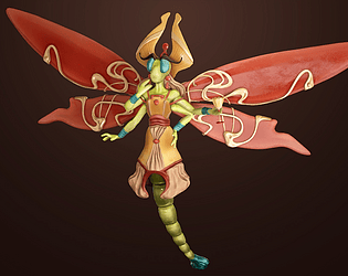
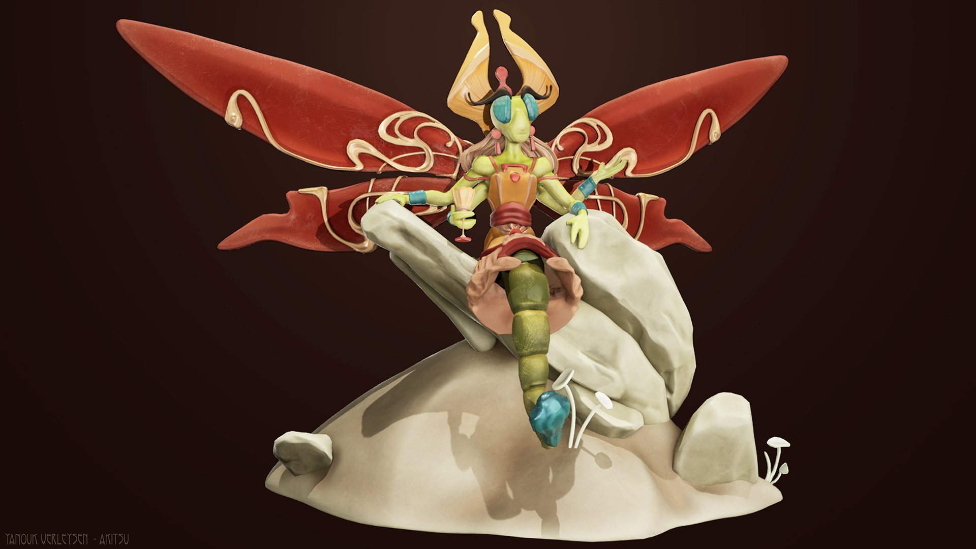
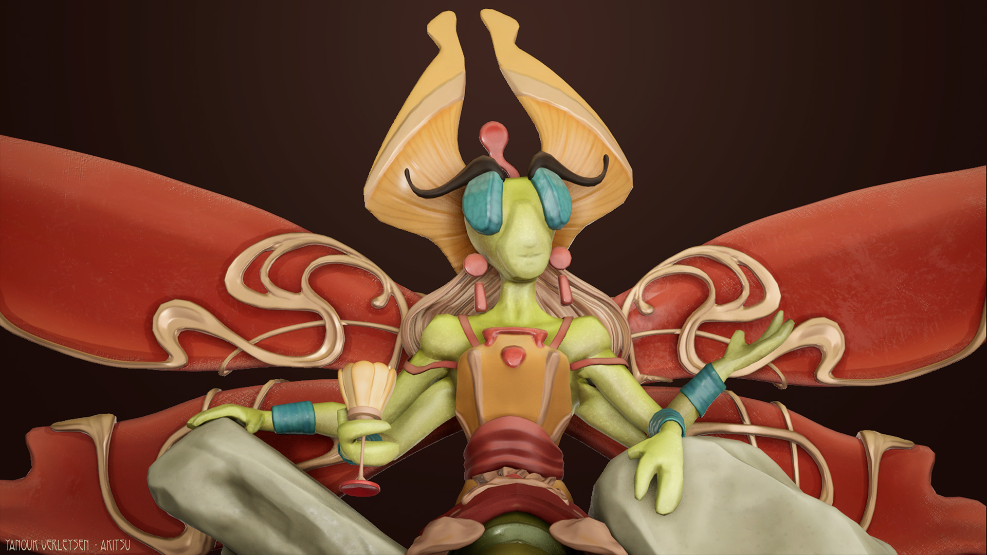
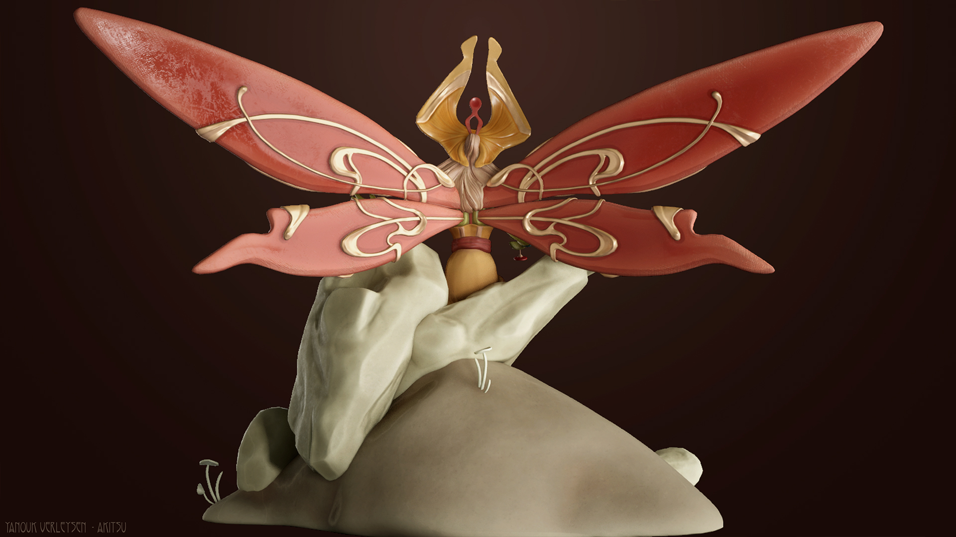
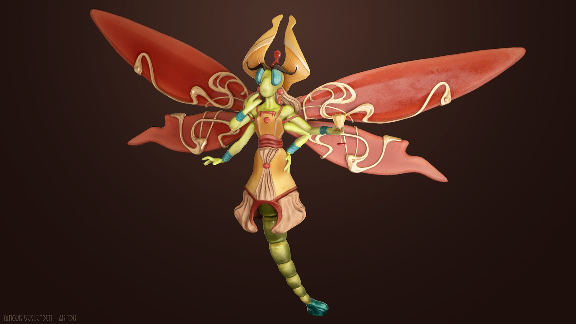
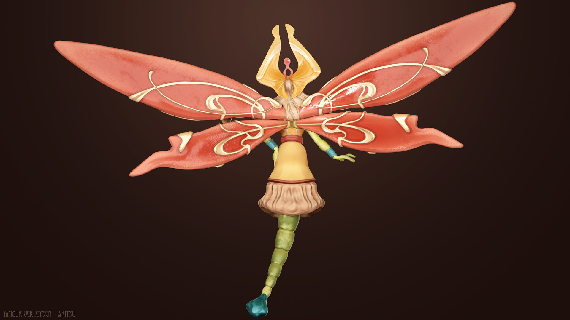
- Hi Yanouk! Great work on this character, I really loved the concepts you’ve created how you carried it through to 3D! Your documentation was a pleasure to read, great job on this character, keep it up! //Research & Development// Excellent research and great choice to add the cup prop for more narrative. You’ve done your own research into real-life dragonflies to support your character, as well as existing game characters to support it too. You could have researched into game-ready topology and lighting workflows to help your final renders. //Technical Art// There are a few assets that need more consideration topology-wise. The hair, wing detail and glass need to be retopologies to match the polygon density of the character. These areas prevent your character from being “game-ready”. In future, gather references of wireframes of other 3D characters and have a polycount limit to set yourself too. In some games, it may have even been too expensive to have those details as full topology and it could have been a better choice to make it a texture on a plane. On the same topic with topology, since you were planning to animate and pose this character, you needed to dedicate bespoke deforming topology for characters. Areas like the elbow, fingers and face need specific topology to help the character shape better. Have a look at Danny Mac 3D’s retopology tutorials, they go into this in great detail. https://www.artstation.com/artwork/P3PGr Huge props that you’ve rigged and animated this character in this short timeframe! I think the animation feels a little rigid and linear (note: I am not an animator so definitely reach out to other people for more feedback on this!) //Creative Art// Akitsu has real charisma and personality to them and I think you’ve carried that element well from the concept through to production. I’d really like to emphasise that your character design skills are excellent - I think you have a real talent for it! Unfortunately though, there are a few areas of your character that get lost in the final renders. The wings look heavy and sort of sticky (not sure if that's the right word) because the roughness is too high. I think it could have really helped to look at real life references of dragon-fly wings to see the micro-patterns they contain. I think some subsurface scattering on the wings or even a more delicate texture could have helped to make it look more lifelike and that it could support Akitsu to fly. Also, I can see you have tried to add opacity in Unreal but its not showing through correctly in your final renders (I can see it in the Sketchfab Viewer though, so maybe it’s a problem with the material). The eyes could have had a little more detail to them as they are the key focal point of Akitsu. It would have been nice to see some iridescent effects or higher roughness there. It looks as though you’ve handpainted your textures which have a great effect in some areas and quite a muddy look in other places. I think the face and headpiece (focal areas) could have done with more colour variation to make it more visually interesting. This is really important in handpainted characters because you are almost completely relying on your albedo and normal map. //Documentation// I love the design of your presentation and how it relates to your character’s design. Even down to your choice of font, small handwritten areas and colour palette - it was so enjoyable to look through. I really appreciate the extra effort you went to making it look consistent. I think you are missing a couple areas in your documentation though: final polycount, map sizes and texturing process. I would definitely include these in your Artstation post too as employers will be interested in this information (as well as adding your map callout pages too, they’re really important when showcasing a character). Also, I think your wireframe could be a little more obvious, just to emphasise where you have allocated your topology and considered it for animation. //Final Presentation// I’ve mentioned a little above that the final renders lose some of the details. This could be done to the lighting setup that you’ve chosen which creates quite a flat, grainy effect. I’d have a look into 3-point lighting setups for characters as this would have elevated your character massively. The rocky pedestal is a great addition and I think it adds to your character's personality. But again because of the lighting (or other issues), they look very plain and almost unfinished. I do appreciate that this competition is for the character only, but for Artstation, I’d recommend spending a little more time for those details because it does make a difference.
- Contestant: Yanouk Verleysen / @Yanouk Verleysen Assessor: Tristan McGuire / @Draconic_Cowboy Tier: Rising Star Congrats on completing your project! Things that went well: ✧ Well thought out concept, with nice research. ✧ Really nice work with the rig! That really goes above and beyond expectations. ✧ The animation is a really nice final touch. Things to consider next time: ✧ Next time you do a high poly, work on making the forms look a bit cleaner. More similar to the look of the wings and headdress. ✧ The topology is a good start, but could be further optimised in places like the hair. ✧ When UV unwrapping, try to make the islands as straight and aligned to the grid as possible, as this allows you to pack them into the square more efficiently. As you are in the Rising Star tier, I hope this feedback can be used to inform how you approach future university projects and I would love to see you take part in the competition again next year! You can find me on the social medias in the link below. Feel free to reach out in the future. All the best! https://draconic-cowboy.carrd.co/ - Tristan, Character Artist at Airship Interactive.
Challenge Tier
Rising Star
Leave a comment
Log in with itch.io to leave a comment.
Comments
No one has posted a comment yet