Play asset pack
Rising Star 2018 - Sci-fi Armory's itch.io pageResults
| Criteria | Rank | Score* | Raw Score |
| Technical | #20 | 2.907 | 3.250 |
| Research & development | #23 | 3.130 | 3.500 |
| Presentation | #23 | 2.683 | 3.000 |
| Overall | #26 | 2.817 | 3.150 |
| Documentation | #27 | 2.683 | 3.000 |
| Creative | #28 | 2.683 | 3.000 |
Ranked from 4 ratings. Score is adjusted from raw score by the median number of ratings per game in the jam.
Judge feedback
Judge feedback is anonymous and shown in a random order.
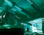
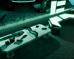
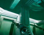
I like the Idea, I feel the execution was a bit hit or miss. The overall feel is ok, and the scene has a decent balance and consistency in Idea but then breaks this with execution.
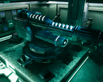
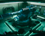
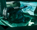
Your texture details seem to be a bit wild. For example why does the concrete has massive gashes in it? But it doesn't make sense. I think this is an easy fix. One of the big problems a lot of new Environment Artist's have is Random Noise. I think if you focus on the real world as reference you will understand. Dirt, Scratches, Noise etc should have a reason to be there. If it doesn't then it can break realism. In this example the giant dark scratches in the concrete make the scale of the elements feel wrong, How big is the Gun if the scratches are that size etc...
The flag at least in the images.. Looks to low poly If its animated I'm sure it will be better but It needs more geometry or it breaks the entire scene. I'd hope when looking at images in the future you would critique yourself and go "does this look right" and remove or fix elements that stand out or look out of place
The lighting is a bit too uniform and doesn't really showcase the central piece at its best. It also makes the scene a bit hard to read and gauge. It's still a nice effort in a semi stylized art form.
Challenge Tier
Undergraduates graduating in 2019 or later
Leave a comment
Log in with itch.io to leave a comment.



Comments
No one has posted a comment yet