


Play asset pack
The Fight Arena's itch.io pageResults
| Criteria | Rank | Score* | Raw Score |
| Presentation | #5 | 4.000 | 4.000 |
| Documentation | #12 | 3.800 | 3.800 |
| Overall | #13 | 3.480 | 3.480 |
| Technical | #14 | 3.400 | 3.400 |
| Research & development | #18 | 3.200 | 3.200 |
| Creative | #22 | 3.000 | 3.000 |
Ranked from 5 ratings. Score is adjusted from raw score by the median number of ratings per game in the jam.
Judge feedback
Judge feedback is anonymous and shown in a random order.
Overall very impressive, I think as a stand alone piece you've done a really good job, your process document showed a good thought through out. Its well lit and you even spent a good amount of effort on the presentation.
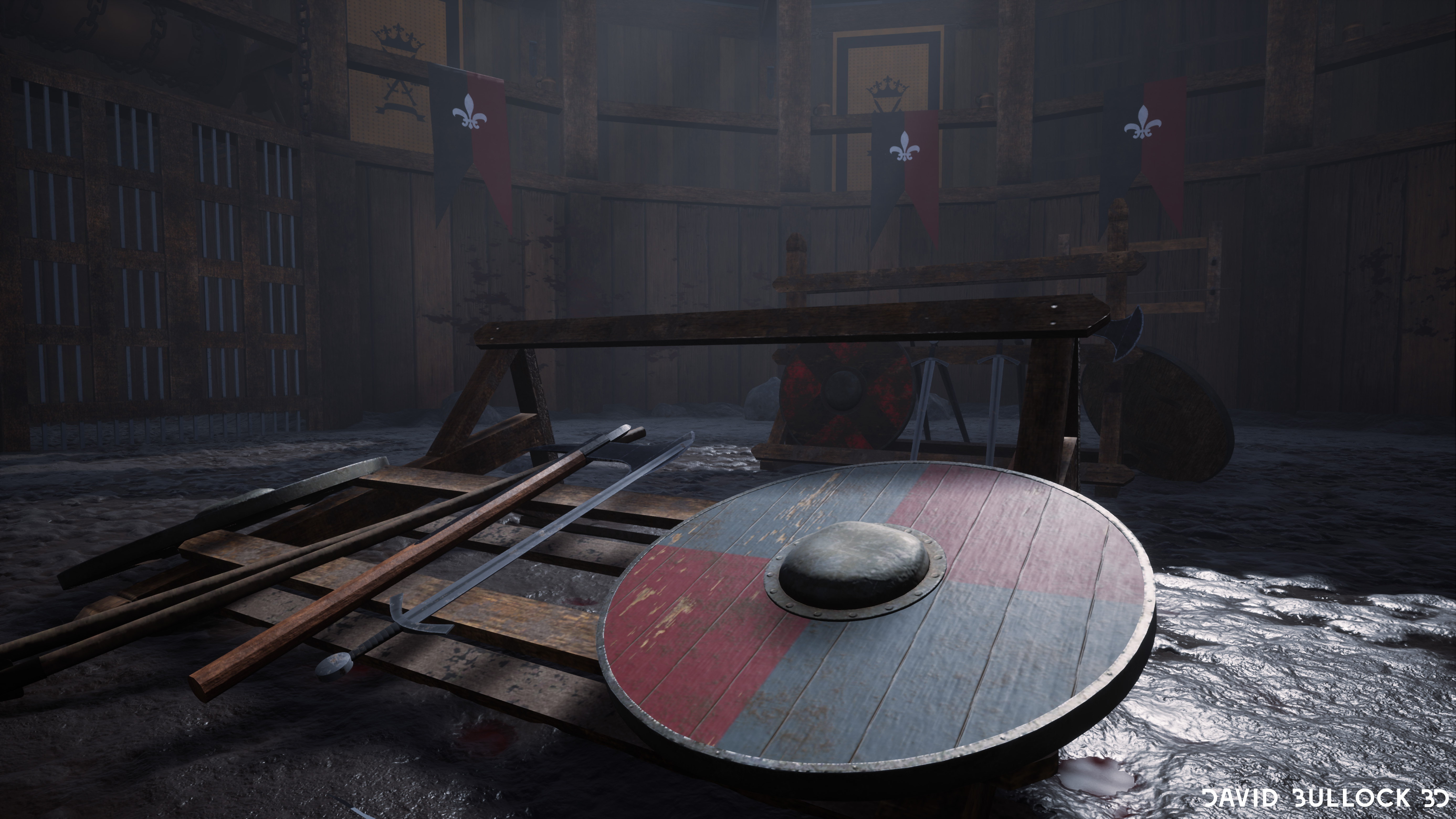
Things to work on - Texturing whilst ok is an area where you could push your scene even further. Things like the bloody hand prints for example feel very "stuck on" and don't fit well imo. The wood materials could be pushed a little more. But Im nit picking, overall your on a great path keep working hard and you'll be in a good place
This is a serious project, well crafted, that shows a good grasp of a complete production pipeline and good technical skills.
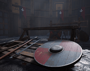
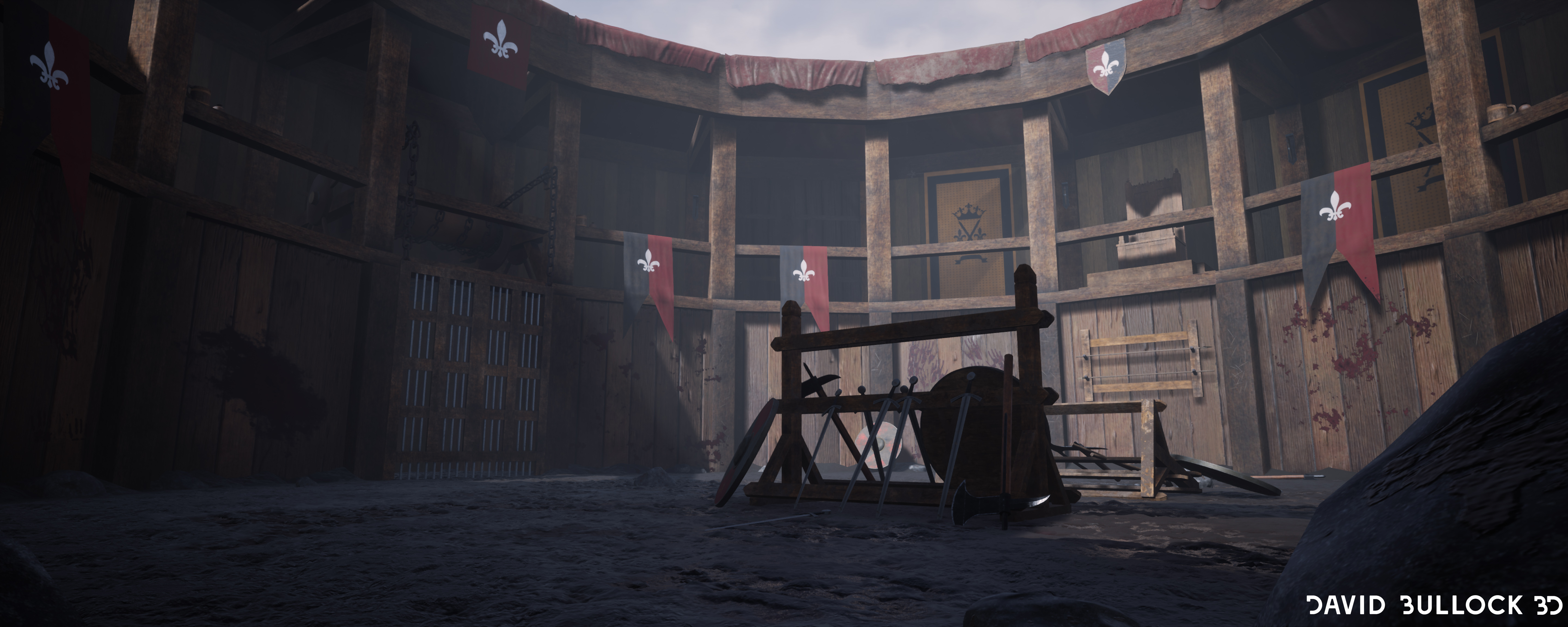
It may lack a better focal point with a hero asset in the center of the arena. The royal chair is not highlighted enough in this scene. Also, overtures on the exterior should contribute to make this arena more breathable.
Overall, although modest, the scene could work in a video game. Good effort!
Good work which as you stated could be improved with some more work/time on it.
Your scene has a good structure, the materials and the lighting work well it's all about adding a few things here and there and moving some elements around to make the composition more interesting.
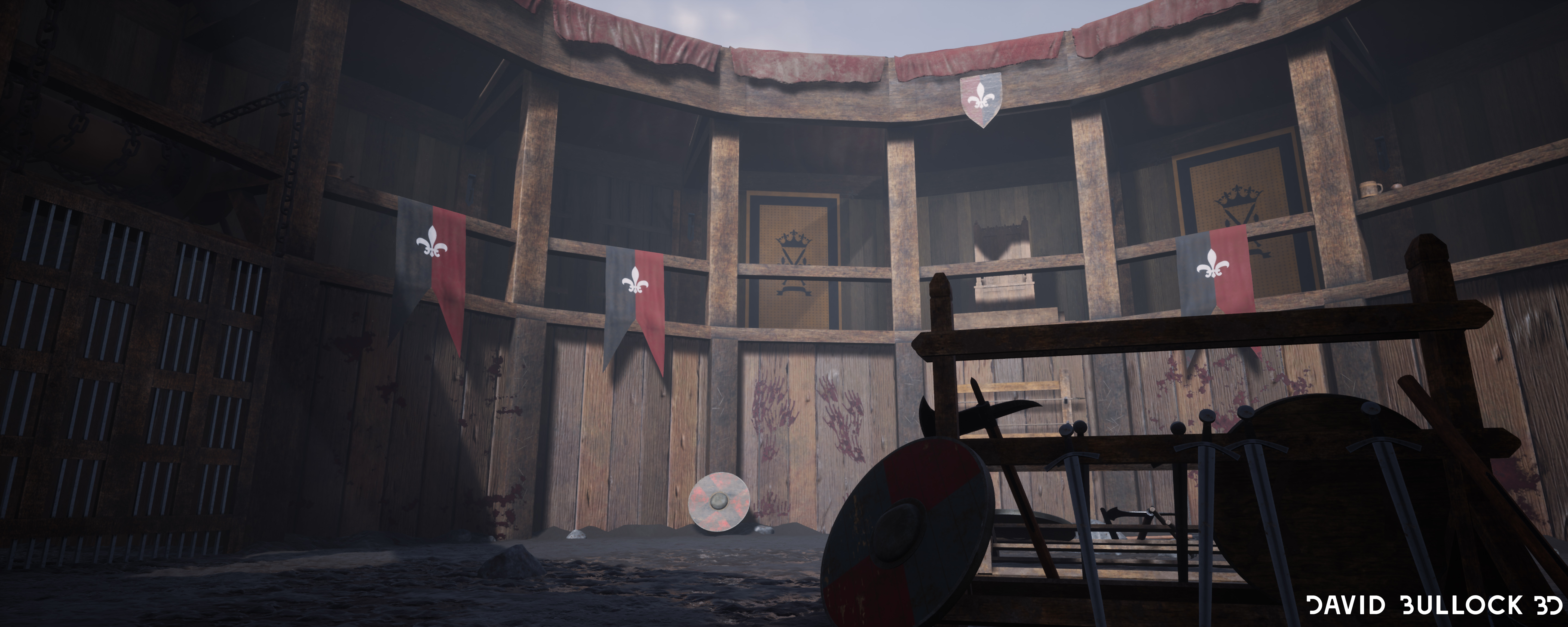
The composition has a lot of horizontal and vertical lines but not a lot of elements to break that. You could add some contrasting element on some of the wood beams(dark metallic "rings", chains, torches..). Maybe make the roof covers length more irregular and use it to break that horizontal line on the ceiling. Overall all the wood beams/planks are super straight, adding some bending/crook here and there would make things look more realistic. Rotating the camera slightly could help create more dynamic shots as well.
The shield in the foreground would benefit from having bigger grooves in it. It's probably something that you should support with the mesh geometry not just textures. Leather straps could have a darker color as well to make them pop visually. You have some smoothing issue on the axe. Weapons are still quite well organized for an "after-fight" scene.
The beams and the walls have very similar color - you could make things more appealing by adding some color changes such as in your reference concept. Making the bottom of the texture more dirty and dark would also help breaking the flat aspect.
Careful with polygons density the torches and the ornaments on the royal chair are a bit intense for their size.
Some other random ideas for improvement : add some height fog close to the ground, turn on torches and try to add some behind the portcullis it could cast some interesting shadows, add some more elements on the ground half-buried in mud.A nice scene with good documentation and reference explaining the reasons for choosing it.
Some neat modelling when I took a look at the wireframe of the assets - easy to see where the polygons are and to work on should someone else have to pick up the asset for optimising or adapting, something that can happen in a game studio. I like the attention to detail in the weathering and worn look of the textures on the assets and the ground looks suitably muddy and wet in places.
The point made about the 'stiffness' of the fabric in the banners is a fair observation and shows thought at where improvements can be made. Another thing to maybe look at is the straight edges in the scene - adding the odd vertex and moving them slightly can break up the straight edges and make things more realistic/interesting.
Overall though a very nice scene well modelled and textured.
Challenge Tier
Final Year & Masters students
Leave a comment
Log in with itch.io to leave a comment.
Comments
No one has posted a comment yet