Play asset pack
Search For A Star 2018 - 'A Foreign Land''s itch.io pageResults
| Criteria | Rank | Score* | Raw Score |
| Technical | #10 | 3.600 | 3.600 |
| Research & development | #12 | 3.600 | 3.600 |
| Overall | #15 | 3.360 | 3.360 |
| Creative | #16 | 3.200 | 3.200 |
| Documentation | #17 | 3.400 | 3.400 |
| Presentation | #19 | 3.000 | 3.000 |
Ranked from 5 ratings. Score is adjusted from raw score by the median number of ratings per game in the jam.
Judge feedback
Judge feedback is anonymous and shown in a random order.
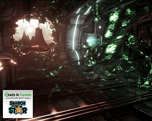
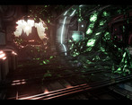
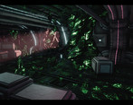
An admirable attempt by the artist to get away from cliched types of environment, this does however still fall into the 'sci-fi' corridor category which tends to crop up a lot. However, with the encroaching alien plant life the artist has made a good attempt to subvert that type of environment into something more unusual. The artist has also shown clear improvement during the course of creating this, especially after getting feedback from peers, and the final result has life to it.
Some really nice elements in this piece, you've researched well, and got a nice feel to the overall scene, the animated shader's help to get what your aiming for across.
I think if you want to take it to the next level I would spend a little longer on the core modelling/texturing. Building up the core meshes and texturing experience will help push you on.
Looking at your project and development log I see that you’ve worked hard on building something unique. While I would of liked of seen the research and ideas within the main art bible itself as makes it easy to access and for people to view. Making documents or portfolio pieces easy to access is key as recruiters won’t waste time looking for information about you etc just something to keep in mind for future. I found that creating your own concepts and a quick white box helped you define the environment first before creating the main assets. I’ve noticed you worked hard to stay as modular as possible to make scene as efficient as you could to ensure maximum performance. By doing this you’ve allowed yourself to put some more high demanding techniques in your shader and FX work without throttling issues. I think the noise shader on the vegetation works nicely for the scene the green glow effect makes it standout from the metal sci-fi props and environment the only thing I would suggest personally is to make the noise on the shader slightly more high resolution and sharper. Overall the textures are created to a high standard with good use of the UV space. This project is a huge improvement from your previous entry with the lighting being the major noticeable change between the two.
Challenge Tier
Final Year & Masters students
Leave a comment
Log in with itch.io to leave a comment.


Comments
No one has posted a comment yet