

Play asset pack
Italian Hotel - Search for a star - 2018's itch.io pageResults
| Criteria | Rank | Score* | Raw Score |
| Creative | #24 | 2.800 | 2.800 |
| Technical | #25 | 2.800 | 2.800 |
| Research & development | #26 | 2.800 | 2.800 |
| Overall | #28 | 2.640 | 2.640 |
| Documentation | #29 | 2.600 | 2.600 |
| Presentation | #33 | 2.200 | 2.200 |
Ranked from 5 ratings. Score is adjusted from raw score by the median number of ratings per game in the jam.
Judge feedback
Judge feedback is anonymous and shown in a random order.
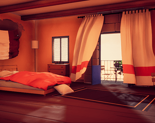
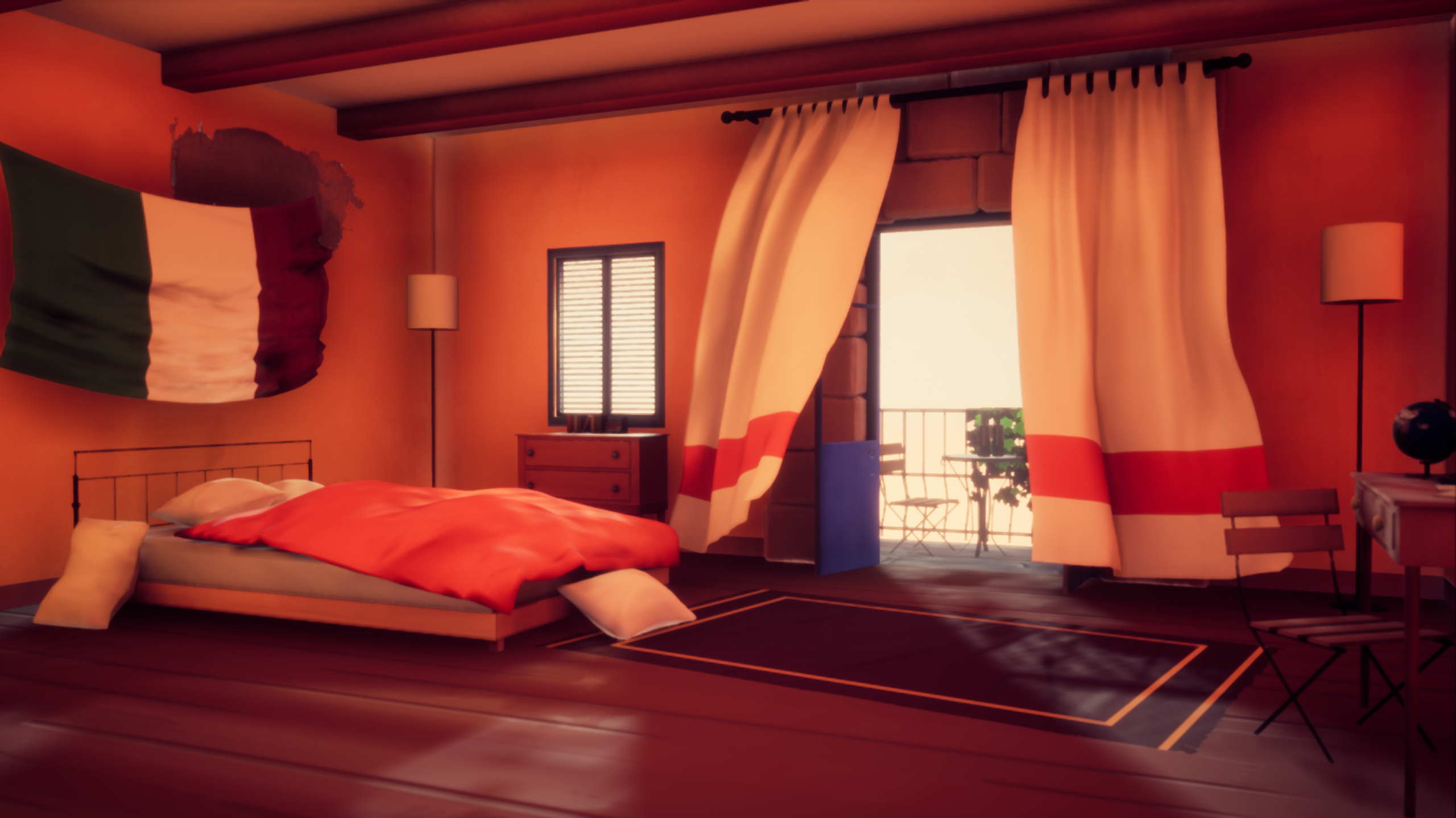
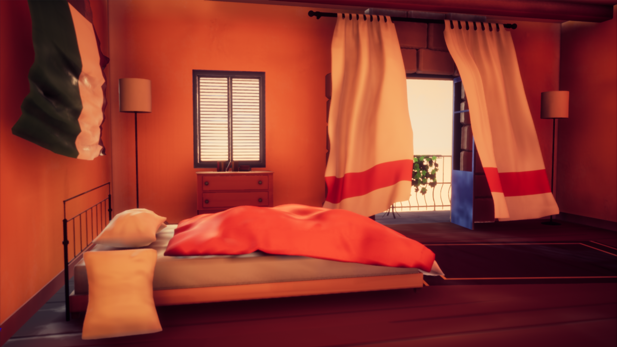
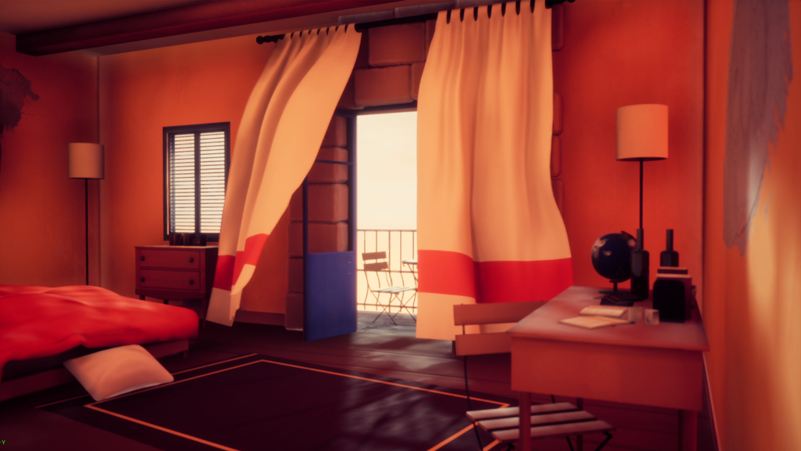
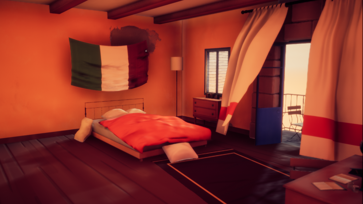
An admirable attempt to get a very specific visual style working, with a pleasing diorama style result.
Whilst that style is some way from photo real, I think this piece could still have benefitted from use of real life reference rather than relying entirely on imagination - even heavily stylised environments still need to contain believable visual cues. The real world reference shown is not what the artist subsequently built - it was a good place to start for inspiration, but some reference imagery to help with prop variation and design for the interior would have helped the final piece.The lighting is way too red-ish for my taste. That's the weak spot in this work. But there's one thing you achieved quite well: the textile. It's dynamic, subtle. It feels like textile. Nicely done.
Very nice texturing touch also. It's just a shame that the scene feels a bit empty. And that lighting doesn't help. But nice effort overall.
Its an interesting piece, I get totally what your going for with the style, I'd suggest focusing hard on the "details" when making a stylized texture set. Right now your wall and floor texture absolutely throw off the scale of the scene I'd take some time to improve them and make them fit better with the props and overall room scale.
The Italian flag also looks really weird. Cloth hung from a wall by it's corners doesn't sag or get badly creased at the bottom like you have. And its a little out of place considering how your curtains came out really nicely. I'd fix the flag and make it'd details much simpler, It should almost be flat with a few gentle ripples..
Challenge Tier
Undergraduates graduating in 2019 or later
Leave a comment
Log in with itch.io to leave a comment.