

Play asset pack
Mausoleum Diorama - Search For A Star 2018 by Michaela Knights's itch.io pageResults
| Criteria | Rank | Score* | Raw Score |
| Research & development | #3 | 4.333 | 4.333 |
| Documentation | #6 | 4.000 | 4.000 |
| Overall | #12 | 3.567 | 3.567 |
| Creative | #15 | 3.333 | 3.333 |
| Presentation | #15 | 3.333 | 3.333 |
| Technical | #24 | 2.833 | 2.833 |
Ranked from 6 ratings. Score is adjusted from raw score by the median number of ratings per game in the jam.
Judge feedback
Judge feedback is anonymous and shown in a random order.
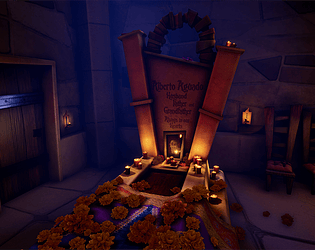
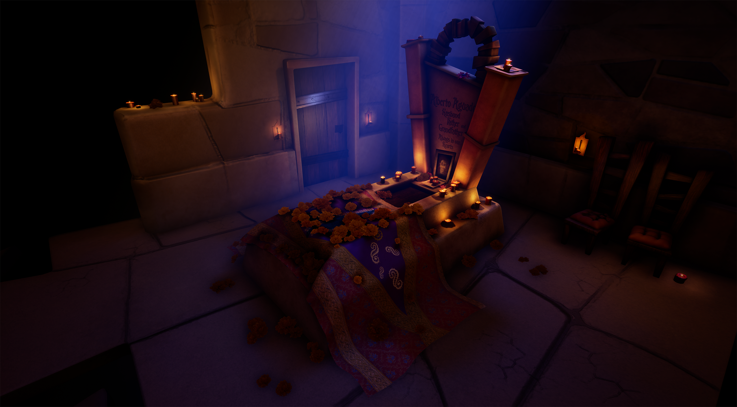
Looking over your submission the documentation is very well explained with every thought process and detail you could think of while working on the project. After coming up with the concept and rough block out, I see that you moved on to gathering research from various sources. I like that you got both real life references as this is always important even when creating a stylised piece. As well you looked at the style in which you wanted to somewhat inspire to and create your own. I also like that you spent the time when needed to look at other artists work and see how they approached either the modelling or texture aspect. I would agree with your peers and Lecturers that diorama would of best suited your situation at the time with another project due in as well, however I’m also glad you opted to create it this way as adds to the stylised feel of the project.
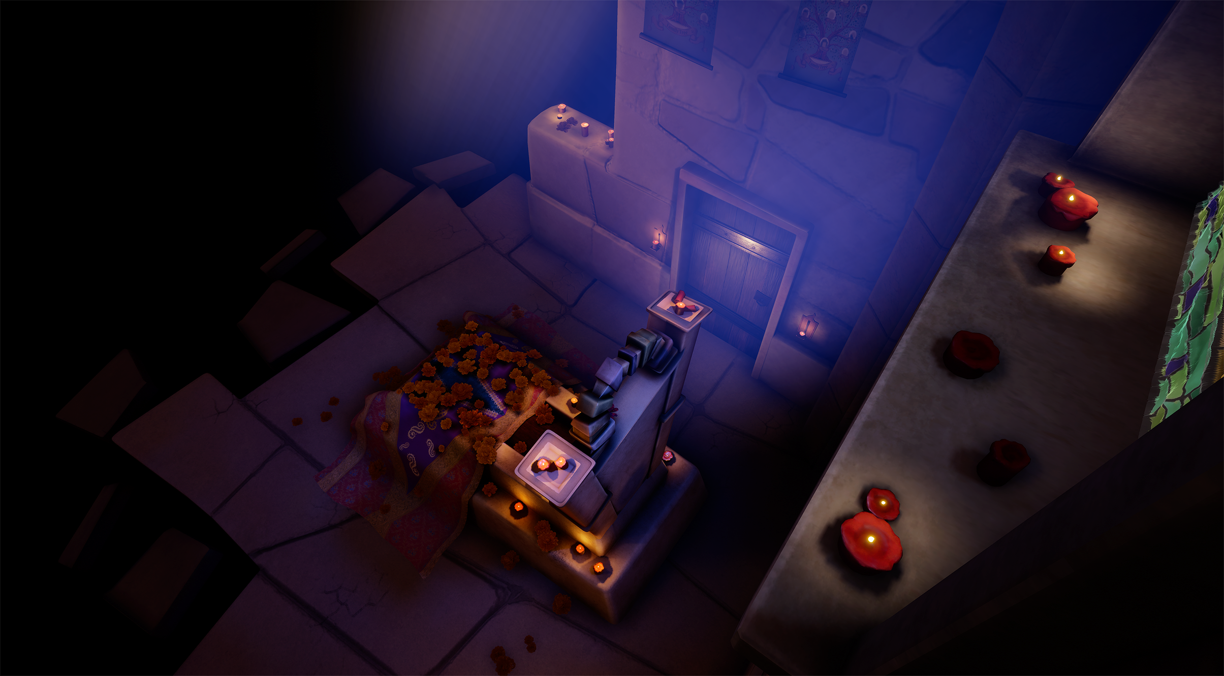
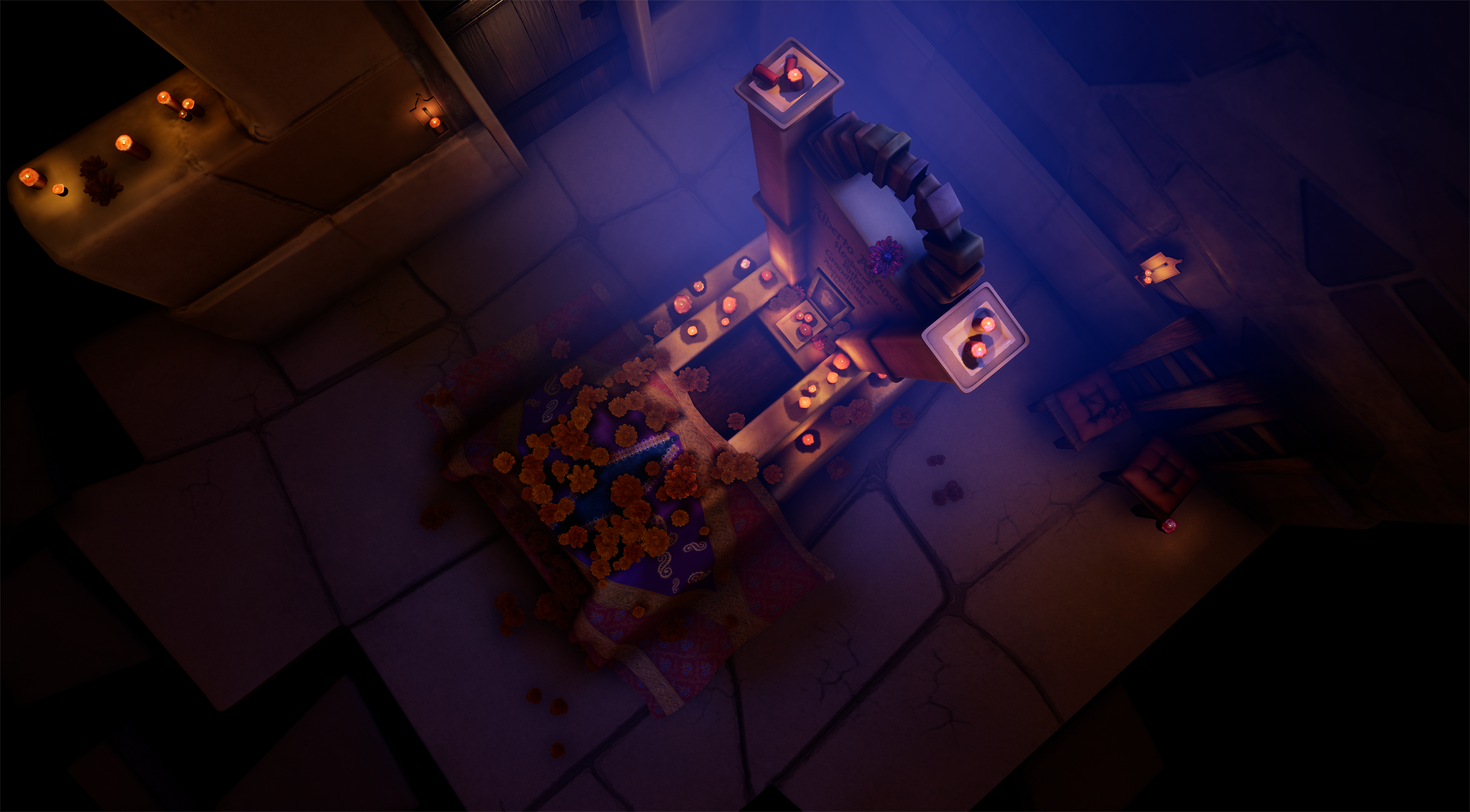
Your modelling workflow is nice and well presented. I can see the journey you took on the creation of each asset. You’ve managed to stay within the style you wanted to achieve with the modelling techniques used. I really like the gravestone as focal point and how creative that area is.Though I would suggest in future looking at some of your polycounts and edge flow a little for example the cushion on the chairs are super high for what they need to be especially as they are in the darkness more. Another would be the main wall there's quite a few triangles not doing anything in terms of silhouette. I would of suggested tidying up the edge flow a little and using the vertices to your advantage to make the silhouette pop out in places. I do like the time you managed to put into each asset using a range of different techniques when needed to whether sculpting like you have for the candle using zbrush, creating the cloth using NCloth I understand the reason for using marvellous designer first as many artists use this software to get similar effects but NCloth can do just as good of a job for a simple asset like this as a professional you seen that it wasn’t going to work in the time frame given so you opted to change approach which is key when working in industry. My other suggestion would be instead of sculpting the main wall as you’ve done I would have created a tileable texture.
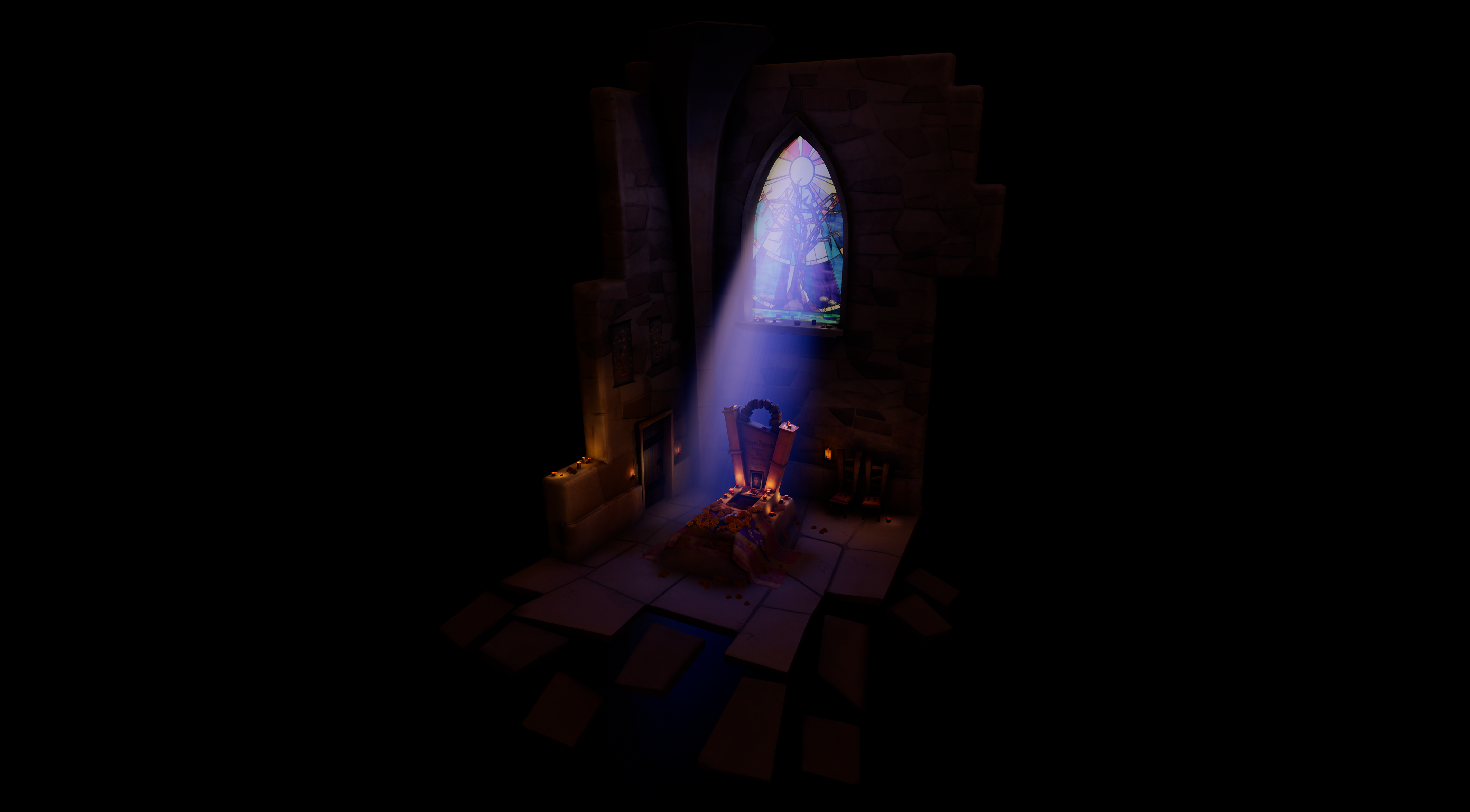
Your texturing is very well done to the style you wanted to achieve. Nice use of software to create the dirt and wear on the gravestone. Liked that you pointed out that you used masks for non destructive manner allowing you to alter textures when needed. The major part in the texturing process for me was the stain glass window texture you created. As the research from the artist Vincent Derozier really helped you in creating process and finding a way into accomplishing a difficult surface material.
Finally the renders you managed to produce for project really give a nice sense of story and the lighting sets the mood. Both well executed. You’ve managed to achieve what you set out at the beginning with a well presented stylised diorama.
Stylised art is harder than it may look, and this is a very impressive piece. The style has been carefully considered, developed and executed. The scene has a nice solidity to it, composition is strong and the lighting in particular is really helping to sell it, plus the whole work has personality, which can often be lacking with 3D environment work.
As the artist themselves points out, tonally there is too much contrast with the scene getting crushed down towards black in places - a boost to the indirect lighting levels would help, but overall I really like this simple but well handled scene.
Really nice feeling coming across from your scene. Its nice to see someone try a stylised look. I think your window and Tomb have worked well and sell the feeling in the right way but..
I think you need to revisit at your Walls and floor, whilst a good attempt I don't think they work well enough. And drag the piece down once you look closer. I'd advise looking at things like Scale of the Grout, Silhouette of the shapes, stylised doesn't need to mean flat/low poly. With a little time redoing the walls and Floor you could have a really nice portfolio piece.
Good scale piece to go for given the time limits. Reference and research was thorough enough. Overall the piece is far too dark. You can achieve contrast and highlight the focal point without the rest of the environment being this dark. It takes away from all the work you've done getting the rest to look good. I'd advise having a brighter ambient light and maybe having your darker areas tinted so you achieve shadow with a colour.
Challenge Tier
Final Year & Masters students
Leave a comment
Log in with itch.io to leave a comment.
Comments
No one has posted a comment yet