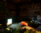
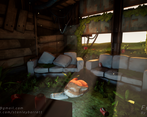
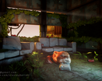
Play asset pack
Fox Room's itch.io pageResults
| Criteria | Rank | Score* | Raw Score |
| Creative | #20 | 3.167 | 3.167 |
| Documentation | #20 | 3.167 | 3.167 |
| Overall | #24 | 2.867 | 2.867 |
| Research & development | #25 | 2.833 | 2.833 |
| Presentation | #26 | 2.667 | 2.667 |
| Technical | #27 | 2.500 | 2.500 |
Ranked from 6 ratings. Score is adjusted from raw score by the median number of ratings per game in the jam.
Judge feedback
Judge feedback is anonymous and shown in a random order.
You overall development seems to show you’ve learned a lot throughout the project especially the production stage using a range of nice technical techniques used within the industry today. From the design and references you gathered I feel your final outcome you’ve achieved that what you set out to do. You’ve used a range of different techniques to get the desired looks of your objects which is key while working on the job. What really stood out for me was the amount of detail you spent into making sure each texture was exactly how it should be with the foliage being the main focal point for me in the project. Your models topology is very clean and suited for its need not going to crazy with the tri count and using only what you thought was necessary to create the form of the object. I’m glad to see that you decided to use some FX within your scene other than just fog to add that extra depth to your work. This as well as the sounds help build that immersion and draws the view/player into believing the scene. Things I would recommend for future is mainly just look at the matinee options within unreal to create more smooth like video footage if you again build for viewers to watch your work.
I like your Idea and the execution has been relatively successful,
Pros - Your plants are good, and your texturing whilst not quite there, is on the right track and you can push it a little more towards Overwatch etc.
Cons - The fox feels weird and out of place, I think I'd remodel or remove the Fox for a portfolio render. Lighting is a little off for me, by using such bright lights everywhere, it feels a touch Dark, which also hides some of the work you've done on the texturing.
It's a cute idea but the lack of material definition hurts its potential.
A creative concept that's clearly had a fair bit of thought put into it. The highly stylised fox is a bold attempt but it illustrates the main issue with this piece I think - the scene is a mixture of stylised and more realistic approaches to both form and texture, and those differing approaches don't sit easily together. It's nicely composed, but would definitely benefit from a more coherent visual style.
Challenge Tier
Final Year & Masters students
Leave a comment
Log in with itch.io to leave a comment.


Comments
No one has posted a comment yet