

What did this game do well?
****************************
I like how the sight and lightning system of the player and the general visual art style of the game.
This game had a great atmosphere that made it super fun to casually roam around and search for the potions. I really liked the fox character, the lighting, and the music.
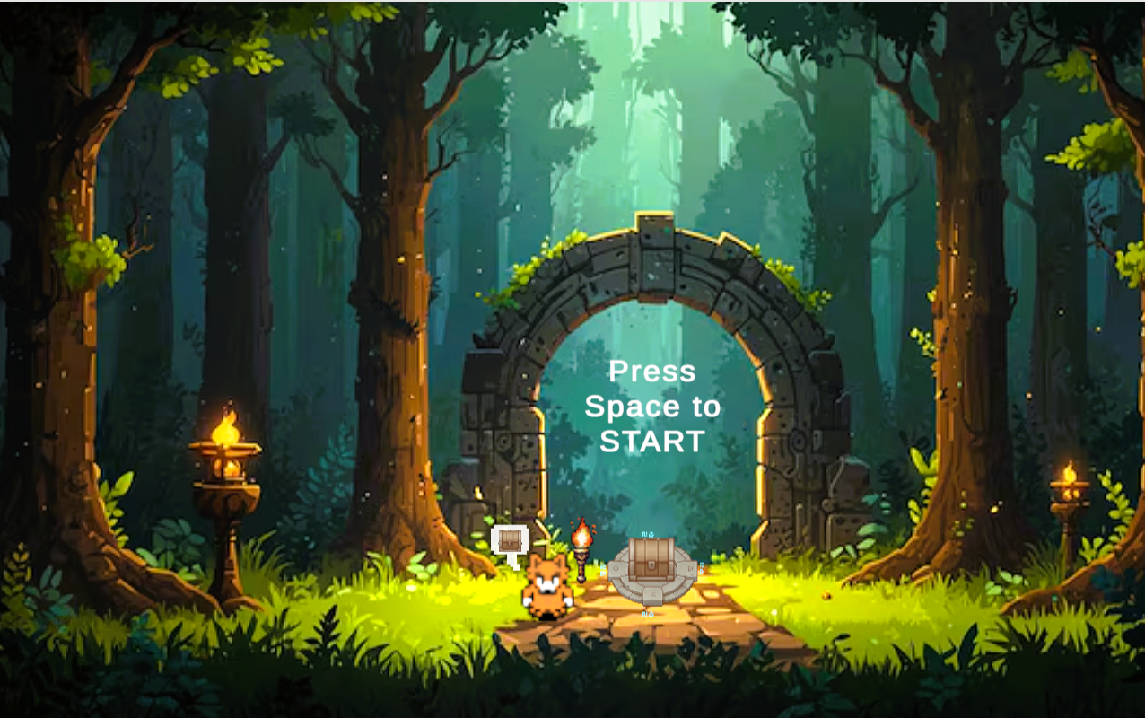
The mini tutorial at the start screen with the comment bubbles was a cool approach that I liked to see. The actual gameplay itself was fun and I liked the mini mechanics of the portals and boxes. I'd would enjoy myself playing this game with more mechanics and more levels
There was a lot of content in this game!
The game has a unique aesthetic (BGM, sound effects, graphics) that is pleasant to experience. The starting menu requiring the player to interact with the chest is a pseudo-tutorial that helps players understand the primary mechanism of interacting with chests and is more unique than a simple click-button-on-UI-menu scheme.
The map design is very good, player hase to search way to open the portal. Interacting with the switchers make me try to plan a better route.
I love the ambience! The lighting makes it so immersive and the fox is really cute! The box pushing mechanic is nice because it helps the player know where they've already explored.
I love not only the the overall game design, but I also thought that the level design was carefully considered. I specifically enjoyed the portal and gate features and how they really increased level complexity. That being said, there were little instruction on what exactly to do and where to go, but if I had a lot of time, I could easily see myself getting lost in this.
Straightforward, teaches the player mechanics about levers and portals well.
I liked the light mechanic of this game is set the scene well.
========================================
What could this game have done better?
****************************
I think the introduction in the start menu can be set more clearly, maybe change the menu to a top down view.
The doors having a 'close timer' as well as the slow walking through vegetation sort of felt like I was being timed in some way, which conflicted a bit with the chill ethos of the game. Without a mini-map, doors remaining open is a great indicator of 'oh, i've been here before,' which can otherwise be confusing. Also, introducing the concept of an empty chest as the very first chest the player encounters made me think there was a bug with the chest itself. Maybe a particle effect denoting that the chest was empty would fix this. Overall fun game!
It was a bit difficult to find all the potions. I understand that that's the intention of the game, as it is a dark maze, but the game can become frustrating when you're only missing one potion and you've found the exit... Maybe add a compass near the exit so that backtracking doesn't feel that terrible? Or, add a small minimap that needs to be filled in as you proceed. I feel like this latter method would be extremely satisfying.
Both the first and second level's sizes are very spacious, and without some minimap or other orientation system it becomes increasingly hard to keep track of where a player has been before. The portal mechanism has potential, but it feels seldom used in conjunction with the large map sizes. Having an orientation or marking system to let players identify where they've been before, or reducing the map size, may alleviate these issues.
Pushing blocks might be replaced with something more interesting.
Definitely could speed it up somehow, make movement more smooth? the maze is huge and getting around takes a while, also i feel like the box pushing is a little annoying to do because it takes a while.
One thing that was confusing from the jump was the on screen instruction on how to begin. However, once I got into the first level, I definitely got the hang of it. In the same light, I think that the instructions in the levels are a little bit unclear. Some instruction would have been nice to solidify my understanding of the objective. One other small thing that I think could have been cool to include is making sure you toggle the gate switches from the appropriate side. Currently, a simple collision does the trick, rather than doing only one side.
Overall, I must restate how impressive this game was. It was executed well, and I think that it place a clear emphasis on the focus of the week: level design.
The map can be made smaller as the gameplay is very repetitive, if completion time takes too much time it get's boring after a while.
I think the game map was a little too large as a lot of time was spent just moving around.
Leave a comment
Log in with itch.io to leave a comment.