Play game
Make Your Choice's itch.io pageResults
| Criteria | Rank | Score* | Raw Score |
| Visual | #5 | 3.834 | 4.200 |
| The uniqueness of the idea | #6 | 3.469 | 3.800 |
| Technical implementation | #6 | 3.469 | 3.800 |
| Game design | #6 | 2.739 | 3.000 |
| Overall | #7 | 3.396 | 3.720 |
| Relevance to the topic | #10 | 3.469 | 3.800 |
Ranked from 5 ratings. Score is adjusted from raw score by the median number of ratings per game in the jam.
Judge feedback
Judge feedback is anonymous and shown in a random order.
- Relevance To The Topic: Very straight forward and good. Pick one out of two choice by jumping on the button. Technical Implementation: The game loop is complete which is great. Navigation of character over the block is difficult. Though the thing to consider the most is selection of the Lego piece. Since line trace seems to have been used. It feels very fidgety. Length of line trace can be changed a bit to make it feel better. Similar issue is felt with placing the Lego block over the piece. A grid system could have been implemented. Where you pick a block to place new block on, and then move it as needed before placing. Game Design: Over all game is there. The fun part of the game is piling up Lego pieces over each other and forming the path. A few things were either not implemented or not thought of as design so I will mention it here. There is no direction or clues towards which choice would be wrong or right. If the game is luck and is to be repeated, randomizing the right choice would be good to implement. Alternatively, the level where the player begins and which levels are picked can themselves be randomized. The consequence of the choice does happen on the next level though it might be fun to let it persist through upcoming levels to make a combination of effects. Visual : Plus: Menu looks great and inviting. The sound of menu and in game is energetic. Creating feeling of a fast paced game. Minus: Text explaining rules should have a more solid background. Text should always be made easier to read. Over all the game itself represent what it wants to do and that is really good to see. There are tweaks that can be done to improve the iteration of the project.
- The game made a good impression. But the cubes sometimes stuck out of the wall. And, unfortunately, the rules didn't help me figure out how to get through the level.
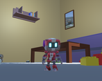
- Игра выглядит отлично. Интерьер комнаты (и небольшие размеры протагониста) напомнили мне Katamari Damacy. Но я так и не разобрался, что, собственно, нужно делать. Инструкций очень много, и все они преподносятся сразу, причём трудно читаемым мелким чёрным текстом. Было бы неплохо сделать небольшой интерактивный туториал, и поэтапно там показать, как обращаться с блоками, и в чём вообще цель игры.
- First impressions - cool music and gameplay fits the theme, but instructions are long and over-explaining - this makes them even more confusing than the gameplay itself is. Jump doesn't seem to work and game gives no hints about jumping/stepping on a block deactivating the block. Graphics look nice but movement is a bit janky. When I finally figured out how to match the blocks together with approaching the white block I had already built a falling tower on... this only happened thanks to the the game showing me blue hint blocks at this point and a text suggesetion about middle mouse button. This should really just be condensed into the "how to play" to avoid people having to figure it out too long. A challenge is not rewarding when it feels confusing. After this, the instructions started to make sense too and the game became solvable and fun. It feels like something to come back to and play again.
Leave a comment
Log in with itch.io to leave a comment.


Comments
No one has posted a comment yet