Play game
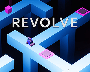
Revolve's itch.io pageResults
| Criteria | Rank | Score* | Raw Score |
| Creativity & Attention to Detail | #1 | 4.286 | 4.286 |
| Presentation Quality | #1 | 4.286 | 4.286 |
| Overall | #3 | 3.607 | 3.607 |
| Uniqueness & Innovation | #5 | 3.571 | 3.571 |
| Documentation Quality | #7 | 2.286 | 2.286 |
Ranked from 7 ratings. Score is adjusted from raw score by the median number of ratings per game in the jam.
Judge feedback
Judge feedback is anonymous and shown in a random order.
- Documentation only found on portfolio rather than upload with project Nice idea for a mobile project perhaps
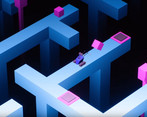
- No documentation in submitted files - lets down an otherwise brilliant submission - simple fun premise that expands as it goes along and delivers satisfying puzzle gameplay - art style is distinct & looks polished - presentation is great, some minor QoL improvements needed (click driven travel won't go around corners for example) & some additional audio polish but otherwise very good project.
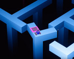
- Really nice little game, however I found that the overall pacing was off. It felt like new mechanics weren't introduced quickly enough to keen me engaged at the start of the game. This game felt a lot like Monument Valley, which is why I didn't give it too many points for innovation. I couldn't judge the documentation because there was none available to download.
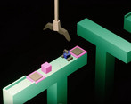
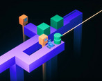
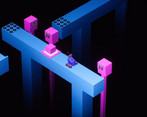
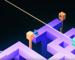
- First of all, this is really fantastic and nicely done! Here's some feedback about the game from design perspective: - Freezing the character's animation whilst other animations are playing is frustrating - would prefer if feedback was faster (e.g. jumping on and off a button would immediately reverse the animation, being able to move whilst switches and blocks are moving - LIKE ON CHAPTER 3, LEVEL 2 - THIS IS IDEAL) - End level tile could be better signposted - Nice Monument Valley feel - Exit is represented by a hamburger menu - Time remaining mechanic introduced very suddenly without warning - Nice click effect on where the player is going - Sometimes pulling levers does not do anything and have to be pulled twice - Nice idle animation on character - Secret Gem medal is presented as having already achieved it until we see that it gets ticked off. - Nice transitions between game and level selection - First cube level is VERY good as it forces players to learn how to push the cube off the edges - Camera does pull back automatically to show important items which is nice, but it would be nice if the player could have a bit more control over it - UI Bubbles are very nice I couldn't find any documentation in the game folder, so sadly got to note this as one star. In summary, great job! This game has a lot of attention to detail with a great focus on the presentation. Polish is almost top notch and I loved spotting all the little bits of detail in there. I'd love to see what you could produce with a team!
- Simple entertaining mechanics executed well, the art was polished and consistent, tools pop ups were informative but blocked the screen and obscured stuff for too long before dismissing. Pathfinding could have been more robust to allow for better one click movement.
Portfolio Website
http://www.timbeedall.com


Leave a comment
Log in with itch.io to leave a comment.