Play asset pack
Project V: Sin Seed's itch.io pageResults
| Criteria | Rank | Score* | Raw Score |
| Storytelling | #1 | 3.500 | 3.500 |
| Presentation Quality | #5 | 2.000 | 2.000 |
| Visual Appeal | #6 | 2.000 | 2.000 |
| Creativity & Uniqueness | #6 | 2.000 | 2.000 |
| Overall | #6 | 2.375 | 2.375 |
Ranked from 2 ratings. Score is adjusted from raw score by the median number of ratings per game in the jam.
Judge feedback
Judge feedback is anonymous and shown in a random order.
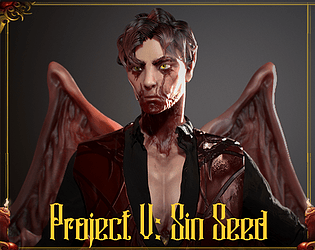
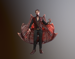
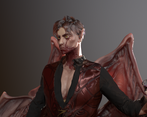
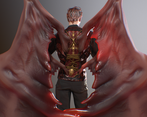
- Being in concept art, I would expect the 3d aspect to be less helpful if this was going to a character 3d artist to make because of this it looks like you have spent a lot of time in the 3d stage and that is the weakest aspect of this model, spending more time in understanding materials, details from macro to micro and defining the concept much further would make this piece far more concrete. When getting into 3d there is a massive emphasis on anatomy, materials and understanding micro detail for skin/textures and general quality. To touch lightly on feedback for the character, the cheek bones are far too high, the skin is rendering a little too much like plastic and the hands appear very tube like, the poses looks very stiff and forced.
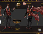
- Its great that you're working through the entire pipeline, it should demonstrate to you how the base concept design informs the final model and the sort of answers you need going into the modelling stage. Conceptually you made a lot of decisions but its not clear why you made those decisions - there isn't a written brief to explain what you were setting out to do. As character mesh the quality is very low compared with industry standards but you have achieved a great deal to get to where it is at, there is not a consistent style in the proportions, texturing and materials. Some elements look like they are realistic and others more stylised. The concepts need to answer questions about each of these aspect of the final piece. Avoid using complex and serif fonts for informative text, keep it clean and simple.
Portfolio Website
https://lucaspopovici.artstation.com/
Leave a comment
Log in with itch.io to leave a comment.


Comments
Great attention to detail on character especially the wings. A lot of research has gone into what textures are most effective.