Play game
Thorn (Fan Art)'s itch.io pageResults
| Criteria | Rank | Score* | Raw Score |
| Presentation Quality | #4 | 3.250 | 3.250 |
| Mesh Quality | #6 | 3.000 | 3.000 |
| Overall | #6 | 3.000 | 3.000 |
| Material Quality | #7 | 2.750 | 2.750 |
Ranked from 4 ratings. Score is adjusted from raw score by the median number of ratings per game in the jam.
Judge feedback
Judge feedback is anonymous and shown in a random order.
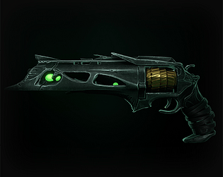
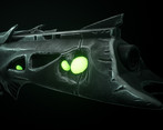
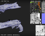
- Modeling needs some serious work. The model overall is too soft and has way too many edge loops. Serious optimization is needed for use in-game. I am not sure of the intentions of the model but it looks stylized overall. Use as much reference from the real weapon as possible. Your materials look very stylized. Further study of PBR is required, overall the material definition just isn't there, the edgewear is applied very heavily and all over the model, again I encourage you to take a look at how the weapons are inside the game to study how bungie approach their materials. The presentation looks okay. I would advise not using a pure black background for presenting. Try to mix it up with a blurred HDRI or even a small scene.
- Mesh The mesh itself looks pretty good and has a good sillhoutte, looking at the original destiny weapon however, it feels like there is a lack of detail, however this could be due to the material setup which I will come onto further down, the mesh and edge itself seems fairly clean for an almost organic weapon, which is good, and you have a consistent poly size which will help a lot with texile density and general pixels per poly. My main concern is how this is a 25k tri weapon. It feels like there maybe a lot backfaces internally on you gun as the wireframe does not look like it should be that high and even then you could perhaps remove some of the loops while retaining the same edge flow. While 25k is not abnormal for weapons in games, it looks like you could for sure make better use of the mesh. Material I feel like you are loosing a lot of detail from the material setup, the texture density is way too low, this looks like in part due to there being a lot more mesh existing than you can see, which is lowing your texile density and use of UV space. It also looks like your texture resolution is much too low, a game like destiny would probably use multiple 2k textures for weapons at the very least. You could also use multiple material ID's and break the cylinder off onto another texture sheet, and have that have its own material entirely. Presentation Your presentation is fairly good, although would recommend not having a perfect black background, as it makes it a little harder to see the mesh. I think you have the right idea for lighting, it should be brighter however, as the whole weapon looks a little dark which is adding to perceived lack of detail. I think you have done a fairly ok job, but you just need to crank up the texture res and remove some back faces.
- Great attention to details matching the original from the game, with major scratches in the same places and large features such as the contours of the holes/spaces and embedded organic like sections. The UI matching in the scope/down sights from the first person view is great to see, it shows your planning this asset for its use in-game and not just aesthetics. Presentation and breakdown are through, showing topology count, wireframe, and materials used, it could be improved with some more interesting/styled font and information regarding the resolution of the textures used. Your textures are a bit soft, edge wear especially which is muting some of the finer details that you have included in the sculpt/normal. Compare this to the original which is sharper in its edge wear, this is very apparent in back of the weapon close to the player view in the first person where the curvature details can be seen blurring into one another Topology is good in the flowing areas where the weapon is more organic but could be cut down by separating the mesh into elements in areas like the rail running along the top. It is a shame there are such a limited number of shots from different angles, an addition for future that would be interesting to try, rendering a similar angle to the in-game stat screen for the original weapon. Try to include information regarding yourself on almost all your renders, so images of your artwork can be traced easily to you or easily searched, such as a bar at the bottom containing your name, project title, portfolio link, etc.
- Striking piece of work! Mesh wise you've really captured the proportion and feel of the real asset. My feedback is more around the sculpt which lacks a little detail and refinement. Overall its a little soft and capturing some more hard edges in the sculpt will make the whole piece feel much higher quality. Also the Retop of the piece is not quite there yet and the LP mesh is still too highpoly for a game asset. The materials are solid and really create an atmosphere, the edge wear is a little too consistent and adds to this soft feel. Some more sharper details in the texture will show the resolution a little better and give it a more High res feel without the extra cost. It's presented well and although we usually refrain from presenting on black (or dark) you've done it in such a way to created atmosphere with the glow and backlight. Awesome work!
Portfolio Website
https://www.artstation.com/thespode
Leave a comment
Log in with itch.io to leave a comment.


Comments
No one has posted a comment yet