


Play game
Homelands's itch.io pageResults
| Criteria | Rank | Score* | Raw Score |
| Documentation Quality | #2 | 3.250 | 3.250 |
| Presentation Quality | #2 | 3.750 | 3.750 |
| Creativity & Attention to Detail | #2 | 3.500 | 3.500 |
| Uniqueness & Innovation | #2 | 2.750 | 2.750 |
| Overall | #2 | 3.313 | 3.313 |
Ranked from 4 ratings. Score is adjusted from raw score by the median number of ratings per game in the jam.
Judge feedback
Judge feedback is anonymous and shown in a random order.
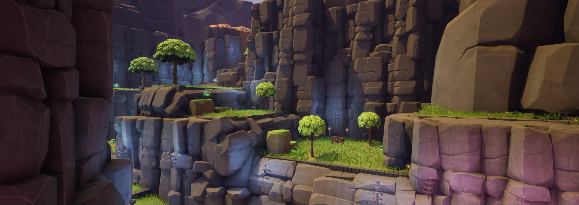
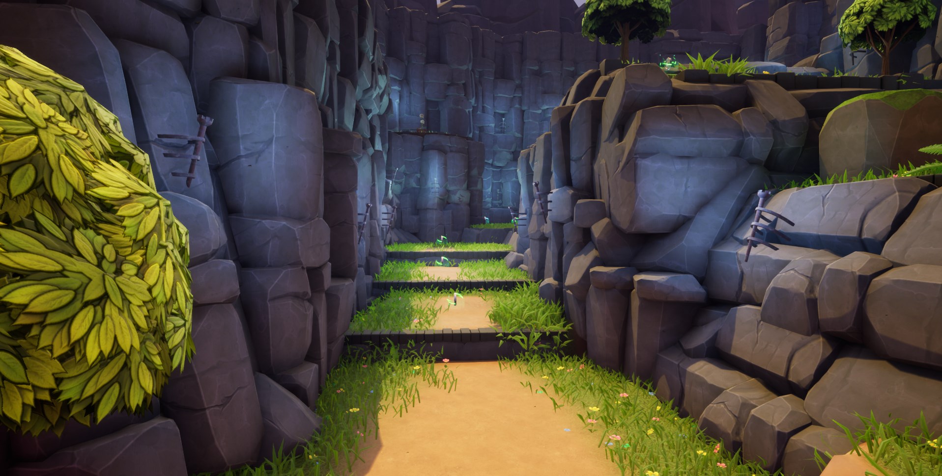
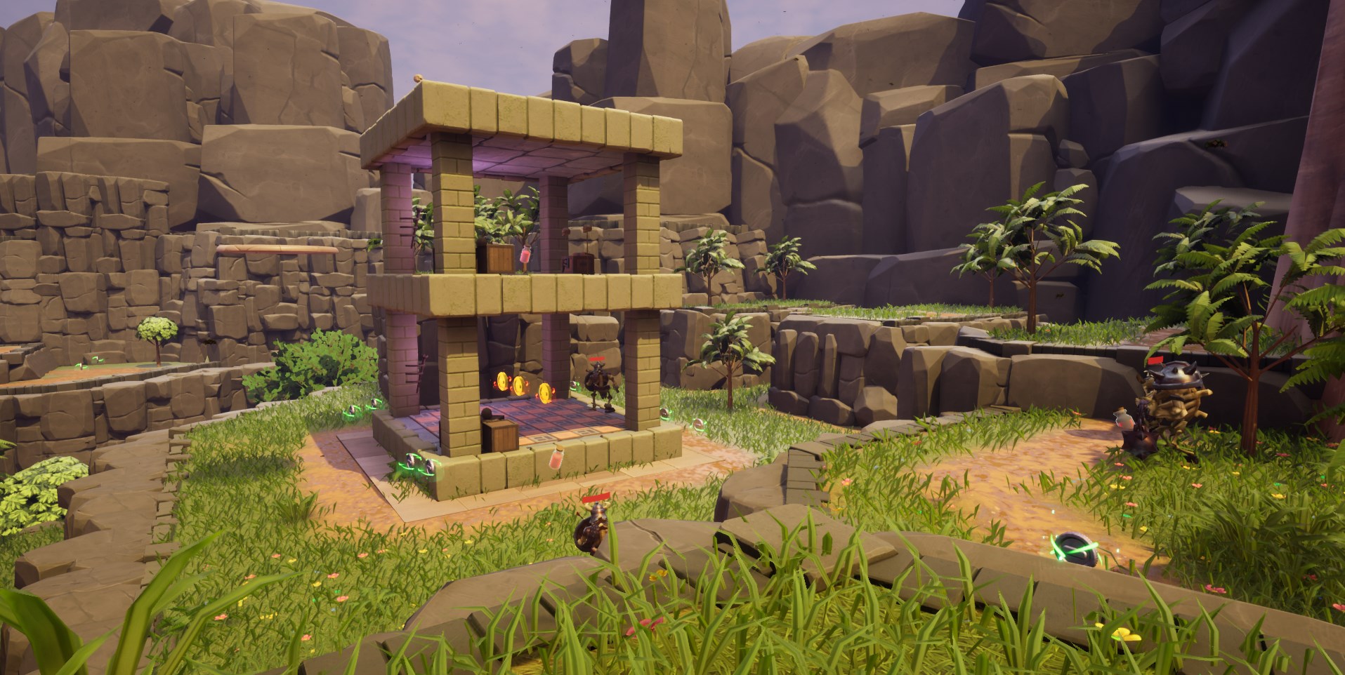
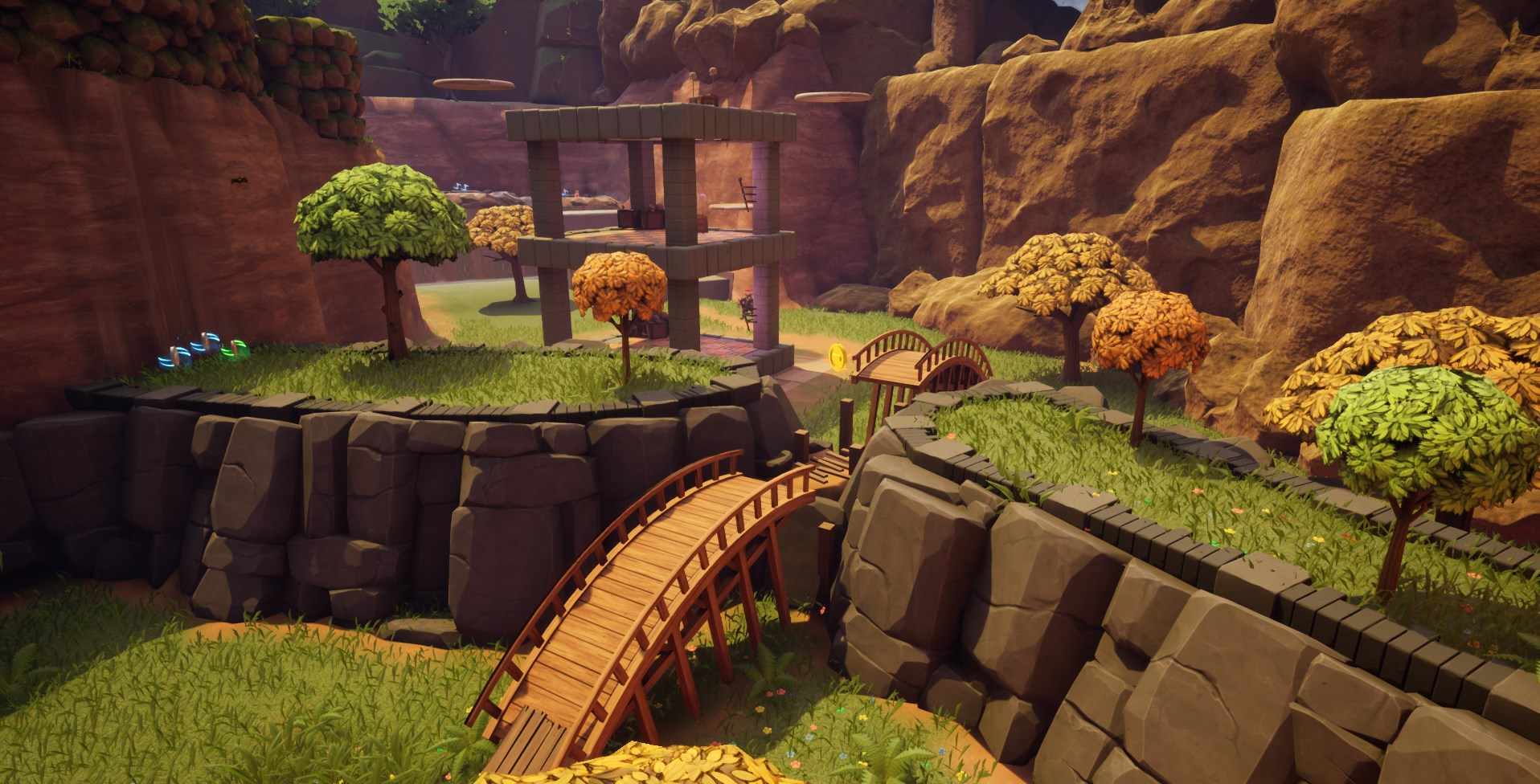
- I imagine the loss of your additional levels as part of Homelands had a large impact on your final product, but the fact you was able to realized the reality you faced regarding time and scope on this project and was able to course correct before it was too late is deserving of praise. With the final submission we have in the end, the shipped level that you have provided does for me, show your strengths and where you can improve further. The first of which I wanted to pay notice to is your critical path, which I feel you have done well with, one common pitfall I do find with projects in this genre is a tendency to create an open map which while it has chunks of interesting spaces, struggling to connect themselves to eachother to create a cohesive whole. In the case of homelands, establishing your critical path in my opinion has been very beneficial, creating a spiral type path that slowly ascends the map until you've collected enough loot in order open the exit. Which was a loop that I fell into naturally when I played the level blind for the first time. I feel the placement of coins could play into your critical path some more however, as I had unlocked the exit cutscene when I had only just dropped down into the magma core, as there were plenty of gold coins waiting at the top of the cave, I feel either moving coin placements or upping the requirement another 100-200 would help that flow out of the critical path, as you are closer to a vantage point that you can get your bearings from after hitting the goal, rather than still being deep underground. - The rest of your documentation on the level design is quite comprehensive, two segments I'd like to call out as positives being your flow map and the platforming breakdown A paragraph each detailing the motivations and intentions behind each main section of your map helps me to understand what you was looking to achieve, and I feel overall you was able to do so effectively There were some useful elements from your early tutorial that you detailed in your documentation in this area, such as the use of yellow paint to indicate areas that need the full jump combo in order to clear, although I don't believe I saw any instances of this being placed in the rest of the map, which would have been very useful, for example the four sliding blocks area area 6 where the final block requires that combo, having a decal placed there would be very useful. - Looking at some of the smaller spaces, there are a few minor feedback points I would like to give you on the level itself - Moving platforms are more difficult to time jumps onto than usual as there is a lack in a delay between reaching each endpoint, so there were times with the vertically moving platforms that I would fall due to waiting for the platform to reach the bottom before jumping, where in reality I need to jump much earlier to make it on before it's too high up. - The full jump combo allows the player to clear an exceptional amount of space very quickly, depending on the vantage point, you can essentially fly over the map and skip many obstacles doing this - For example I could use the full jump combo in order to clear the fake floor leading to the magma core in order to open the two inaccessible chests on the other side - Understanding your movement system is important in the structure of your platforming challenges, for example, tempa takes a lot of time to change momentum when in the air, making precision jumps more difficult, especially on platforms tightly packed together. Which lead to the ruins being one of the more uncomfortable areas to navigate, due to largely consisting of small platforms packed closely together.
- So I had a lot of fun exploring this level and wanted to keep exploring every nook and cranny trying to find all of the coins. The documentation however was a bit of a mess with lots of overlapping images and images stuck in the middle of text making it hard to read. Level feedback: + Pacing on teaching players new techniques felt good with a small section after each tutorial so players can get used to the techniques - I was able to make some of the jumps which needed the jump, dash, double jump with just the double jump. But I'm sure this could be easily remedied with more playtesting and time + Exploration was great, the level flowed well and I think I pretty much followed the critical path showed in the documentation exactly. I never felt lost and managed to explore all areas fully (to my knowledge) - There was some slowdown when first entering the more open area of the level, might have been rendering too much of the map but this is a minor negative really as it could be optimised + Use of height was great, plenty of movement up and down even if you took the towers out of the equation + Good use of the different moves in different areas to keep things fresh Documentation Feedback: + I was happy to see a timelapse of your progress - However, it was hard to keep track of the changes you made since the timelapse kept switching locations. Keep the camera in relatively the same place and show me all the changes for one section, then show me the next section. + Gameplay video was good + The trailer showed off most of the gameplay and teased some new areas it seems you didn't get chance to finish, but they looked interesting and showed some nice little puzzles and environmental challenges - However, the constant fade to black was annoying. It would have been nice to see some of the gameplay section uninterrupted. I'm not sure why there's so many fades to black? - As mentioned the documents have images all over the place. I'm opening them in both open office and Word and it's a mess and hard to read text due to the images splitting up sentences. Shame as I would have liked to read more on it but don't have the time to decipher it all. General Feedback: - Keyboard and mouse didn't work for me but says it does in the instructions :( + It's nice to see all your setup in the documentation, seems a lot of work went into this outside of the level too - I died down in the lava section once and the respawn put me outside the map, I managed to get back into the level but was very easy to fall out of the world - Exit game button didn't work but that's minor - I noticed the smoke pfx start as I entered the big open area. Tip, start it sooner so players don't see the pfx start up :) Overall: I enjoyed playing the level and would have been nice to see the other levels had you had the time to finish them. I think it works great as a platformer level. It flowed well, I never got lost and you encouraged exploration. Would have been nice to see a special collectible hidden away like in Crash you get the 3 pieces of a character image to unlock a secret level to encourage exploration even more. I think the level does meet the requirements set. Thanks!
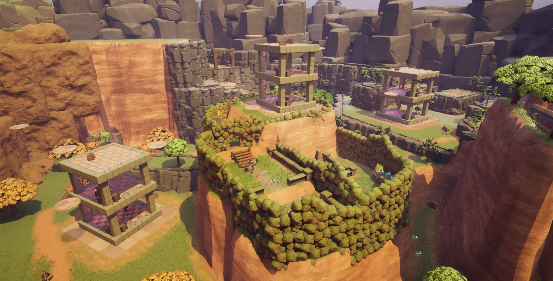
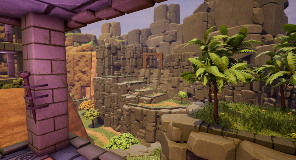
- Opening Thoughts Amongst the entries, this project really stood out at a glance for a few reasons. The first was the screenshots; each was nicely framed showing something that was interesting. Combined with the art style, this set a strong appeal and made me interested in playing. The other reason was the inclusion of video links to show the timelapse and intended playthrough. These are great because even with all the experience, Players still find ways to play games in a way you didn’t expect, so also showing the designers intended playtrhough is a great addition. Documentation - The amount of detail in the documentation was great; both in the Design doc and the LDD. Even before playing the game I had a great understanding of what the game was and how it should play, which is exactly how it should be. One thing I will say is there are chunks that sound more like a blog of how you’re going to achieve the work. It’s great to see this thought, but the GDD and the LDD should read more like a recipe book with detailed instructions of what the game/level should be. Imagine after writing the documentation that you were to hand it to someone else to make the game and you couldn’t have any further interaction. These documents should serve to answer any and all questions. It may be worth adding your thought process sections in a separate section towards the back of the document. - If I had to pick something to work on for future documentation, I would say the presentation and layout. The Table of contents is great, but when you’re in the thick of the document it’s easy to lose track of which section I’m under. The pages and paragraphs easily blur into one. To address this, I would make more use of sub headings throughout the documents, make them stand out more (in Word, you can use Heading 1, 2, 3 and 4 and even format them to how you like for consistency). Any important new sections, have them start on a fresh page so it’s clear this is something new. The header and footer tools are great for framing/detailing pages out too. For example, you use page numbers in the table of contents on your LDD, but then the pages themselves aren’t numbered (you do at least in the GDD). There’s a lot of different sized gaps between content which makes it look messy, particularly when there are multiple images such as the animation previews. For these I would add a table to the document and put them all inside. This will help uniform sizing and spacing much better. Content - It’s great to see the level introduced with a main menu. It may not feel like much but it makes a huge difference to the presentation. - When the level begins, I would add what the purpose of the level is. It’s explained part way through to me in a tutorial note but it would be great to know the importance of the coins before I’ve ran through a chunk of the level. - I like that the level starts narrow and linear, before expanding out into the wider, heart of the level. This is great for introducing the player to the mechanics of the game. The only thing I would add is that where you introduce a new mechanic, make sure you can only progress by successfully doing it. In most (if not all) of the cases where I was taught a new mechanic, I often found I could run past it or exploit part of the level. - Be careful with your metrics for jumps, particularly in a platform game. When you look at a ledge, before you get there it should be clear whether you need to do a single or double jump etc. In many cases I found myself jumping and only just not reaching the next ledge. This can lead to frustration and players think maybe they timed it wrong or hit it at the wrong angle. This also increases the chance of players looking for exploits and breaking your level. If a jump is double height for example, I would expect the ledge to come to my waist or above. - Following the note above I don’t think the dash jump works and I wouldn’t design the level with it’s inclusion. The name suggest it’s more of a thrust forward but it just gives you a tiny nudge up which when you build ledges with this specifically in mind just causes added frustration as per the previous point. - When you enter the main area you’re told you need to collect x coins to open the exit, but it’s not called out where the exit is. I would make this way more obvious in the design, maybe even include a cutscene that showcases it as you arrive. Making a bigger thing out of this could also give you a more distinct identity for your level. For example, maybe the exit of this is to enter a castle and when you enter the space this could be your focal point. The rest of the level can then take place skirting around the castle walls. Another nice touch would be the coin counter in world over the exit, re-iterating that the 700 coins is for progression rather than how many there are in the level. - The restart checkpoint feature was a really beneficial addition to the game. Something else I would have added is a reset level or return to main menu. I actually fell out the world in one playthrough and the checkpoint respawned me in a death loop. In order to restart or close the game in general I had to force close the game through windows. This isn’t a level design thing admittedly and it’s a good problem to have overall, but this is just one of them things that could be easily implemented and make a big difference to the accessibility. - Also on the point of checkpoints, it would be great to know where these occur so that when I choose go back to a previous checkpoint I know where I’m going. This could be something as simple as a UI notification, or something more elaborate like a flag/marker in the world that animates when you trigger it. Closing Comments Overall I thought this was a really strong foundation for a nice little game. You can see the love and effort that’s gone into it. If this was my project and I was to continue working on it, I would look at expanding the level with more visually unique areas (see the castle in the centre for example). If this is meant to be a more Spyro-like layout where you’re essentially given the free roam to hunt down coins, you want to know where you are in the level at all times. Right now there’s a couple of locations where it feels like you don’t know where you are in relation to the rest of the map. Great job though!
- Very Brief feedback of project Gameplay is fun and well presented to start with, so the goals outlined in the documentation are being met, however cracks start to show due to the scope of the project, scaling back and focusing on the best examples present in the level would go a long way to improving the project overall. That being said, good examples throughout of understanding of level design practices in the demo, student clearly knows how to set up good working examples of what they want, could just be documented a bit clearer in paperwork, but opening segment is a really good “tutorial”, that opens up into a nice fun playground for the user. Longer Overall Feedback of project Gameplay demo & playthrough video - These present a very tidy & presentable opening segment of this project, however the polish starts to fade a bit as you progress further along and small areas of conflicting quality of presentation start to add up to what looks like a case of “tried to tackle too much”. Which is a shame cause the opening chunk looks and plays well, if it was a bit shorter & more focused it would leave less room for gaps / issues to present itself and feel a lot more “final”. The opening segment covers traversal mechanics & the core gameplay loop of “pick up things” really well, but the end goal isn’t presented until you get into the big play space, and even then it’s not an immediate presentation, would really expect the end goal to be clear from the off. Again, solid piece, just lets itself down in places, but refining and tightening the experience to a more polished end result definitely looks achievable. Documentation & time-lapse video – The Documentation is functional but not very well presented / shown in an easy to read / navigate way. Has lots of information but no further breakdown to anyone just looking at it blind. E.G – Character movement – having the unreal data input values as a screenshot is good, but there’s nothing in there saying stuff to the effect of “Tempa has a wide range of character movement on both the horizontal axis, via walking around the environment via the use of the joypad. As well as the vertical axis, via the use of multiple jumping mechanics, such as the standard jump, double jump etc.” Basically just throwing screenshots out isn’t that intuitive. Is good to break down the points of each heading / segment. Same thing applies when we get to the pickups / world intractables, a table presenting this information would be a lot easier to read rather than images & text with no formatting. However all the information needed is present, just not in an easy to read manner. Time-lapse video & design document don’t show a lot of white boxing process (indeed, the time-lapse just opens up in editor with no white box at all) – this is something we notice being missing from a lot of portfolios / demos, good white box documentation goes a really long way. Research sections shows good understanding of the games being referenced but use of emotive language & lack of examples to showcase specific elements (e.g. – enemies, if you’re referencing Spyro a breakdown of rough enemy types in Spyro would be good, as it shows further understanding of other games mechanics that you are referencing.
Portfolio Website
http://www.shanetoye.com
Leave a comment
Log in with itch.io to leave a comment.
Comments
No one has posted a comment yet