


Play game
Adventurers house's itch.io pageResults
| Criteria | Rank | Score* | Raw Score |
| Demonstration of Technical Ability | #13 | 2.667 | 2.667 |
| Concept/Idea Realisation | #16 | 2.833 | 2.833 |
| Overall | #17 | 2.722 | 2.722 |
| General Visual Appeal | #18 | 2.667 | 2.667 |
Ranked from 6 ratings. Score is adjusted from raw score by the median number of ratings per game in the jam.
Judge feedback
Judge feedback is anonymous and shown in a random order.
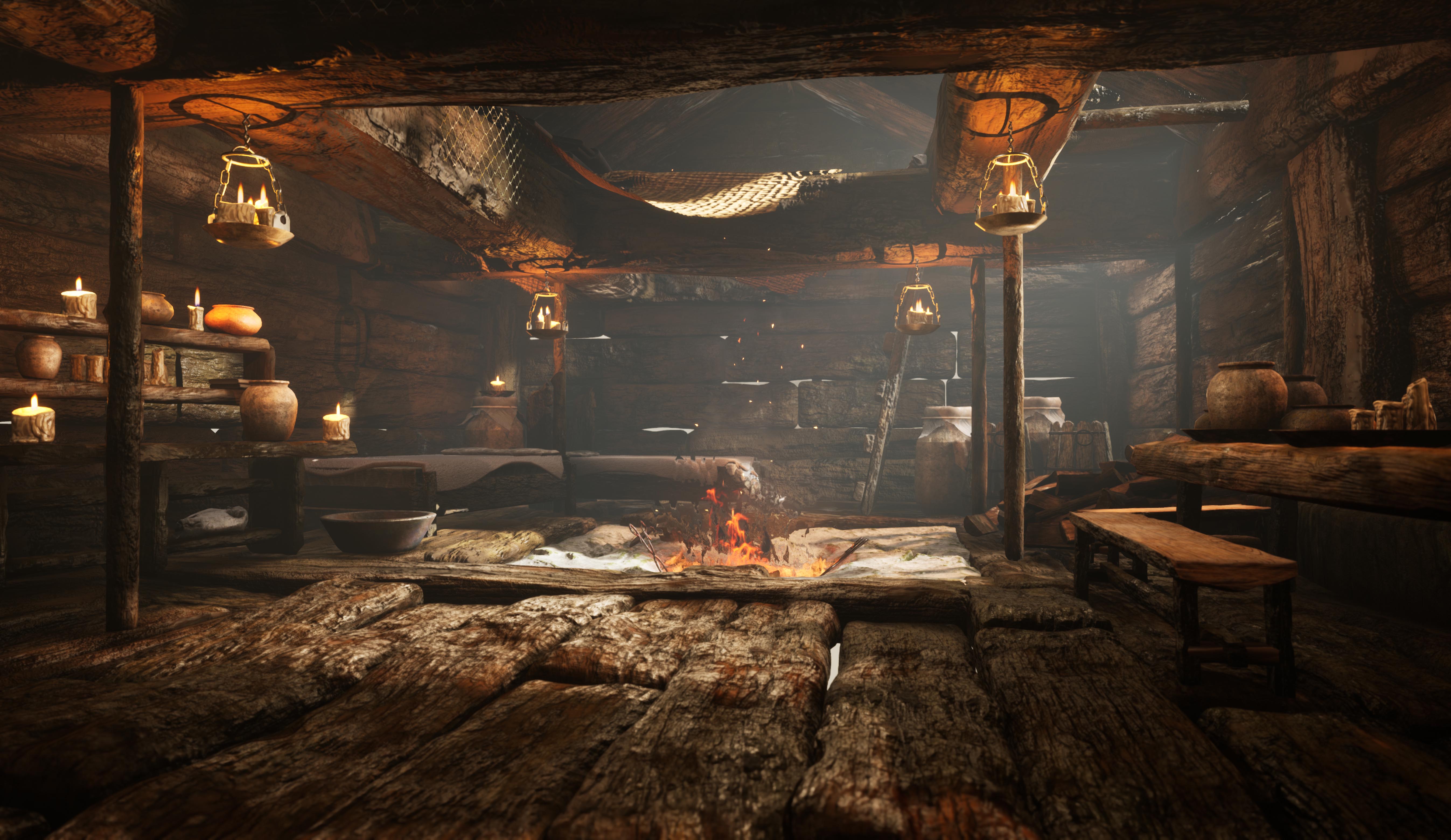
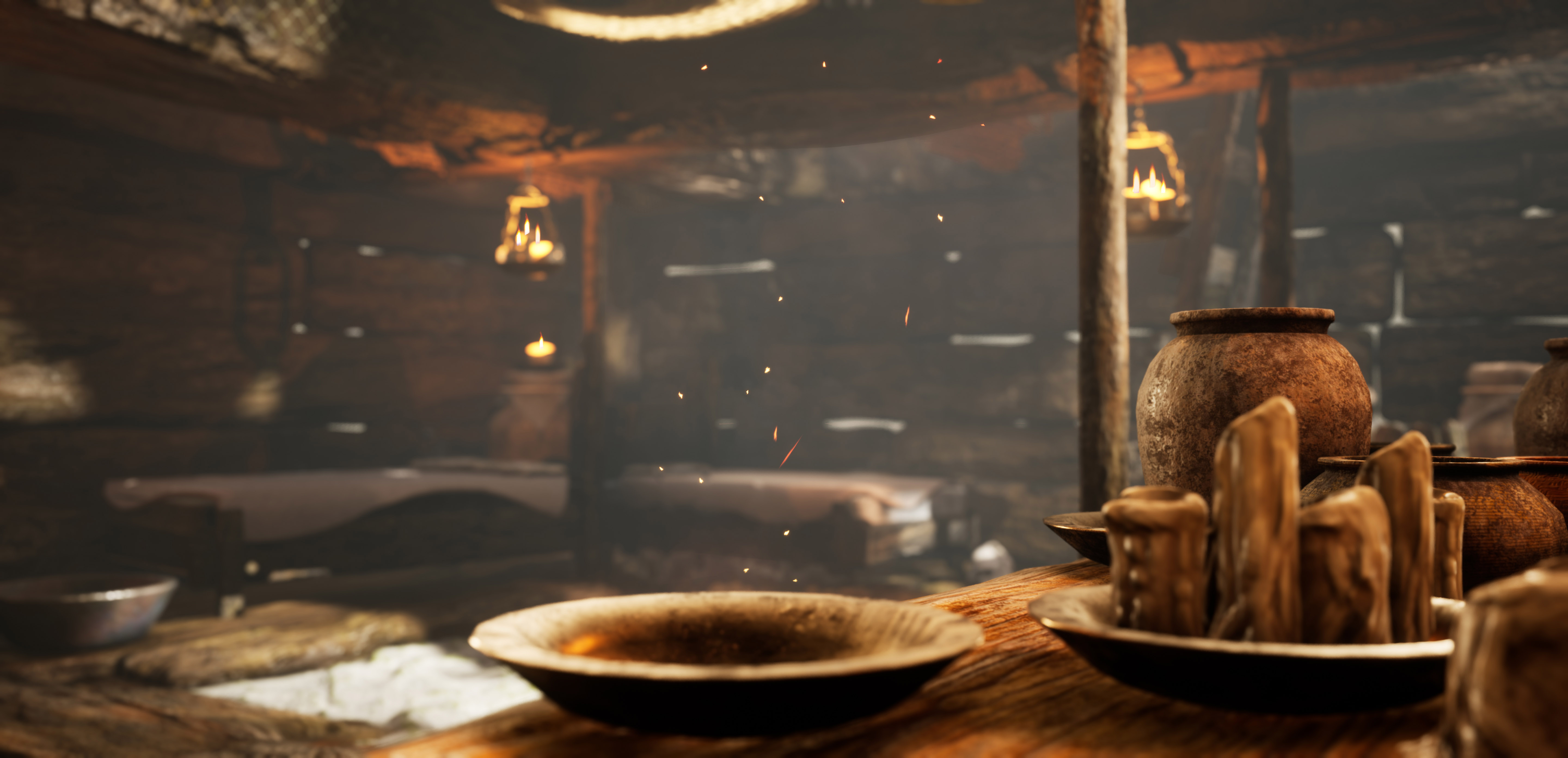
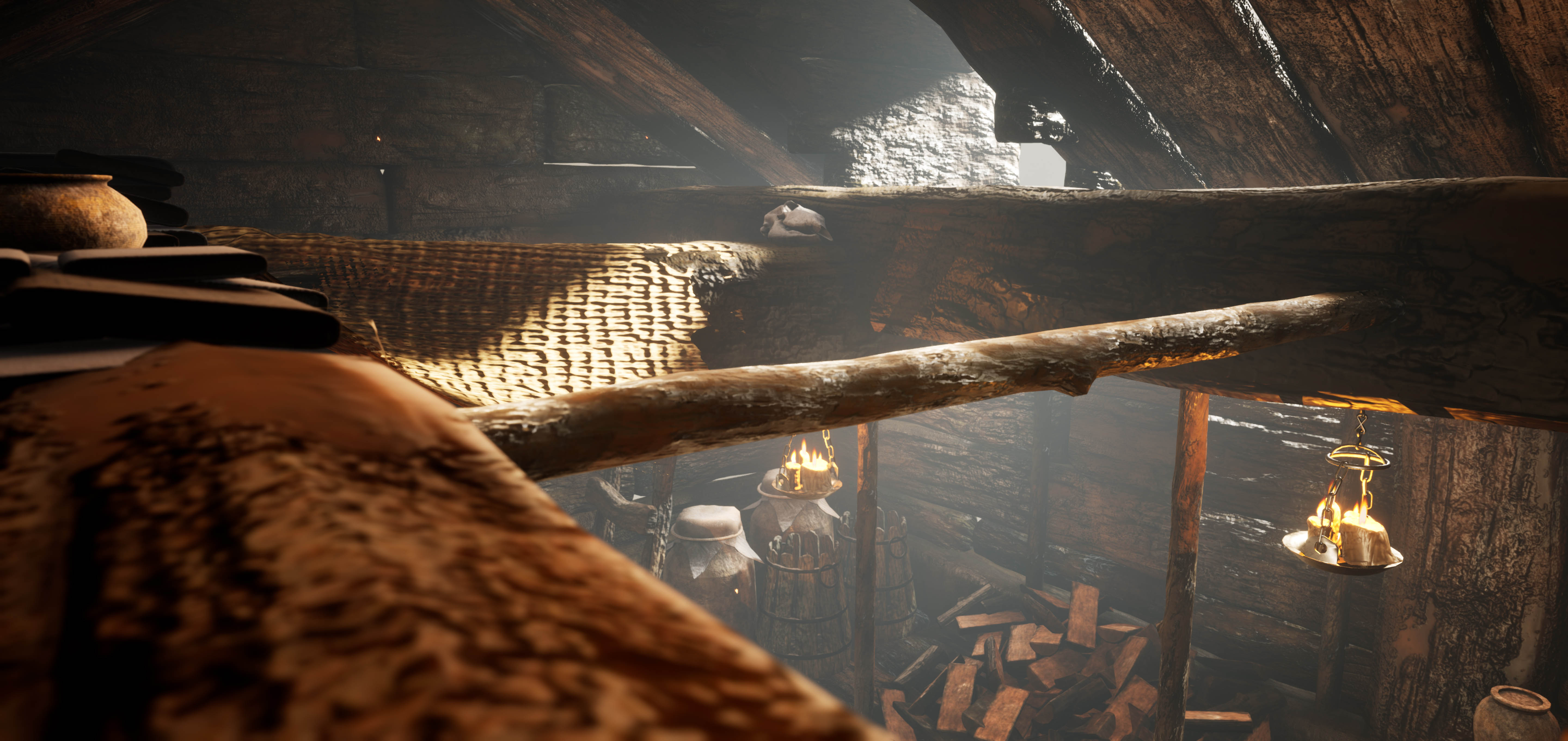
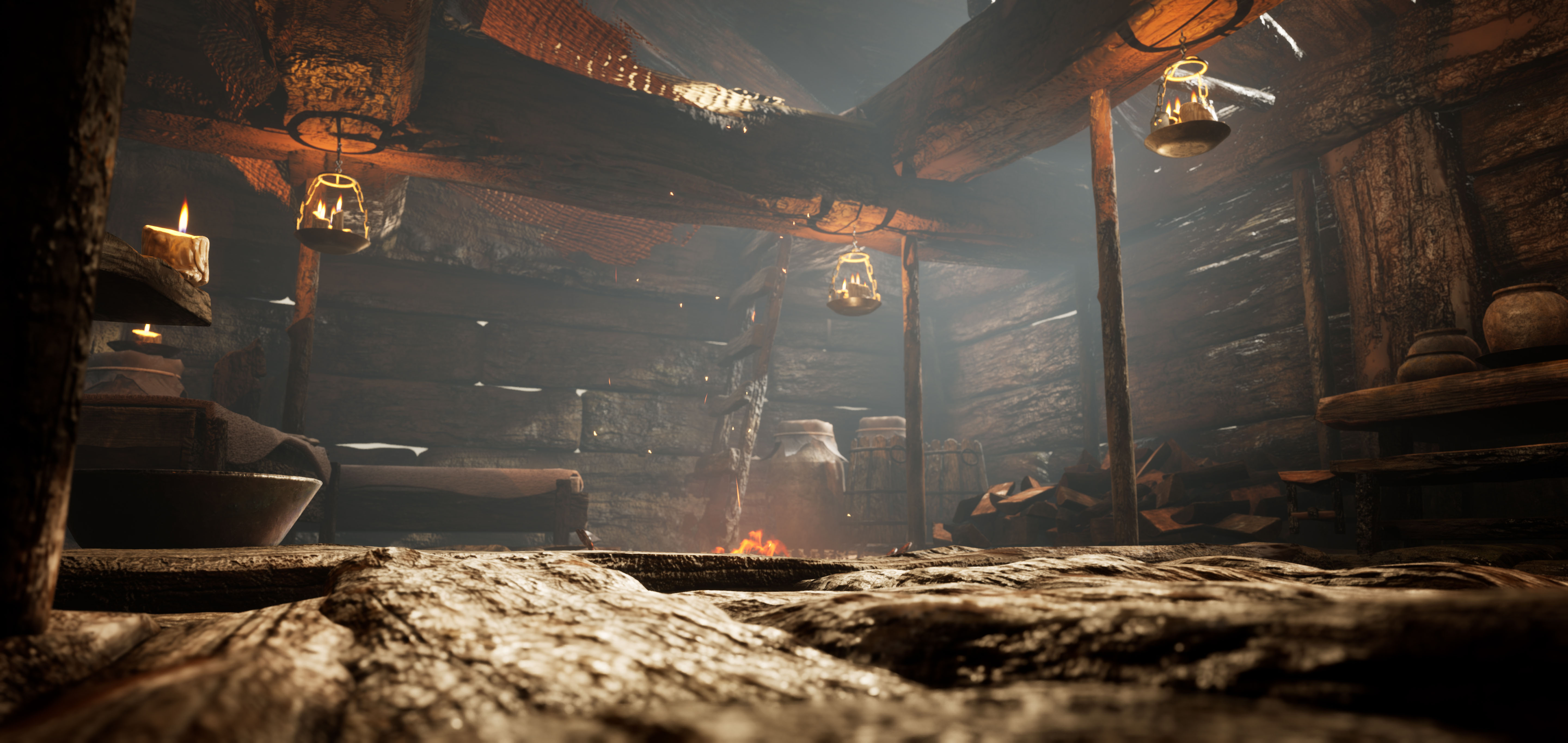
- You have captured the vibe and feel of Kratos' house well, however the scale and proportion feels odd. The beams across the ceiling are huge, and dominate the upper 1/3rd of your image, combined with the thinner uprights, it makes the scene feel top heavy and structurally unsound. However, your sculpts on the beams look great and play really well with the orange lantern light. It's great to see some breakup on the horizontal lines with some chips, damage and natural warping of the wood. It would pay off to bring some contrast into the scene by making the external lighting that is coming from beyond the cabin a colder blue to really compliment your candle and firelight. You would also benefit from pushing the contrast in your roughness across most of your materials. In the God of War environment, you can see some areas of wet wood, particularly near the door, there are also some places where the wood has worn smoother through use, all of this helps tell a bit of a story and also helps break up your roughness values and helps your lighting bring the best out of the scene. Your fire pit VFX looks great and the heat haze really works to sell the open fire feel.
- Bold move to take on Kratos' space in GoW! Did you know that in the actual game they only had a few materials to use due to memory budgets? Even the props (pottery etc) are built from the same wood material!
- The general mood is accurate to the game and well executed here but the scene is lacking in many aspects. The general level of propping is too low compared to the original and many important parts of the lodge are missing. Your scale is off on a lot of parts too, so be sure to spend more time in blockout until it matches the original. Take screenshots and overlay them to compare if you need. You have a lot of opportunites to introduce small story telling elements and inject your own take on the scene. Make sure to capitalize on them. I have done some paint overs for you. (Itch is shit, you need to copy and paste the links manually) https://drive.google.com/file/d/1nnkm53Rbg0LJL6_XJlw06nSG2CgTqvAZ/view?usp=sharing https://drive.google.com/file/d/1hrmfxdEHTydC7mhRGo8rLh6uT4dEX5vY/view?usp=sharing
- Looking good! I love the rustic and handmade feel you're given this with the irregular wooden planks for floorboards and walls. You've also done a good job making the place feel lived in - there's some nice clutter and you've got a good start on the environment storytelling. I would just take it even further! More pots! More candles! Discarded logs, fabric - all that jazz that makes Kratos feel warm and cosy (he... gets cozy, right?). I like that I can see through the wooden planks in the wall (I would just brighten up that exterior fog a touch, and dare I say... god rays?) - just be careful of allowing us to also see through the floorboards in the same way. When I have things like this I sometimes just put a plane there with a black fully rough material on it (gotta do what you gotta do) - just to stop light showing through. A tiling dirt material would also have worked here - it'll render basically black when you build lighting anyway! Nice work on the candle flames - they're beautiful. Don't be afraid to increase the Subsurface on your wax candles though - enabling subsurface profile is a fixed cost to performance so it's usually OK because we can predict the impact! If it's on... it's on so you can use as much as you want (shhhhh don't tell your tech artists). You have some really great material work here! Crank up the resolution a wee bit though - I think you could get away with a bit more. A good rule of thumb is 1k resolution for 1m or 2k for 1m if you're feeling brave or making a portfolio piece. Overall, nice job. 10/10 would start a father / son journey through a mythical landscape from here.
- - Too much post processing. Images appear blurry and have too much depth of field/Camera POV. - The Stone wall at the back, the blocks look too big, too soft and probably wouldn’t have huge gaps between them. Find ref for farmers ‘dry stone wall’. - Not sure if someone would build half their houses' walls with stones and the other half with logs. If they used stone anywhere, It would probably be the floor/around the fireplace. - Logs Supporting the roof look too thin and flimsy considering how big and hefty looking the roof joists are. They also look too straight and uniform. - The texture on the sheet thing hanging on the roof looks too low res. Not really sure what its supposed to be. - Logs for campfire want stacking. People don't live in mess. - Shelving wants revisiting. Probably need to be higher with room for bigger props. - Consider adding furs, antlers/hunting trophies, hanging herbs & other assets to give the scene a greater variety of textures & a sense of being lived in. - Add a Black plain underneath the floor. You can see out into the world through the gaps in the floor.
Portfolio Website
https://www.artstation.com/baylisbe
Leave a comment
Log in with itch.io to leave a comment.