

Play asset pack
The Last Call's itch.io pageResults
| Criteria | Rank | Score* | Raw Score |
| Demonstration of Technical Ability | #5 | 3.395 | 3.667 |
| Overall | #8 | 3.395 | 3.667 |
| General Visual Appeal | #9 | 3.395 | 3.667 |
| Concept/Idea Realisation | #10 | 3.395 | 3.667 |
Ranked from 3 ratings. Score is adjusted from raw score by the median number of ratings per game in the jam.
Judge feedback
Judge feedback is anonymous and shown in a random order.
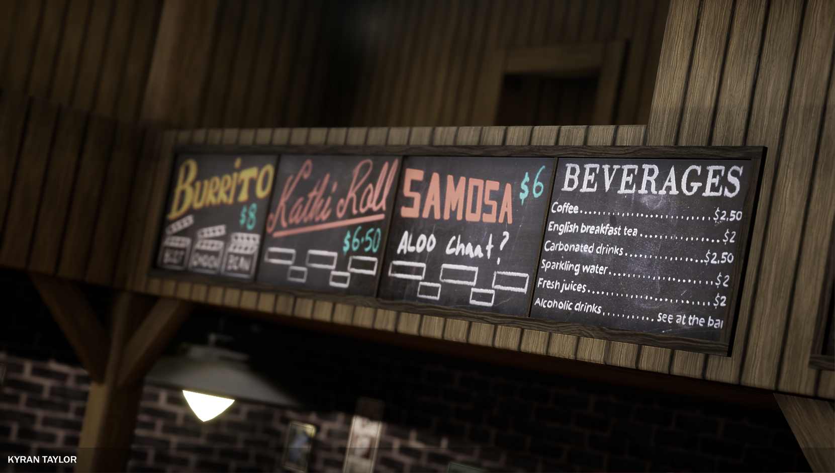
- This is a strong scene but is missing some easy wins. With some additional time and effort, this scene could land you a job no problem. You need to focus on pushing your story telling a little further. Think about how people use the space and invent a story surrounding that. Perhaps the owner loves hunting? What if the cleaning staff hated their job? How many times have you picked up a menu and not wanted to fold it =) Looking through the rest of your folio, it is clear you are improving quickly. There are a lot of small mistakes in your work that your not noticing, but are very easy to fix. Perhaps too much to go through here, but I suggest you get a portfolio review from Dinusty (google him if you dont know about him) or reach out to a few people you trust and try to get a detailed portfolio review. I have done some quick paint overs to show you what I mean though. (Itch is shit, you gotta copy and paste the links yourself) https://drive.google.com/file/d/1NUDkGZFJRXuI_VynE77szPskOsr2nB_5/view?usp=sharing https://drive.google.com/file/d/1QQO2MvTgYyT2LEXnLGxBzx3FLl0NrrwZ/view?usp=sharing https://drive.google.com/file/d/1NSAVOToqESGOLay6hUUBVweQfj8tuV_m/view?usp=sharing Continue working and improving! Look forward to see you progress, Kyran.
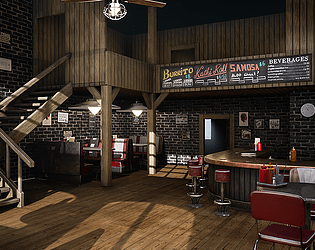
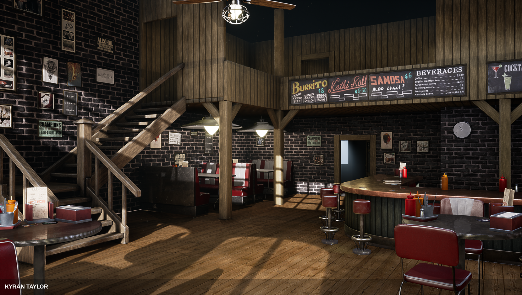
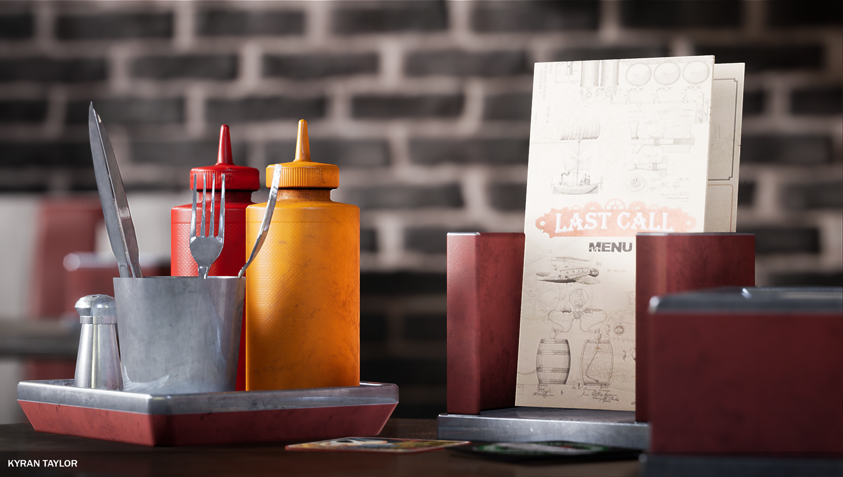
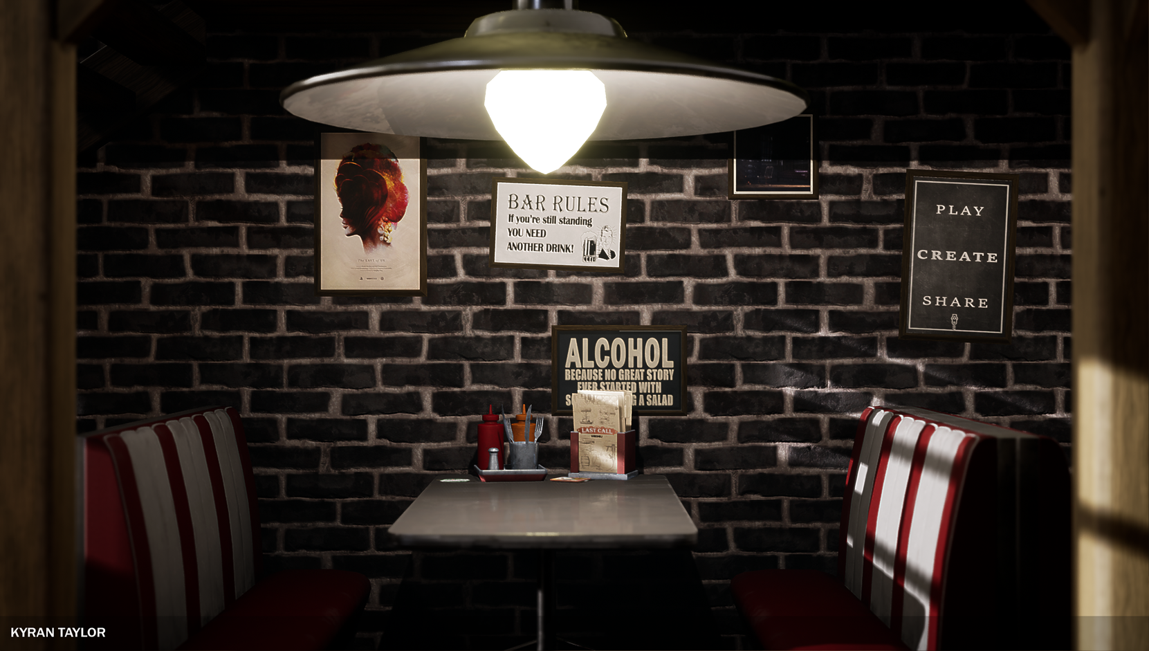
- I want to eat here, $8 burrito's what a bargain! This piece has some great use of lighting - my eyes are lead around your hero piece really nicely - I look at the booths, then through the door and the bar, round to the stairs and up at the sign! Nice work! You have some really lovely details - the ketchup and mustard bottles are oddly satisfying to look at! They feel very real! Also nice work on lining up your planks of wood realistically - I know that's not easy sometimes when you're using tiling textures so awesome job. It's also nice to see some movement with your dust motes and the fans! I think all I would do is dress your top floor and through the door on the bottom floor a little more - it's good to have spaces to allow your eyes to rest but they feel like they're missing something for me (closing the door on the top floor might do it? Or a toilet sign point down the corridor might be cool). Awesome job.
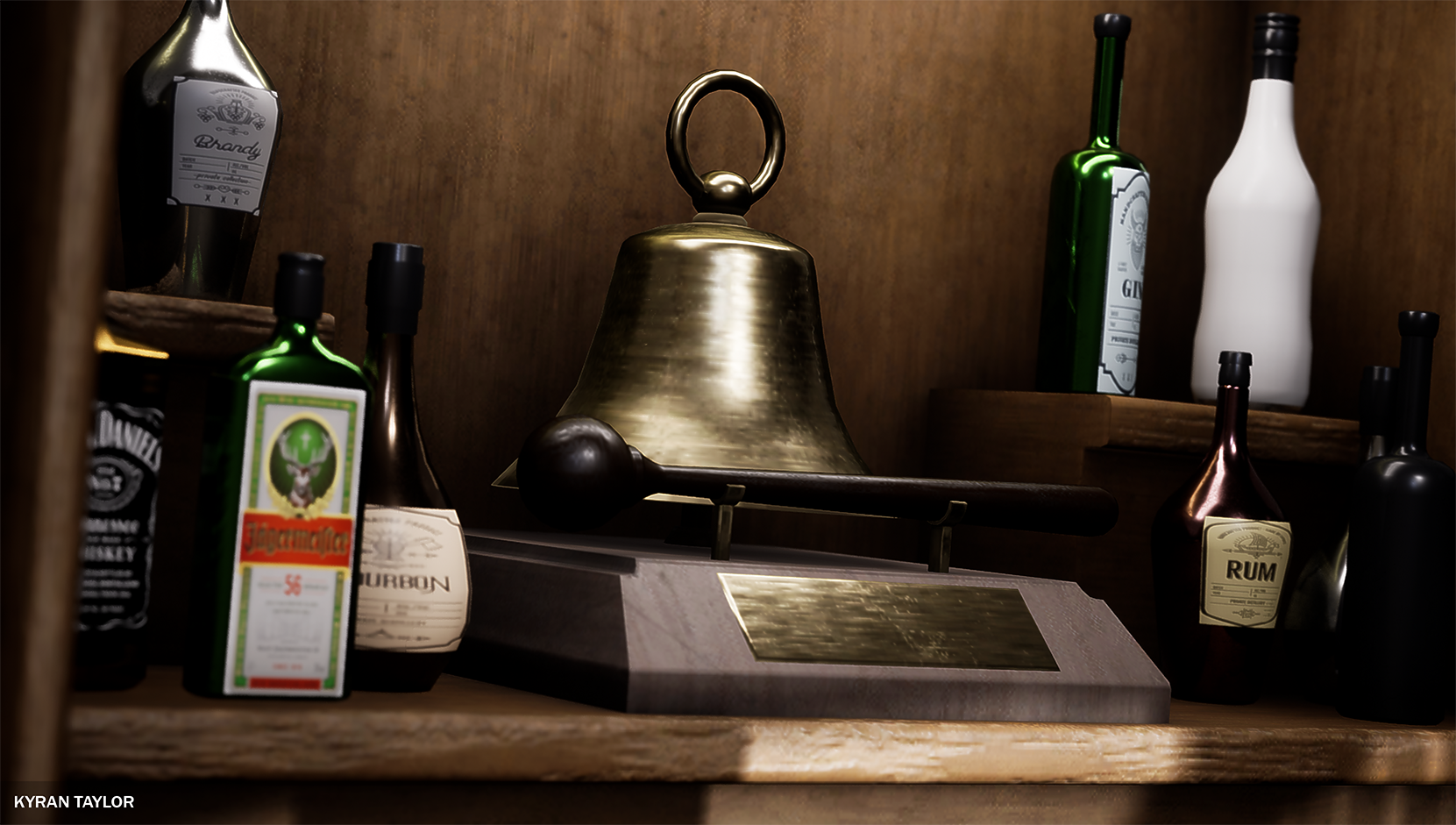
- A good environment, definitely giving off an American Diner feel. I like the colour usage through the scene, the red and white chairs are classic and go well with the dark wall and natural tones throughout the scene. I feel like you could have done more with the upper floor, the material change is a cool idea, but comes across slightly flat, a more chipped and worn look would be a great rustic feel, contrasting the more modern leather and metal of the chairs and furnishings. One thing I noticed in the scene is that the normals on your liquor counter behind the bar appear to be flipped. You've created a number of set dressing props, and it would be great to see them fleshing out the scene a bit more. particularly on and behind the bar.
Portfolio Website
https://www.artstation.com/kyrantaylor
Leave a comment
Log in with itch.io to leave a comment.