Play asset pack
Oblivion Arena's itch.io pageResults
| Criteria | Rank | Score* | Raw Score |
| Concept/Idea Realisation | #19 | 2.750 | 2.750 |
| Demonstration of Technical Ability | #20 | 2.250 | 2.250 |
| Overall | #20 | 2.333 | 2.333 |
| General Visual Appeal | #21 | 2.000 | 2.000 |
Ranked from 4 ratings. Score is adjusted from raw score by the median number of ratings per game in the jam.
Judge feedback
Judge feedback is anonymous and shown in a random order.
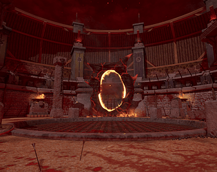
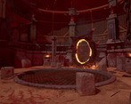
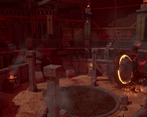
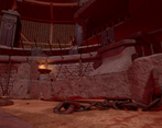
- The scene is faithful to the elder scrolls universe and you certainly executed the general feel of the game. However, there are some logic issues in this scene which end up devaluing the work you put in. While you have made a good attempt to describe a story, it comes across as a bit random and not thought through. Most importantly, physics should still apply, even in a magical realm and things like arrows sticking out of rock is an immediate immersion breaker. The lighting is what could be improved the most I feel. I would suggest collating all the feedback you get from the event and give the lighting another pass. Look to really make the gate shine and stand out. Right now it gets completely lost with the rest of the scene. I have done some paint overs for you. Itch is shit, so you gotta copy and paste the links yourself. https://drive.google.com/file/d/1Xf0Hy6ISly9CjBdw7mPY2FOuKMqhYbJA/view?usp=sharing https://drive.google.com/file/d/15Ac6AqsGcax9Oi_gMD93JWS-7_ycdeqA/view?usp=sharing https://drive.google.com/file/d/15bEXTNXAX54HGcIew9ze9g_-qqK6kz9E/view?usp=sharing
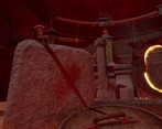
- Instantly recognisable as the Oblivion arena and an Oblivion gate, with great modularity and use of decals to build up the environment. One aspect that is hurting the overall look of the scene is your materials. The normal map for your stone feels very bumpy and that is giving your stonework a low res, lumpy feel. The scene could also do with more roughness contrast to differentiate and define your various materials. This may be down to the lighting, it could benefit from a stronger directional light to help pick out your materials and surfaces better. The VFX for your oblivion gate is great and looks exactly how I remember it. Likewise the fire and heat haze effects are good and really help with the overall atmosphere. All together a good environment, but suffering from flat materials and lighting.
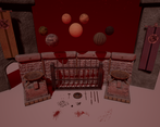
- - Stone columns and other stone assets look soft. Stone columns and arches should also look as if they were constructed from smaller blocks, rather than a single piece of stone. - Textures look low res and too uniform in colour. If these assets use unique textures, try a tiling texture or trim sheet instead. Add details with texture blending, decals, edge normal decals and Mesh decals. - Wooden Structure around the edge of the arena looks too uniform and lacks any details. Need more ‘jankiness’ and colour variations. - Use a few small meshes (tufts of grass, Mounds of sand/gravel, small rocks around the base of your columns, stone walls. This will better hide the transition to the sand floor & help embed them in the scene. - Gravel looks like marbles. Too uniform in size and shape. Colour should closer match the sand floor or stone walls. - Sand floor is too flat & needs more colour variation. Add details with texture blending, decals. - Blood decals are too large/cartoonish. Would be darker, especially when soaked into sand. Would probably be pooled blood from where bodies fell. - Arrows embedded in stone? - Banners look like hanging sheets of paper. Add some creases into the normal maps & vertical ripples/folds in the mesh. Use shaders & vertex colours to add subtle wind effect. - Lighting looks a little flat and uniform. Use lighting to highlight the Oblivion gate as the focal point for the Scene.
Portfolio Website
https://www.artstation.com/alex_hannah-johnson
Leave a comment
Log in with itch.io to leave a comment.


Comments
No one has posted a comment yet