Play Environment
Lonely Island's itch.io pageResults
| Criteria | Rank | Score* | Raw Score |
| Concept/Idea Realisation | #3 | 4.000 | 4.000 |
| General Visual Appeal | #3 | 3.800 | 3.800 |
| Overall | #3 | 3.733 | 3.733 |
| Demonstration of Technical Ability | #4 | 3.400 | 3.400 |
Ranked from 5 ratings. Score is adjusted from raw score by the median number of ratings per game in the jam.
Judge feedback
Judge feedback is anonymous and shown in a random order.
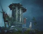
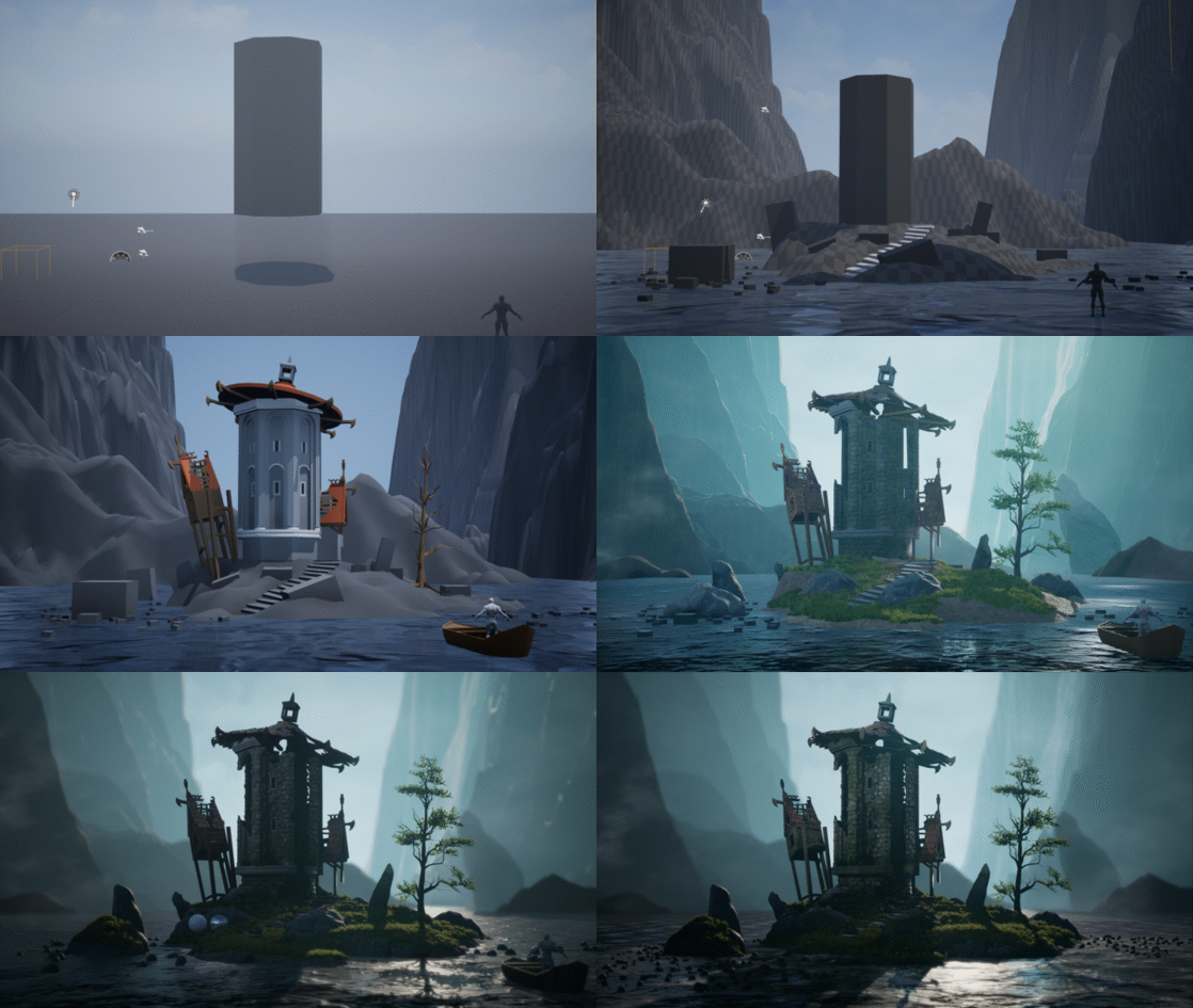
- This is a very nice rendition of the concept and executed well. However there are some important elements which I think really bring the scene down. Firstly, from a simply technical stand point. You have some very strange banding issues on the background cliff. I'm guessing these are cascading shadow steps but what ever they are, its not acceptable to have an error like this so prominent. For me, this alone would have your job application rejected. More importantly however, I think you are missing some key features from the concept. Mostly related to shape, silhouette and lines of action. These should all be very simply fixes though but it's important you pay attention to this kind of stuff in future projects! While the concept is quite muted, I feel like your scene is a little flat. You can get a lot more from the scene with just a little bit of contrast adjustments. This scene is a huge improvement over your previous work and you are progressing well! Look forward to seeing more from you! I have done some paint overs for you. Itch is shit, so you gotta copy and paste the links themselves. https://drive.google.com/file/d/1f7zD05cqijJRE_NfSWp7LHhlG1rtKmQr/view?usp=sharing https://drive.google.com/file/d/1o17Gfil4-bufPclhs4p2H4eHQfXzF04w/view?usp=sharing
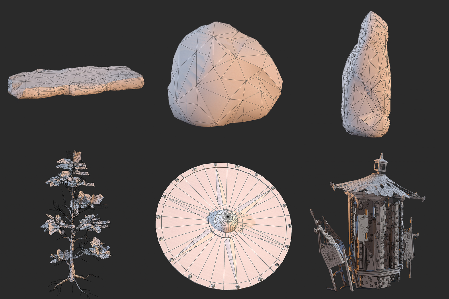
- You did a good job of realising the concept at a scene-level, it presents itself well. There's some great high>low work and organic modelling that adds interest as well as good foliage, lighting and post. The water however comes across a lot more like ice, and the assets that sit in the water feel like they have been sliced at the shore line partly because of this (they don't seem to affect or be affected by the water). I also think the 3D stones on the building and the integration of them to the mesh to make it feel cohesive could be improved.
- You've done a great job of matching the concept art here and have included some more technical aspects. Your water has come out really well and your foliage adds a lot to the scene too. It would have been great to see some stronger ambient shadows to bring some contrast to the scene. Some of the elements of the stonework from the concept have been lost, which is a shame and would have really helped add some visual interest to the tower. The longboat is excellent and the closeup shot of that really shows off your material work and has a great composition.
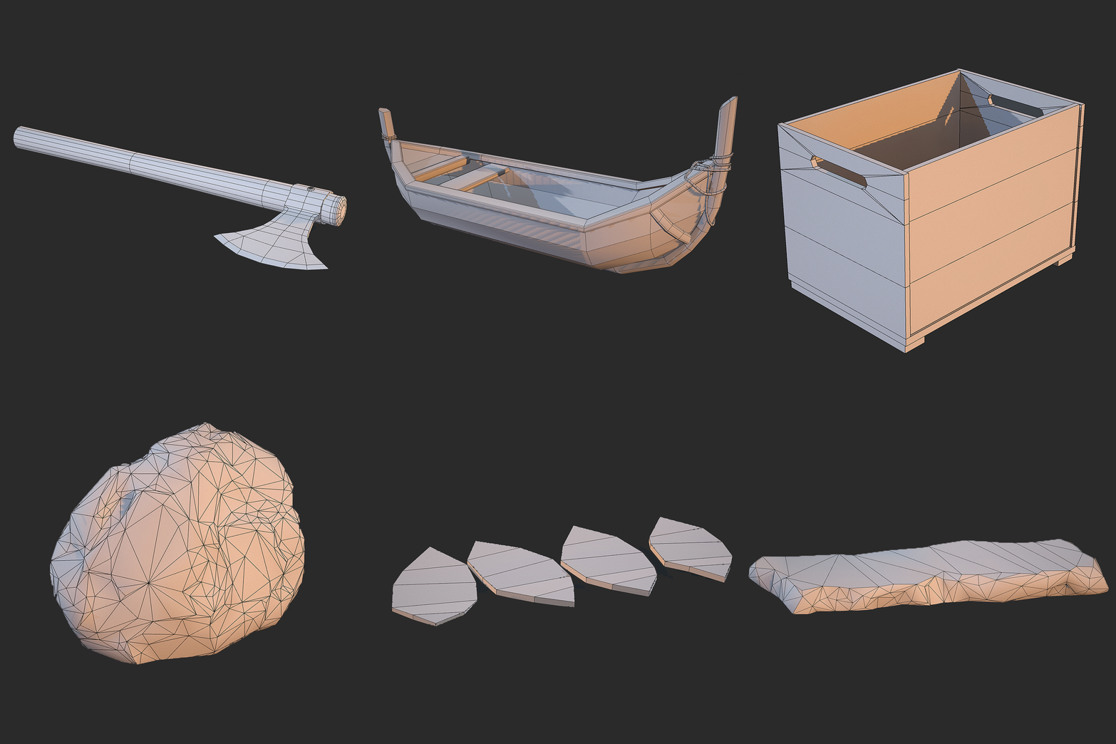
- - Not sure if the lake is supposed to be Ice or still water. Even Still water has a little moment to it. If its Ice, snow or frost patches might help sell it better. - The harsh transition between the Rocks/Stone/island and the lake surface is really quite jarring. Snow or frost patches would help the transition. Other small meshes (tufts of grass, Mounds of sand/gravel, small rocks will also help. - The little rocks are strangely round. - Both the Canopy roof on the right and the structure on the left of the tower need more ‘jankiness’ like in the concept. In your image, they look perfectly straight. - There is a Broken ruined arch that from some angles looks like a perfect column of stone. This seems unlikely. - The forest on the mainland looks a bit sparse. Boat sits too level on the water. It should look like it's ‘bobbing’ a little. - Viking Shield looks far too thin. Chamfer those edges. Texture of the metal components needs more work. More rusty & less shiny. - Boat looks a little Low Rez in its curved surfaces. - Mountains in the background have strange banding artifacts on them. In other pictures, their textures look stretched massively. - Use a more consistent aspect ratio for your images.
Portfolio Website
https://www.artstation.com/koraz
Leave a comment
Log in with itch.io to leave a comment.


Comments
No one has posted a comment yet