


Play project
Winterfell's itch.io pageResults
| Criteria | Rank | Score* | Raw Score |
| General Visual Appeal | #3 | 3.800 | 3.800 |
| Concept/Idea Realisation | #5 | 3.800 | 3.800 |
| Overall | #5 | 3.600 | 3.600 |
| Demonstration of Technical Ability | #7 | 3.200 | 3.200 |
Ranked from 5 ratings. Score is adjusted from raw score by the median number of ratings per game in the jam.
Judge feedback
Judge feedback is anonymous and shown in a random order.
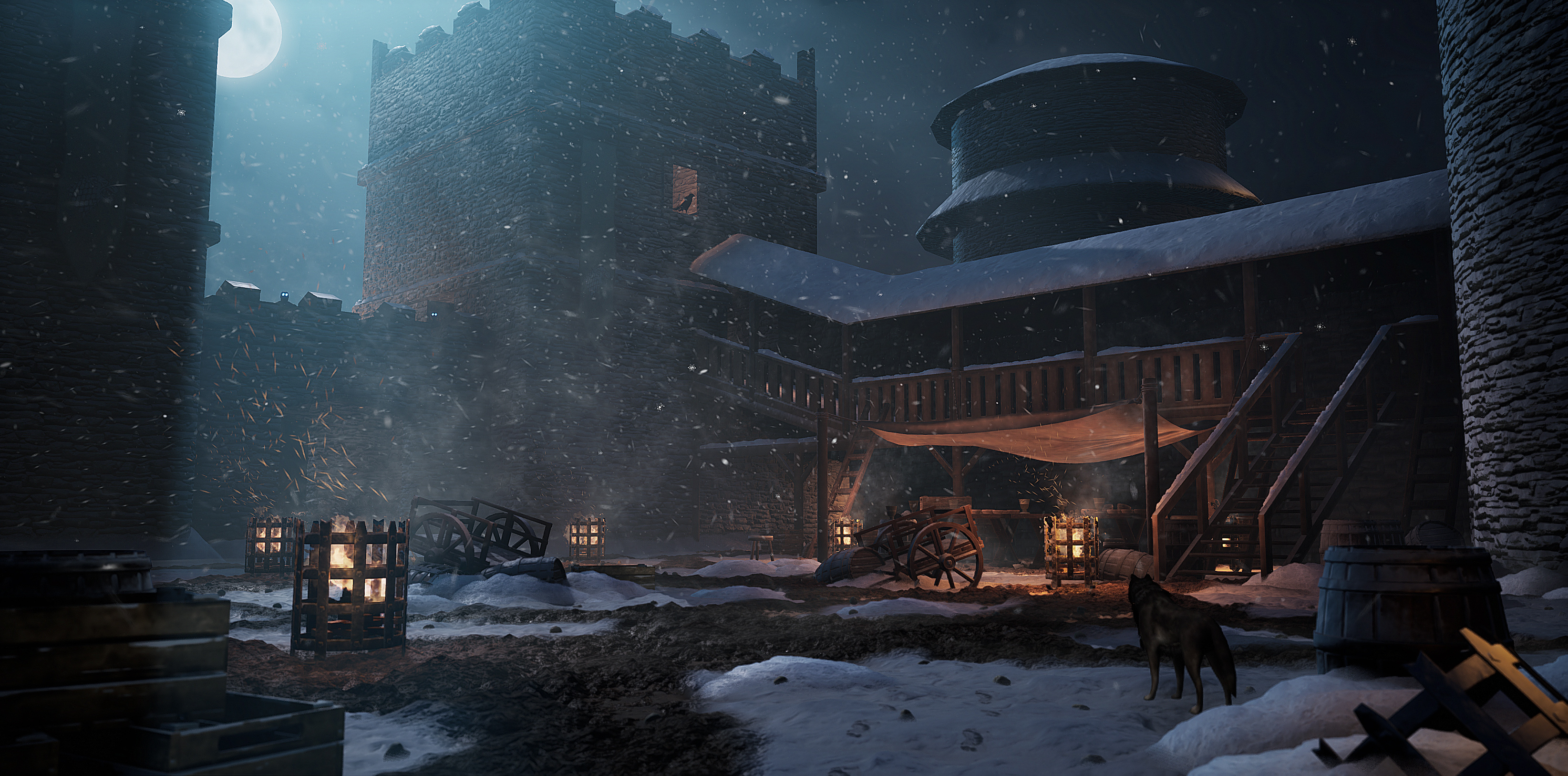
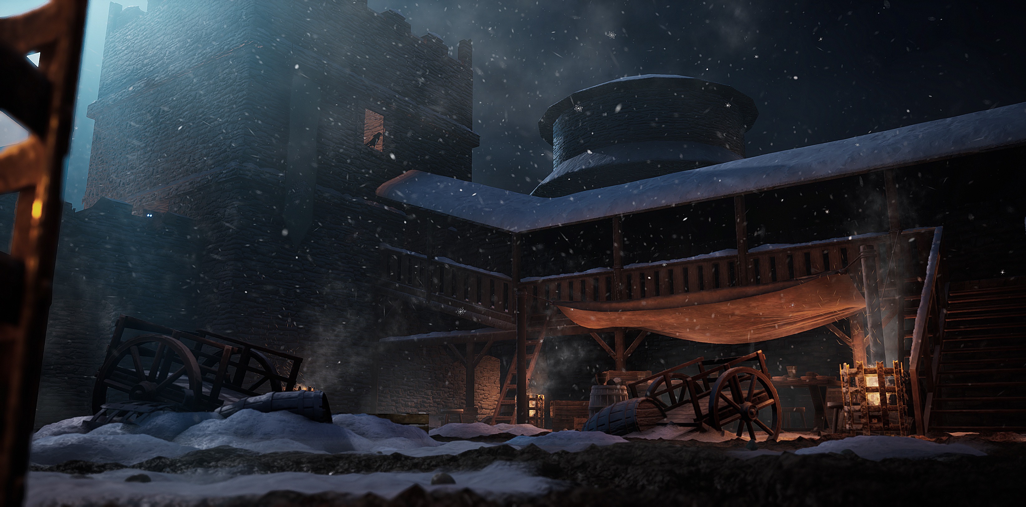
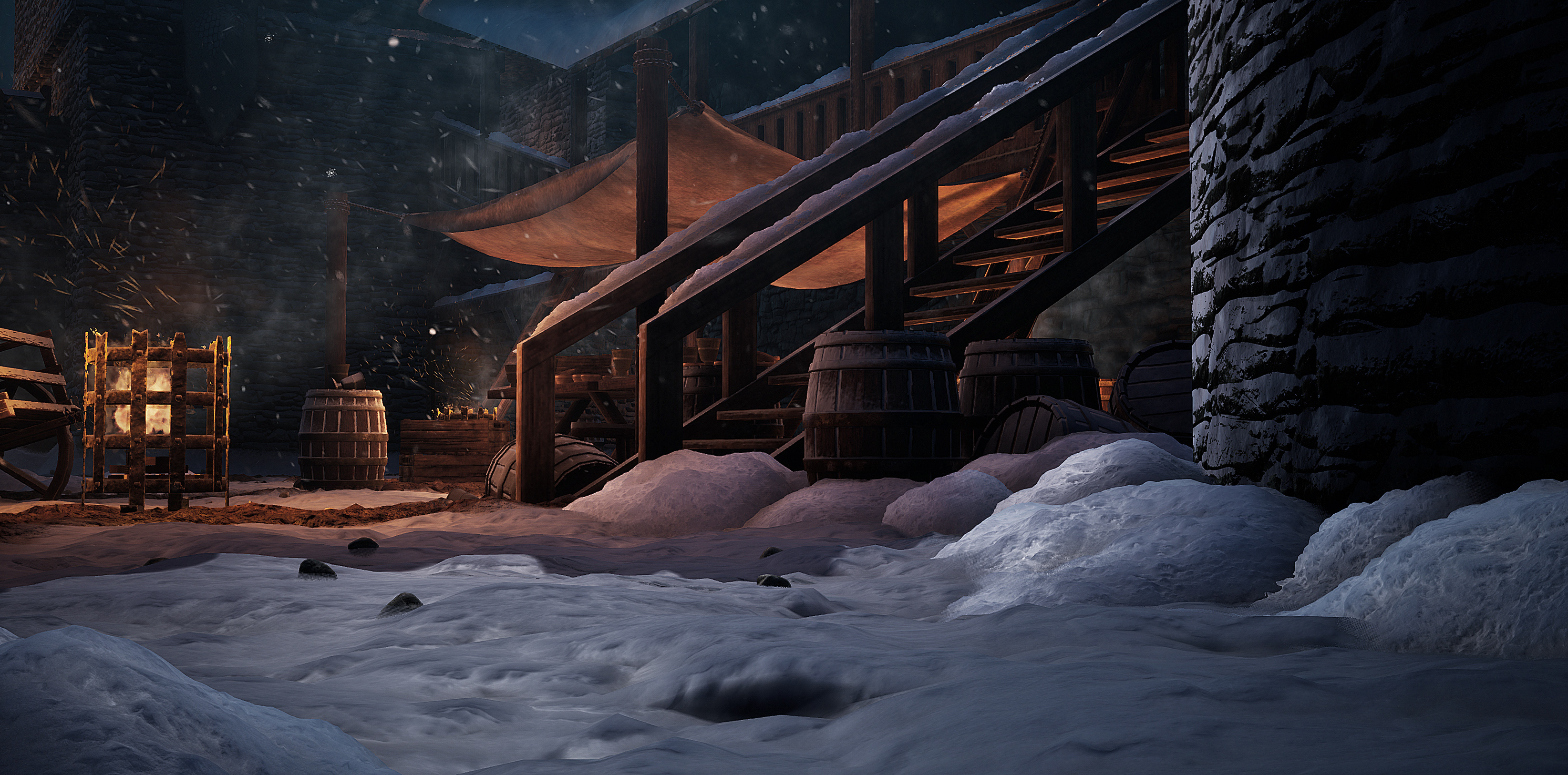
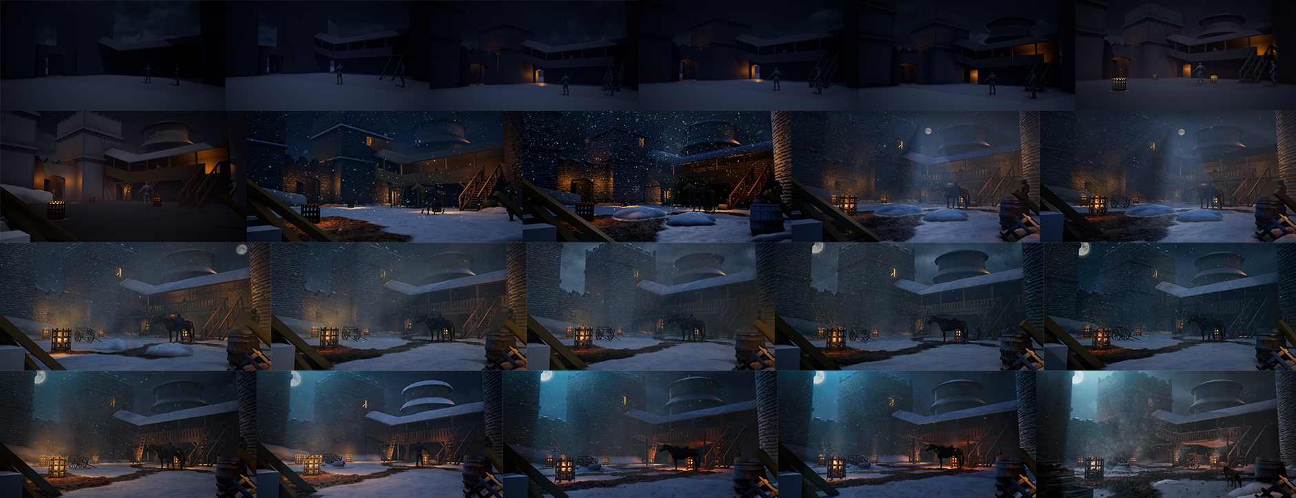
- Excellent environment, instantly recognisable as Winterfell courtyard, full of movement and atmosphere. It really feels lived in and alive. One area of improvement would be your materials, the stonework particularly stands out, there's some very harsh and dark self shadowing going on, particularly visible on the round tower on the right side of your main angle. You could also have done with some high frequency breakup of the roughness on your snow. Your lighting is great, moody with a heavy contrast between the blue from the sky and the firelight, combined with the atmsospherics and the swirling mist/steam and sparks from the fires. It really gives the whole place at atmosphere and mood. I would have loved a breakdown of your assets, to see some of your texturing and modelling skills up close, but all in all an excellent scene.
- Great implementation of snow subsurface which is boosted by the time of day and angle of lighting you picked for the scene. I especially like the use of tesselation and your application of it on some of the assets (eg stairs). The VFX and post really adds to the depth of the scene which really sells itself in the vid/gif. Great job on utilising the blockout stage to realise your vision and composition, you stuck to this well. I'd recommend focusing on a smaller project (prop) next to focus on pushing your material skills and really hone in on realising that in your work.
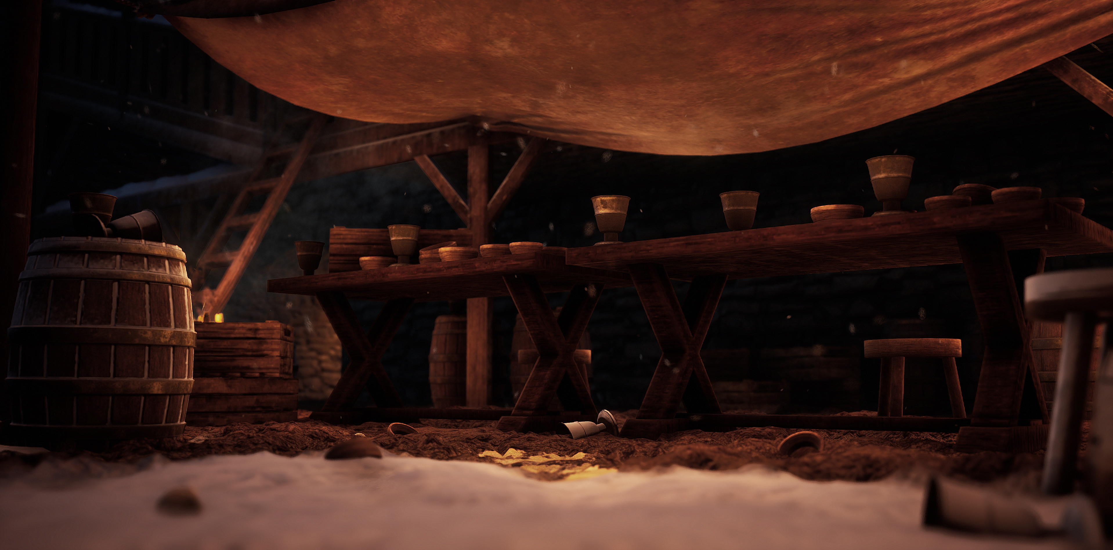
- - Make Flythrough Video a bit longer, Fade to blacks much shorter (feels like half the video is a black screen), reduce Camera movement (pan less). - Stone wall texture looks far too noisy. Use bigger bricks. - Stone Wall texture tiles really obviously. Add variation with texture blending, decals, edge normal decals and Mesh decals. Model a few separate brick assets that you can subtly imbed in your walls. - Corners of your stone wall walls (the rectangular tower) look too straight and even. Use edge normal decals, or make a tiling mesh out of individual bricks to insert and sit over the corners of the building. - Parapets at the top of the walls look Copy/pasted. - Roof on the circular tower looks too low res. - Wooden walkway looks too straight, even and lacks details. Needs more ‘jankiness’. Wood texture lacks colour variation - Wooden cart asset looks too flimsy. Wooden crate asset looks like a textured box. Not sure if the Mud texture should be ‘impacted/walked-on’ snow, or if the ground - - - snow should be more like ‘slush’, or at least less heavy. Snow VFX has a tiny ‘snowflake’ jpeg in it. Looks a bit naff. - Whitewalkers on the wall are not really noticeable.
- Solid showcase of technical knowledge.
- I thought this was a very nice scene and took a good direction away from the reference, while remaining faithful. It is however, poorly built. Your asset quality is no way near your lighting or artistic ability. I actually had a hard time providing feedback on this because your at a point now where you need to choose a path and knuckle down on it. I would say your lighting is by far your strongest skill and I guess also your main interest. Especially given this is your weakest piece in your folio. I think there are some improvements you can make here, mostly related to filling out bounce lighting and colors, but I actually think improving the textures and modelling would help the most. Right now, the lack of bevels, silhouettes and good materials is fighting the effort you put into lighting. Your composition feels great but the story your trying to sell isnt quite coming through. There is a lot of work you can do here as well, but they are easy fixes. Collect reference, think about what your doing and get feedback on the way and you will have no trouble with propping and story telling going forward. So you need to pick a path. Either you double down on environment art or focus on your lighting. While you can do both, it is unlikely you will land a job doing both right now, so its worth prioritizing one. However, I do think you need to work on your asset quality regardless. Even if you do not intend to be making assets in the future, your base line right now is too low to show the required understanding of the discipline. Here you want to focus on modeling first, forget about materials for now and just work on removing these straight lines, bedding assets correctly and getting good silhouettes. It feels like a lot of effort was put into the ground but everything else is basically a simple primitive. Get your modeling to a consistent quality, then move onto your desired topic. I have done some paint overs for you. Itch is shit so you gotta copy and paste the links yourself. Looking forward to see more from you Adam! https://drive.google.com/file/d/1h5WV7aE_2TD0WFPQDwyDnfdkcwpiFOEQ/view?usp=sharing https://drive.google.com/file/d/1imntKLHOJ_evzNpaNi_-5a5YwU-V9ldS/view?usp=sharing https://drive.google.com/file/d/1_jFKslMJp3ZKGMsl4uIblLP6EeIw9cwJ/view?usp=sharing https://drive.google.com/file/d/1DcSsetsndjKJO5Q1KpM5Ch0EngF30RJ5/view?usp=sharing
Portfolio Website
https://www.artstation.com/adam_williamson
Leave a comment
Log in with itch.io to leave a comment.