


Play asset pack
The Last of us "Bedroom Scene"'s itch.io pageResults
| Criteria | Rank | Score* | Raw Score |
| Concept/Idea Realisation | #22 | 2.160 | 2.333 |
| General Visual Appeal | #22 | 1.543 | 1.667 |
| Demonstration of Technical Ability | #23 | 1.543 | 1.667 |
| Overall | #23 | 1.749 | 1.889 |
Ranked from 3 ratings. Score is adjusted from raw score by the median number of ratings per game in the jam.
Judge feedback
Judge feedback is anonymous and shown in a random order.
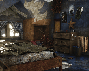
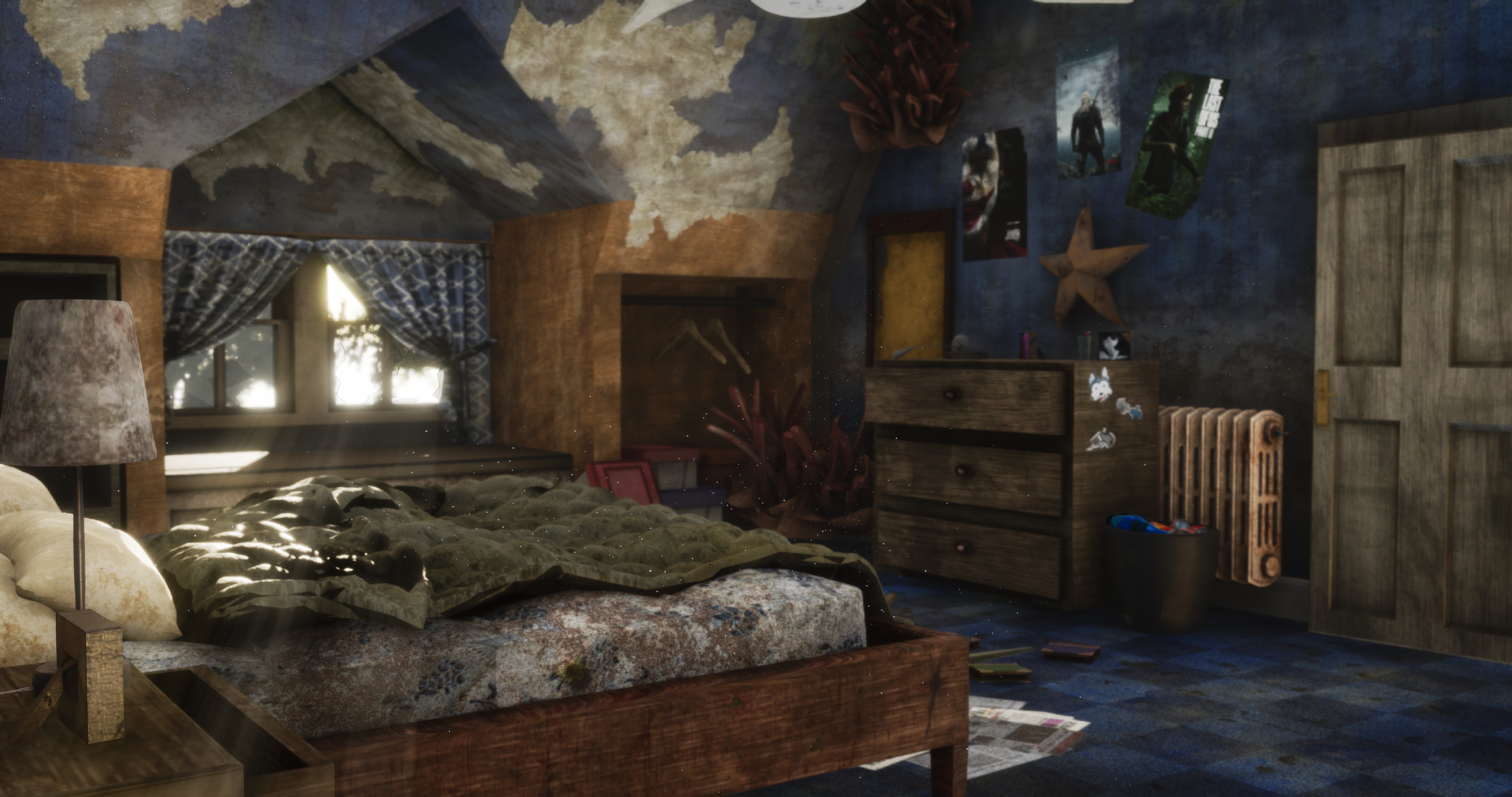
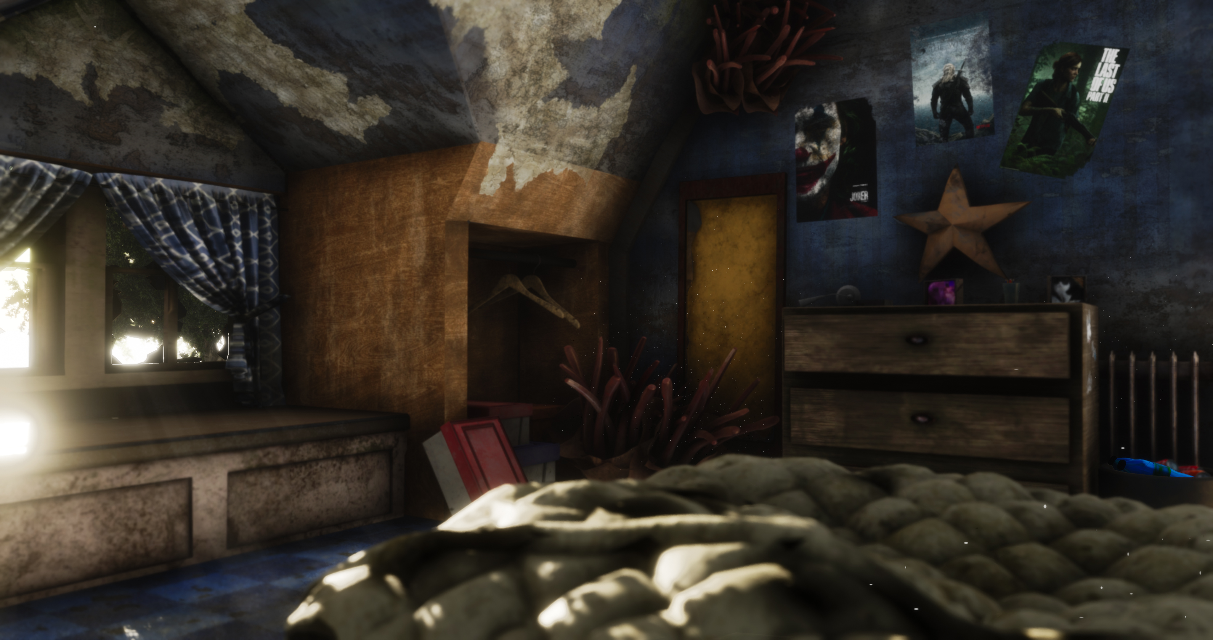
- - Too much post processing. Images appear blurry and have too much depth of field/Camera POV. - Assets don’t appear to be built with real world scale in mind. Assets are out of proportion. - Assets lack any real details. Assets have been modelled without consideration for their realworld construction. Door, Desk, Bed, Wardrobes all look to be carved from a single piece of wood. Grain flows in the wrong direction. Model from reference! - Decals have been placed haphazardly. - People wouldn't put drawers in front of a radiator. - Doesn't really feel like The Last of Us. Although apocalyptic, many of The Last of Us environments are still lush & Vibrant. Consider finding a way to incorporate Ivy & foliage. Or go the other way and lean into the dank Mushroom fungus.
- Overall, a good start to building a believable scene. However there are many aspects that I feel need to be improved on. - Texel Density is not consistant around the environment, when making portfolio pieces, always aim for high texel density and high polygon count. It's all about the presentation. - the wallpaper material youve made is nice, I think everything else could be improved on vastly though. Everything appears flat, I cannot see any roughness variation, nor can I see normal details. god rays from the window are nice, but the rest of the environment is very flat and lacks any hard shadows, which result in am image which i almost all the same value. (turn the image to black and white and see) - Lighjting needs to be vastly improved.
- - General concept is nice, the room feels well lived in - Particles add to the atmospherics of the scene. - Scene suffers from a scaling. Parts of the environment feel very "thick". This is not helped by the scaling of the textures. Elements like wood grain are so big they makes the asset look bigger than the physically are. - Assets like the desk (with the draws pulled out) are a single material. No metal runners or distinction of material types. Edges are harsh. - A story needs to be considered, more than just the theme of the room. Why has the wallpaper peeled off where it has and not in other places? Is the brown parts of the wall (where the hangers are), is the wallpaper or wood? If its wood then why is it peeling. - clutter on the floor is nice. - Things to consider going forwards: What materials are used to make up that specific asset? It can't just be a single material i.e. wood. Look at scale of objects, doors and how they sit in the scene. Use the real world, go measure things.
Portfolio Website
https://www.artstation.com/john_mccormac
Leave a comment
Log in with itch.io to leave a comment.
Comments
No one has posted a comment yet