


Play project
Modern Life's itch.io pageResults
| Criteria | Rank | Score* | Raw Score |
| Concept/Idea Realisation | #3 | 4.000 | 4.000 |
| Overall | #4 | 3.667 | 3.667 |
| General Visual Appeal | #5 | 3.750 | 3.750 |
| Demonstration of Technical Ability | #6 | 3.250 | 3.250 |
Ranked from 4 ratings. Score is adjusted from raw score by the median number of ratings per game in the jam.
Judge feedback
Judge feedback is anonymous and shown in a random order.
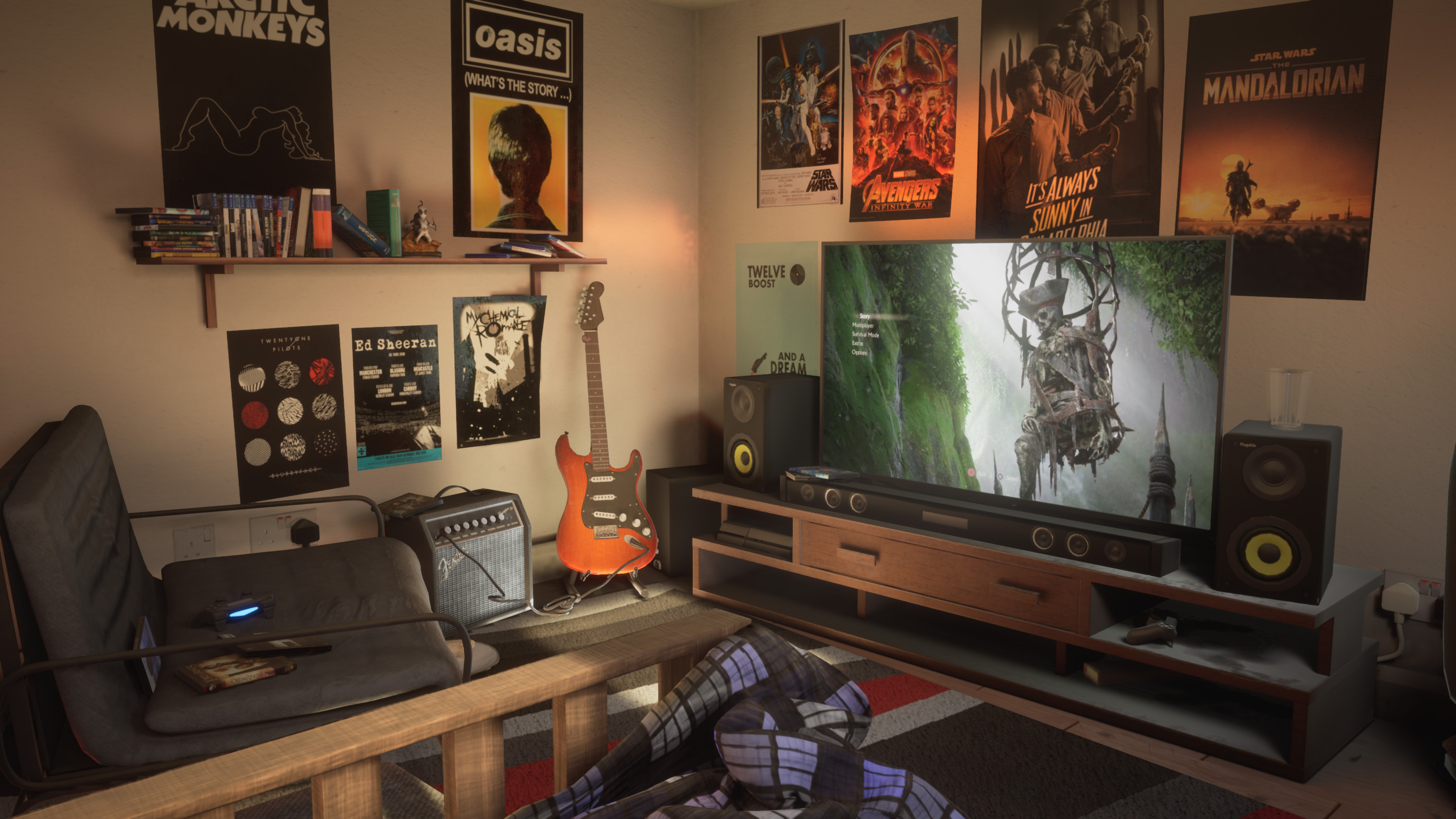
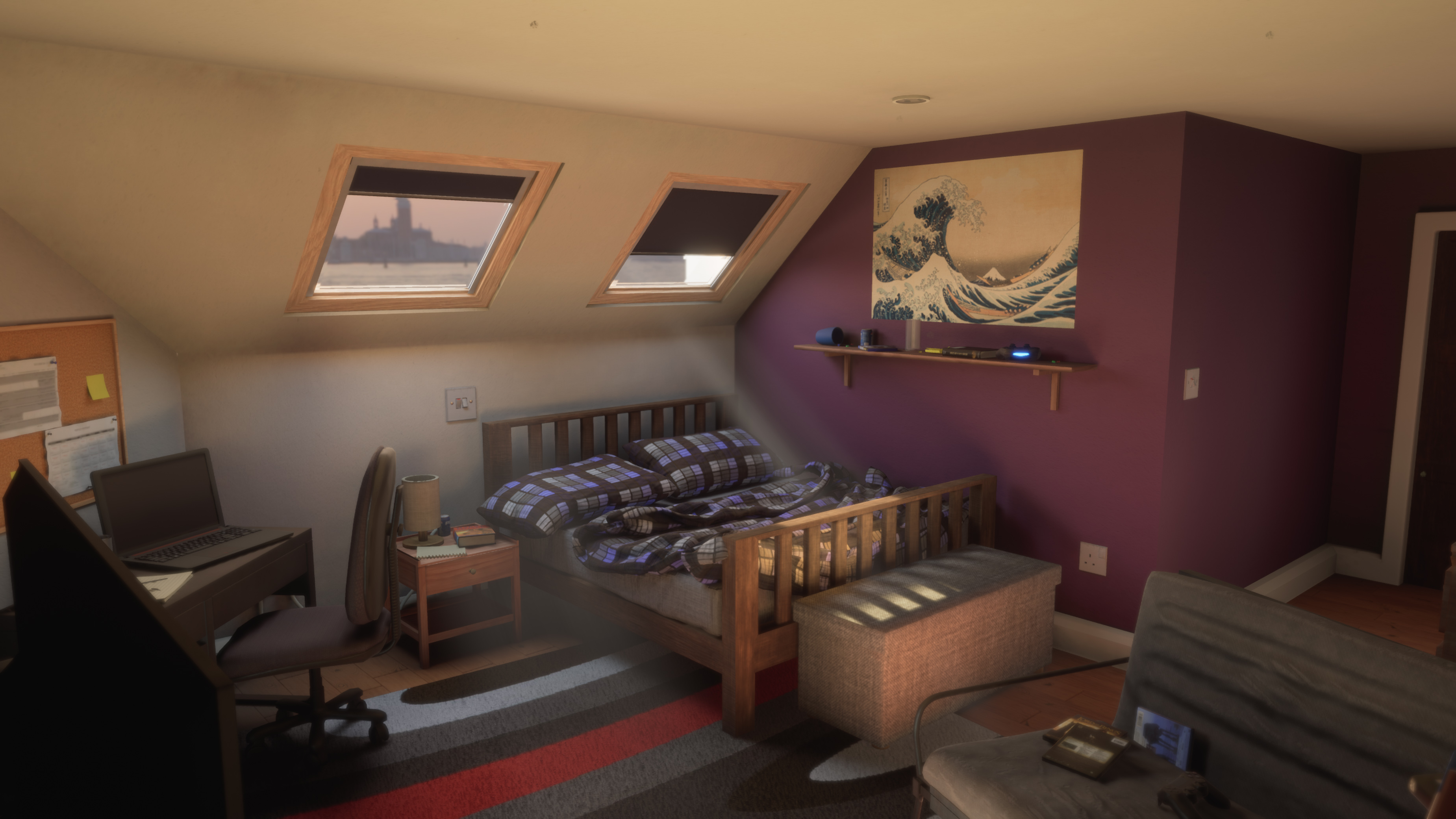
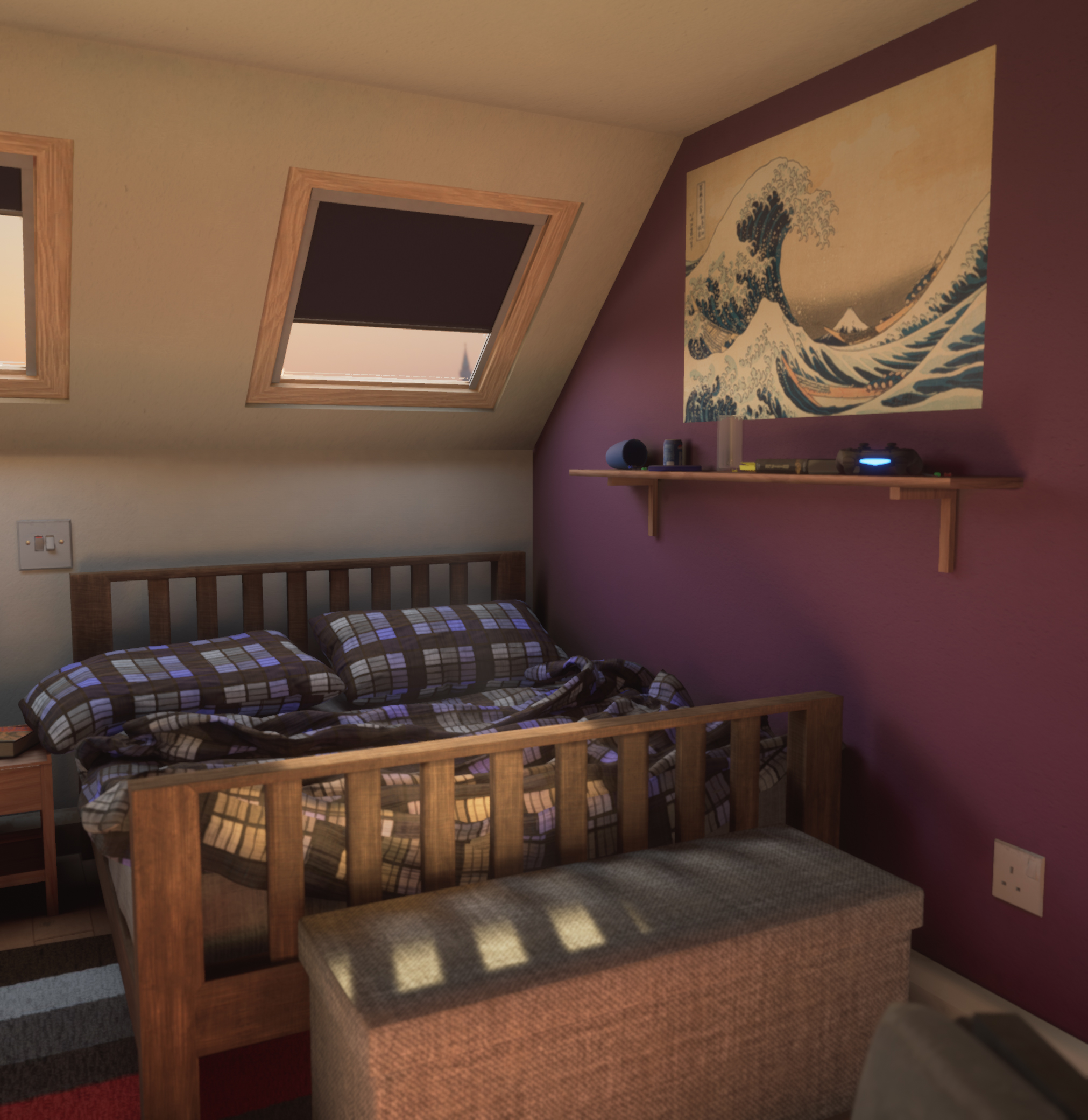
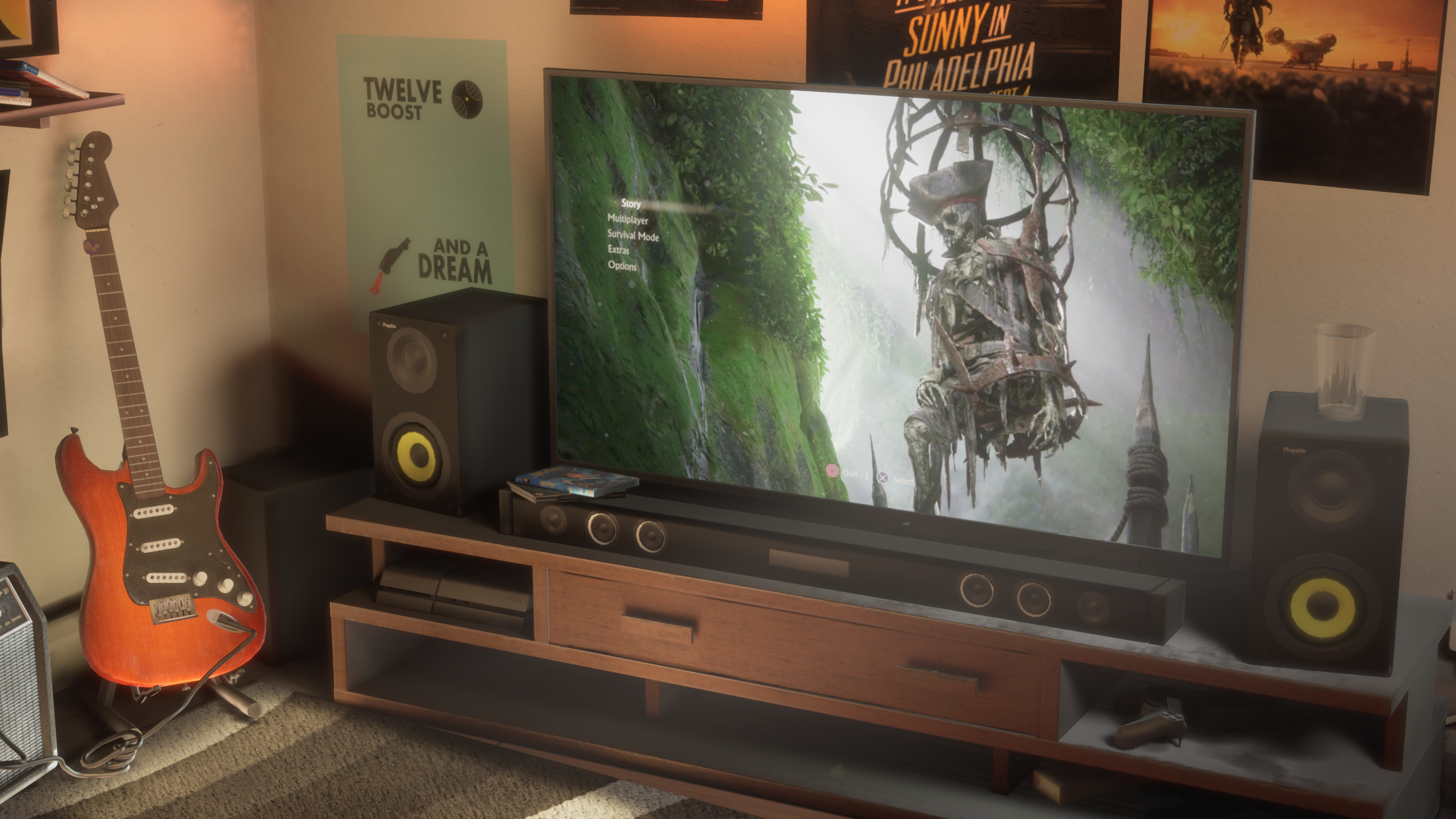
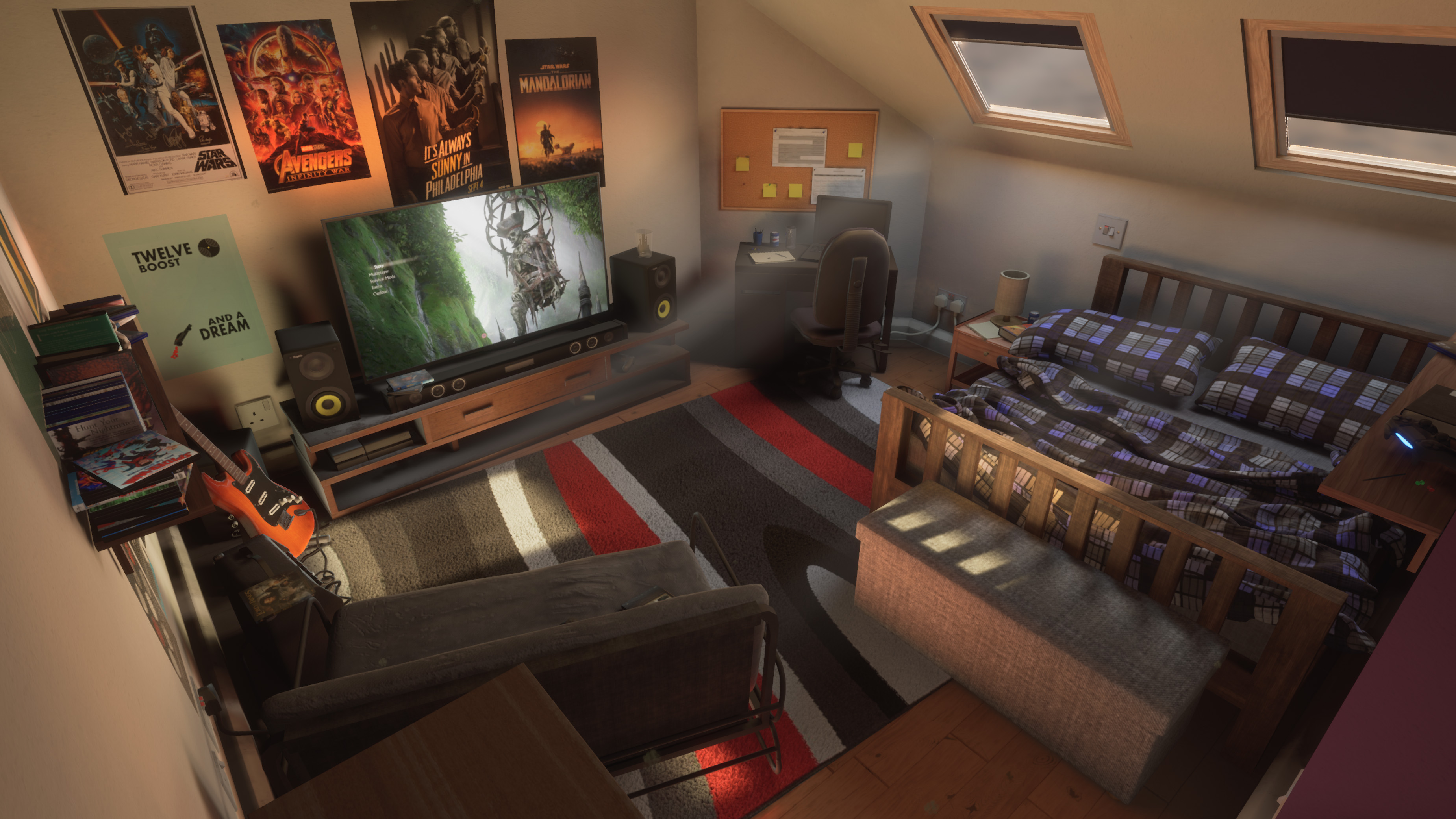
- - Too much post processing in fly through video. Images appear blurry and have too much depth of field. Title card appears randomly 2 thirds way through the video? - Some assets appear out of proportion. Desk and Office Chair look oddy small & out of proportion. As do light switches, power sockets and skirting board. - Posters look oddly flat against the wall. Maybe add paper creases/folds to the Normal map. Play with Roughness to give more of a ‘glossy’ quality. - Dust on the TV stand looks like ash. Oddly out of place as the rest of the room looks relatively clean. - Inset for the Windows Should be Deeper. Makes Roof look paper thin. - Theme seems more like Teen bedroom than young adult. Putting the pictures in frames, adding pot plants, props such as calendars & coat racks would all help the room look like it belonged to someone more grown-up.
- Nice looking scene that is well lit, full of a variety of assets some of which suffer from scaling issues. Points to consider: - Scale: The bed is a big stand out for me. Either the pillows are too big or the bed isn't long enough. If in doubt grab a tap measure. Plug/sockets/switches also throw the scale off for the scene. The plug behind the TV looks huge! Look at how everything sit in the scene, measure things if unsure. Skirting board are very thick. - Dust: Definitely too much. I do like how things have been moved and its a bit clearner, but this beens to be a subtle thing that people notice, rather than a key point of interest in the scene. - You've modelled a lot of assets. If you've spent the time on them show them off. Take some "artsy" shots showing close ups on things like the PS4 controller, add a bit fo DoF etc. - Geometry: There are a couple of assets that need some extra geo, speakers and chair mainly. - This is just a personal preference thing, but posters on walls seem a bit lazy. It's just textured plane. Maybe consider creating some picture frames. That will give you an opportunity to have wood and glass materials on the wall. You can get some nice surface information (smudges on the glass etc) and maybe a light reflection off them. Just a thought. Good work overall, you should be pleased with this.
- Fantastic, really like this one! Excellent composition and lighting. My primary feedback would be on material definition, that would be something i'd suggest looking at continuing to devlop.
Portfolio Website
https://danlord3d.artstation.com/
Leave a comment
Log in with itch.io to leave a comment.