What did this game do well? (Answer in a few sentences)
A pretty fun game that requires careful planning and quick responses. I also really like the background music.
The idea is refreshing. This game really requires good time management.
The gameplay and the data play well together
The idea is very interesting and it is very fun to chain fares to make lots of money in little time. The music is also relaxing. It's overall a very chill game.
Its a cool game of foresight, information, and speed. I had to play a few times to get a feel and understand how to optimize money - I feel that this game has solid skill depth. I've never asked a taxi driver, but this feels like a good balance of actual decisions that may be made.
What could be done better? (Answer in a few sentences)
If you have more time, I think it might be better to make the game more polished (finer map, gradually moves to the destination, passenger dots on the map, etc.).
The game felt it was less player friendly somewhat. It would be great if taxi goes to one spot and give feedback as in comment or some pop-up
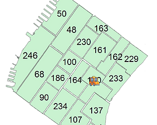
It is hard to play because it is hard to cooperate the area number on the map to it on the order.
I think the orders scrolling up is a bit distracting. Naming all the area locations numbers makes it hard to understand where the taxi is and where they should be going. I constantly had to keep checking the map and the orders to figure out where I was.
Its a little difficult to process and absorb the information. I understand that reading info and using it to make decisions quickly is the primary skill of the game. Because of this I feel that it makes sense to invest a little more in positioning the information in a way that is easier to view. Currently the time is on the top left, you cant see the zone youre on top of so your eyes have to look to the bottom left, and all the orders are on the right side.
TLDR: theres a lot of text on the screen that could be organized better - maybe by repositioning, styling, or using colors.

Comments
What did this game do well? (Answer in a few sentences)
A pretty fun game that requires careful planning and quick responses. I also really like the background music.
The idea is refreshing. This game really requires good time management.
The gameplay and the data play well together
The idea is very interesting and it is very fun to chain fares to make lots of money in little time. The music is also relaxing. It's overall a very chill game.
Its a cool game of foresight, information, and speed. I had to play a few times to get a feel and understand how to optimize money - I feel that this game has solid skill depth. I've never asked a taxi driver, but this feels like a good balance of actual decisions that may be made.
What could be done better? (Answer in a few sentences)
If you have more time, I think it might be better to make the game more polished (finer map, gradually moves to the destination, passenger dots on the map, etc.).
The game felt it was less player friendly somewhat. It would be great if taxi goes to one spot and give feedback as in comment or some pop-up
It is hard to play because it is hard to cooperate the area number on the map to it on the order.
I think the orders scrolling up is a bit distracting. Naming all the area locations numbers makes it hard to understand where the taxi is and where they should be going. I constantly had to keep checking the map and the orders to figure out where I was.
Its a little difficult to process and absorb the information. I understand that reading info and using it to make decisions quickly is the primary skill of the game. Because of this I feel that it makes sense to invest a little more in positioning the information in a way that is easier to view. Currently the time is on the top left, you cant see the zone youre on top of so your eyes have to look to the bottom left, and all the orders are on the right side.
TLDR: theres a lot of text on the screen that could be organized better - maybe by repositioning, styling, or using colors.