Play game
spirit's itch.io pageResults
| Criteria | Rank | Score* | Raw Score |
| Fun: Is it fun for you? | #1 | 4.000 | 4.000 |
| Theme: Does it follow the theme? | #2 | 4.000 | 4.000 |
| Game Design: Does the mechanics all work together? | #3 | 3.000 | 3.000 |
Ranked from 2 ratings. Score is adjusted from raw score by the median number of ratings per game in the jam.
Leave a comment
Log in with itch.io to leave a comment.


Comments
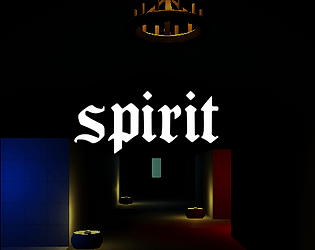
There seemed to be a few light with invisible sources that would either hurt or heal you. Such as the first two at the start of the game. I couldn't really visibly tell much of the difference between the two of them.
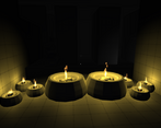
I think some of the pressure plate buttons where a little hard to spot once the lights where extinguished. Perhaps if in the dark that had a little bit of a glow to them similar to that of the exit level cylinders. Though I just might be dump and spent a minute or two not noticing one of them.
Other than that I really enjoyed it!
Thanks for the feedback! The idea with the invisible lights was that things could be concealed by the light and you need to risk the possible danger and step into it. Could have made more clear what does what to enhance player control. Reminds me of Dark Souls where you can find out if the chest is a mimic or not just by looks.
The button positions and highlighting can be improved, yes. Important for flow.
Dark Souls had ways to determine if it was a chest was a mimic or not with visual ques such as watching for the lids of Mimic chests to occasionally open ever so slightly as they breath.
Perhaps in your case if where to redesign the first area slightly so the player can see both hallways at the same time and make them both look slightly differently, and then maybe put some burns/char marks on the ground or embers/ash wising in the air or some other subtle indications that one is bad. And perhaps make the hallway longer so that the player can't cross it in one life? Other wise they might just dash through tanking the damage and not attempt to go down the other hallway, because they might just think it will burn them as well.
In your current design you have also primed your players with two message right before the first light encounter "Move Though the dark" and "You never know what hides in the light" and the 't' junction you have set up funnels the play to the fire trap first. So the lesson learned might just be going into the light is bad.
Usually I am a fan to make the player experience more enjoyable that is why I tried to put a lot of stones around and increased the visibility in the dark. Your suggestion for the first level sound good! Initially the lights did not even had an healing/fire effect played when entering, was added quite to the end because I thought they lack feedback.
I would have downscoped a bit more and used that time in a proper level introduction and even better balancing instead of more levels.