As I was working on a background for a cutscene for Bahooey v Ziwaa (my upcoming top-down shooter), I found myself curious about how different types of gradients/dithering would look for sky artwork. I'm primarily a programmer, so I took this opportunity to explore my art tools a little more. I use Aseprite to make my sprites, and its gradient tool has 4 options for the level of dithering:
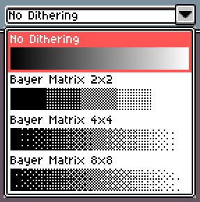
I was making a sunset, so I tried each of the options with the sunset colors I had chosen.
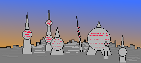
The smooth gradient is up first, and for my money is by far the worst for this sprite. It looks enough like a sunset, but the colors are very muddy. I don't know much about color theory, but I imagine that because the 2 starting colors have such different hues, some of the intermediate colors end up greyish.
Next is the Bayer Matrix 2x2, and this is already a huge improvement. The intermediate sections look vibrant like the colors of a real sunset. The heavy stripes aren't what I want for this background, but could look great for the sky of a planet with rings.
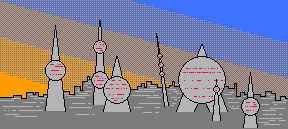
4x4 is where it really starts looking like a beautiful sunset to me. There's a fuzziness to the colors like you see in a real sunset, and it all looks great.
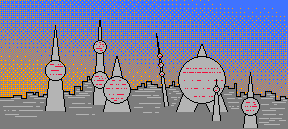
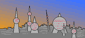
8x8 looks pretty similar to the 4x4, but the slightly fuzzier bands of color gives it the edge to me. This is the version of the sprite that will be in the final game, which will be released by the end of the week!
If you took the time to read this (especially if you're a more experienced visual artist), I appreciate your interest. Last week's devlog featured another side-by-side comparison, this time a comparison of firing patterns.
Did you like this post? Tell us

Leave a comment
Log in with your itch.io account to leave a comment.