“Whatever you now find weird, ugly, uncomfortable and nasty about a new medium will surely become its signature. CD distortion, the jitteriness of digital video, the crap sound of 8-bit – all these will be cherished and emulated as soon as they can be avoided.”
We got our first family PC in the summer of 1997 - a machine with a 200 MHz processor, 16 MB of RAM and a CD-ROM drive. It blew my mind. It was packed with software - games like SimCity and Civilization, and “desktop publishing” software too - but also these odd things that didn’t fall into either category.
They were educational, but not boring. They were fun, but they weren’t really full-blown games. They were variously described as “interactive” and “multimedia” and they almost always took advantage of the 650 MB capacity of the new(ish)-fangled CD-ROM to have all kinds of photos, videos, and music alongside entire libraries of text.
")
There’s a lot to be said about multimedia CD-ROMs, but they are probably one of the shortest lived mediums in the history of humanity. We have had books for thousands of years; TV is coming up to its first century; some form of the World Wide Web will probably outlast us all. But multimedia CD-ROMs scarcely made it a full decade, having got off to a slow start in 1989 and essentially being obsolete by 1999.
These clunky, ugly software packages were out-of-date as soon as the discs were burned. And yet, like Brian Eno said, we can look back on them now after 30 years and really appreciate their flaws as something to be treasured.
And so I hope to bring back some of that 90s feeling in my game Mysteries of Old Tokyo, which you can wishlist on Steam now!!! Until now I’ve been developing it based on vague memories and a few old screenshots, but I thought it would be interesting and informative to do a bit of a deep dive and identify some of the design elements that really define this forgotten era.
In this post we’ll be looking at a (Microsoft-heavy) selection:
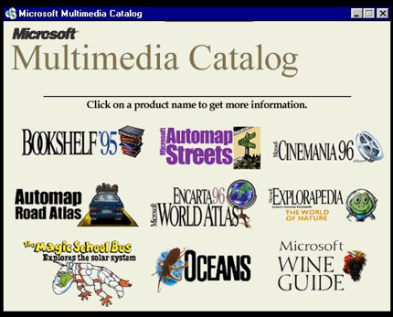
This was the Microsoft Multimedia Catalog for ‘95 and you can see a real theme going on. Some of these logos are more successful than others. Cinemania 96 is great, I think - a classy font, a clear symbol. Oceans has a nice, unusual font and well, yeah, an eye-catching octopus. On the other hand, Explorapedia has text way too small to read on a 1024x768 monitor, and the grapes for the Wine Guide are smushed and almost unrecognisable. Still, everything (apart from the Magic School Bus) shows something of a unified design.
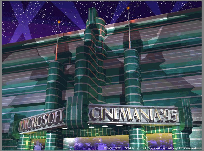
A special mention to this awesome 3D render for Microsoft Cinemania ‘95:
I found a huge variety in the overall styles used in these apps.
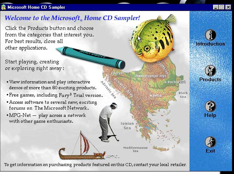
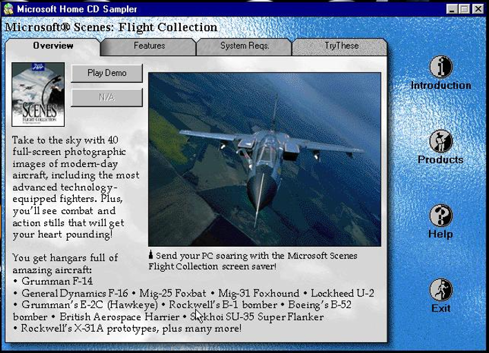
A big part of these 90s CD-ROMs is just… stuff - the software equivalent of a family restaurant with all kinds of crazy crap on the walls. This maximalist design from Microsoft Home CD Sampler just throws the kitchen sink at the screen:
But sometimes it’s a no-nonsense approach that’s the same as Windows, like with Microsoft Automap Road Atlas:
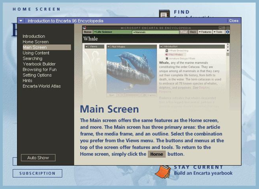
Encarta ‘96 uses a rather modernist design with muted greys and creams. Compared to some other software of the time, it looks remarkably modern - except a modern that never happened. I’m not sure this style ever went mainstream. It’s quite impressive that the designers resisted the urge to go over-the-top with the style and came up with something that is still clean and readable today.
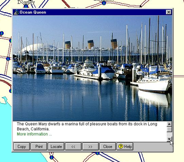
But Encarta 96 has colour at times. Here we can see a classic 90s multimedia layout - big title, small description, and tiny images that kind of all clash with each other.
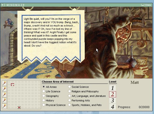
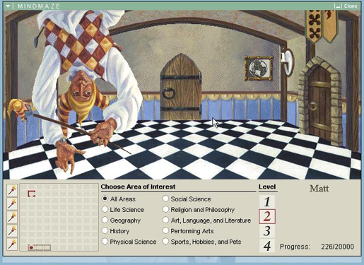
And of course, we couldn’t talk about Encarta without discussing the game mode, “Mindmaze”. It’s fascinating how the richly illustrated and evocative artwork contrasts with the generic font and interface. With artwork this good it’s a shame everything else lets it down.
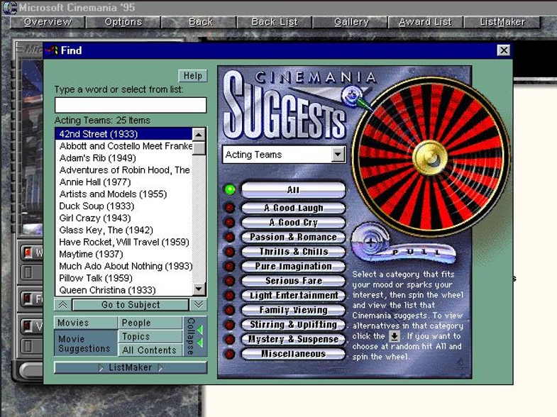
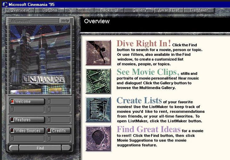
In general, these applications weren’t shy in mixing styles. Here on Cinemania ‘95 we can identify at least four badly clashing visual styles:
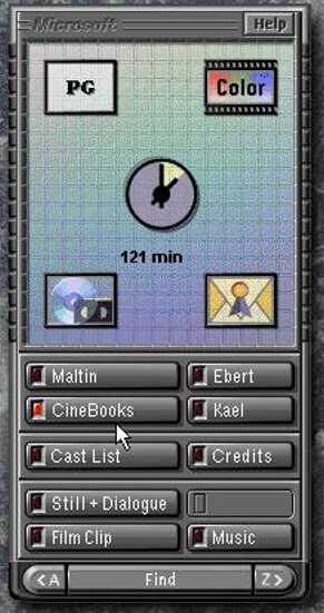
This side menu is quite nice, though. In this skeuomorphic TV remote thing, the buttons are all quite clear (even if the icons aren’t), complete with nifty embossed 90s Microsoft logo.
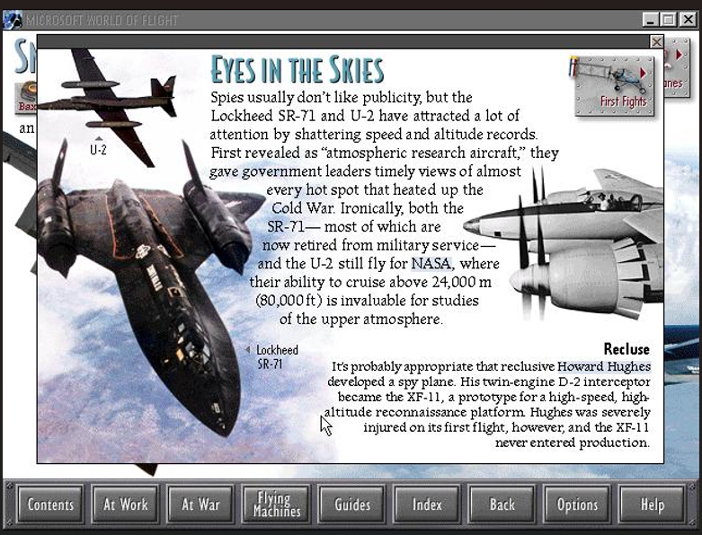
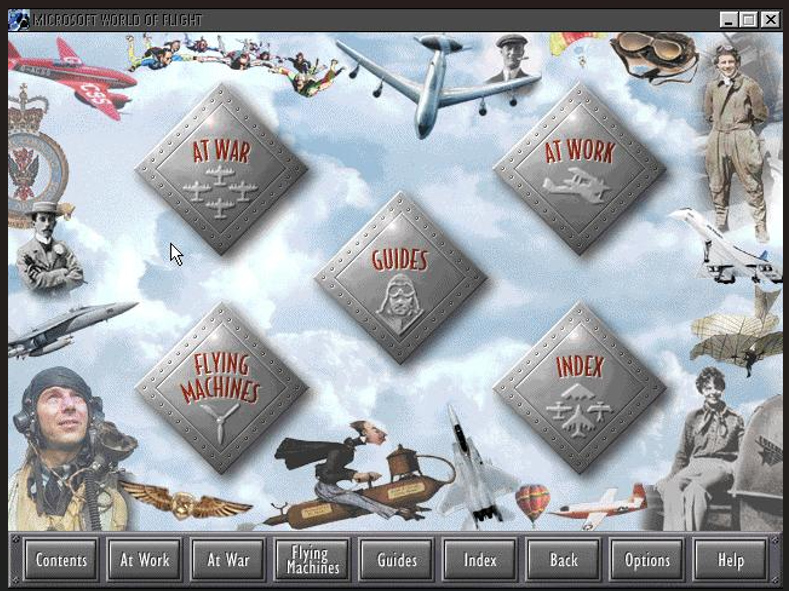
Some works, like Microsoft World of Flight, are cleaner, but not quite so interesting. Here they’ve clearly taken a leaf from glossy educational children’s photo books, the kind that were a staple for Dorling Kindersley. It works, though it doesn’t particuarly stand out.
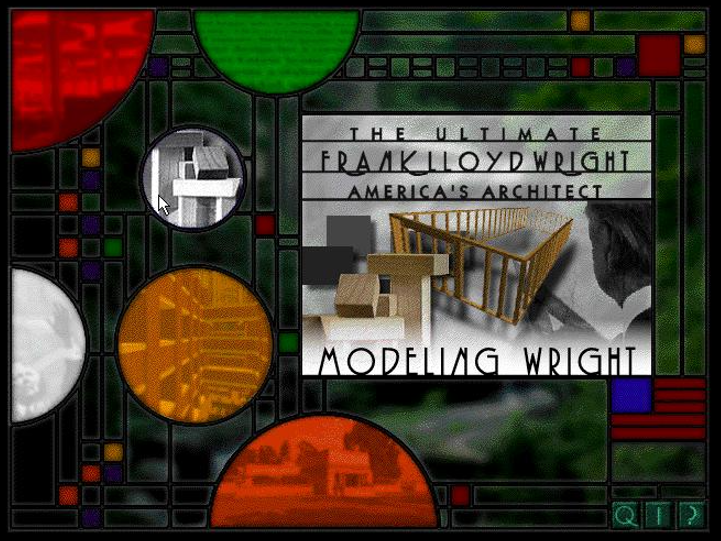
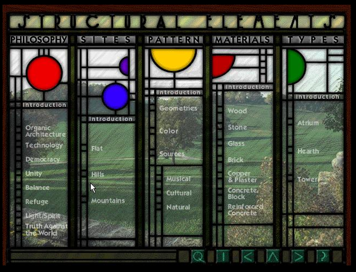
But sometimes you get a style that really sings - the interface for The Ultimate Frank Lloyd Wright is both clean and colorful, modern and antique, just like Wright’s designs: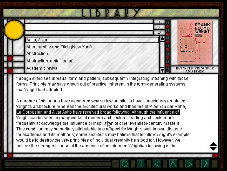
Special mention to Exotic Japan, which is a bit more dated than the other titles here (published in 1991), but still manages to have its own style.
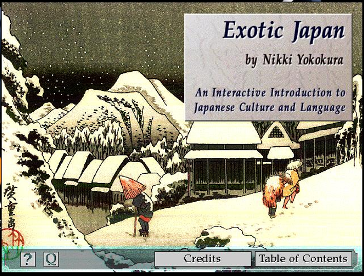
Exotic Japan, as an earlier title, has quite simple menus, but still manages to carry its own style through small touches - the hand-made-paper look, the concave corners, the surprisingly pleasant brown-green colour scheme.
With the later titles, once again you can tell a lot of design came from the concept of “digital books” - this layout from Dangerous Creatures would look at home in any Dorling Kindersley glossy children’s encyclopedia.
Sometimes, this collage aesthetic goes a bit too far. The main menu for Microsoft World of Flight looks a bit like someone went through a few copies of FlyPast with scissors and glue and called it a day. It’s very clearly that 90s multimedia aesthetic, but isn’t particularly noteworthy, with its haphazard arrangement of images:
In other cases, like The Ultimate Frank Lloyd Wright, the designers really went all-out. This “mystery meat navigation” (you have to mouse over the circles to see what the menu items do) is kind of bad design, but who cares when it looks this good?
Microsoft AutoRoute uses a pretty basic, but fun set of buttons.

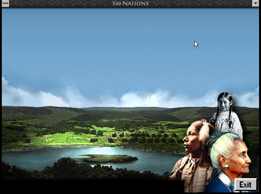
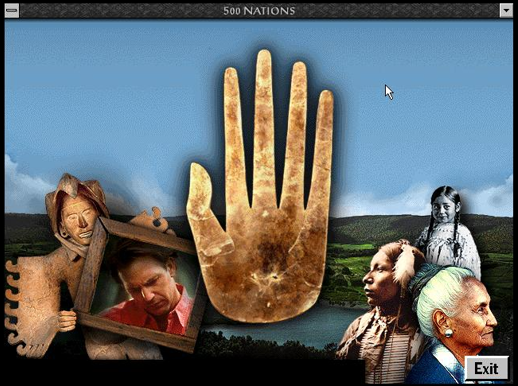
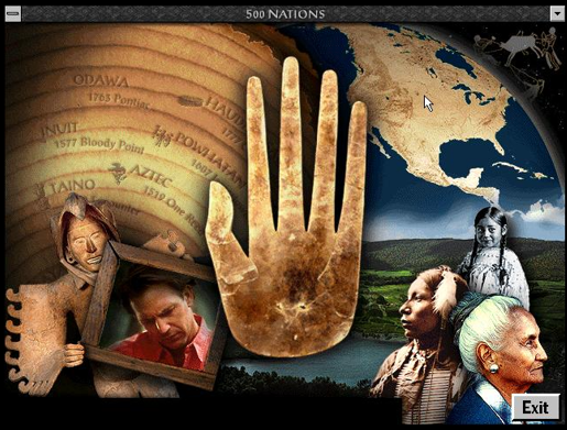
500 Nations does some really nice theming:

World of Flight is simple, but nice and “metal”-y:

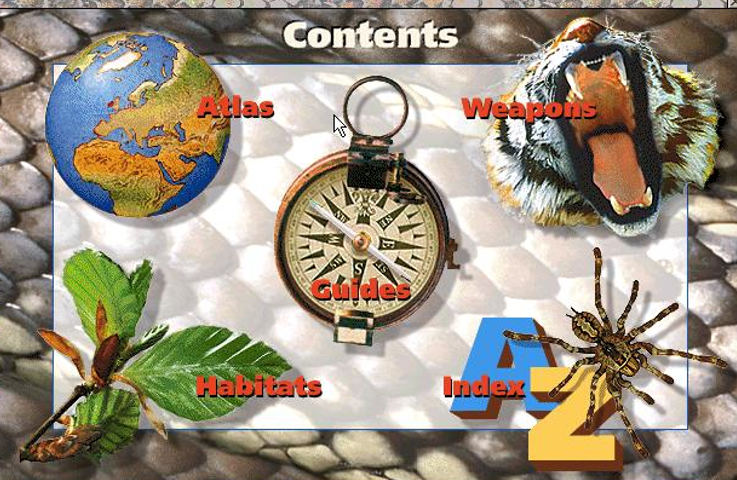
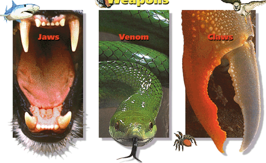
Dangerous Creatures really nails the aesthetic. Colourful icons, gradients, curvy buttons.

This could have been a simple 3-item menu, but is turned into a real visual treat:
Tabs were already a big deal back then, as can be seen in this promotion for Microsoft Scenes: Flight Collection (”40 full-screen photographic images!”). I don’t know why I like this, I just think it’s a neat display of information:
Sometimes there are just buttons, buttons and more buttons, such as Cinemania ‘95 which presents the player with no less than 3 menus, all providing a slightly different window into the software’s database, together with a really neat marble background. We can also see the multimedia style hallmarks here of just throwing all the fonts, in all the sizes, at the screen:
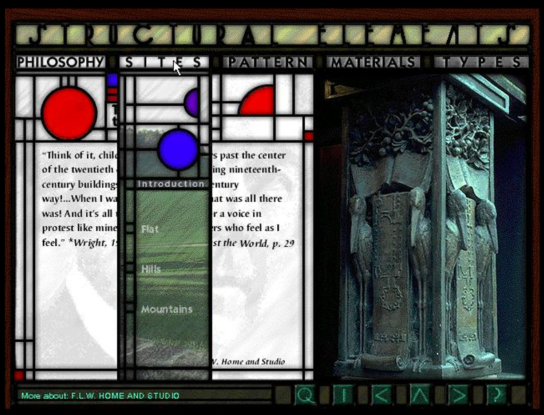
At the peak of 90s multimedia design, you get things like The Ultimate Frank Lloyd Wright which actually manages to be both thematic (inspired by Wright’s famous stained glass windows), good looking, and accessible. When you access a page, and then go to a menu item, the “panes” of glass are overlaid on the page you’re reading. It’s really neat.
Encarta 96 takes a straightforward searchbox and really makes it zing with that neat timeline search. Again we see the colourful icons as a hallmark of the multimedia style, which clashes a little with the software’s muted aesthetic. We also see an illustration inspired by “Global Village Coffeehouse”, the art aesthetic that was so prevalent at the time. In fact, you could almost say all the elements of mid-90s multimedia software design are in this one image.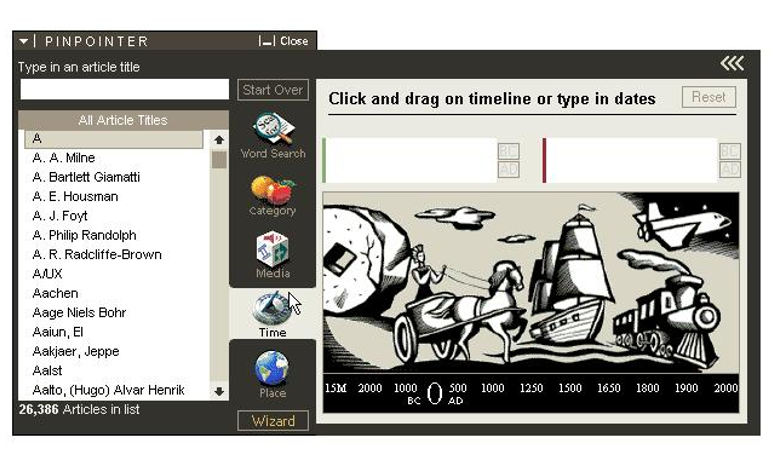
Finally, I noticed with both Encarta 96 and 500 Nations a strange commonality - when you first open the software, you see images fading in one-by-one as the software loads the main menu. It’s actually pretty cool.
I don’t know yet, but I think there are elements that are consistent enough to make a list:
All these applications have something interesting about them, though I’m not a fan of all of their designs. I wanted to highlight Encarta ‘96 for having a timeless, clean design; The Ultimate Frank Lloyd Wright for going all out and looking great; and Exotic Japan for doing a lot with simple elements.
These are just a few of the hundreds of CD-ROM multimedia titles that were published in the 90s. I hope to do another deep dive soon and find some more inspiration!
Did you like this post? Tell us

Leave a comment
Log in with your itch.io account to leave a comment.