This is part 1 in a series of akward devlogs where I talk about the various subsets of game development, and why I suck at at them.
The modern expectation of a videogame is some software that responds to user input to generate audiovisual feedback. Even with this barebones description, you have three very distinct fields to grapple with- some kind of coding to tell the computer what to do, some kind of audio skill to generate the sound, and some kind of artistry to generate visual feedback (That’s before getting into all the other hidden soft skills). I have yet to speak to someone who hasn’t at least struggled with one of these. Here’s how I (try) to tackle one of them
(As always, you can find this post mirrored on the Crabbit Slater Website)
Today’s subject- Art!
(I suck at it, and by reading this post, you can too!)
The stereotype of the modern ‘technical person’ is that they suck at art. This isn’t entirely without justification, the term ‘programmer art’ exists for a reason. (Dear programmers- this isn’t your fault- it’s the fault of the education system that splits society into left and right brain people*).
So if you are someone who wants to make a game, and Suck At Art- what do you do?
Some options:
Almost all games pursue 1. Look at the credits of almost any game and be confronted by the terrifying amount of person-hours that went into making your game pretty. Pursuing 2. is possible, Dwarf fortress and Thomas Was Alone are two examples of successful games that deliberately eschewed ‘conventional’ art. The problem with 2. however, is that you either need to bring something to the table to make that lack of art either a hurdle worth jumping for the player (an engaging story, unique mechanics) or a deliberate stylistic choice that enhances the rest of the game.
I’m too poor and anti-social for 1. and I’m not clever enough for 2. so I’ve picked
3. Abandon all sense of shame. Do your own art.
It’s easier to show than to talk in the abstract- so here’s the process I went through producing a particular asset for my(dumb and sucky) upcoming game.
GOAL: generate asset(s) to represent a static hazard in a 2D game.
If you’ve played any platformer, you already know these. They’re an almost universal staple of the genre, a few examples here- from retro, to modern, to modern retro. The humble spike. You touchy, you hurty.


Left to right: Megaman, by Capcom, VVVVVV by Terry Cavanagh, and Hollow Knight, by Team Cherry
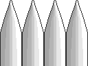
Here’s my version:

At least 30 whole seconds in aseprite. You can see I pushed the boat out here. The goal was simply to get a sprite, any sprite, finished to test implementation in the rest of the game. It’s firey red and spikey. JOB DONE.
Or not. Firstly, the sprite is the wrong size, secondly, it looks kinda hazardous, but doesn’t obviously look like any real-life hazard, so unless animated to look like fire, it looks weird.
All in, looks sloppy and lazy. Which is fine. I was being sloppy and lazy. There is no point in expending effort on something if critical details like the sprite size aren’t defined.
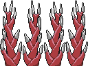
This is terrible for two reasons, firstly it looks quite shabby, and it’s not clear that they’re spikes. The second becomes apparent when you look at the screens below.Once the implementation is solid enough to know what size of sprite we need, we can start applying ourselves. It’s…. not great. Spikes or white picket fence? YOU DECIDE.
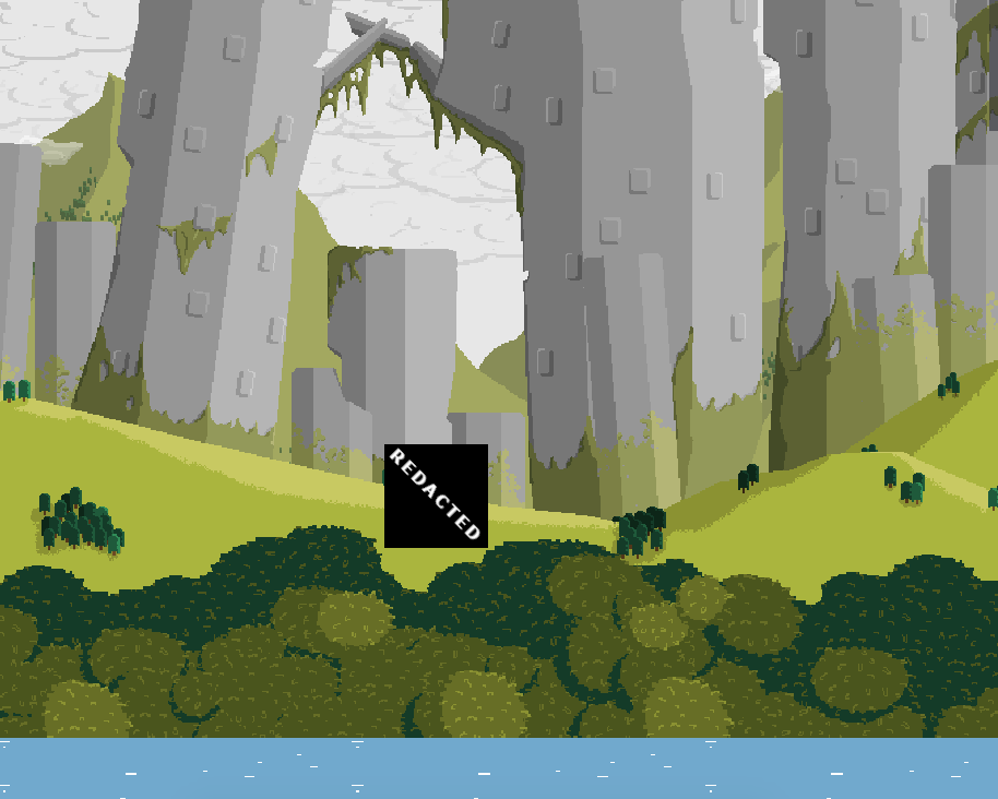
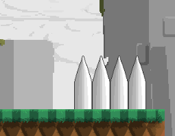
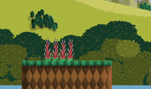
The spikes will be against any one of three main colours of background- blues (water) greens (foilage) and grey (clouds and ?????). On two of these it’s kinda visible, and on the other, it disappears.
While not the most pressing issue, I’m also thinking about what it says about the wider game environment. Who put these awfully clean, uniform spikes there? What purpose do they serve? Who are they meant to be spiking?
Given that [REDACTED] has no [REDACTED], it doesn’t make sense to shoehorn in [REDACTED] like these spikes.
Of these three concerns, I arrange them in the following priority.
So, what do we do?
One of my pet peeves is people who jump into a task without really planning or thinking through how to achieve it. Who has two thumbs and is a massive hypocrite? (it’s me).
So, instead of jumping straight in “hurr hurr spikes are simple, I’ll just draw some shaded triangles and mark as complete” I should’ve thought about my list above. How do I make FUNCTIONAL, AESTHETIC, NARRITIVEspikes?
Our spikes must be hazardous, and obviously so. How do we do that? Firstly, make them spiky. That’s a given. The problem is that’s plainly not enough- even with an outline, our spikes fade into the background. My solution: pick a colour that contrasts with the background. Red seems like an ideal choice- it stands out against the blue, green and grey. It’s also a ‘hot’ colour, which lends itself to the foreground.
Just to really drive the point home, let’s add a contrasting highlight- nature loves this to signify danger. Wasps, blue ringed octopi, skunks and so on.
Speaking of nature, let’s think about aesthetics and narrative here.
Because the game takes place in [REDACTED], the shiny metal spikes of the previous attempt don’t make sense. I’m thinking that these hazards should look, and give the impression of a naturally occurring hazard. Something like spiky vines.
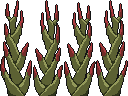
So our first ‘thoughtful’ attempt looks allright- I tried to mimic the kind of organic growth pattern you see in a head of wheat, but it’s a bit too regular to give the impression of a ‘natural’ phenomenon.
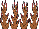
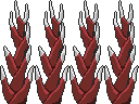
Introducing some cheap variation can help a lot to break up an otherwise monotonous feature. One in the block of four is flipped, and the other two are slightly vertically distorted. Also trying out some different colour schemes. The last is my favourite, it stands out the most, and the silver tips give the impression that this plant is growing metal thorns. I really like this idea, as [REDACTED].
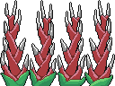
Now I’m settled on an idea- all that’s left is to add the finishing touches. This is mostly cleaning up my horrendous, rough pixel work, but also adding the little details that make things pop- in this case, leaves or green bud casings to the spikes. This drives home the idea that they’re organic and plant like hazards, and as they’re only little details, we don’t need to worry about contrast. The buds also help to disguise the fact that each spike is an obvious copy of its’ neighbour by adding in a touch more variation.
So there you have it- That’s how I Suck at Art, and now, you can Suck at Art too!
*(Historically this wasn’t always the case, look to Da vinci’s Vitruvian man, and many scientists had to be able to accurately sketch their observations before the advent of the photograph)
-----
What do YOU Suck at? What would you like me to Suck at?
Leave your suggestions in the comments!
Did you like this post? Tell us

Leave a comment
Log in with your itch.io account to leave a comment.