(There is a mirror of this post in the devlog section of Making a Monster's itch.io page)
Another month, another devlog, and honestly my July had been taken up by a vacation, stupid car bullshit, and also the O2A2 2023 jam! I'm sure you saw but in case you haven't, I just released Making a Monster for that jam and a lot of this devlog will be the postmortem and some vn behind the scenes for it. It's also going to contain spoilers for it too, so I recommend playing the game first! But I can't tell you what to do so if you want to look at the process before playing then hell yea. If you didn’t want to read the postmortem, you can also skip to the So what now? section for the plans for things I’ll be doing in the future.
Story Concept
So funny enough, I had actually been planning out an entirely different vn to do for O2A2 2023. I won't spoil what it was until I get to work on it for next year's jam, but the concept for MaM came up a week before the jam started and my brainworms latched onto it.
As you may or may not know, I have a rule about never explaining my work. This one should be pretty obvious though, and I've already gotten a lot of nice comments about the story and how relatable it is! Which, on one hand, yay I'm glad it resonates! On the other hand, oh no I'm so sorry you've ever felt that hard enough to relate to poor Loupe.
It's worth mentioning too that I've had severe art block since my mental breakdown a few months ago, and drawing anything had become such a struggle in that time. It was frustrating, to say the least! A game jam like O2A2 was able to help me break out of it and also I started adopting the incredible mindset of Fuck Its, which means I’m going to be super self indulgent in the design and colors and setting. I don't know if online knows this about me but I'm always a slut for fantasy and the only reason why I haven't done a fantasy story yet is because I got caught up in the worldbuilding for my main series and, oh, you know, tried to make some conlangs haha.
But I wanted to write fantasy so bad that I also adopted the Fuck Its for this fantasy setting, that is, I Do Not Think of worldbuilding and I'll just make stuff up as I go because that, too, is a really fun way to create.
I just wanted to have fun making things without overthinking it like I usually do. So with this vn, I did just that!
The Art and Artstyle
I didn't have an artstyle in mind when I came up with the concept, and I was honestly set in painting and drawing everything in my natural style. The main idea I had was Loupe staring at a copy of themself but the copy is fucked up looking. Since it's a fantasy setting, magic was most likely involved in creating this thing, so the aesthetic is going to be magic fantasy themed.
The first thing I design in my vns is the user interface. After all, this is going to be the thing people interact with and look at the most, and its sizing and design will dictate how many words it’ll take to fill before the user has to click. So that means: fonts!
When looking for fonts, I wanted fancy yet fantasy because too fancy will make it look like The Perfect Portrait. I then stumbled across Mutlu. The aesthetic of the font gave me a sense of magical energy trails, so I figured Hell Yes and that I could try this linework aesthetic in the art’s lineart and graphical parts of the UI to make everything in the vn look visually cohesive.
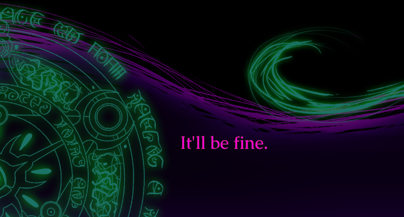
As for the magic circle in the logo, textbox UI, and transitions, I honestly found a public domain clipart of a magic circle and edited it from there, keeping Mutlu's aesthetic in mind. The text around the circle is actually a font I made myself, and is, in fact, one of the first fonts I’ve ever made for one of my first fantasy conlangs. I’ve since redesigned the language so the writing style (which was that font) is obsolete, but hey it looks cool in the circle! Good job me from over a decade ago!
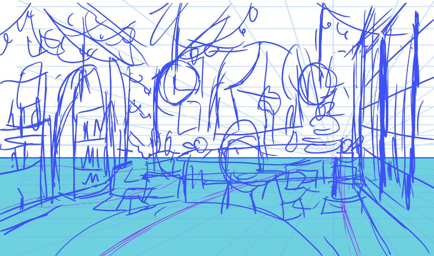
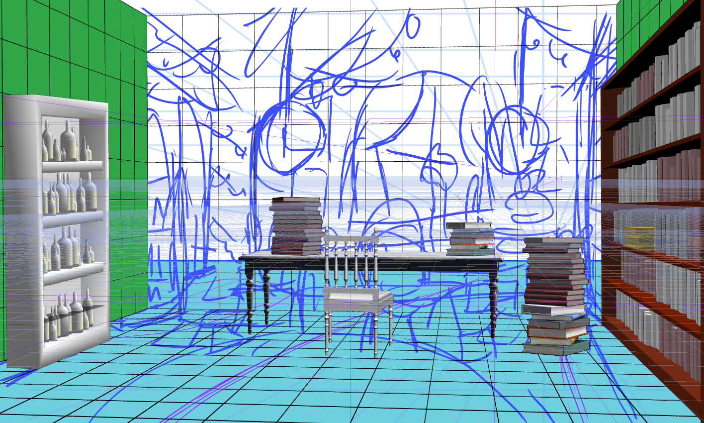
Admittedly, I didn't think too much on the background other than it had to definitely belong to a magic user, so books, potions, notes, and tea everywhere! And an indoor tree adorned with fairy lights because why tf not, that looks cool as hell! I'm trying to use more 3D in making bgs to help speed up the process, and it definitely helped here. Honestly my main focus of the vn’s presentation and storytelling was going to be the copy of Loupe in the middle of the screen, so I tried to keep the background interesting looking for the sake of setting and perhaps telling more about Loupe beyond the story.
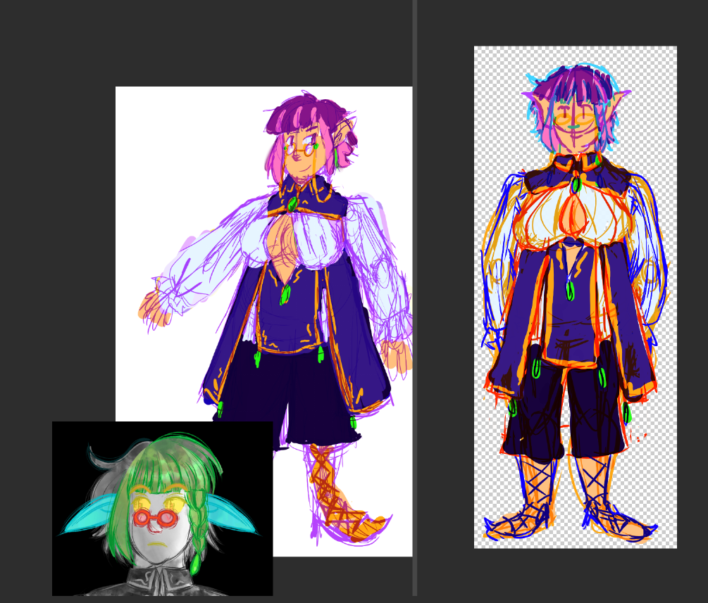
Loupe’s design was honestly me having fun and being super self indulgent. Yes that includes the tig bitties. That also includes the ears because I like long eared beings being expressive with how they move their ears, so that added an extra layer of emotions for Loupe. I ordered the expressions in this way (base->ears->bangs->eyes->glasses) so that the ears are nicely covered up and also so the eyebrows help convey more expression too.
Special Effects
So hey I made this neat looking magic circle, might as well put some use into it! I like how Ren’Py lets you create and customize transitions because it’s actually pretty simple to do with ImageDissolve.
You get a black an white image because the engine uses darks and lights to designate which gets wiped first, so you just gotta make a grayscale image and experiment from there. Ren’Py allows you to go black to white or white to black and time it as you need, so I just had an interesting looking blurred photo with the circle on top. You can check out more about ImageDissolve here!
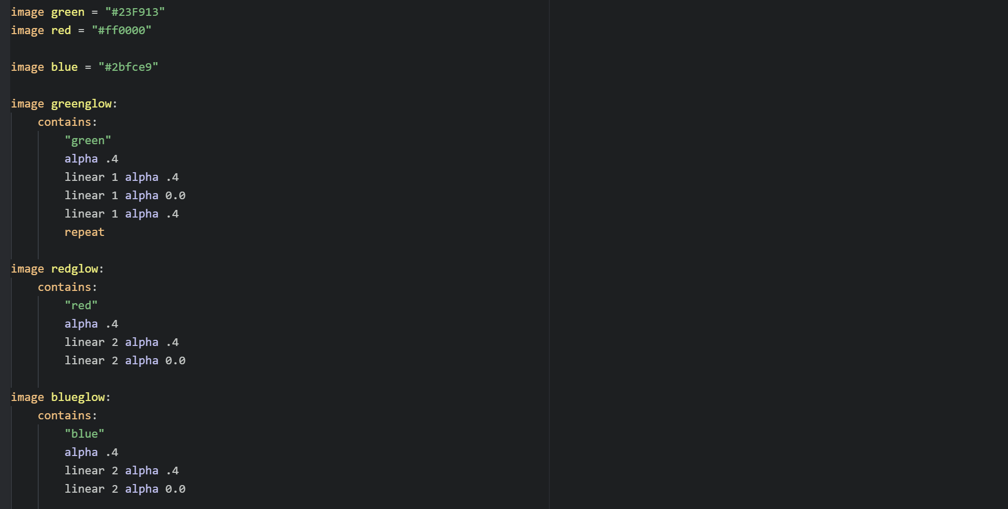
As for the green magical glowing, you just get some good ol’ hex color codes and Ren’Py’s Animation and Transformation Languge (ATL) to get some faded colors going. It's honestly pretty simple but this with the particles and the sound effect I mashed together made it seem magical, eh?
The waviness of the doll came from Daniel Westfall’s fantastic wave shader code, and all that's needed was to mess with the values to make it look magic-like. The doll was colored using Ren’Py’s ColorizeMatrix that I love to abuse lol. Basically, it takes the darks of an image and the lights and changes them into different colors depending on what hex color you use. I used this a ton on No !@#$s Left to Give and The Perfect Portrait and I love the effects it creates when you mix color combinations.
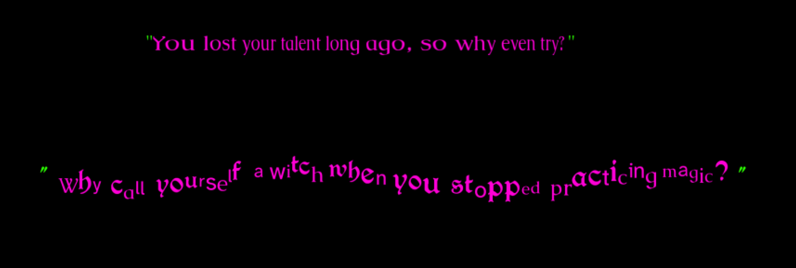
Version 1.0 of the game had some of The Doubts’s text be stated in this same wavy effect that uses the same wave shader engine. I wanted to keep this because visually it could be hinted that the thoughts were coming from the wavy thing. However, there was this issue where if the text animates to the quotation marks, then it would clip. I had to publish the game sooner because of issues cropping up with my life (thank the car) and in hopes of editing the wavy text in the future so that it doesn’t clip. But even after I had some time to look at it I just could not figure out how to make it not clip. This, alongside kind criticisms of The Doubt’s text, prompted me to just style it differently for 1.1.
So with 1.1 I used Westfall’s code for Chaos Text. It animates in that if you give the code a set amount of fonts, a range of sizes in points (pt) for your text size, and colors in hex code, it’ll have this neat psychedelic effect with the text. You can see in his demo how it initially looks, which I love, but boy it’s hard to read when it animates. I made some modification to his code so that the text is still readable by using fewer fonts (3 total, which is Caudex the default font, Atkinson Hyperlegible, and Berry Rotunda the button font), set the text size range closer in values (36-50pts, instead of 1-80 which will potentially make some letters 2pt font thats too hard to read lol), and make sure it doesn’t animate in that each individual letter changes size and font every millisecond lol. That way I can still give the text that disjointed inhuman feel, and the text won’t clip or be super nauseating when it animates! This only came about because I was trying to find a way to disable all animated text, which proved to be a little more complicated than I expected and is something I’m still working on.
It still kinda has its quirks though! For example, there's a bug with the kinetic text tags what will make it run outside the textbox if you don't use paragraph {p} tags. Because the lines are rendered differently each time you view them, when you have a 3 layers of textbox dialogue the line will re-render the fonts and sizes another 2 times. It looks kinda jank when you see it ingame but in a way it works? Since the feeling for The Doubts is meant to look really disjointed anyways.
I’m really proud of what I was able to achieve with Making a Monster! O2A2 is one of my favorite game jams because it makes me think and experiment with code and art presentation in ways I wouldn’t typically be able to in my longer projects.
For example, this is the first time I used the side image function in Ren’Py. I wanted Loupe to react even if they’re not thinking or talking, so making sure their portrait was reacting properly was fun.
I did want to have Loupe look more visibly tired through the scenes and see if I could tie it into the values you get from the choices, but I ran out of time unfortunately. I also wanted to expound on the endings because I feel that they’re a little sparse and abrupt for my liking, but alas, only 1000 words and I felt that the buildup to the endings was necessary to put words into. Speaking of word count, I was having a tough time this time around because I kept having too many words even after several proofreads until I was able to cut it down by rewording some sentences and taking out scenes.
I asked my beautiful and sexy music composer and partner Dan Vallerand to make a song that was not only foreshadowing what was to be made, but also had some optimism in it. He typically asks for the script and a beta of the game so he can get a feel of what to compose, but because of slowness on my part due to having to deal with car issues, I essentially shorted him on time. I felt so bad about shorting him on composing time, but he still managed to get Harmsichord and its variations made! I was thinking of having him edit the song a slight bit more, but after I placed the song in the game I found it still fit the scenes I wanted to use it for, so yay! Now go listen to his music right now.
I want to do more story stuff with Loupe! I love them a lot! With what, I'm not sure, but perhaps it'll have their partner Cynthis as well? At the time of writing this postmortem, I haven't had anything else planned for the two of them, so who knows what the future holds~?
After publishing this project and the 1.1 update, it feels like a weight I’ve been holding onto has lifted. I saw a lot of kind comments on my art which has made me tear up in happiness. Usually I try to plan an artstyle fitting for the story, and admittedly I still kinda did with the lineart, but the art style seen here is actually pretty close to my natural drawing and coloring style. When I say natural, I mean its what I tend to draw in when I'm not thinking of a specific style or aesthetic. I usually style the visuals depending on the story's themes and most times I limit my palettes to make editing images easier. Don't get me wrong, thinking about artstyles for a visual novel is one of my favorite parts of vn dev because exploring how the visuals will look and experimenting in making consistent and cohesive visuals that can be replicable for several images is super fun for me! But this time around and thanks to that terrible artblock making it hard to draw anything, I just wanted to relax with my art. But hey thank you everyone for making me cry with your lovely and kind comments! I mean it! :D
So what now?
Well, I’ll be back into a vn dev hiatus now that O2A2 season is over. I'll be doing my usual stuff of getting my art portfolio site together, getting my Ko-Fi in order, drawing more bg art for CC use, and doing the GUI updates for Pillars on Poppy Hills and Wolf’s Wool, as well as their artbooks. I also want to see if I can make animated text toggleable for MaM and other games I made in the past that has animated text, but that may take some time as well.
I will say, before O2A2 started, I had taken out a vn script I wrote in 2017ish and have taken to editing it, but will it see the light of day? Perhaps, but who knows when since I'm not going to be hard into vn dev because of the previous things I stated I need to do first and foremost, but the brainworms are there. It's just whether the spoons are since I’m juggling a lot lol
Also, you should play some games that were in O2A2 2023! There's a lot of cool stuff in there!
There's also a lot of cool stuff in Nonbinary Jam 2023 as well! Check them out!!
If you like my work and want to financially support me and what I do, I have a Ko-Fi! Even without money you can still support me with 5 star reviews on itch.io and spreading the word of my games. Thank you all so much for the support, and I’ll see you in next month’s devlog! :D
~Knickknack PJ
Did you like this post? Tell us
Leave a comment
Log in with your itch.io account to leave a comment.