Whether you want to steer players towards a certain objective or just make a really good looking game, knowing what to do when it comes to color is vital to game development. Luckily, there are some shortcuts out there to help us make games that look pretty good right out of the gate.

A color palette is a set of colors that is used together in a visual design. Games without color palettes can look visually chaotic but how do we actually decide on what colors to choose? Well, we got to use color theory! There are many amazing articles that really get into this topic, but you don’t NEED to know this knowledge right away to make good looking games if you use a little shortcut.
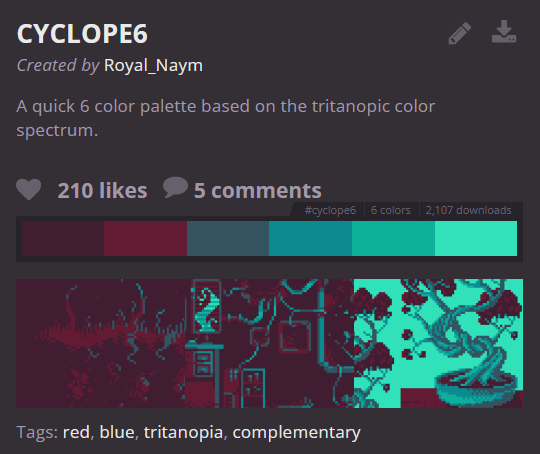
There are websites that allow you to grab color palettes without having to come up with them yourself:
Lospec – has an entire database of palettes created by artists for people to use.

Coolors – this is one of the many websites out there that automatically generates color palettes using an algorithm.

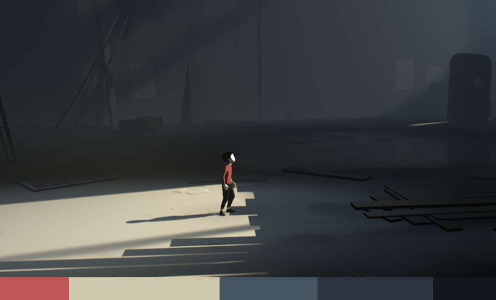
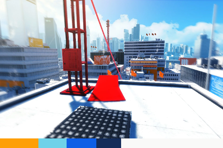
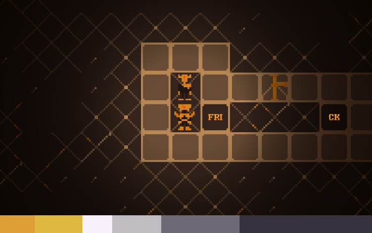
To put it simply, 60-30-10 represents the ratio of each color in your scene. 60% is the primary color, 30% is the secondary color, and 10% is the accent color. It’s a rule originating from interior design, but can be seen in many visual mediums.

Like any creative endeavour it’s a rule that can be broken, so it’s more of a guideline. However if you do decide to break the rule, you probably want to do it for a specific reason.
I really recommend taking advantage of these 2 ideas to make much more visually striking games with much less effort than you’d initially expect!
P.S. If you’d like to read more about color in games, here’s a link to an article that helped inspire this blog post!
-Hey guys, originally did this for a school assignment but thought that some of you would want to see this too!
Did you like this post? Tell us
Leave a comment
Log in with your itch.io account to leave a comment.