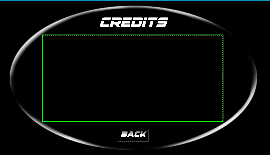
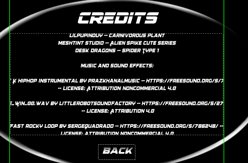
When I first set up the credits menu, everything looked fine with short text. But once I added the full credits, the text ended up being way too long. The problem was obvious during the rolling animation: instead of staying inside the credits window, the text scrolled right outside of it, which looked messy.
At first, I thought I just needed to resize the text block, but that didn’t actually solve the issue. The problem was with how the text was placed in the layout.
The box where the text credits went outside:
What worked was putting a scroll box inside the space box and attaching the credits text block to that. The Scroll Box acts as a proper container, so the text is clipped to the box instead of going out. It also makes the roll animation look smooth since the scrolling is confined to the right area.
Did you like this post? Tell us
Leave a comment
Log in with your itch.io account to leave a comment.