Devlog - UI/Polish
Posted May 23, 2024 by Throns
Devlog: UI/Polish
Devlog for the game 'Into the Mist', a game project/assignment for KIT109.
UI/Polish
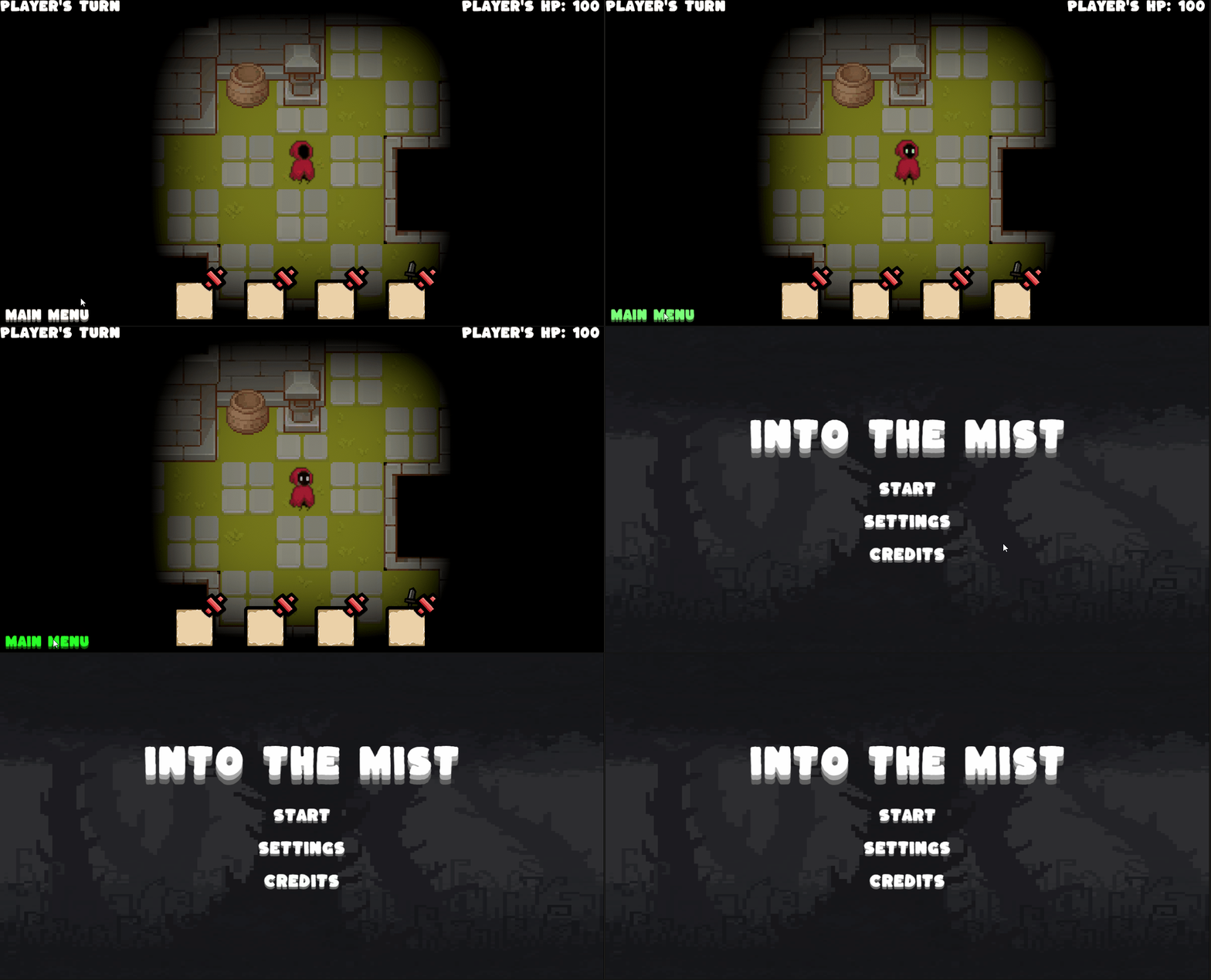
This week, we added polish to the UI for the player health information and game turn (Figure. 1). To implement this, we utilized the canvas game object and added a script to change the text based on the health info script and game manager script which records the game state. Furthermore, we add a go back to menu button (Figure. 2). Implementing the back to menu button uses the button component. The KIT109 Tutorials code inspires the code for all UI and buttons.
 Figure. 2 Go back to menu button.
Improvements and Alternatives Implementation
We want to make many improvements, namely, a simple health bar for the enemy, UI for the item descriptions, extra details on the movement UI (range of enemies' attack), etc. Another thing I would like to add is a loading screen and a tutorial scene, where the user can learn all of the basic controls. As for alternative implementation, we could make the player health UI a heart UI.
Feedback from Peer Review
I got many feedback and ideas from other people, and the feedback was mainly positive. However, some are insightful and might be able to make the game better:
Adding a description for items and enemies
I agree with adding extra descriptions for the items and enemies, as users need that information to make a good decision. To implement this, I would make a UI that pops up when a mouse is hovering over a particular item/enemy. We would surely implement this in the future if we have the time.
Adding sounds
Adding sound to the game is a significant enhancement. It not only makes the gameplay more immersive but also significantly boosts the fun factor.
Files
- Build.zip 7.5 MBMay 17, 2024