Devlogs
Improved text / image layout for readability
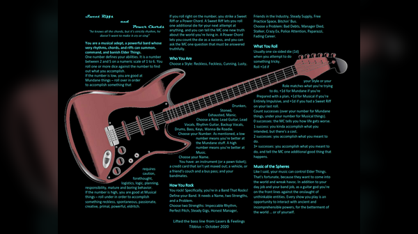
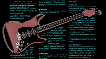
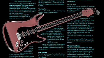
I think the title of this post explains what's going on. I got a lot of feedback about how hard it was to read the text imposed over the guitar. Someone kindly suggested I try wrapping the text around the guitar, instead. I made the font 10 points, which may be a challenge to read. Another option is to go to two pages with additional content. Let me know if you'd be interested in seeing that; I'm not totally bound to the one page aesthetic though I do like that I'm following so closely to my inspiration.