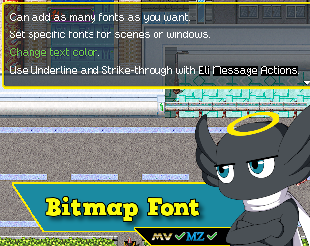
This is an amazing plugin, I use the pro version for my game ad it looks perfect.
I have a question: Is there a way to disable the plugin for a specific language? I'm planning to add Chinese and other languages and I cannot make all the characters...
I use a plugin for the translation that allows me to change the parameters of the plugins for each language so a simple switch will do.
Hello, I have a bug when trying to use the plugin (pro version). As you can see on the image, the text is all messed up. It is strange because your plugin used to work on a previous project. I'm on the 5.4.16 version of EliMZ_Book and 3.2.3 for the BitmapFontPro plug in. Thanks for your help!!
This is a plugin parameter configuration problem. Probably the amount of characters you put on your bitmap file does not match the amount set on the plugin parameters.
Hi, the plugin has been great! It's a game changer for my game's visuals for sure.
I don't understand how to use the outline feature though. I made an outline version, making sure to stay within the 10 pixel width, but it looks like this:
Also, is there a way to have the spacing be negative? If I want the letters to be closer to each other than 0 pixels.
Take a look at my sample project. There are an outline font there that you can see how the bitmap file was made and how did I setup this bitmap parameters.
You could try putting negative numbers, but I don't know if it will accept negative inside the code. If not, I will implement it :)
Your sample project doesn't include the pro version so there are no parameters set up for an outline font. But just looking at the font image files, it doesn't make sense to me. I'm looking at "cyborgSister_28" and its outline version, and I can't seem to figure out the rule for how they are lined up. I thought it made sense that the outline version would line up perfectly with the font, but your file looks completely different.
Also I manually added a negative number in the code as the parameter box doesn't accept them, and it does decrease the spacing. However, it cuts into the letters and creates a gap of the same width as the spacing, very similar to my screenshot above. I think the two issues may be related.
Is it possible that the way the fonts are rendered doesn't allow for the individual letters to overlap? Because in your examples, I can see that you've set up the fonts in such a way that they don't. While this is fine for regular fonts without outlines, the gap between letters becomes too big when there is an outline, especially when it's a tiny pixel font like I'm using (it becomes a 4 pixel gap betweeen each letter)
I'm bad at explaining so I'll show you an example of what I'm trying to achieve:
I'll also attach my font files in case you want to take a look at those:
The sample project does not include the Pro version of the plugin file, because it is paid. But the plugin parameters of the pro version is on the sample project. Is just a matter of you copy and paste the plugin file inside the plugin folder of the sample project, then activate it on the plugin manager. After the plugin file is inside the sample project, you will be able to double click the parameters and see what is inside. But if you try to open the parameters before the plugin file is on the plugin folder, it will reset the parameters.
The outline font works like two exactly bitmap.png files on top of each other. Therefore, they must have the same file size(width and height), and also the same "letter" size inside the image editor. Taking the example of the CyborgSister_28_outline file, using GIMP as the image editor.
Below is the layer of the font without outline:
Now, this is the layer of the font with outline:
Now, you will export each layer, individually. In a way that you will have two files.png so you can assign into the plugin parameters:
When the text is been drawing on the RPG Maker, the plugin code will first draw the font file without the outline, then after that, it will draw the outline font file above it, making the letters look like this:
This need to be done this way, because the letters as drawn as an image, not as text(which is the default). And so, the plugin must treat the outline and non-outline files individually, in case you want to change the outline color or the font color individually.
So, on your image editor, you need to take into consideration when creating the font file, that both font versions must have the same size. The outline type will not be drawn on rpg maker, as an outline over your font. But instead, as a file on top of another.
Now that I'm talking to you, I can see why you are confused. Other than taking a look at the sample project, the help file is missing those kinds of information. I will update it with all this info. Let me know if this explanation helped you :)
------------------
About the negative space, I will have to play with it myself to see if there is a solution for that.
Thank you so much for taking your time to work with me on this issue! I finally understand how the outline fonts work now, I've adjusted my font and it works properly as long as the spacing isn't negative. I tried setting the spacing to -2, and it almost works! The only issue is that the outline cuts off at the end, like this:
At least it doesn't cut off on both sides like it did before, but this plugin would be perfect if this can be fixed :)
I have an issue with the pro version. The demo version works just fine and loads the font properly, but when I add the pro version, it doesn't load the font. I checked the console and found that there were param errors so I refreshed the plugin parameters (without changing anything), but now I get the following error when launching the game:
TypeError
Cannot read property 'getHexOrName' of undefined
Specifically, after reinstalling the plugin several times and repeating the process, I found that this error only occurs when changing the "All Characters" params.
This occurs even without any other plugins enabled.
Make sure you are using my core plugin Eli Book somewhere above all other Eli plugins.
And make sure you have the same amount of characters in your bitmap file and on the All Character parameters.
If it still does not work, when the error happens again press F8 or F12. A browser window will open. Go to the CONSOLE tab, and send me a screenshot of the error so I can take a look.
I was wondering if there is a way to fix this name from being blacked out and using the default font in the battle status menu. This only occurs when having VisuStella's Core engine installed.
This should work when you go into the font parameters and set "Use Battler Name" to true. Then, the plugin will use this font to draw battler names.
Now, if you already did this, and using Visu plugin make it not work, then it is a plugin conflict. And since because of the Obfuscation that visustella uses and their terms of use, I will not try to solve this conflict.
You can try change the plugin order or see if there is any parameter on the Core Engine that related to the UI/Name of the battler that you can deactivate and see if they will work together after that.
Unfortunately I already had the parameter set to true and have changed plugin priority multiple times.
I was considering dumping Visustella plugins (due to the obfuscation) all together and switching over to Yanfly by using a MV to MZ conversion plugin I found online.
If you have any advice or recommendations it would be greatly appreciated.
It's hard to say because a single Visustella plugin can do a lot of things. I mean a lot. So it's hard to recommend an alternative unless you could tell me exactly what are the things that you are using with their plugin. You could search alternatives based on that. I know there is this forum post that list only free alternative plugins for Visustella:
Small feature request: Would it be possible to have a parameter setting for the way it auto-calculates the width of each individual letter within the font file, to always use the maximum per-letter width instead? For example, your How To Use documentation lists an example of a good, properly formatted .bmp file 1940 px wide, divided by 97 characters = 20 px per character (no remainder, whole number that divides evenly, so it's good.) Would it be feasible to have an option to toggle between the current method of auto-calculating the width of each individual letter and, for this particular example, just setting them all to 20?
That would help to properly preserve and utilize fixed-width/monospace fonts, you see. ^^
I don't know if I understood you properly. But here we go.
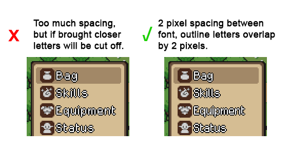
Since you can create the bitmap font in any image editor, I think it is kinda useless to create a parameter like that. Because, if you are creating the font, you can already create it in a "monospace" way. You can even choose the size in pixels of the blank space by the spacebar and also the space in pixels between each character:
Look at this example, with this settings.
Setting A - The space between characters is 0 pixels and the blank space(using the spacebar) is 4 pixels. Here is the results.
Setting B - The space between characters is 4 pixels. The blank space(using the spacebar) is 8 pixels. Here are the results.
Are those kinds of effects you are looking for? Or maybe I misunderstood the concept of monospace font?
You might have, or perhaps I just wasn't clear in my explanation, in which case I apologize ^^;
This is a fixed-width or monospace font:
This is a screenshot in an image editor of the file that we made for use with Bitmap Font Pro. Every single character is EXACTLY 18 px wide (the black lines are a grid I set to show with squares every 18px just to prove this) because that's what Bitmap Font Pro needs to correctly figure out how to divide the image up, to know where one character stops and another starts. So even a narrow character, like i or l, takes up exactly as much space as a wide one, like W or #.
This is a varied-with font:
This is approximately what this same image would look like after Bitmap Font Pro converts it. Bitmap Font Pro automatically looks for characters with empty space (such as the aforementioned i or l) and removes that empty space, so this is what's left. This is why it takes up less space on the line overall and why there's a gap on the end. I turned the grid off for this shot because it doesn't line up to said grid anymore.
What we're asking for is that if it's possible to add an option for Bitmap Font Pro to skip the empty space removal step of that conversion and simply take something like the first image there (which we used for the input) and render an in-game bitmap font exactly like that. Rather than changing each letter from 18px to (18px minus whatever empty space it removed,) simply do nothing, leave it looking like that, unchanged, lining up with a hypothetical grid like that, etc.
The appeal of having this kind of fixed with/monospace font is that you know exactly how many characters' worth of room you have on a given line (you don't have to guess and try to account for the fact that typing "iiiiiiiiii" takes up less room than "wwwwwwwwww" despite being exactly ten characters each), and when you have text that goes on for multiple lines, a monospace font lines up with itself in a way that is varied-width fonts don't:
As long as the line has a three-letter word, a three-letter word, and a six-letter word, the spaces in between them line up neatly--every letter lines up neatly, for that matter, regardless of whether it's an l or a w or anything in between. This can be useful for things like displays with a lot of numbers, for example. (For flavor, it also gives the text a sort of monotone "mechanized" feel to it, which could be useful to help convey that mood if one of your party members is a robot or is interfacing with a computer terminal or something?) And it is something that Bitmap Font Pro currently cannot do, as inputting a monospace file like the first attachment here leads to it converting it into a varied-width bitmap font like the second one.
It seems a nice addition to the plugin! I will add this feature to the plugin and let you know when I have done it! Thank you for the detailed explanation and the suggestion! ^^
Hello again! I encountered an obscure compatibility issue that was causing some incorrect display visuals, but I don't need any help with this at all this time--I already dug around, isolated the problem, figured out what it was, and solved it. ^^ I just wanted to post this here for no other reason than to chronicle what happened and how we fixed it, if anyone else is having this problem!
So, we were experiencing a text alignment issue where the spacing of the text itself seemed to get out of place for a single line or two when using alignment codes such as \align[center] from Eli Text Actions. In these screenshots, note how we used \align[center] to center this text, then printed the exact same line in the exact same font three times, but the first line displays longer (if you look closely, I believe the difference comes from a bit of extra space between the "1" and "2" characters specifically.)
The peculiar thing is that these are the same lines from the same NPC, in the same session, during the same test. It was the strangest case of... if you talked to this NPC, sometimes the first line would be longer than the second, and sometimes they perfectly lined up. Upon further testing, I determined that auto-skipping the text was what was causing it; when I was impatient and hit "Enter" in the middle of the text being printed to make the entire rest of the dialog print instantly, then it was misaligned, but if I waited for it to print at the default game speed without touching anything then it lined up perfectly.
Finally, the fix: If you're running any (and I mean any) VisuStella plugins, you're probably running VisuMZ_0_CoreEngine, since literally everything they do is built off that. (Going without the core engine would be like trying to use any Hakuen Studio plugin without Eli Book. ^^;) In the VS Core Engine parameters, look for a setting under the "Quality of Life Settings" category called "Font Width Fix" which is set to true by default (according to the plugin description, this "fixes the font width issue with instant display non-monospaced fonts in the Message Window.") Turn that off (set it to false). And viola, everything lines up now, whether you try to skip the text or not!
Anyway, like I said, problem already solved so no action needed on your part, but I just wanted to leave this here if anyone else was having trouble with this. ^^
← Return to RPG Maker Plugin
Comments
Log in with itch.io to leave a comment.
This is an amazing plugin, I use the pro version for my game ad it looks perfect.
I have a question: Is there a way to disable the plugin for a specific language? I'm planning to add Chinese and other languages and I cannot make all the characters...
I use a plugin for the translation that allows me to change the parameters of the plugins for each language so a simple switch will do.
Thanks!
Hi there!
No, there is no way to disable the plugin once it is installed.
I'll look into other options, thanks though!
Hello, I have a bug when trying to use the plugin (pro version). As you can see on the image, the text is all messed up. It is strange because your plugin used to work on a previous project. I'm on the 5.4.16 version of EliMZ_Book and 3.2.3 for the BitmapFontPro plug in. Thanks for your help!!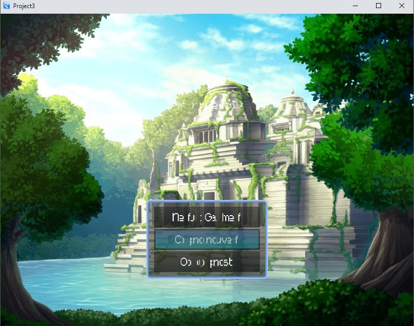
Hi there!
This is a plugin parameter configuration problem. Probably the amount of characters you put on your bitmap file does not match the amount set on the plugin parameters.
Take a look at this post, it had the same problem https://itch.io/post/5465325
If you are using Visustella, make sure to take a look at the compatibility section on the help file.
Hi, the plugin has been great! It's a game changer for my game's visuals for sure.
I don't understand how to use the outline feature though. I made an outline version, making sure to stay within the 10 pixel width, but it looks like this:
Also, is there a way to have the spacing be negative? If I want the letters to be closer to each other than 0 pixels.
Thanks!
Hi there!
Take a look at my sample project. There are an outline font there that you can see how the bitmap file was made and how did I setup this bitmap parameters.
You could try putting negative numbers, but I don't know if it will accept negative inside the code. If not, I will implement it :)
Your sample project doesn't include the pro version so there are no parameters set up for an outline font. But just looking at the font image files, it doesn't make sense to me. I'm looking at "cyborgSister_28" and its outline version, and I can't seem to figure out the rule for how they are lined up. I thought it made sense that the outline version would line up perfectly with the font, but your file looks completely different.


Also I manually added a negative number in the code as the parameter box doesn't accept them, and it does decrease the spacing. However, it cuts into the letters and creates a gap of the same width as the spacing, very similar to my screenshot above. I think the two issues may be related.
Is it possible that the way the fonts are rendered doesn't allow for the individual letters to overlap? Because in your examples, I can see that you've set up the fonts in such a way that they don't. While this is fine for regular fonts without outlines, the gap between letters becomes too big when there is an outline, especially when it's a tiny pixel font like I'm using (it becomes a 4 pixel gap betweeen each letter)
I'm bad at explaining so I'll show you an example of what I'm trying to achieve:
I'll also attach my font files in case you want to take a look at those:
The sample project does not include the Pro version of the plugin file, because it is paid. But the plugin parameters of the pro version is on the sample project. Is just a matter of you copy and paste the plugin file inside the plugin folder of the sample project, then activate it on the plugin manager. After the plugin file is inside the sample project, you will be able to double click the parameters and see what is inside. But if you try to open the parameters before the plugin file is on the plugin folder, it will reset the parameters.
The outline font works like two exactly bitmap.png files on top of each other. Therefore, they must have the same file size(width and height), and also the same "letter" size inside the image editor. Taking the example of the CyborgSister_28_outline file, using GIMP as the image editor.
Below is the layer of the font without outline:
Now, this is the layer of the font with outline:
Now, you will export each layer, individually. In a way that you will have two files.png so you can assign into the plugin parameters:
When the text is been drawing on the RPG Maker, the plugin code will first draw the font file without the outline, then after that, it will draw the outline font file above it, making the letters look like this:
This need to be done this way, because the letters as drawn as an image, not as text(which is the default). And so, the plugin must treat the outline and non-outline files individually, in case you want to change the outline color or the font color individually.
So, on your image editor, you need to take into consideration when creating the font file, that both font versions must have the same size. The outline type will not be drawn on rpg maker, as an outline over your font. But instead, as a file on top of another.
Now that I'm talking to you, I can see why you are confused. Other than taking a look at the sample project, the help file is missing those kinds of information. I will update it with all this info. Let me know if this explanation helped you :)
------------------
About the negative space, I will have to play with it myself to see if there is a solution for that.
Thank you so much for taking your time to work with me on this issue! I finally understand how the outline fonts work now, I've adjusted my font and it works properly as long as the spacing isn't negative. I tried setting the spacing to -2, and it almost works! The only issue is that the outline cuts off at the end, like this:

At least it doesn't cut off on both sides like it did before, but this plugin would be perfect if this can be fixed :)
But that issue of the font being clipped, only happens with the negative spacing, right?
Hi,
I have an issue with the pro version. The demo version works just fine and loads the font properly, but when I add the pro version, it doesn't load the font. I checked the console and found that there were param errors so I refreshed the plugin parameters (without changing anything), but now I get the following error when launching the game:
TypeError
Cannot read property 'getHexOrName' of undefined
Specifically, after reinstalling the plugin several times and repeating the process, I found that this error only occurs when changing the "All Characters" params.
This occurs even without any other plugins enabled.
Hi there!
Make sure you are using my core plugin Eli Book somewhere above all other Eli plugins.
And make sure you have the same amount of characters in your bitmap file and on the All Character parameters.
If it still does not work, when the error happens again press F8 or F12. A browser window will open. Go to the CONSOLE tab, and send me a screenshot of the error so I can take a look.
Ah I'm stupid. I had no idea there was a core plugin. Thanks, it's all working great now!
Nice! Have fun! :)
Hello,
I was wondering if there is a way to fix this name from being blacked out and using the default font in the battle status menu. This only occurs when having VisuStella's Core engine installed.
For reference I'am using the Pro version.
Thank you,
Hi there!
This should work when you go into the font parameters and set "Use Battler Name" to true. Then, the plugin will use this font to draw battler names.
Now, if you already did this, and using Visu plugin make it not work, then it is a plugin conflict. And since because of the Obfuscation that visustella uses and their terms of use, I will not try to solve this conflict.
You can try change the plugin order or see if there is any parameter on the Core Engine that related to the UI/Name of the battler that you can deactivate and see if they will work together after that.
Hello,
Unfortunately I already had the parameter set to true and have changed plugin priority multiple times.
I was considering dumping Visustella plugins (due to the obfuscation) all together and switching over to Yanfly by using a MV to MZ conversion plugin I found online.
If you have any advice or recommendations it would be greatly appreciated.
Thanks.
It's hard to say because a single Visustella plugin can do a lot of things. I mean a lot. So it's hard to recommend an alternative unless you could tell me exactly what are the things that you are using with their plugin. You could search alternatives based on that. I know there is this forum post that list only free alternative plugins for Visustella:
https://forums.rpgmakerweb.com/index.php?threads/list-of-free-alternatives-to-vi...
This helps out quite a bit, I appreciate you taking the time to respond.
Thank you.
Good luck :)
Small feature request: Would it be possible to have a parameter setting for the way it auto-calculates the width of each individual letter within the font file, to always use the maximum per-letter width instead? For example, your How To Use documentation lists an example of a good, properly formatted .bmp file 1940 px wide, divided by 97 characters = 20 px per character (no remainder, whole number that divides evenly, so it's good.) Would it be feasible to have an option to toggle between the current method of auto-calculating the width of each individual letter and, for this particular example, just setting them all to 20?
That would help to properly preserve and utilize fixed-width/monospace fonts, you see. ^^
Hi there!
I don't know if I understood you properly. But here we go.
Since you can create the bitmap font in any image editor, I think it is kinda useless to create a parameter like that. Because, if you are creating the font, you can already create it in a "monospace" way. You can even choose the size in pixels of the blank space by the spacebar and also the space in pixels between each character:
Look at this example, with this settings.
Setting A - The space between characters is 0 pixels and the blank space(using the spacebar) is 4 pixels. Here is the results.
Setting B - The space between characters is 4 pixels. The blank space(using the spacebar) is 8 pixels. Here are the results.
Are those kinds of effects you are looking for? Or maybe I misunderstood the concept of monospace font?
You might have, or perhaps I just wasn't clear in my explanation, in which case I apologize ^^;
This is a fixed-width or monospace font:
This is a screenshot in an image editor of the file that we made for use with Bitmap Font Pro. Every single character is EXACTLY 18 px wide (the black lines are a grid I set to show with squares every 18px just to prove this) because that's what Bitmap Font Pro needs to correctly figure out how to divide the image up, to know where one character stops and another starts. So even a narrow character, like i or l, takes up exactly as much space as a wide one, like W or #.
This is a varied-with font:
This is approximately what this same image would look like after Bitmap Font Pro converts it. Bitmap Font Pro automatically looks for characters with empty space (such as the aforementioned i or l) and removes that empty space, so this is what's left. This is why it takes up less space on the line overall and why there's a gap on the end. I turned the grid off for this shot because it doesn't line up to said grid anymore.
What we're asking for is that if it's possible to add an option for Bitmap Font Pro to skip the empty space removal step of that conversion and simply take something like the first image there (which we used for the input) and render an in-game bitmap font exactly like that. Rather than changing each letter from 18px to (18px minus whatever empty space it removed,) simply do nothing, leave it looking like that, unchanged, lining up with a hypothetical grid like that, etc.
The appeal of having this kind of fixed with/monospace font is that you know exactly how many characters' worth of room you have on a given line (you don't have to guess and try to account for the fact that typing "iiiiiiiiii" takes up less room than "wwwwwwwwww" despite being exactly ten characters each), and when you have text that goes on for multiple lines, a monospace font lines up with itself in a way that is varied-width fonts don't:
As long as the line has a three-letter word, a three-letter word, and a six-letter word, the spaces in between them line up neatly--every letter lines up neatly, for that matter, regardless of whether it's an l or a w or anything in between. This can be useful for things like displays with a lot of numbers, for example. (For flavor, it also gives the text a sort of monotone "mechanized" feel to it, which could be useful to help convey that mood if one of your party members is a robot or is interfacing with a computer terminal or something?) And it is something that Bitmap Font Pro currently cannot do, as inputting a monospace file like the first attachment here leads to it converting it into a varied-width bitmap font like the second one.
OHHHH yes, you are right, I misunderstood this!
It seems a nice addition to the plugin! I will add this feature to the plugin and let you know when I have done it! Thank you for the detailed explanation and the suggestion! ^^
Oh, excellent! Thank you!! ^^
Hello again! I encountered an obscure compatibility issue that was causing some incorrect display visuals, but I don't need any help with this at all this time--I already dug around, isolated the problem, figured out what it was, and solved it. ^^ I just wanted to post this here for no other reason than to chronicle what happened and how we fixed it, if anyone else is having this problem!
So, we were experiencing a text alignment issue where the spacing of the text itself seemed to get out of place for a single line or two when using alignment codes such as \align[center] from Eli Text Actions. In these screenshots, note how we used \align[center] to center this text, then printed the exact same line in the exact same font three times, but the first line displays longer (if you look closely, I believe the difference comes from a bit of extra space between the "1" and "2" characters specifically.)
The peculiar thing is that these are the same lines from the same NPC, in the same session, during the same test. It was the strangest case of... if you talked to this NPC, sometimes the first line would be longer than the second, and sometimes they perfectly lined up. Upon further testing, I determined that auto-skipping the text was what was causing it; when I was impatient and hit "Enter" in the middle of the text being printed to make the entire rest of the dialog print instantly, then it was misaligned, but if I waited for it to print at the default game speed without touching anything then it lined up perfectly.
Finally, the fix: If you're running any (and I mean any) VisuStella plugins, you're probably running VisuMZ_0_CoreEngine, since literally everything they do is built off that. (Going without the core engine would be like trying to use any Hakuen Studio plugin without Eli Book. ^^;) In the VS Core Engine parameters, look for a setting under the "Quality of Life Settings" category called "Font Width Fix" which is set to true by default (according to the plugin description, this "fixes the font width issue with instant display non-monospaced fonts in the Message Window.") Turn that off (set it to false). And viola, everything lines up now, whether you try to skip the text or not!
Anyway, like I said, problem already solved so no action needed on your part, but I just wanted to leave this here if anyone else was having trouble with this. ^^
Hi there!
That issue was already solved some time ago, and that solution is written down on the help file under the compatibility section.
But thank you for your kindness to say it here ^^
Oh, oops. ^^; Well, here it is again for people like me who missed that, I guess XD