On Sale: GamesAssetsToolsTabletopComics
Indie game storeFree gamesFun gamesHorror games
Game developmentAssetsComics
SalesBundles
Jobs
TagsGame Engines

rogerty

97
Posts
9
Topics
65
Followers
41
Following
A member registered Mar 03, 2016 · View creator page →

Creator of

Recent community posts

so cute!
Love the level select screen, the simplicity of it and the way you can move in game vertically as well.
I made a similar game (https://rogerty.itch.io/nippen), now I think this should be a new genre. Atari platformer <3

If I make a new one, I also want to make a cave-level! :D
Why are these graphics so compelling?

Een amsterdoom kloon, eindelijk!

Gefeliciteerd en goed gemaakt! Nostalgie-bonuspunten verdiend! :)

All tracks checked, everything is perfect.

Thanks for paying attention. Where did you encounter this?

Thank you!

Yes please :)

Be responsible with your god powers

The sun appeared when you wrote that comment. And it winked at me! Wait, now it's getting creepy

Thanks HeinzGaming, you're the best

Does the toilet room look like Goldeneye's beginning of Facility? :)

Thank you Jupiter, this is the 2nd time you are covering a game of mine <3

no rite. Is something wrong with me for liking it?

Thanks for the feedback!

Similar question: am I allowed to change a sound effect during the rating period?

I think you for playing RC

Thank you for writing so many letters. You even gave me tips. I thank you many. As you might have noticed I have already played your game. It was quite delicious to play :) Mine was made in about 1 day. So you could say it was rushed.
The title screen has blurry fonts. I noticed it and I like it. I like blurry... :(   blurry lover <3

So far it seems like the death sound effect is too loud.
Seems like a good punishment... for dying in my game?

Cute game <3 I love square balls. This. is. TRUE. volleyball.

I will try to make it less random :)

Thanks for trying! Hmm... I think I have to explain in game that a double jump can destroy spikes. That may solve your problem :)

Yes! Ehm... particles or sprites or sound effects or screen shake (not too much^^) or whatever effect you can think of :)

Nice idea. The buildup in levels seems good. The fox is cute^^ I think the game can use more effects when actions are happening. Good luck with this and your next game.

(1 edit)

I worked in a 64x64 viewport in the development tool. Perhaps "sub pixel" is turned on? I will look into it, thank you.
Edit: I fixed it!

A fun and original puzzle game. The idea and graphics are cute.

hello, the itch viewport dimensions can be set to any number.
I made my game in 64x64

Can I make the viewport any (bigger) size I want?
For example: 128x128, 192x192

Thanks a lot for your extended feedback. I am big thank :)  It will take some time to figure out per point if and how I will use it, but I know for sure I will use some of your advice.

So it was very useful. Thanks again.

Thank you Alexandra

hello!
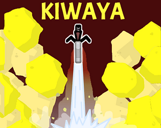
I have noticed that the least popular game I have is KIWAYA.
I am interested in hearing about your feedback, purely based on the store page (screenshots and description).
- Does the store page seem boring?
- Does the game look like a badly made clone?
- Are the graphics too off putting?
- Does the description miss a 'hook'?

Any feedback goes, even 1 sentence. Thanks!

https://rogerty.itch.io/kiwaya

Finally an original game! This looks so much fun <3

(1 edit)

Nice video! Well made, good to see a lot of things explained and glad to hear a video start without -SO WITHOUT FURTHER ADO- :)

(1 edit)

Interesting to try out and I like to see the use of split screen! The graphics and sounds feel very retro-ish. I've been staring at the   GAME!"-logo thinking, how can I steal this nice design idea without anyone noticing...

You earned 400 xp. Thanks for making this <3

Wow thanks Leaf for answering. Love your projects.
Ok, in that case I will blindly follow Leaf's advice and go with 1 site. Thanks!

(2 edits)

hello! Everyone!

Is it ok to have 2 project pages of the same game? One being the "premium" version (with several OS versions) and one the free version.
This way one project appears as free in the itch browser and one as paid.

I have read: https://itch.io/docs/creators/quality-guidelines#avoid-uploading-and-lsquoreskin...
("Avoid uploading ‘reskins’, or many project pages for minor changes Do not create multiple project pages for projects that are essentially the same but with minor adjustments. If the code or asset changes are substantial it’s okay. Additionally, if you're trying to preserve different versions of the project, eg. jam versus final, it’s okay. If you need to sell different tiers of the same product you can use our individual pricing tools.")

And I have read https://itch.io/docs/creators/pricing

beautiful game <3  Love the clouds. I wish the houses were not so far away ^_^

Hellow fellow developer or not-developer!
This game is truly untested. Except by me. But that doesn't really count.
If you have time to try my game out, I would appreciate it if you have any feedback.
For example - what is your first impression and what do you like and dislike?

Thanks in advance.

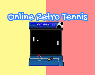
https://rogerty.itch.io/online-retro-tennis

Interesting to read. Perhaps everyone gets this except me, but why do you call it 3.49D? :) 

Interesting! Would you mind sharing how you made this?

I have enjoyed the view of your game ;)