
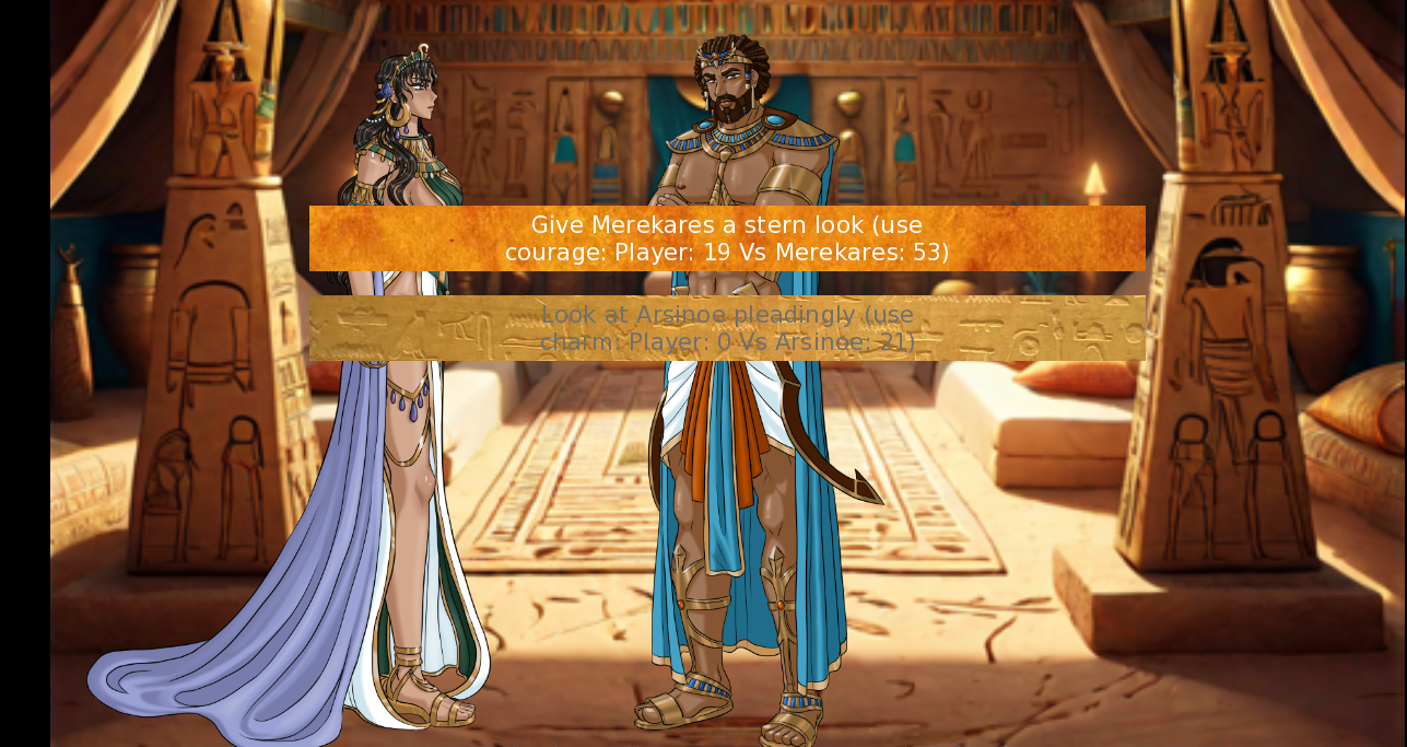
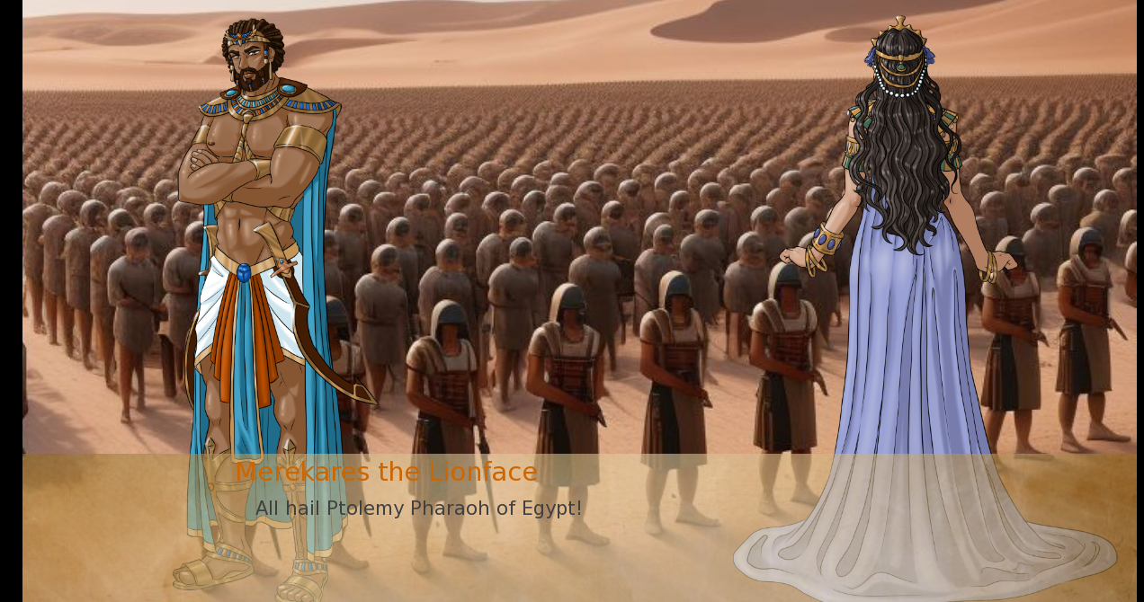
Hello, the textbox in the second image is more preferable to those found in the first, and I would suggest altering those found in the former to maintain a simple and consistant appearance. It would greatly increase readability for the user, with text colour providing instant recognisability and differentiating the information being displayed - Orange for the speaker, black for body text, and say white/purple for information on the stat being used. Also, I would suggest doing something that has the effect of making the text box background more consistant so the text is more readable. In the second image, you can see how the varying background decreases the legibility of the orange text in places. Some ideas could simply be increasing the opacity, blurring the portion of the image behind the box, or adjusting the background or character positions to be less meddlesome to the text.
It seems like fun to mess around with the text box background image and fonts, but in my opinion it just ends up overcomplicated something functional that requires simplicity, to be crude, a potentially disruptive mess. As ever, I'll also give my opinion where it wasn't asked for, and kindly request that you put a comma after "All hail Ptolemy." Thanks!