Indie game storeFree gamesFun gamesHorror games
Game developmentAssetsComics
SalesBundles
Jobs
Tags

Pixel Art Advice- 2D platformer background

A topic by ZeggyGames created 45 days ago Views: 153 Replies: 1
Viewing posts 1 to 2
(1 edit)

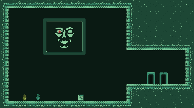
I'm having a hard time coming up with something that makes sense visually for my puzzle-platformer game. I'm not classicly trained as an artist or animator and I usually just operate on what feels right. I can't really seem to come up with a design for the background that I like. currently its just a single flat color background which is...well boring. You can see the current state of the game HERE

It is a work in progress, but I just want to dress it up and make it look more cohesive and complete. Here is an idea i liked and I started to work with a little bit (some creepy AI/enemy watching you and reacting as you progress through the levels.. but i'm still having trouble finding the right colors/ further bg design to get it all to make sense together.


Any ideas/advice? Making the background darker seems to help with the contrast but im more or less shooting in the dark right now..


(1 edit)

I'm not a professional but I have a few inputs to give as for the level design

1. Background 

You should have some more diversity in color, to start it seems the primary color is green, I believe you should have two secondary colors , some kind of blue, and maybe orange. There should also be a accent color like dark gray or gold to represent mechanical stuff and wires.  I'd it be appealing to add old looking bricks, wires and piping to the background, some giant tubes would be nice too as well as some flickering/non-flickering lights.

2. Characters 

This is for the characters: I believe you should exaggerate the characters more, like there hands and arms would be good. I think that If the face screens were made a bit larger and more prominent it would  give your game the sense that you and your character need to be more observant.  If the arms (epically the hands) were exaggerated to be bigger or longer  it emphasize the need to grab objects in the environment.  Personally I would also prefer if the avatars were a color that stood out more from the background, it feels as though they blend too well with their environment. 

3. Gameplay

I'm not an expert but I feel as though the avatars should move a bit more quick  due to the size of the puzzle rooms. Also the default button layout feels too close together, I'd think it would be better if you have the arrow keys as jumping and movement and change the grab and jump function to Z, and X, shit works just fine for me. Another possible layout could be arrow keys for movement, and A, W,  D be for the, "A=Grab," "W=Switch," "D=Throw."  

3. Personal Note

To make the game a bit more fun having idle, animations and emotes that you can do with the avatars would be fun, and if you could customize the characters with gloves or helmets. Having though to draw multiple skins and animate each one though maybe to time consuming.

hope this helps.