
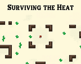
Great game, felt a bit too "trial and error" on few levels. But it was still really fun!
A member registered Nov 03, 2018 · View creator page →
Creator of
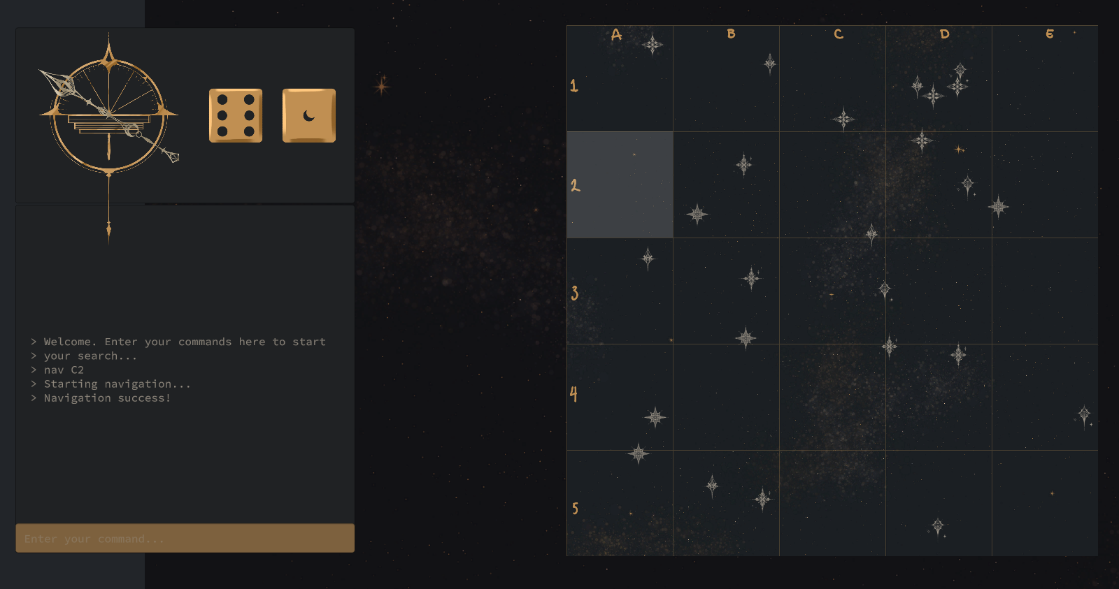
Play in browser
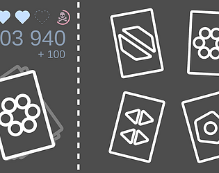
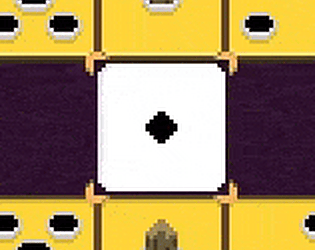
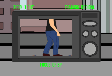
Press as fast on correct cards as possible! You need to be fast, really fast
Play in browser

Recent community posts
itch.io Community » itch.io » Ideas & Feedback · Replied to Dr.Hippo in Game Categories for the Creator page
itch.io Community » itch.io » Ideas & Feedback · Created a new topic Game Categories for the Creator page
A useful feature that I think would be worth adding is an ability to create "categories" or "groups".
For example, I would love to split my page into a "game jams" and "normal releases" sections. Currently both kinds of games are shown together in a single grid.
What I want is a layout like this: Doing that by hand in the HTML is relatively easy as those are just <h2> elements
itch.io Community » itch.io » Questions & Support · Replied to FieryLion in Grouping projects in Dashboard
itch.io Community » itch.io » Questions & Support · Created a new topic Grouping projects in Dashboard