


The rounded font looks really nice.
A member registered May 31, 2023 · View creator page →
Creator of


A 1 bit pixel art tileset for platformer games
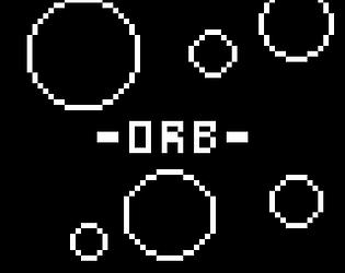
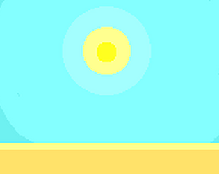
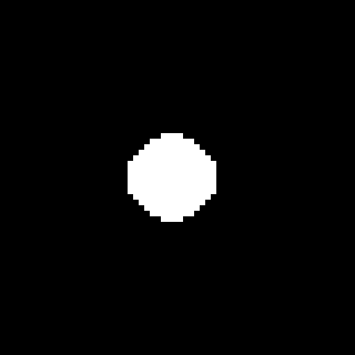
Guide the orb through eight challenging levels of increasing difficulty.
Platformer
Play in browser
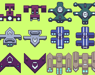
A downloadable pixel art collection of TopDown spaceships.
A collection of pixel art cars for a top down racing game.
A collection of pixel art Explosion effects.
Recent community posts
itch.io Community » General » General Discussion · Replied to sarahdwells in What is your art style?
Hey
Not sure if you'd like this but I've just released my first speedrunning game. Its a simple 1 bit game with a minimalistic art style. There are currently no sound effects or anything as it's still being developed.

Hope you like it.
itch.io Community » General » Release Announcements · Created a new topic [Asset] Top down race cars
Just released a top-down race cars asset pack. Check it out if you're interested.
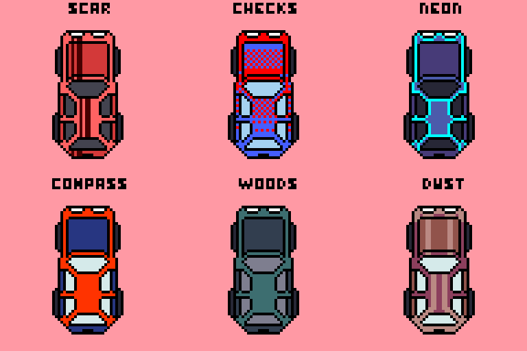
Also I'm not very good at pixel art and have a lot to improve, so completely open to ( and really encourage ) critics and suggestions.
Will update the pack soon. Hope you like the art : )
itch.io Community » Creativity & Art » 2D Art · Created a new topic What new kind of explosion assets would you like to see added to our asset pack?
Hey, we have just published our new asset pack. Pixel-art explosions
The asset pack currently consists of eight different pixel art explosion sprite-sheets and we're planning on expanding it. Please let us know what new kinds of explosion sprite sheets you would like to see.
 We're open to suggestions and criticisms.
You can find the art asset pack on our itch.io page. We provide a link here : https://aim-studios.itch.io/explosions-pixel-art